


Internet Annoyances
Internet CrimeBad Design & ProgrammingCommercial and Legal OutgrowthsOnline Community IssuesSocial Media IssuesFormer Annoyances
I am online since 1996, with occasional interruptions of at most a couple of days, and I am overall pleased with the development of the internet to a universal platform to acquire information, to work on common projects, to exchange opinions, to do shopping and banking and to have fun. Some trends, however, have become increasingly annoying, for me as the webmaster of a big site as well as a "normal" user.
Disclaimer While I'm doing my best to stick to the facts in this commentary, please note that all of the observations are based on personal experiences and some may be outdated.
Internet Crime
Spam
Sure. Who doesn't hate it? But most of all I am astonished that the overall spam volume is still rising after so many years, although there can be close to no return from it. Currently the vast majority of all e-mail messages has to be considered spam. If it hasn't already been filtered out automatically, every human being who is not a complete moron can recognize spam in milliseconds. This used to be different in the mid-90s when I actually read some of the then infrequent spam mails, especially the amusing ones pretending to come from former African dictators.
I reckon that when some dick sends out 10 million spam messages today, only some 500,000 will arrive and get noticed at all for a split second. Out of these 500,000 human spam recipients, maybe 5000 will read more than a few words. Of these 5000, only 50 will click a link to penis enlargement because, if there is any information provided, it is quickly recognizable as fraudulent or at least untrustworthy (for instance, because of bad spelling). Statistically, I believe that at most 1 of these 50 people will buy anything. And this is only possible under the assumption that the site is working and sells anything at all and is not just another dead link or a redirect to something totally different - many spam-advertised sites appear to be dead ends!
So even if it is possible to earn a few cents per 10 million spam messages simply because someone pays for the page clicks, there can never be sufficient return to justify the (admittedly small) effort of sending out all these mails. Common sense tells me that whole system should be increasingly unlikely to work, even if it were legal. And if sending a single e-mail cost only 0.1 cent, the spam business should have collapsed long ago. So why is it still thriving? Unless the spammers themselves are complete idiots (which is what most spam messages look like), spam must be a miraculous way to find the needle in the haystack, the one out of ten million who is still gullible enough.
On a side note, regarding the customary "I need your bank account to transfer my money" fraud (the Nigeria scam), I read about an investigation that came to the startling result that intellectual people are much more likely to fall for it than users with average education!
Phishing
Of all fraudulent internet manipulations, phishing is the probably most insidious one. Because you can never be careful enough. I sometimes spend a few minutes until I can rule out the authenticity of a message from a bank, from PayPal or from eBay. The spoofed messages very often look legit, even on a second glance.
Here is what I do when I suspect that I have received a phishing mail (in about this order):
- Have I ever given away my e-mail address to my bank or any other company or agency (especially regional)? If they don't know my e-mail address, the mail can't be from them.
- Have I received e-mails from the sender before? If the suspect e-mail, titled like "Your Account Will be Suspended", is the first one from them, I discard it because it very likely isn't authentic.
- Is the language in the mail correct? I have a German eBay account, and English or Spanish mails pretending to come from eBay are likely phishing attempts.
- Is the e-mail header correct? Not the "From:" field in the header is relevant because the phisher can put anything in this field, such as "<eBay> [email protected]". The decisive criterion is the server from which the message was sent; it must be made visible in the option menu of the e-mail client or by saving the whole message as plain text. If it's something like "someserver.ru", then the e-mail is from Russia without love and not from your local bank (unless you're Russian, of course, no offense meant!).
- Is the URL of the site that you're referred to correct? Most fabricated URLs should be obvious. The URL "secureserver.ebay.evilurl.com" can't be an eBay server because the second-level (second to last in the URL) domain is the decisive mark. I am surprised how many people still don't know how to read URLs after so many years and think that everything is okay if just the third or fourth level looks trustworthy!
Bad Design & Programming
Modern web design and SMO
Websites traditionally used to have a menu bar, preferably easy to find on the top of every page. This has changed in the years since about 2010. An increasing number of websites, especially of companies, do not have a menu bar and do not have any kind of consistent navigation, at least none that could be recognized easily. Index pages of "modern" websites usually consist of a full-screen title image or a "slider" and otherwise of all kinds of clutter, such as links to special announcements, to other news, to promotional videos or to social media, often differently sized and with different behavior. Sometimes clicking links merely makes the browser scroll down to further buttons, giving the website the air of a bad Powerpoint presentation with slide transition effects. Well, in many cases it is still possible to defy this predefined path and scroll all the way down to the bottom of the page, to find a big gray box with a bunch of unattractive looking but useful text links to what the website actually has to offer ("Company", "Products", "Services", "Distributors", "Career", "Contact"). But that is obviously not the way the site is supposed to be viewed because otherwise these links would be on top.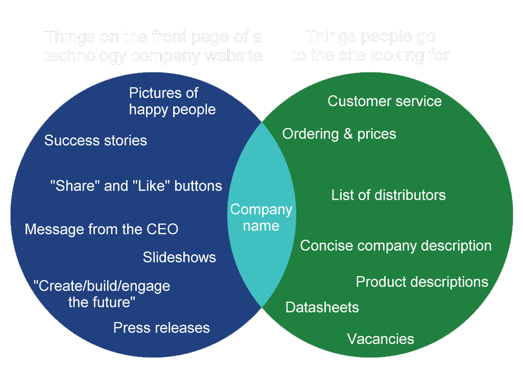
What's more, it has become a strange habit that company websites don't readily give away what the company is about in the first place, no matter whether they are B2C or B2B. Very often there is not even an introductory paragraph such as "[Techcompany] is a leading provider of [tech]..." It almost seems that today's cutting edge companies all produce and sell the same: huge pictures of happy people, which are further "explained" with buzzwords such as "Create", "Experience", "Share", "Get involved".
Many years ago some websites tried to catch the attention of visitors with splash screens before showing any actual navigation aids or any content. This practice was commonly frowned upon for very good reasons and was ultimately abandoned in the early 2000s. Likewise, hidden or animated navigation elements were criticized as "Mystery Meat Navigation" and usually didn't last for long either. It seems the latest generation of web designers repeat all the mistakes of the past and worse. Accessibility was yesterday. The absence of a clear navigation structure and of a common design is not only a problem immediately after coming to a website but often continues all the way through the sub-pages. It looks like "modern" websites don't even want that their "traditional" in-depth content can be explored by visitors, even if this content still exists.
There are several rationales for this development, a few of which are of technical nature and at least partially understandable. It is clear that for mobile devices a horizontal navigation bar with eight to ten items side by side is not practical any longer. The better ones among the modern sites offer a mobile-friendly extendable "hamburger menu" with the basic links, yet they don't care much for users of PCs, who are left without a navigation tailored to their needs.
It is clear that there is a second, perhaps more decisive driving force for the current trend in website user interfaces. In the age of social media, people don't want to spend their time exploring websites, or that's what the developers think. Eye-catchers in the form of huge photos are a decisive element to guide the visitor straight to the news, with the main goal that it gets shared. A navigation bar would only invite people to leave the predetermined path. Moreover, it would ruin the layout in the eyes of the designers. In other words, function follows form (although the clutter that usually follows underneath the pretty header image ultimately ruins this perhaps good intent anyway). The most recent or the allegedly most attractive or "most popular" content is presented ostentatiously, the rest is hidden in a way as if a sitemap or category pages were something embarrassing. Access to the range of products of a company appears to have a low priority, unless it is an online shop. Rather than detailed product descriptions or datasheets, news articles of less than 500 words is what people expect to find on a website today, or so the developers think. Actually, social media optimization (SMO) requires the news to be short, and too often takes precedence over usability, accessibility and comprehensibility. My impression of SMO is that it is deemed more important that the news is shared than that it is understood.
Summarizing, SMO has established the following unfortunate trends:
- Sharing news is deemed more important than understanding news.
- In-depth content is removed or is made hard to find, in favor of dumbed down news.
- Websites lack uniqueness in design and content. You get the impression you can find everything on the Facebook page of the company too.
- Megabytes of huge images and animations dominate everything - function follows form.
- The needs of PC users are disregarded as if everyone (even business customers!) always accessed the internet with smartphones.
Empty spaces as links
One web design habit has become so irksome that it deserves a point of its own in this list: empty spaces on a web page that are misused as links. The annoyance can be found with increasing frequency in portals with ads (see below) where not just the banner but the whole space to the left and the right serves as the link. When I try to mark portions of the page or only accidentally click the area, I am in for an unpleasant surprise. Sometimes the whole screen with the exception of the customarily tiny useful area of a commercial site becomes a link to the sponsor.
The phenomenon, however, is not only symptomatic of overly aggressive advertising. It can also be found in apparently well-meant designs, because some people think if there's a link somewhere in a table, the whole table cell has to become a single big link, without being marked as such (which, just like the hidden part of ads, prevents me from marking the text, at least on the first try that takes me who knows where).
Forcing the link target
Around the year 2000, it annoyed me that when I clicked a link on a website, it was a JavaScript link and the image or sub-page opened in new browser window (sometimes a non-maximized mutilated one without a menu bar and location bar, especially in MSIE). This bad habit has vanished since the advent of tabbed browsing, and with the freedom to use "CTRL+click" and open links wherever we want. Furthermore, there is the possibility to organize, lock and even restore tabs. I was confident the time of patronization was finally over but I was mistaken.
After not being a nuisance for several years, links that can't be opened where the user wants (such as in a new window or tab) have resurfaced massively since about 2015. They are commonplace on big sites such as Facebook, Twitter and Deviantart. Even worse, a distinction of free and forced links is not possible (unless I right-click each link and check whether the option "open in new tab" is available). Sometimes when I perform "CTRL+click", the same tab reloads instead of a new one opening, and I lose the focus on what I was reading - which is particularly bad if I reached that point by means of "infinite scrolling". It seems the web designers want their websites (both mobile and desktop) to work like their apps, and they disable the use of multiple tabs to take away that advantage.
Inaccessible images
This is just a short notice on how much I hate it when a thumbnail is displayed on a page and the access to an existing larger image size is obstructed. In many cases I can't simply click the thumbnail to open the larger version. Very often nothing happens when I click it because I would have to lower my browser security settings to enable (a totally unnecessary, in this case) script or cross-site image display. And even on many pages that open the new window without much fuss the displayed image still isn't the original size but some intermediate thumbnail. On Facebook, Flickr and some other sites I have to click up to four or five times until I am finally able to see and download the original image in its full glory and without forced resizing. On some other sites it is necessary to go to "Page Info" (in Firefox) or to modify the URL parameters to be able to see the unresized image (in a pathetic attempt to keep me from downloading it).
Finally, some image hosts such as Imageshack, Photobucket or Imgur impose so much overhead on the image display that I never know whether the original doesn't exist any longer or whether due to some browser problem, script glitch or delayed loading of ads it simply isn't displayed. The embed code of Imgur, for instance, consists of 93 lines, 90% of which is for tracking, SMO and ads! Whenever I see an embedded image coming from Imageshack, Photobucket or Imgur anywhere on another site (such as a BBS), I don't even bother clicking it because they have turned inaccessibility into an art. These services are effectively image viewing prevention services and are among the currently biggest internet annoyances.
Another annoying image host is Pinterest. I usually wouldn't care for this community, but numerous Pinterest results are among the top results when I perform a Google image search. I need to register with Pinterest in order to view those images at full size, which is almost fraudulent because I expect from Google to find only pages and images that are accessible to everyone. I often type something like "K't'inga -site:pinterest.com" (or "K't'inga -pinterest", which also excludes other Pinterest TLDs) in the search bar to save me the annoyance. What's worse, items at Pinterest are routinely shown without any credits. So it is hard, and sometimes impossible, to find out where they really come from. Many images that I created for EAS are on Pinterest, and are commercially exploited without providing openly accessible credits!
Infinite scrolling
I don't know if users have ever complained about the necessity to click the "Next page" link in long search result listings or in image galleries. Anyway, the website programmers of search engines, social media and blogging software address this alleged issue by offering infinite scrolling, often without an "old-style" alternative (Deviantart is a pleasant exception). The intention is that visitors simply scroll to the bottom, and new content loads automatically, without the need to do anything. Alternatively they show a link such as "Load more images", which does the same - load megabytes of new data on the same page.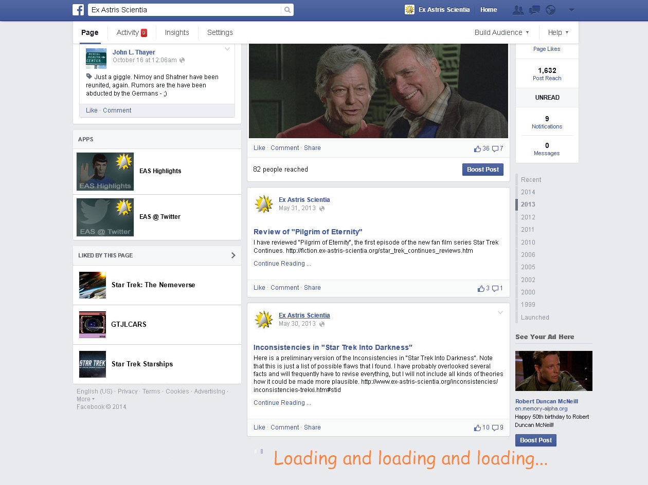
This technique sounds like a good idea because it seems to allow smooth browsing, especially on mobile devices. However, it comes with severe disadvantages. Firstly, it is a dynamic technique, and whenever it doesn't work perfectly (for example, if the server doesn't respond, if the connection deteriorates or if a script stops working), it causes the page to hang or to load incompletely. In such a case the visitor has to hit "Reload" and start all over from the very top of the page. It often takes several minutes to load everything again and find the point where the transfer was interrupted. Infinite scrolling is not just a problem for users with slow connections but also for those with less powerful hardware. At some point their CPU will burn and/or they will run out of memory. The immense amount of content packed on a single page, accompanied by various scripts that are running all the time, is too much for older processors and for memories of less than 2 gigabytes. And finally, even for those with fast enough hardware it is often a pain of the ass to scroll back and find anything in an extremely long list, especially when they are seriously researching a topic. In the age of pagination it was still possible to open the list in a second browser tab and look there for the second result, which is not possible any longer, at least not without starting over all again in the new tab.
The programmers of web pages have obviously forgotten that there were reasons why mankind abandoned scrolls many centuries ago and switched to books...
Mobile usability disasters
Common lists of mistakes to avoid on a mobile web page include trivialities such as "too many navigation items" or "too small links". But there are some things on many mobile pages that I personally find much more bothersome.
Many websites are just too small on my 4.6'' smartphone. If it is a mobile version, website authors usually take care that font sizes are legible. But images are very often too small to recognize essential details. So I have to pinch and zoom on many mobile pages that I visit. But some websites disallow pinch and zoom for reasons that I don't understand. I fail to see the rationale why it is technically possible to disable it in the first place. After some time I discovered that the mobile versions of Chrome or Firefox can override the anti-zoom setting. However, some particularly nasty creators of mobile websites have found ways to overrule this important accessibility setting, making their websites unusable for me on a small display. Apps, by the way, almost never allow pinch and zoom. Maybe the developers just impose the same limitations on their mobile websites to take away an inherent advantage and get people to use their apps?
As a matter of fact, the usability of many old-fashioned sites that were designed before mobile devices even existed, is a lot better on smartphones than that of many sites with the most recent mobile CSS techniques. On old sites I know that I can zoom in on any portion that is of particular interest to me, whereas several mobile sites show me just as much of a page's content as their creators deem useful, and only at the one fixed size they deem useful.
It is a rather new annoyance that a couple of mobile sites, and in particular news portals, jump to the index page once I scroll down to the bottom of a page. I don't know who possibly asked for such a behavior. When I scroll to the bottom of a page, in particular on a news portal, it is because I want to see the links to the categories, or the comment section. Or perhaps I just wish to check the conclusion of the article, rather than read it all. News websites also frequently bug me with messages such as "Our home page was updated. Do you want to go there?" There are so many other ways to get back to the index page, and usually so little reason to go there even when prompted. So please end this madness and let me scroll to where I want!
As already mentioned, some of the problems of mobile websites seem to be a hint to get the app, instead of using the mobile browser. In the less decent cases I get big messages such as "Our mobile site sucks, wouldn't you rather use our app?" each time I visit a site. Well, not quite phrased like that but that is the impression I get. Google's "Progressive Web App Checklist" even *recommends* that developers annoy site visitors with frequent hints to add a web app (technically just a link) to their home screen, to "increase the engagement"!
In some extreme cases, on Android, certain internal links on websites even open the Google Play Store and compel me to install the app, instead of taking me to the corresponding mobile web page! Facebook's mobile site, for instance, doesn't allow to read messages. Any attempt to open messages takes me to the Play Store where I am prompted to download the Facebook Messenger app. I tried out the app, but even without any new messages it sent me push notifications and always remained in the foreground. It took so much control of my device that I angrily uninstalled it for good.
Commercial and Legal Outgrowths
Overcrowded and ad-polluted portal websites
The portals of fully or partially online-based companies such as e-mail providers, other internet services, media companies, newspapers or TV stations are visited by millions of people every day. While this should be an incentive for them to come up with a particularly decent looking, fast-loading, well-ordered and easy-to-use web design, their portals are very often the exact contrary. There is usually no consistent site design, and sometimes no visible concept at all. Important functions such as "Sitemap", "Search", "Help", "FAQ" or "Contact" are missing or are not supposed to be found easily (see also "Hidden or cluttered navigation"). Direct navigation to content pages is not possible, but only via an intermediate page (with more ads, of course).
Half of a page's real estate is often reserved for off-site ads. Many websites even give away their page background to ads, which then appears in colors such as pink or yellow (and is sometimes turned into a single big link, see above)! Much of the rest is spent for unrequested videos and animations that waste valuable bandwidth and CPU power. After several years in which pop-ups were a no-go and rightfully so, they are back again, prompting the user to agree to the terms of service, to allow notifications or to subscribe to the newsletter. The ads, on the other hand, are a bit more subtle now, often disguised as links to actual content. Well, and even the site's own content is presented in the form of clickbaits. Most portals look like porn sites these days, only without tits.
The rationale for the degradation of websites of online companies is evident, however. The sites were initially set up as a service for their customers, an online catalog/help desk, many of them as soon as in the mid-1990s. But now that the internet has become a mass market it is just too tempting to squeeze profit out of a site by filling it with ads and by offering paid "premium" services that very often have nothing to do with the original purpose of the website or even with the scope of the company itself. When I go to the site of a TV station, I would expect to find extensive information about their programs, such as transcripts, annotations, background information, production information or additional links. But it is a huge disappointment every time I look for such content. Some TV stations don't even post a schedule in a place where I could quickly find it! I am apparently asking too much, and I am rather expected to play games, buy merchandise or subscribe to a premium streaming service on a TV website. And pertaining to the ads, it is peculiar how companies (at least if they are not direct competitors) love to mutually pollute their websites!
The pleasant exception among the web-based companies shouldn't remain unmentioned: Google - a commercial site that does not only have a very simple and fast interface but also decent ways to integrate ads into the search results (well, Google's all-dominating AdSense service for other sites is another story). The same praise goes to eBay, although to lesser degree because it is not quite as clean any more.
Prompt spam
As already mentioned, most websites welcome visitors with a prompt that has to be acknowledged before it is possible to read or to interact with the site: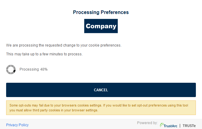
- Agree to our terms of service.
- Set your cookie preferences.
- See our special offers, only today and especially for you.
- Receive notifications in your browser (or our newsletter).
- Sign up to see what the search engine found but what we hide from anonymous human visitors.
It seems like the first two items on the list are legally required, but somehow I doubt that an anonymous visitor, who just reads something publicly accessible, would need to be subjected to an approval process. While it may be a precaution to cover blurry legal situations, I can't help the impression that companies (or their website programmers) just love to engage visitors like that, thereby creating an interaction where otherwise there would be none.
Modern paternalism - We know better than you what you want!
Several websites claim to be more intelligent than I am. They anticipate what I am allegedly looking for. The first example has not yet become a commonly accepted technique, and I hope it will never happen. On some websites hosting blogs or articles it happens that words inside a paragraph are underlined. But what appears to be a wiki-like keyword-sensitive linking to an encyclopedia entry or further information turns out to be a particularly insidious way to incorporate ads. Example: A link on the word "Starfleet" leads to a shop selling T-shirts with a Star Trek logo. Sites or hosts doing something disgusting like this should be boycotted.
A perhaps even worse example of websites that know better what I want than I do myself is the automatic correction of alleged misspellings in search results, including hits for search terms that have nothing to do with what I am looking for. Example: In order to stay informed about where EAS is cited, I can do a simple web search, combining "ex astris" with various keywords. Google, however, gives me many search results with the term "Astrid" instead of "astris", without telling me that the search was extended. Google obviously assumes that I am looking for a girl named Astrid but I am too stupid to spell her name correctly. I don't know what the criteria are, because "astris" is not even an extremely odd word that might justify being "auto-corrected". Typing other unusual search terms (even things that have to be typos by all means) Google does its job the way I would expect and only suggests "Did you mean...?" when it suspects a misspelling, which is a lot more transparent and less patronizing. There is absolutely no need for covert auto-correction.
Finally, why is it that many websites refer me to "most popular topics"? This may be helpful on news sites, but it has become a common practice everywhere. At EAS, I'm trying to direct people to the best features in my humble opinion, especially when I think they deserve more attention than they usually receive.
Speaking of "most popular", eBay lists the "best matches" on top of the list, which actually means "promoted items of top-rated commercial sellers". This is unfair because private sellers get even less exposure at eBay than before, if they are demoted in the search result order. And there are investigations that 80% of all users don't change the default search order. It is also bothersome for me as a "more demanding" user because each time, when the results are already displayed, I have to reload the search with a useful order (such as by date or by price).
Geoblocking
Not only ads but increasingly also the content of websites is customized, even for visitors that are not logged in. Visitors are only shown what is deemed relevant for their country, effectively re-establishing national and language borders as they should not exist in the internet in my opinion. If people in different countries are seeing different content at seemingly the same URL, it doesn't only lead to unnecessary confusion, it may even give rise to conflicts. I repeatedly had to explain to people that I couldn't watch certain trailers at YouTube because they are blocked in Germany. Vice versa, I posted videos at EAS that worked fine for me but that were not available in certain other countries, for which I was blamed.
In some cases I can understand the reasoning for geoblocking, especially if it is paid content and some streaming provider could snatch away customers from countries where their service legally shouldn't be available. But it escapes me why trailers are geoblocked just because the movie or series is released by different distributors in different countries. Shouldn't Netflix or Amazon be glad if CBS trailers for Star Trek productions are available worldwide? Doesn't it occur to CBS that it deters potential viewers outside the US if these get the impression they are not welcome?
On a further note on geoblocking, a frequent suggestion is "get VPN". That may help me with YouTube videos I can't view but doesn't solve the other problems. More often than not, VPN plus log-in equals trouble. Even though logging in to paid streaming accounts with IPs from outside my country may be perfectly legal, it could violate the terms of service. Creating a new account, pretending that I reside in a different country, definitely does and may be against the law as well! The streaming service could shut down my account once they notice I'm logged in from a blacklisted VPN IP. And even if they don't penalize me immediately, they may block these IPs beforehand and additionally monitor how often I try different IPs. I won't take the risk. Furthermore, having VPN myself doesn't help at all with geoblocked videos that I want to post at EAS (unless, of course, I log in with different IPs from around the world to check each single video I'm going to post).
The trAPPed mobile user
As mentioned above, online marketing platforms bug their users to get their apps, rather than visiting their websites. I have to admit that a well-designed app can be a more pleasant user experience than a mobile website.
But apps come with various pitfalls compared to mobile websites:
- Many apps leave out functions of the corresponding websites that I deem important. Especially the account management and the forms for posting or searching usually lack functions that I am used to.
- No app that I have installed or at least tried has something like tabbed browsing. You are always stuck with one window, which makes such things as comparing items in a shopping app very hard.
- Pinch and zoom to recognize details in photos is almost never possible.
- Getting data into and off apps can be hard too. The clipboard often doesn't work as desired. Sometimes it is not possible to copy or paste text at all.
- With apps, the content or service provider generally has more influence on what I see on the platform than in case I use a browser. Also, in the browser I can log out and additionally choose a "private" mode in which the website shows me the content in a more "neutral" fashion (well, not completely neutral, as long as I don't manage to conceal my location and my OS just as well).
Pertaining to the first bullet point, it seems that the trend has reversed its direction. Some apps, like the one of Facebook, offer extra options not available on the website. On the other hand, I doubt that the app has all the functions of the extremely complex Facebook interface, which can be accessed through the website by only searching long enough.
Notification spam
Getting notified about something like new comments in "hot" discussions or being outbid in an auction is a great thing. But overall the sheer number of notifications and their ever decreasing relevance has become a major annoyance and a considerable waste of time, not only in apps that just love to spam us with push notifications by default, but also on many websites and in almost all social networks.
Whereas the users of mobile devices were already used to the hardship of push notifications from apps, desktop browsers now support the technique too, and an increasing numbers of sites bug me with the question whether I want to get notifications from them. I have never agreed so far, although I am waiting for some really important sites to offer notifications so I can try them out.
On Facebook, the menu bar is traditionally littered with red notification icons every time I log in: new reactions, new likes, new visitor posts, new chat messages, new suggestions, and so on. In my experience I can ignore most of them without missing anything important. Only page visitor requests are something that may require me to react ASAP. But there is no way for me to recognize immediately what is important, no way to restrict notifications to the relevant or urgent types, and no way to click away everything irrelevant at once and for good. Each time I need a full minute just to check out and click the notifications away, thereby clearing my to-do list, and then reload the page. That is, if they actually go away. Many of them reappear when I reload the page, giving me the impression I missed something. Actually, the whole notification system is meant to give me the feeling I miss something when I'm not on Facebook 24/7.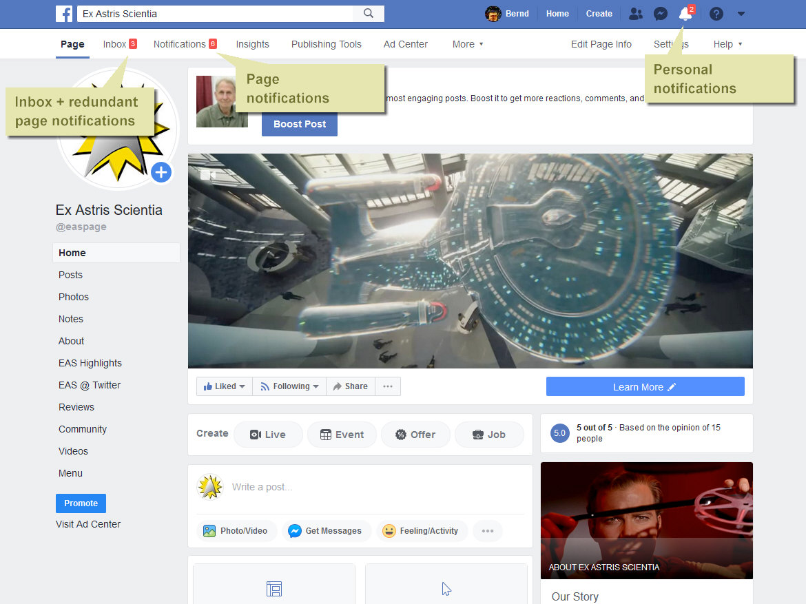
Since some time in 2018, much of the unimportant stuff is doubled as a "summary" in my Facebook inbox, so I have to click these things away a second time - one by one instead of simply saying "Mark all as read", an option that doesn't exist in the inbox. I solved the problem - by removing the inbox altogether and not allowing direct messages to my page any longer! Since about 2020, notifications are doubled yet again, as they now appear on the top, and some of them also in the menu bar on the left. And it still isn't possible to check at a glance whether there are messages or visitor posts that require immediate action. And in yet another update to Facebook pages, Facebook has introduced the Meta Business Suite, which adds another layer of complexity and in which, you guessed it, there are more notifications that I am required to check out.
eBay can be quite annoying too. The update of the notifications on the eBay website just doesn't work the way I would expect. Messages that I have clicked away and that I never want to see again very often reappear - sometimes after immediate reloading of the page, sometimes still the next time I log in again.
Google, the self-declared website police
Since the early 2000s Google is the all-dominating market leader among the search engines. The visibility of a website in Google's search results is a key factor for the success of a site, which in many cases determines the commercial success of a company. Google has an air of being fair, but the monopolist creates and enforces its own rules that websites have to comply with. The user experience is supposed to improve by ranking sites higher that comply with Google's standards for content and design. However, irrespective of the true quality of their sites, webmasters have to work and/or pay a lot to fulfill Google's demands, and to keep their sites from vanishing somewhere beyond the fifth result page.
- Google's PageRank is a seemingly "democratic" way to rank sites based on their link popularity. But my impression is that the PageRank is manipulated. Google penalizes sites that have links to many other sites (imputing it is a discouraged SEO advertising scheme), while it seems to promote partners of Google's own advertising services. I haven't read much about PageRank in the past couple of years though. At least, it seems that SEO (and the opportunities to make money with pages that are rated as poor by Google) has moved on to other key topics.
- Google demands mobile compliance from all sites and lays down a number of rules that sites have to fulfill. Although most smartphone users don't have a problem with pinch & zoom to read text on non-optimized pages, Google says that they will rank mobile usability still higher in the future (perhaps even higher than the content?), in which case many older sites will either have to be completely redesigned for thousands of dollars or will die. Despite or perhaps just because of Google's strict rules, the performance of many websites optimized for mobile displays is poor. Menu items are missing, touch elements don't work and pinch & zoom is often disabled, all of which Google doesn't check. Moreover, users are increasingly prompted to use the app, rather than the mobile site (for which I wouldn't blame Google, though).
- Starting in 2017, Google Chrome warns users about sending data via standard ("non-secure") HTTP. The browser tags any forms on web pages not using HTTP Secure (HTTPS) as "non-secure". I can see the reasons why users should receive a warning before they transmit sensitive data like passwords or credit card information through a non-secure channel, where it can be intercepted. However, Chrome makes no distinction any more and extends the warning to innocent forms such as for a site search engine, which will be tagged as insecure. The expected outcome is that many people will refrain from searching the site if prompted so by Chrome, and may even avoid coming back to the allegedly insecure site at all. The only solution to this dilemma that Google suggests to webmasters is upgrading to HTTPS. But this is not possible on all servers and in all hosting contracts.
- In early 2021, Google introduced Core Web Vitals, an extra ranking system besides mobile usability. Core Web Vitals includes three metrics, among which FID caught my attention and causes chagrin because almost all EAS pages failed the test, with values of over 100ms. I found out that FID stands for "First Input Delay" and represents the delay until the user can interact with the page. I stared at the result in total disbelief because EAS pages are among the fastest in the whole internet and don't need a single line of extra scripting to render them! Yes, my pages are long, but that doesn't prevent anyone from clicking around while images are still loading. The performance of my pages in this regard is vastly superior to 90% of all blogs and to 100% of all social media! It is obvious that the algorithm to calculate FID is flawed, or it was custom-tailored for the big players to pass, because I can't imagine that everything on Facebook or Amazon would fail the test.
Penalizing independent sites through SEO standards
I am wary for more than a decade that big corporations, social media and SEO/SMO companies are going to take over of the internet completely. For independent, non-commercial or privately owned sites such as EAS it is always becoming harder to earn the trust of visitors (which sadly happens less and less through the content) or to get noticed in the first place.
Is this our fault? Should we succumb to the laws of the market and try to imitate what the big players are doing? I don't think so. On the contrary, I can promise I will never include any scripts to track visitors, I will never include any other external scripts (except on explicit request) and I will never display ads.
But - I am compelled to do all that and more, otherwise my site gets denounced as spam! No kidding. I checked my so-called "Spam Score" at Moz, one of the leading SEO providers. I expected it to be 0% because EAS is totally spam-free. But it was 28%! I then looked up their criteria for tagging a domain as "spam", which made my jaw drop, followed by "You fucking bastards!!!" On their list, my site checks 10 of the 27 boxes, maybe a few less but rather a a few more.
The criteria that downright infuriate me (as of June 2023) are the following:
5. Google Font API Present "Domains which do not use special fonts (e.g. Google Font API) are often more likely to be spam sites. Lacking this special font feature was common among spam sites we found." - In other words, EAS gets penalized for not including parasitic code in the CSS.
6. Google Tag Manager "Google Tag Manager is almost never present on spam sites." - In other words, EAS gets penalized for not running parasitic code for marketing purposes.
7. Doubleclick Present "The Doubleclick ad tag is almost never present on spam sites." - In other words, EAS gets penalized for not having ads and scripts for user tracking.
8. Phone Number Present "Spam sites rarely have real phone numbers present on their pages." - In other words, EAS gets penalized for being run by a private person, not a company.
9. Links to LinkedIn "Almost no spam sites have an associated LinkedIn page, hence lacking this feature is correlated with spam." - In other words, EAS gets penalized for being run as a hobby and not as a profession.
19. Facebook Pixel "The Facebook tracking pixel is almost never present on spam sites." - In other words, EAS gets penalized for not allowing Zuckerberg to track visitors.
20. Number of External Outlinks "Spam sites are more likely to have abnormally high or low external outlinks." - In other words, EAS gets penalized for linking to related content and for strengthening the community.
21. Number of Domains Linked-To "Spam sites are more likely to have abnormally high or low unique domains to which they link." - In other words, EAS gets penalized for linking to friends and other independent sites, rather than to social media.
22. Ratio of External Links to Content "Spam sites are more likely to have abnormal ratios of links to content." - In other words, EAS gets penalized for linking to related articles on friends' sites.
24. Hyphens in Domain Name "Spam sites are more likely to use multiple hyphens in their domain name." - In other words, EAS gets penalized for a domain name that was fine 20 years ago and is impossible to change.
Okay, Moz is not Google or a social network. They are not in a position to restrict the visibility of sites that are not their customers. But I suppose if Moz has such a set of criteria, the sites that decide about if and how EAS is found and how it is ranked may do it in a similar fashion. And even if they don't, as more and more sites are getting fucking SEO and complying with the rules, this sets a precedence that may become a quasi-standard (like getting Google fonts and ads and removing all outgoing links has sadly become one).
In a similar vein, scam-detector.com (a competitor to the respectable WOT) gives EAS a mediocre rating of 58.5/100 (in other words, almost a scam), after allegedly checking all kinds of factors that would indicate whether a site is legit and safe or not. Some other Trek fan sites that I totally trust rank still lower. Instead of telling me what is wrong, they recommend to sign up and learn how to improve my site. Fuck you!
Logged out means locked out
In order to keep up my privacy, I think it is important to become anonymous again after visiting Facebook, Twitter, Google, eBay, Paypal etc. Therefore I log out after each visit. In case I should forget that, I have configured Firefox to shut down all log-in sessions once the browser is closed, at least on my desktop computer. This used to work quite well for many years, until about 2020. I can understand the security concerns, and I agree that sometimes two-factor authentication is the only safe solution for critical accounts. However, when signing in from the very same computer again and using a regular connection (not VPN, which only invites trouble), there just have to be different solutions than bothering me with the following obstacles, in increasing order of their escalation/annoyance level:
- E-mail: "Your account was accessed with a new device. If this was you, you don't need to take further actions."
- E-mail: "Your account was accessed with a new device. Please verify it's you by clicking this link."
- Prompt: "Your account was accessed with a new device. Please click on all bicycles to prove that you' re human... and then on all chimneys... and then on all boats.
- Prompt: "Suspicious log-in. We'll send you a text message with a PIN to verify it's you." (This would be the normal course of action with two-factor authentication.)
- Prompt: "Suspicious log-in. We'll send you a text message with a PIN... Okay, but in order to ensure it's really you, please answer the security question."
- Prompt: "Suspicious log-in. We'll send you a text message with a PIN... Okay, but please answer the security question... And now, to ensure the security of your account, enter a new password."
- Prompt: "Suspicious log-in. Please contact the administrator to unlock your account."
Am I the only one who thinks that, besides security concerns, the trouble that users have to face after logging out is a decent hint to stay logged in (and be tracked) 24/7?
Online Community Issues
Mindless bookmarking and blog posts
Maybe I am hopelessly old-fashioned, but I miss the days when website visitors actually recognized what was new and exciting and when they used to read and reflect on what someone was writing. Case in point: In early 2008 the EAS counter went up because of several blog, social networking and online bookmarking posts. The subject: "Starship Interiors", a page that had already been in existence at EAS for several years at that time. First off, I am glad that people still seem to care about my site, and now is as good a time as any, even if an old page is in the focus. But the latter is also a part of the problem of today's internet. Once it has entered the blogosphere or social networks, old news gets reposted effortlessly, and it becomes something "new" (at until it has been shifted down to the 14th archive page, where it will be lost until it is old enough to be re-reposted).
And while I think that many of the people who clicked the "Starship Interiors" link did have a closer look at the content, many of those who felt compelled to comment did not mind the actual topic. It seems that they took for granted that that I created those cross-section views of the ship interiors myself, although the actual source is credited beneath every single thumbnail. Also, several people complained "So many images, but none from the Enterprise-D?" They didn't even bother going one page level up to look for the special Enterprise-D page. It appears they don't know or don't care any longer how a website such as EAS works - a real website with a navigation structure, not a blog with overall randomly selected half-baked stuff.
A more recent example of the "old news still is news if we desperately need news" trend of the internet is Gene Roddenberry's original pitch for Star Trek that "resurfaced" in February 2011, at least if we believe the blogger who posted the PDF file. The very same file had been available at EAS all the time since 2006. (The pitch was originally posted at trek5.com from where I rescued it when the site went down. A newer version can be found at Star Trek History.) I don't claim ownership of a file that I simply reassembled and I don't mind people taking it for their blog from EAS, even if they neglect to give me proper credit. But the old news got reposted, and not once with a simple check where it actually came from and whether it was really news, in hundreds(!) of blogs and on all the major Trek news sites. In light of the fact that something found in an obscure blog is hyped in the blogosphere as well as in fan circles, rather than the same content that has been on a major Trek site for years (and linked from Memory Alpha and Wikipedia, by the way), I feel let down by the internet (and even more so, by the "social web" of more recent years that has disconnected itself from blogs just like blogs used to ignore traditional websites).
Trekkie-bashing
People around the world enjoy Star Trek, and few of them are ardent fans that talk about Trek-related topics every day. But many casual viewers feel a need to clarify that there is a great difference between them, the "cool" people who only watch it, and the "trekkies" who care way too much for it. In their eyes, "trekkies" are losers that run around in silly costumes or autists that tend to totally unimportant things all day. Especially in the wake of the recent reboots (Abramsverse and Discovery) with their mainstream appeal the trend of nerd-bashing has become worse. Even within the Trek community there is now a certain flavor of fans who have become bullies, who permit no doubt that the new style is superior to the old nerdy Trek and who accuse nitpickers of ruining the fun of watching Star Trek.
A symptomatic situation on a movie or science fiction message board, in a bookmarking community or a social network is that someone mentions that starship scales in a Trek movie are inconsistent. Several other members, who are often surprisingly (and suspiciously) knowledgeable for self-confessed non-nerds, give their two cents on the particular scene or on scaling issues in general. So far the geeky stuff is still considered cool enough to be discussed. But then someone posts a link to EAS where the very problem is analyzed in detail.
I really don't expect people to be grateful for my work. Actually, it is okay if they find misinterpretations or errors in my research and criticize me for it, because EAS lives from continuous improvement. And even if they ignore the link to my site and carry on regardless, I don't mind. But it happens frequently that someone starts shit talking about me and several others chime in. It becomes a vitriolic campaign in which the posters spread lies and misinformation about my site and my person, sometimes coming from people who claim to know me. A campaign in which the posters insinuate I suffer from mental disorders and in which "measly basement dweller" or "sperg" (which I learned is short for "Asperger" in antisocial circles) are still among the rather harmless comments. In some communities it seems to be a common practice that, after a few posts of decent discussion, the participants feel an urge to bully fans who are arguably still nerdier.
Those people are clearly anxious to dissociate themselves from "nerds" and particularly from the worst category of nerds, the "trekkies". And while they put down the diligent and dedicated work by true fans like me, they themselves create nothing but hot air. I have no problem at all with people hanging around in discussion forums or social networks just for fun, but only as long as they don't do it at the expense of other people. And while non-fans with disdain for "trekkies" are bad enough, there couldn't possibly be anything more hypocritical than Star Trek fans disparaging other fans. Irrespective of what these people are like in real life, I find it very pitiful that they need to practice cyberbullying to feel good.
Overzealous spam watch or netiquette in forums
As someone who runs or moderates several online communities, conventional bulletin boards as well as social network pages, I am well aware of the existence of trolls, spammers and bullies. I never had many problems with such people though, and even the social media are surprisingly friendly places where relatively little moderation is necessary. In this light it is paradoxical and very unsettling that a number of online communities have labeled *me* as a spammer or troll. Here are three cases:
- I used to frequent big Star Trek news blogs/forums with usually controversial discussions, and for all I know I was still among the rather moderate commenters. But for some reason some of my comments were never admitted or were lost without a trace some time after I posted them. Sure, this may have technical reasons or my posts may have been deleted accidentally. Still, I wonder whether someone wanted to get rid of a critical voice (see "Trekkie-bashing" above).
- Disqus is a commenting system that I added to EAS for users to give their two cents on my articles. The comments have been civil so far, with very little need to moderate. That's the situation on EAS. Whenever I myself commented somewhere else, my own comments repeatedly got flagged as offensive or as spam. This happened on other sites using Disqus for commenting, as well as in the Disqus support forum. And in the latter case there is no reason to assume that someone wants to punish me for my unpopular takes on the Abramsverse or Discovery. Among hundreds of recent posts in the support forum it was my two requests that were marked as spam! I have no idea what I did wrong because the wording of the comments was not anything like spam, and wasn't in any other way offensive. In addition, my complaint about the unjustified stigmatization was deleted. There are apparently more than just one or two people (or bots) who hate me. For more than just one reason. But for reasons that I'm totally unaware of.
- While no one explicitly called me a spammer in this case, there is a German message board that I used to visit where my style of posting was repeatedly called "impolite". You should know that this message board (that has nothing to do with Star Trek) has a special netiquette. You have to begin the post with something like "Dear forum members" and close it with "Best regards, REAL NAME". My "mistake" was that I forgot to include these two lines and that I did not want to reveal my real name (which is *not* a requirement but just a "recommendation" by the moderators). The result was that most of the responses did not address the topic I wanted to discuss but were friendly reminders such as "I would give you feedback if you were more friendly". Agreed, this is an extreme case of a very special message board, but perhaps it is part of my problem.
Summarizing, I am sure that I am very kind to other people who have requests, as I can tell from the overwhelmingly positive reactions at EAS, in the social media and especially in follow-up e-mails from people with whom I discuss Star Trek stuff. There are two explanations for my frequent failure to request something from other people, in communities that have nothing to do with EAS:
- I am actually a rude person and not aware that I'm offending other people.
- Few other people are as kind and patient as I am myself when it comes to tending to requests or to simply listening.
Wikipedia and the arrogance of power
I used to like Wikipedia very much. It was and still is one of the few sites that I visit almost every day, a site where I can spend hours and always discover something new. I consult Wikipedia very often for my research in various fields. I learned a lot on subjects that I barely knew anything about before Wikipedia. I still appreciate very much that some people dedicate much of their spare time to extend the site, to keep it accurate and up-to-date.
But many of the people in charge at Wikipedia abuse their power. They thwart necessary corrections or additions to the content. They treat contributors, often experts in their fields, with disrespect, hiding behind narrow-minded policies. The Wikipedia articles on many topics (not only Star Trek) are inaccurate, inconsequential and self-important, and I can do nothing about it because the bureaucrats discourage edits and don't even listen.
It is not just a problem of the Star Trek fandom, but I will pick it as an obvious example. It is dissatisfying that well-written articles about major Trek websites such as TrekBBS were deleted from Wikipedia and even Memory Alpha has been tagged for deletion for some time. All because of lacking "notability" under the debatable terms of Wikipedia that might permit the inclusion a local school magazine and perhaps a garage business but not of a renowned fan website with tens of thousands of worldwide users every day. On the other hand, the Star Fleet Universe, a gaming subculture that few fans care for, was conceded a whole article series (which has been cut down in the meantime though). I'm not even complaining that an article about my own website, Ex Astris Scientia, was first rewritten to one about the Starfleet Academy motto of the same name and then merged with the one about the Starfleet Academy. The only sentence left about EAS was totally off-topic and was eventually removed too. EAS may not be "notable", but the deletion policy should remain consistent, which is not the case as long as other unofficial fan works still have their place at Wikipedia, not to mention many other fan sites outside Star Trek.
Something that offends me personally is that dozens of links from Wikipedia articles to EAS were deleted although they were perfectly fitting in the context, the best off-site references Wikipedia could possibly get, with much more detailed information on the very topic of the Wikipedia page. The cited reasons in these cases: "A personal website is not notable/reputable", "original research" or even "link spam". In fact, Wikipedia withholds important information and denies its users the opportunity to obtain a second opinion by not linking to EAS, the definite #1 website for canon starships, technology and continuity issues. On the other hand, Wikipedia absolutely loves to cite the ramblings about Star Trek by "reputable" critics or newspaper columnists, although these usually have neither special ties to nor sufficient knowledge of the franchise or the fandom to produce anything "notable".
Wikipedia gets the basic facts about Star Trek right, but does everything to keep the franchise and even more so the fandom small. Overall it is not a good Trek resource. On many pages Wikipedia gives mentions in novels or games the same weight as canon facts or simply omits the necessary distinction. The list of Starfleet ships classes, for instance, is a pile of crap (still as of December 2019). Pages about the characters list non-canon second names from obscure and highly questionable sources. Some episode descriptions have note fields calling for citations in "reliable third-party publications" as if some newspaper critic were required to confirm canon dialogue! Well, Wikipedia doesn't want to be an encyclopedia of in-universe (canon or non-canon) facts of Star Trek and adds more weight to the real-world implications. Still, this doesn't justify the countless mix-ups of Star Trek facts that can be found at Wikipedia.
More generally, Wikipedia increasingly suffers from the following deficiencies:
- Wikipedia has an odd 20th century idea of "notability" and of the "reliability" of sources. Other websites, blogs or forums have no place in Wikipedia's view of the world. In Wikipedia's terminology, unlike newspapers with "professional journalists" they are not considered "reliable sources". The ironical (and maddening) thing is that "invalid" sources (such as EAS) are often where the bulk of information in Wikipedia articles is taken from, for which they receive no credit!
- Wikipedia prefers renarration ("reliable third-party sources") over genuine competence. It deters scholars and experts from contributing, not only because of the learning curve until their writing style would be fit for an edit not to be undone immediately (see below), but most of all because their knowledge is not asked for in the first place.
- Wikipedia deems adherence to formal criteria ("Manual of Style") more important than the correctness or the completeness of the facts. While this may not be chiefly the fault of the platform and of its principles, too many users indulge in hair-splitting. They often criticize or even undo useful edits because of small stylistic weaknesses instead of fixing them.
- Wikipedia prefers incorrect or outdated information over "insufficiently cited" corrections. Overzealous users usually revert any updated or corrected facts if these come without "reliable" citations, even in cases where the old information was obviously wrong or didn't have any cited sources either. They usually don't perform a simple plausibility check but simply undo the edit.
- Wikipedia is ruled by a small number of full-time users and their bots. They appear to lie in ambush for edits by normal users that they feel compelled to revert, with the rationales mentioned above and often within seconds after the edits were submitted. They engage in edit wars over trivialities on recently changed pages. Other parts of Wikipedia, irrespective of the topic, remain unattended for years, even if the articles are obviously poorly written or an edit was requested. If admins gave all pages the same treatment as the ones they discover as a prime target, especially regarding "notability" and "reliability of sources", I am certain they would have to remove 98% of Wikipedia's content.
- Wikipedia admins and other privileged users treat newbies with disrespect, which is extremely discouraging, especially for people who would have more to contribute than citations or stylistic corrections in existing articles. It has become a club of full-time bureaucrats who love to cite from thousands of rules and who leave no leeway for people who have to work for their living and who are on Wikipedia because of their interest in certain subjects or just for fun.
- Wikipedia is self-contained and self-centered. External links are effectively banned from Wikipedia articles (because almost no website is deemed "notable"), unlike it is good practice everywhere else in the internet. In other words, Wikipedia does not want readers to leave the site, or to obtain a second opinion elsewhere.
- Wikipedia imposes lots of formal rules on its members but no responsibility for the correctness, completeness or coherence of articles. In fact, the edits done by overzealous bureaucrats in some articles qualifies as vandalism. They remove huge chunks of useful information or revert corrections, and they very often post signs saying that references are missing, that the article sounds like advertising or that the content is disputable. While in most cases this assessment may be correct according to Wikipedia's own rules, it damages the reputation of the people, organizations or companies that the articles are about.
- Wikipedia articles are subject to favoritism. It is only natural that articles about important topics are longer and are edited more frequently than others. But in addition to this, there are certain popular people, companies and other topics whose articles enjoy a preferred treatment regarding the acceptance of updates and corrections and a lower threshold regarding the quality of new sources. There are often far more proponents than opponents of an update or expansion. The opposite applies to less popular articles as already explained above. Even if an expansion of a "stub" was explicitly requested, very often all editing attempts get reverted. Wikipedia is *not* neutral but favors those topics that are considered particularly important by the community.
- Wikipedia says its is "the free encyclopedia that anyone can edit." The latter part is untrue. Just like "This article is a stub. You can help Wikipedia by expanding it." I made perhaps 40 to 50 edits to articles (not only Star Trek) in my Wikipedia life, almost all of which were reverted after a short time, for one or more of the above reasons. There's no reason why I should still bother, and Wikipedia itself should finally acknowledge that it does not allow people to edit.
For all the reasons mentioned above, Wikipedia is definitely the wrong place to look for reliable Star Trek facts. That honor belongs to Memory Alpha, although especially in the wake of the latest developments in th franchise it too has developed a bit of a "better than thou" attitude towards "biased" fans and their "insufficient research". Overall, the way that Wikipedia and, to lesser extent, Memory Alpha deals with the fandom is another aspect of the general trend that the operation of personal websites and blogs is increasingly obstructed and their mere existence is ignored. It is obvious that no profit can be made in any form of alliance with sites such as EAS, which makes them irrelevant in today's business-driven internet. But I can't help the impression that this stance rubs off on an increasing number of private internet users and on Wikipedia as a non-commercial platform, who may have come to think that a place that doesn't sell anything and has no ads can be no good. Fan sites like EAS that are not organized in a seemingly "democratic" fashion but are maintained by single individuals are additionally under suspicion of being inappropriately biased and intrinsically incorrect, as if online collaboration could eliminate personal opinions and flawed concepts a priori.
There is another, albeit minor source of sorrow pertaining Wikipedia. Minor, however, only because EAS is non-commercial and I don't need people who click my link for a living. Wikipedia has enforced the automatic addition of <rel="nofollow"> to any outbound link, which is a questionable SEO technique, with the same effect as the other techniques of deferred linking mentioned above. That way Wikipedia does not leak Google PageRank, while it gains PageRank from any incoming links (such as from EAS) that are usually not protected. The consequence is that Wikipedia pages climb up the list at Google. Indeed, many Wikipedia articles have much higher PageRanks than the index pages of whole major websites dedicated to the very same topic and with the same keyword in the title. Those Wikipedia pages appear first in Google's search results, although they are just sub-pages. There are many factors that contribute to Google rankings, but Wikipedia's link policy certainly helps to stay on the top. Maybe I should be even glad that there is no article on EAS at Wikipedia any longer...
Social Media Issues
Twitter litter
I am not a big fan of many trends since the early 2000's because I was quite content with the conventional internet as a platform for companies, institutions and individuals to present their products, services, research or opinions. I certainly appreciate the possibilities of online shopping and banking, of online collaboration and photo/video sharing. But I never cared for social networks, until it was unavoidable because they had become a big thing. I just didn't want to boast a list of online "friends" or "followers". I didn't want to share funny pictures and videos with my social network "friends", because I found that embarrassing already in 1990's when e-mail was the only way to do it. So I signed up with Twitter because some other notable Trek sites were on Twitter too. I didn't expect much, but what I found there was arguably the most underwhelming internet innovation of all times.
The most evident drawback of Twitter is the posting limit of 280 (formerly 140) characters. What can I say with just 280 characters? Sorry, that is not sufficient for me. Not by a long shot. I understand that the posting limit allows the tweet to be sent as a text message from and to a mobile phone. But it is the 21st century, and we have got smartphones and LTE. There is no need for the limit. Overall, the social networks have lost perspective of the amount of information that is useful for a purpose and in a given medium. On one occasion they bombard me with dozens of videos on a single page without asking, another time the "news" that people urge me to read at Twitter consists of a few inane words.
To most people it may be a minor nuisance, but the necessity to shorten links in a tweet is another thing that puts me off. For me as an internet literate it is important to see in advance where a link will lead me: to a news site, to a personal website, to yet another social network? Or to shameless spam, to porn, to Nazi propaganda, to malware? Provided that the redirect works at all (which is not always the case), clicking the obfuscated link can become a very unpleasant surprise.
The thing about Twitter that puts me off most is the total absence of a logical structure and the totally missing coherence of the tweets. Twitter may be an easy way to spread the word about serious issues such as disaster relief or protests against dictators, but even this usually vanishes in the white noise of the mindless omnidirectional chatter. In conventional message boards there are topics, and off-topic posts are commonly scorned for very good reasons. In Twitter everything is off-topic by default. I can try to trace who replied to what, but it requires me to follow link after link, and sometimes I just don't find the original tweet. It feels like I'm thrown back into the internet stone age. I often can't tell what two or more people are talking about (and perhaps they don't know themselves?). I was following the tweets of two Trek actors for some time, but I could not make any sense of most of what they were writing, what were the matters on which they replied to other users and to which users they would reply at all. Twitter is a totally chaotic chatter that defies any attempts to order your own trains of thought and your conversations, much less to create something of substance or to really get to know other people.
Following the example of other big Trek websites, I tried to post at least my site updates on Twitter. I expected that could be done automatically, because I already had the hand-made RSS feed as some sort of admission ticket to the world of social media. But in order to get third-party tools such as Dlvr.it or Feedburner to work, I need to include additional fields (compliant with RSS 2.0), which means even more hand-editing for me. As one of the very last dinosaurs who run a static website there will be a point in the not-so-far future when I have to concede that I can't keep up the visibility of the site in the world of social networking any longer.
I'm sorry if my rather low opinion on Twitter offends the people who are obviously having fun there. Twitter may be a good platform for casual discussions that wouldn't be possible elsewhere. It may be great for actors and other celebrities or for people who just imagine they are famous to gather followers who hang on their lips and click every ad they are posting. But its basic principle short off-topic posts is in strong contrast to my idea of electronic communication, and since I have to take considerable efforts just to repost my own site updates, it is rather a duty than a pleasure for me to be on Twitter.
Visit us on Big Bro Facebook!
My rant about social media wouldn't be complete without mentioning Facebook. Yes, I'm on Facebook too. But just like with Twitter I'm not there in the first place because it is so much fun to repost my site updates there. It is primarily because people expect EAS, as a high-profile site that caters to the Trek community, to be on Facebook. To put it drastically, if you're not on Facebook, you don't exist.
I personally see Facebook as a sometimes more and sometimes less useful supplement to the main site. Not as a place for me to hang around. It is something between a better guestbook and a platform for announcements, discussions and fun posts that are too small for an EAS article and too big for the index page of EAS. And while it means additional work it sometimes really pays to have the support and the feedback from the great people that are on Facebook.
However, unlike EAS, an ever increasing number of celebrities, other individuals, big companies and small businesses alike, as well as TV stations are overdoing their Facebook activities. They urge, almost coerce their fans, customers or viewers to visit their Facebook pages, rather than their genuine websites or blogs. "Visit us on Facebook" - this phrase is all-pervading on TV, in print media and, of course, in the internet itself. Many company websites boast Facebook logos the same order of size as their own logos. It sounds as if their Facebook page were the only thing that mattered, the only way to get in touch with a company, at least the only officially endorsed way. Many companies offer feedback and other services exclusively to Facebook members. Some have even stopped updating their website or have abandoned it altogether in favor of Facebook. Websites that often used to be well-maintained, with a wealth of well-ordered content and with a distinct design. In other words, with everything that Facebook doesn't offer.
Well, posting at Facebook is a lot more convenient and less time-consuming than maintaining a fully-fledged website or only a blog. You don't have to care about the design and the structure, much less about the coding and server maintenance. However, it is a shame how individuality is increasingly abandoned in the age of social media, and how it makes way for a conformist world where everything looks and works alike and everyone has to become a member to participate.
While there are a few options to enhance Facebook pages by adding apps (that include content from other social media, for instance), Facebook doesn't offer any kind of directory of apps that they approve of. The so-called "App Center" of Facebook lists only the following types of apps: games, games, games, shopping, games, and more games. I actually have to go to Google to find useful apps for my Facebook page!
As already mentioned further above, Facebook is notorious for spamming me with all kinds of notifications in all kinds of places and for not removing the notification icons after I have clicked them, so I often check the same messages multiple times. On the other hand, Facebook loves to hide serious account issues from page administrators, such as when my posts get removed. Well, I could allow notifications by e-mail, but I can't limit them to the important stuff. And even if I get notified, Facebook doesn't tell me anyway why my post was removed. This must be an AI thing that is intentionally kept totally intransparent because Facebook itself can't control it and perhaps doesn't understand it. Anyway, while checking in vain for the reasons to remove my post, I also found an option deep in the confusing UI to check my site's reputation - with the result that another post was flagged as being against the community rules. And you guessed it, without citing a specific reason. The only option for me is to remove this totally legit post or to fire the administrator who posted - that would be me. Facebook reeks of arbitrariness these days.
On a final note, I take care to log out after each Facebook visit, because I neither want Zuckerberg to know where else I am going, nor do I have a desire to see "Like it" buttons and other plug-ins everywhere that urge me to vote for or comment on something and to make that visible for everyone in the world, increasingly with annoying pop-up windows. And since I respect the privacy of my visitors just as well, I promise that I will never install any Facebook (or Twitter) plug-ins at EAS.
APIs and the demise of RSS
Posting content across multiple platforms is a big topic in today's internet. until the mid-2010's, RSS (Rich Site Summary or Really Simple Syndication) used to be very helpful in sharing the content of a website or blog, but also of Facebook, Twitter, YouTube or other social media. Importing an RSS feed to a reader was very easy, and although it is not possible to parse it without additional tools such as a server-side PHP script or the online service Feedburner, it was also the method of choice of bringing news from around the internet to websites such as EAS. The Trek Feeds page at EAS is composed of RSS feeds from several other websites.
But RSS (or the alternative format Atom) is dying a slow death:
- Twitter terminated the RSS feed for the user timelines in 2013.
- The built-in feed for a user's or a page's Facebook wall was extremely poorly maintained as long as I used it. For over one year, the shared links in the feed looked like this: "l.php?u=http://truelink.com". In other words, a relative link to a script on Facebook's server that redirects to the true URL. This relative link would only work from Facebook but not from other places (which is what RSS was meant for after all)! The only way to make Facebook's RSS feed work was to program the parser to extract the true link "http://truelink.com" from the mess. In July 2014, the links were "fixed" to absolute links, but it still wasn't possible to click them when posted anywhere else, because they still pointed to the Facebook server, where they produced a warning before the true link could be accessed! But even worse, with many tools, including the script on my server, it wasn't possible to even access the reworked feed, because now it used HTTP Secure. Facebook evidently disregarded essential rules that were nailed down for feeds for a good reason: to make them accessible for anyone from any place and with any device. Well, all that doesn't matter any longer because since 2015 Facebook's feed is gone too.
- Feedburner, which used a major tool for webmasters and content providers to process feeds, has been downgraded to a mere proxy service. It will likely stop working soon, considering that it is owned by Google, and Google is no longer interested in supporting non-commercial social media activities.
RSS is dead and buried as far as the big players are concerned, for obvious reasons. It's not real-time, it can't be tracked, it can't be customized with ads. And it is only a matter of time until other sites and blogging platforms will follow and will share information only via social network APIs and no longer with each other. Former publishers of feeds are forced to work with the various APIs (Application Programming Interface) of the social platforms if they still want to include off-site content in some fashion. APIs, however, are a trillion times more complex than feeds and can only be handled by experienced programmers (or with plugin-ins for ready-made platforms such as Wordpress). Even worse, APIs are not a standard such as RSS. They are frequently "upgraded" by the providers and hence require permanent maintenance also on the client side. Whereas big companies have whole departments of programmers to upgrade their own APIs and to work with the APIs of other platforms, there is no chance to keep up for webmasters who are doing their own thing. At some point in the future sites like EAS will be excluded from social media content.
Well, I could still use the ready-made badges or widgets by Twitter and Facebook to incorporate their content at EAS. But I will never do that, because I refuse to post code that I can't control and that sniffs out my visitors' browsing behavior. What's more, the widgets are extremely ugly and I'm not sure whether CSS can be used to customize them in a way that they blend in. Regarding the other direction, I simply refuse to repost site content manually at Facebook or Twitter that can be handled automatically.
I spend several hours per month already now, only to test and implement limited social media integration at EAS, and for the maintenance of the various services that are involved. At some time I may have to stop posting any off-site content.
All your header are belong to us!
As already mentioned in my above paragraph, it is becoming always more difficult to embed social media content on a web page because the social networks replace simple RSS with outrageously complex and ever changing APIs that would require a whole software department to keep up with. The same can be said about the opposite direction, the sharing of pages of conventional websites in the social media, and the search engine and social media optimization. The number of obstacles and pitfalls for webmasters who want their content to be found and shared is growing rapidly, not to mention the extra work that is necessary to make a web page ready for different social media and search engines.
When sharing a link on Facebook, the API tries to grab up to three images from that page to select from to illustrate the post, or so it says. Actually the API skips images smaller than a minimum size that is probably around 300 pixels width. All my thumbnails are ignored because they are "only" 267 pixels wide. Links to bigger images are ignored as well. Whenever someone posts a link to one of the many EAS gallery pages that are full of images accessible via thumbnails, Facebook will not offer any of them for posting, neither the thumbnails nor the linked large images. Google+, while it still existed, accepted thumbnails as illustrations. Facebook, in contrast, usually selects the EAS header image, which is obviously large enough not to slip the net with its width of 400 pixels, and the posts look accordingly indefinite and ugly. Even if my thumbnails are too small for technical reasons (which is not true considering that Facebook scales down pictures anyway!), what is so hard about crawling image links? Effectively Facebook excludes many web pages from showing rich content in shared links, although they do have this rich content.
Well, Facebook offers a possibility to define an image to be posted along with a shared link. To achieve that, I spent several days and included an individual tag <meta property="og:image" content="http://www.ex-astris-scientia.org/dir/image_dir/individual_big_image.jpg"> in the header of each single page. Whereas some people keep telling me to get a CMS to solve all my problems with accessibility and content sharing, the CMS wouldn't have facilitated that extra effort a bit (among the many other problems that a CMS simply can't solve). And worst of all, Facebook frequently ignores the meta tag and grabs the header image nonetheless, or no image at all!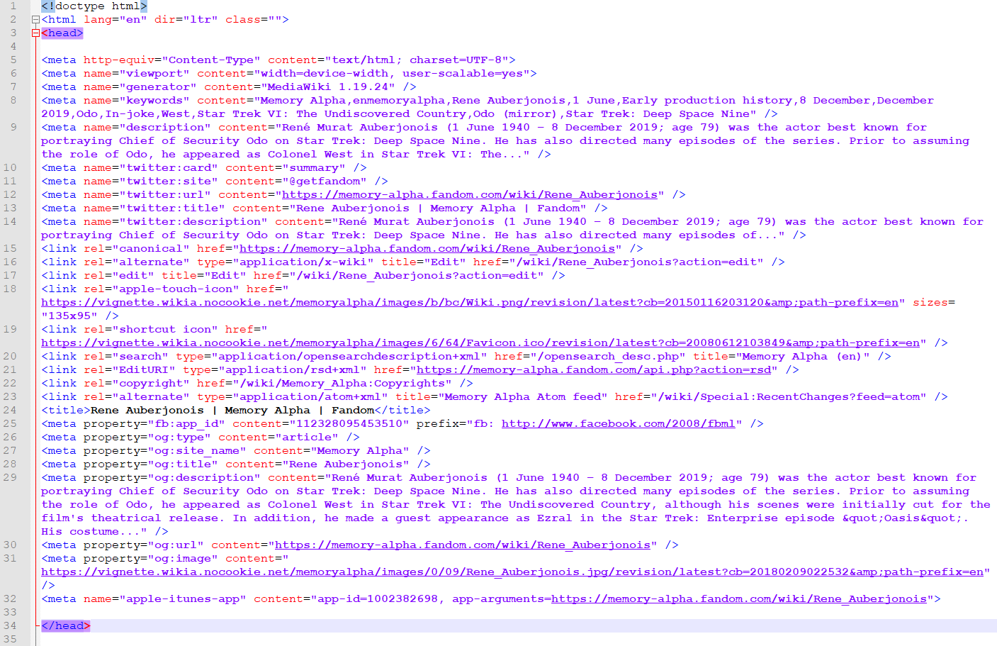
The og:image meta tag is part of the Open Graph protocol that is said to simplify the inclusion of external content on Facebook. This may sound like a good idea because I *can* tell Facebook exactly how data from a web page should be handled. But in reality website owners *have to* tell Facebook how each of their pages should be handled in order to keep up the visibility of the posts and to prevent Facebook from misrepresenting the content. The quasi-obligatory og:image meta tag is just a first step to "educate" webmasters and CMS operators to include all kinds of repetitive or redundant information in their page headers, causing a huge amount of extra work - a special service for big companies that have whole departments for SEO and SMO (social media optimization) and a slap into the face for smaller businesses, not to mention people with custom-made websites.
Everything described above is just for Facebook. Open Graph is not a standard. The discontinued Google+ used Open Graph to, but Twitter has its own proprietary meta tag system, Twitter Cards, that has to be included to each single page in addition to Facebook's Open Graph tags. Twitter has even gone one step further and significantly increases the visibility for tweets once it happily detects Twitter Card tags in the linked resources. It is obvious that a "Card", a link with an image, with a description of the linked page and with other extra information posted, will get a lot more attention than a simple textual tweet with a cryptical(!) link. And this is only possible after a request to be whitelisted for Twitter Cards - a permission that may not be granted to or may be withdrawn from "substandard" sites like EAS is one in the world of social media.
And as if this all were not yet enough extra work, Google (the search engine) too demands a shitload of special meta information (AMP markup that is not compatible with Open Graph either) from a "quality page". In other words, from a page that gets displayed more prominently in search results because of its meta quality and irrespective of its true quality (i.e. the quality or relevancy of its content).
Former Annoyances
Website miniaturization
The screen resolutions and monitor dimensions are steadily growing in the beginning 21st century. The last time I worked on a 640*480 pixel monitor was in 1996. But many websites, and particularly those of some big companies, have a fixed width of 800 or even 640 pixels, and are using the smallest possible font size that is barely readable. What's more, on many news sites that squeeze the text into a narrow column between the navigation bar and the ads, I get only a small portion of an article at a time and I have to press "next" several times to carry on reading. While I can increase the font size for better accessibility (which inevitably ruins the layout especially if the text columns are narrow), there is no real way how I can tell the website to occupy a larger portion of my big screen (which is big for a reason after all). Some sites should list a magnification glass among their viewing requirements.
I think that, rather than paying attention to antiquated monitors, the web designers simply don't know better but to nail down absolute dimensions for everything, especially since everything can be formatted so easily with CSS. I am fond of CSS as a great way to customize everything, but it encourages and sometimes forces web designers to abandon the art of adaptive layouts.
Update The font sizes have grown immensely, and there is an increasing trend to occupy the whole screen instead of a narrow column. This trend was fostered by the need to support mobile devices with their lower resolutions. Since the programmers needed to create a special CSS for the smaller screen sizes, they had to think of new concepts of adapting the page widths, which work just as well in the opposite direction and now allow full-screen layouts. Actually, the current trend for images as well as navigations elements is "the bigger, the better".
Streaming
I understand the desire to avert unwarranted distribution of copyrighted media, or at least to make any duplication as hard as possible. But the need to stream videos instead of downloading them may be a nuisance for the user (and it still doesn't prevent computer buffs from ripping streams). Most importantly, streams are a huge and continually increasing waste of bandwidth. This may be ultimately at the expense of HTML, e-mail or download traffic, all of which I rate as much more valuable than a transitory video.
Streaming effectively excludes everyone with not quite as fast a connection from accessing online media in the first place. It almost seems like video portals are cooperating with providers of DSL or mobile internet, in order to allow them to sell always broader bandwidths. Case in point: UMTS is usually not sufficient for streaming, so it fuels the development of LTE. But even with fast internet, streaming never worked well enough for me, and perhaps never will. Even if it happens "only" once every two minutes, it annoys the hell out of me when the stream and briefly later the playback hangs, making it inferior to analog radio or TV broadcasts that have been working smoothly for almost a century. But the providers of online media, among them TV stations whose conventional broadcasts are doing fine, apparently expect me to put up with such a disrupted "viewing experience" when watching a whole movie or episode as a stream. No thanks. And when I try to load a video stream in the background while doing something useful in the meantime, it happens quite often that the video is gone when I return and I have to load everything again (speaking of wasted bandwidth).
Well, after I had given up on listening to web radio in 2001 although I already had Mbit/s internet access at the university, I finally have a decent quality of audio streams since 2006. But I have no hope for the streams of video portals or TV stations to meet my expectations of adequate online videos any time soon - which would be a quality and reliability at least on par with old-fashioned analog TV.
Update It seems the available hardware and connection bandwidth have finally caught up in the "arms race" with the streaming content in the 2010's. Streaming is still not a perfect technology, but it works much better today. At least, on computers with enough CPU power and memory, and with a stable connection.
Flash Player
I concede that streaming may be an acceptable way to show small (and accordingly fast loading) clips embedded in websites, if only there were a reliable software to play them. But most streams force me to have Flash Player installed. I don't know if I'm the only one, but messages like these keep haunting me for over ten years: "Get Flash Player now" (when I have Flash Player but it was not installed for all browsers for some reason), "Please upgrade to the latest version" (when I already have the latest version) or "You need Flash Player 9 to play this video" (when I have version 10 installed).
When I go to the Adobe website to get Flash Player 10.1, I first have to install the Adobe Download Manager (DLM) and, if I don't notice the little checkbox, McAfee Security Scan too. Great. Yet more parasitic programs sitting on my system. When I proceed with DLM and want to install Flash Player, I have to close Firefox, but nothing happens. After three or four times downloading the whole stuff in vain, I go to a website with a different prompt to install Flash directly through Firefox, and this time I am allowed to get Flash without the crappy DLM, and without even closing Firefox. Adobe once again remains truthful to their unofficial motto: "Why make it simple, when you can have it complicated?"
The whole concept of Flash is flawed from the start, because it is overblown at the expense of usability. Well, Windows Media Player is overblown too, but at least there are lightweight alternatives that don't exist for the Flash Player plug-in. As already mentioned, if there were a lean video player to play streams (like with conventional TV that fundamentally needs no player software at all), the idea of online broadcasts wouldn't be all that bad. But Flash is much more than a simple player, and it does much more than becomes apparent to a normal user, such as circumventing the security and privacy settings of my browser or its plug-ins. Still, it doesn't offer any useful configuration options. And the use of Flash on websites is not restricted to playing videos or presenting truly interactive content (for which it can be beneficial in spite of everything). Many web designers just can't resist creating complete navigation structures with Flash, or they pack text into Flash images, which makes it totally inaccessible. And don't get me started on the dreadful Flash ads! Speaking of reduced usability, it is extremely frustrating how Flash disables the right-button menu and CTRL-LMB to open a new tab, throwing me back into the browser stone age (and forcing me to reload the same browser window all over again when going forth and back, speaking of wasted bandwidth).
But worst of all, nasty Flash applications frequently usurp 100% of my CPU power and make my PC or laptop hang, so the only remedy is to end Firefox by force. This may not be Adobe's fault in the first place, but of all applications that run on my computers, either stand-alone or as browser plug-ins, it is usually Flash that makes the system freeze, so there must be something genuinely wrong about it.
Update I still didn't get to like Flash, but in the last few years of its existence I experienced no major problems with it, except for occasional crashes. Flash Player was discontinued by Adobe in 2020.
Babylonian sites - Parlez-you deutsch?
Ever since I got connected in 1996, I have been accustomed to speaking English whenever I am online, unless I am moving through a purely German realm like with eBay, other online shopping, my bank account etc. However, all sorts of sites force me to speak German even when I don't want to. They are "intelligent", analyze my IP and switch to a customized German version, even and especially when I'm not logged in (because when I'm logged in, I can tell Amazon or Google my language preferences). Vice versa, some sites switch the language to English when I log in with, apparently because I use an English interface for Firefox and although in my online account I select "German" as a language preference. Similarly, I was frequently presented a French version, because my former company's network hub is located in France.
Google is among the sites that insist on me speaking German - when I type "www.google.com" I wind up at "www.google.de". This wouldn't bother me very much, if the search results were not customized as well, with German language results always coming first. But not only the ordering of the results is different. Google has separate databases on their different language-specific sub-sites. Being in such a filter bubble, I may not even find some English-speaking results with the German Google. The only way to switch to the English default version is to click a small link at the bottom of the page, which then takes me to and keeps me at "google.com". Well, I can stay logged in, so Google will respect my language preference, but I don't really want them to know everything that I search for.
It's similar with many blogs and communities. On some blogs I am greeted with "Willkommen" because of my IP. This is fine as long as the German version is correct. But when I visit a blog of some American guy, and it shows the content in English, but the standard links, navigation and even his bio in German, it becomes bizarre. For example, "Education: High School" is translated to "Schulbildung: Gymnasium". But a German Gymnasium is only remotely comparable to a US high school (the better analogy would be "Gesamtschule"), and it must not be confused with a gym! Again, I could try to find the little link that may allow me to change my standard location, but I don't want to do that every time I visit any website, much less would I want to register at any place I visit, just to set my language and location preferences.
IMDb exhibited a peculiar behavior for some time. Depending on my IP, sometimes every bit of text, including the menus, is still in English, but the movie titles are in German. I can't find "Star Trek: First Contact" any longer, it is automatically converted to "Star Trek: Der erste Kontakt" for me! When I visit imdb.com with a different IP, I can still find the English titles.
I am only glad that most sites don't attempt to automatically translate essential content with Google Translate to create total confusion... But this will be only a matter of time. On a funny note, eBay auto-translates some of the item description from foreign eBay sites as a "translation service without warranty". This includes translations of ebay.at items, from Austrian to German language as it seems! :-)
Update The language problems with Google, with eBay and with most blogs have been solved as it seems - although content is still heavily tailored to my location.
Deferred off-site links
I don't know if this annoys other people just as much as me, but I absolutely hate it when I click an off-site link, and instead of being taken directly to the destination I get an intermediate page with a friendly message "You are leaving..." and an advertisement. This habit was a temporary nuisance already around the year 2000, but it has resurfaced vehemently in the early 2010's.
Even some sites with a so far very good reputation such as Memory Alpha show an ad page after an off-site link has been clicked. This clearly has economic reasons and is imposed on the site by the mother company Wikia, rather than by the fans who maintain MA. Anyway, it can only be labeled as bad style. It slows down the performance perhaps even more than a pop-up banner would do. The companies that buy and sell ads on the internet don't ask whether their practices annoy the hell out of the visitors. They just try putting ads in every place where it is technically possible. But it remains to be seen whether the intermediate page acts as a subconscious barrier and makes people stay at MA, or whether it rather damages the site's reputation.
An almost cynical variant of the intermediate page showed up for some time (until about mid-2010) when someone clicked an off-site from Facebook. It read: "Be careful. For the safety and privacy of your Facebook account, remember to never enter your password unless you're on the real Facebook web site. Also be sure to only download software from sites you trust." Oh yes. The internet is so dangerous, you better stay in the cozy realm that is Facebook. Seriously? Facebook is infamous for its own lack of data security, and they warn people when they try to leave the place?!
Another aspect to be taken into account is that because of the intermediate pages the mere existence of off-site links is concealed, and that they may become invisible to search engines. It depends on how it is done exactly, but a page whose outbound links are "protected" with intermediate pages may not contribute their due share of Google PageRank to the link target, while the page still gains PageRank from any incoming links. If this is true, the consequence is that pages of MA and (formerly) Facebook climb up the list at Google at the expense of the linked pages. I can't verify if this is really the case though.
Update The intermediate pages have largely vanished - which is no surprise because they were annoying like hell and I definitely wasn't the only one to complain.
Scraper sites
I frankly concede that the performance of Google (and of other search engines likewise) has improved a lot in the past few years despite the ever rising data volume to be handled by their servers. It has always become harder to cheat and to get fraudulent content listed. However, there are still too many fake sites that slip the net and that receive average to good ranking from Google. The typical fake is an automatically generated so-called scraper site with a short and distinct static URL (insinuating rich content) and a common Google search term as its title. But looking closer, the "content" consists of nothing but a list of old search results, random news and ads that are keyword-driven and that may or may not be remotely related to the page title. Something like this is utterly useless and frustrating each time a user is looking for real information. I stumbled across pages where I could "Learn everything about Ex-Astris-Scientia.org" or even "Find the Lowest Prices for Ex-Astris-Scientia.org", as if my site were for sale!
Google usually deletes auto-generated pages from the index when they are discovered or reported. Many of them are parts of link farms that were set up to rank another page higher and are therefore banned from Google. I appreciate that. On the other hand, until 2012 Google even offered to build such sites with their AdSense for Domains program! In other words, Google helped to cheat unsuspecting visitors and helped to undermine its own index. I appreciate that they finally reconsidered their involvement in this immoral business. It is a pathetic pretext that "parked domains" will eventually be filled with content. If a parked domain is really meant to serve a certain company, the least they must do is announce the upcoming launch of the website instead of filling it with pointless ads that will deter visitors forever. For the same reason, a half-way respectable company would never register a domain that has been contaminated with a spam portal in its recent history and may even be much more expensive than a fresh one. Ad-polluted parked domains (many of which have been taken away from defaulting webmasters and its reputation ruined to embarrass them) are dead domains, and it is good that Google doesn't actively support this business any longer.
Another annoyance are ripped sites, especially those duplicating Wikipedia. While it may be a good idea to have more than one universal encyclopedia just to read a second opinion or to see a different approach, there are many wiki-based encyclopedias that exactly copy a portion of Wikipedia and are never updated. I can understand well if something like news is exchanged among different sites, but encyclopedic content should be off limits. I am not sure about the legal ramifications (Wikipedia may allow to copy their articles). In any case it is a total waste.
Update It is my impression that the number of scraper sites has decreased in the late 2010's, or that Google has taken better measures to exclude them from the search index. In any case, it is not really an annoyance any more.
Google Web Light
In 2017, Google started to enforce Google Web Light on search results, a service that is said to reduce the data volume on slow (mobile) internet connections, by passing pages through Google's servers in order to cut down their volume. I have multiple issues with this practice. Firstly, I don't want anyone to parse, filter, rebuild and serve my site. It is my creation, and no one but I myself is to decide how it is supposed to look. Secondly, I checked the look of my site once it is served by Google Web Light. It looks like a pile of shit, the layout is totally scrambled and for someone who does not understand that it's Google's fault it looks like I'm a complete idiot who doesn't know basic website coding. Thirdly, for someone who reassembles and serves my site it is easy to sneak in unwanted scripts such as for user tracking, or even ads. For all these reasons I don't want Google Web Light to touch my site. But the only way to avoid it would be to opt out using "Cache-Control: no-transform" in the page header, in which case my site would be punished for not allowing Google Web Light (or, as Google would put it, for "not being optimized for slow connections").
Update Google Web Light was silently discontinued in 2020, and nobody will miss it.
CAPTCHAs
I hate them. CAPTCHAs first showed up around 2007 and it took them just one or two years to become one of the worst online plagues. I want to comment on a blog or write into a guestbook, I want to log in somewhere or download something. I'm in a good temper, but suddenly a page comes up with a cryptical image of disfigured numbers and letters. I look at it for a few seconds and try to figure out what it shows. But as careful as I am, I fail to pass about every second CAPTCHA that I encounter. Am I just too stupid? No, that honor belongs to the people who conceived the CAPTCHAs. They rarely work the way they should for one or more of the following reasons: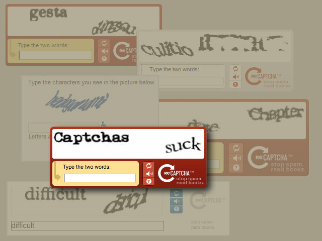
- Characters are not recognizable at all because the image lacks the necessary contrast or because the font is awful.
- Numbers and letters look alike, such as "g" and "9".
- CAPTCHAs may be case-sensitive, but many capital and small letters look alike, such as "C" and "c".
- The orientation of the letters is not clear, so "z" may look like "N".
- With letters and numbers all over the place their correct order is not clear.
- Sometimes I have to solve an additional puzzle by only typing a certain selection of the barely visible characters.
- In some cases I suspect the displayed image does not even belong to the expected input.
- Occasionally the image does not load at all.
As a website owner I know too well how nasty spambots can be. But "enhancing" the CAPTCHAs by making them always more enigmatic riddles doesn't help. It only annoys the hell out of the human visitors. The much better option is to ask a simple question that a human being can easily answer. Since I switched to such a procedure, asking a simple question that every casual Trek fan can easily answer, there have never been any automated spam entries in my guestbook.
While the overall frequency of CAPTCHAs seems to have decreased again, some companies use them as an additional obstacle for frequent users to log in. Whenever I go to DHL to track a parcel, I have to solve multiple(!) complex visual CAPTCHAs ("Click on all pictures showing a tree, bus, bicycle, crosswalk..."). I don't know why DHL thinks this is a good idea but but it is a disservice to paying customers, especially considering that it is crucial for something like parcel tracking to be accessible quickly, and on any device. But speaking of devices, I can achieve the same using the DHL app. Perhaps it is just a way for them to tell me to stay away from their shitty website login and use the app?
Update Textual CAPTCHAs have largely vanished until 2020. But solving puzzles of the type "Click on all boats/stairs/hills" isn't really less annoying.
See Also
EAS on the Downturn - my thoughts on why EAS has lost half of its visitors and how to preserve what's left
Where Have All the Trek Sites Gone? - essay about the shrinking number of Trek websites

Back to Technical Support index


