


Variations of the Alliance Emblem
by Jörg Hillebrand, Bernd Schneider and Brad Wilder
Appearances of the EmblemConclusion
There are five DS9 Mirror Universe episodes, all which feature the Alliance of Cardassians and Klingons in some fashion: "Crossover", "Through the Looking Glass", "Shattered Mirror", "Resurrection" and "The Emperor's New Clothes". We can see several variations of the emblem of the Alliance in these episodes. They all have in common the placement of the Cardassian emblem above the Klingon emblem. The colors and the level of detail, on the other hand, are not consistent. Only one variant, the silver/black badge, appears in all five episodes.
Appearances of the Emblem
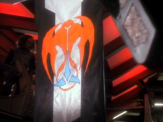
Banner
 The banner of the alliance only appears in "Crossover" on the promenade. If we look closely, we can see two of these banners hanging on the promenade. The banner that is shown in a close-up is mirrored, which can be recognized by the orientation of the Klingon logo. The banner that is visible a little further in the background is the right way round. On the banner, the Cardassian portion appears in orange, while the Klingon logo is light blue. This all is placed on a background of a central vertical white stripe and two black stripes on the sides. In this version, the Cardassian logo has no further subdivisions.
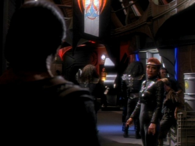
Promenade sign
This variant of the emblem also appears in "Crossover" only. The Cardassian logo is red and not further subdivided, the Klingon part is gray. Both appear on an oval black background.
Badge
![]() This version of the Alliance emblem can be seen in all five episodes. It is completely black on a silver, oval background. The black part is slightly recessed in the metal badge. The Cardassian logo is not further subdivided.
This version of the Alliance emblem can be seen in all five episodes. It is completely black on a silver, oval background. The black part is slightly recessed in the metal badge. The Cardassian logo is not further subdivided.
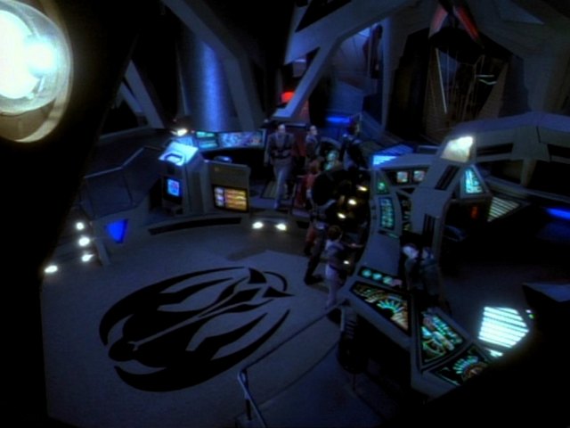
Ops floor
We can see this logo on the floor of the Ops on Terok Nor in black on gray. It can be made out clearly in "Crossover". In "Shattered Mirror", only a small portion is visible in one shot. Here, the logo doesn't look black but rather gray.
Ops door
On the inside of the Ops door to the commander's office we can see a golden version of the logo that splits in half when the door to the office opens. This variation can be seen first in "Crossover" and then also in "Through the Looking Glass" and "Shattered Mirror".
Animated logo
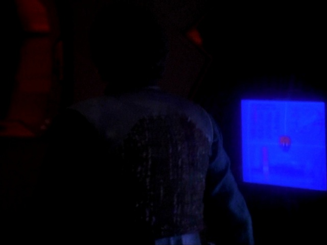
An animated variant can be seen on screens in the commander's office, the Ops, the promenade and Quark's Bar. Here, the Cardassian logo is dark red, its "eyes" are black and the Klingon part is dark blue. Depending on which screen the logo is on, the red of the Cardassian logo appears differently dark. The Cardassian logo is not further subdivided. Four dark circles always move towards the center of the logo and then away from the logo. This animated variation can be seen in "Crossover", "Through the Looking Glass" and "Shattered Mirror" (only in Nog's Bar).
Label
In "Crossover" and "Through the Looking Glass", the emblem appears as a sticker on mining equipment and next to doors. The red Cardassian logo and the blue Klingon one are on a black, oval background. The emblem thus resembles the promenade sign. In "Through the Looking Glass" it also has a white border.
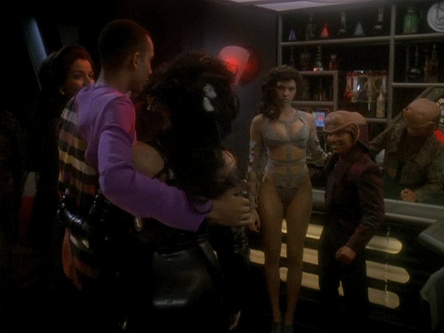
Quark's Bar
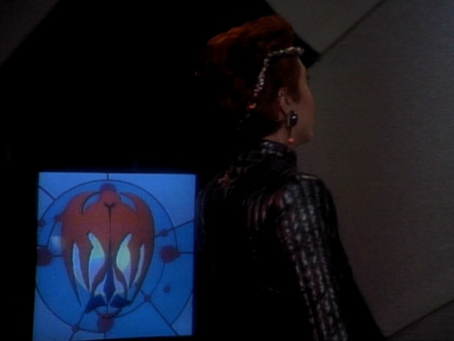
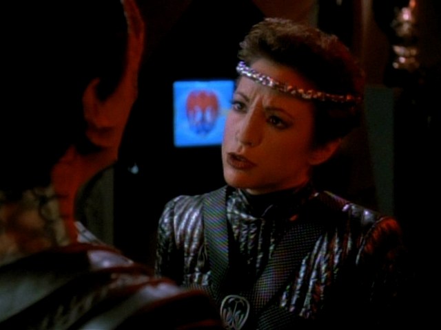
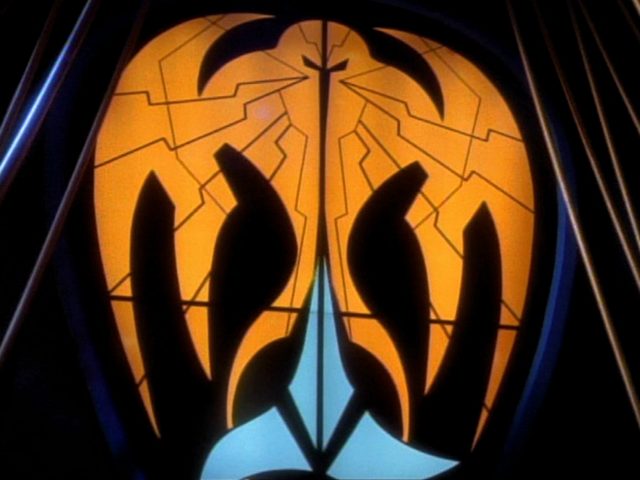
The biggest and so far most complex version of the emblem can be seen in Quark's bar in "Crossover". The logo is located in this place instead of the large Quark's Bar logo of the Prime Universe behind the Dabo wheel.
The Cardassian portion is orange while the Klingon portion is light blue. Both the Cardassian and the Klingon logos are split in two in the middle. The Cardassian logo also has numerous thin black lines that further subdivide it. A couple of the lines run towards the "eyes" of the logo. This all is placed on a black background and is surrounded by a dark blue light ring.
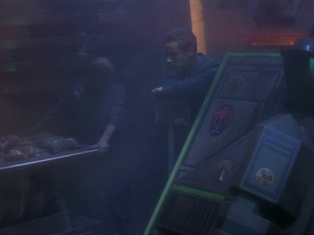
Cargo label
In "Through the Looking Glass", we can barely make out the logo in black on a white background on several freight containers. Details are not really recognizable, but we can see that it has been supplemented by some structures in the lower area.
Small animated logo
In "Shattered Mirror", a very small variant of the animated logo from the previous two episodes appears. In Nog's Bar, however, the familiar, larger animated version of the logo can be seen.
Nog's Bar
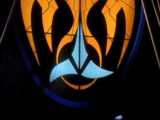
Quark's / Rom's / Nog's bar does not appear in "Through the Looking Glass". In "Shattered Mirror", we can see it again, as Nog's Bar. It was probably attempted to recreate the original large emblem from "Crossover" as faithfully as possible. Most likely the old large translight was no longer available. The variation in Nog's Bar comes with small differences to the one from "Crossover". The logo in Nog's bar looks unlit. The Cardassian logo is red (not orange, as in "Crossover"), the Klingon logo is light blue, but darker than it was in Quark's bar. The whole emblem is not divided into two parts, the general shape is different and the thin black lines inside the Cardassian logo run differently.
Brig
In the detention cell, there is a black version of the logo on the wall in "Shattered Mirror" (not in "The Emperor's New Cloak"), similar to the one on the floor of the Ops in earlier episodes. The size of the logo corresponds to the one on the Ops door.
Display graphic
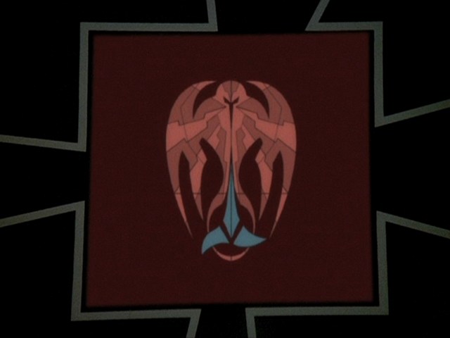
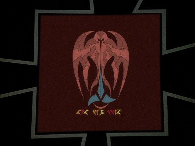
 In "The Emperor's New Cloak", we can see one last new variation on a screen. At the beginning of the communication, only the logo is visible, at the end of the transmission a few Klingon letters are also displayed.
This version is based on the large one of Quark's Bar in "Crossover". The thin lines in the Cardassian logo correspond more closely to the lines on the variation in Quark's Bar than to the later one in Nog's Bar. The entire emblem is again divided in two halves, but the central vertical line is as thin as the other lines in the Cardassian portion. The Klingon part is light blue, while the individual areas of the subdivided Cardassian logo are colored in two shades of red. The whole emblem appears on a dark red background. It overall looks a bit slimmer and more elongated in this variant than known from the previous ones.
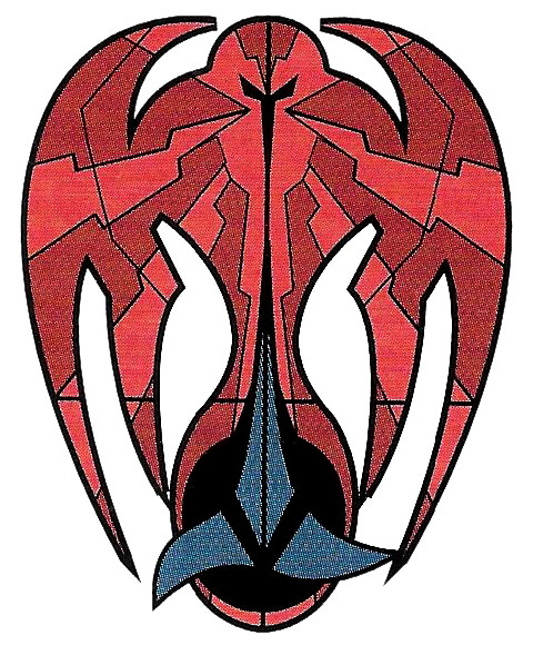
The multicolored version used here could be seen for the first time in the second edition of the Star Trek Encyclopedia, well before "The Emperor's New Cloak" aired. Presumably the logo was drawn for this book and that drawing was then reused for the display in the episode. The course of the thin lines fits exactly, the two red tones also appear here. Only the Klingon logo is highlighted with a black circle. This version also appears unchanged in the third and fourth editions of the Encyclopedia.
Conclusion
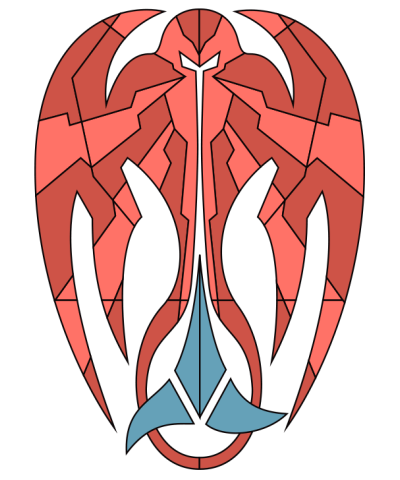
The emblem of the Klingon-Cardassian Alliance can be seen as a monochrome logo or badge (black on white or gray), as well as in different colored variants. The Cardassian portion is usually orange or red, while the Klingon logo is light blue (unless it appears on a blue background). In some, usually larger versions of the emblem, the Cardassian logo is further subdivided by lines. Finally, the last variation that appeared on a screen in "The Emperor's New Cloak" is more elongated than probably all earlier Alliance emblems.
The following comparison picture shows all existing variations at a glance.
See Also
The Evolution of the Klingon Emblem - exhaustive survey of all variants
The Evolution of the Cardassian Emblem - exhaustive survey of all variants


