


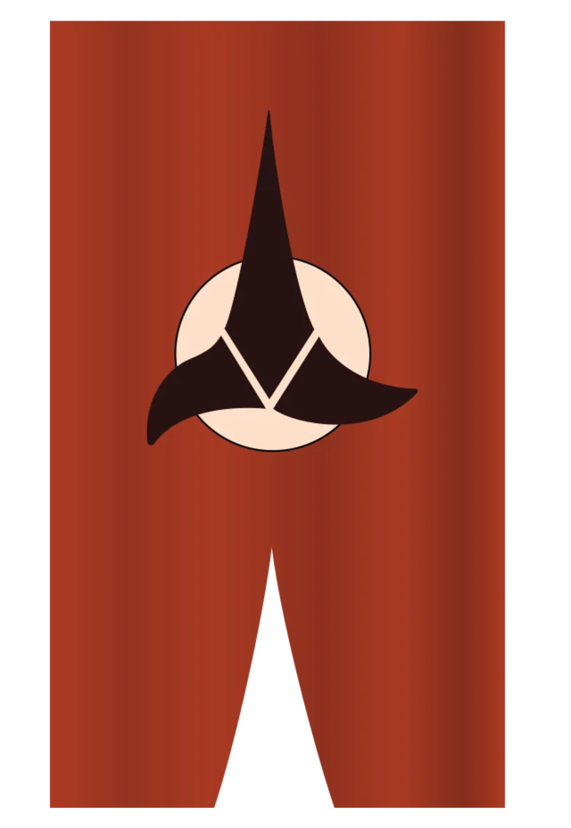
The Evolution of the Klingon Emblem
by Bernd Schneider, Jörg Hillebrand and Brad Wilder
Obscure TOS EmblemColorful EmblemsMonochrome EmblemsConclusion
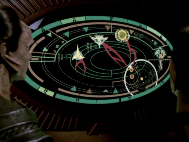
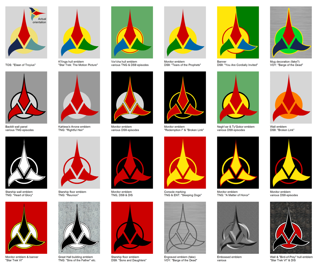
Klingons could be seen in more than 450 Star Trek episodes or movies. Even if we discount the appearances of the series regulars Worf and B'Elanna Torres, there are still well over 100 episodes with other Klingons. In most of these episodes we can see members of the race who act on behalf of their empire, and so its emblem is visible in some fashion. Klingon emblems appeared in several more episodes, even without direct Klingon participation. The now familiar trefoil emblem, however, wasn't the first Klingon symbol to appear in TOS. And the trefoil emblem itself, as simple as it is, comes in dozens of different color combinations.
With the exception of a few tiny logos that are hardly recognizable, this article summarizes all variations of the Klingon emblem that ever appeared in canon Star Trek. Strictly speaking, it doesn't outline an evolution of the Klingon emblem, as that would be practically impossible because of the random color changes. Due to its already mentioned simplicity it was very easy to create a new variation whenever one was deemed useful, with common resources such as plywood, cardboard, adhesive tape or felt. Still, some of the variants are far more common than others, and some that are popular in fandom are surprisingly uncommon.
Obscure TOS Emblem
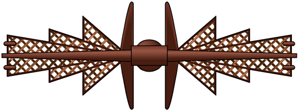 The first time that Klingons appear in Star Trek is in TOS: "Errand of Mercy", as occupying force on Organia. There is no sign of the famous Klingon trefoil yet. But when Kor is holding the proclamation imposing an assembly ban on the Organians (conveniently written in English!), we can make out something like a logo on the top of the sheet. At least it would have to be something official and not just an ornament if the proclamation were human-made. The idea that the logo is indeed meant to be the emblem of the Klingon Empire (or that of the Klingon Defense Force) at the time is corroborated by an apparently wooden wall relief that serves as a torch holder in Kor's office. It has the same pattern as the logo on the sheet. Hence, it is evident that the wall ornament must be of Klingon origin and was not simply taken over from the Organians. And since the two symbols are the same, they should have a certain significance beyond being mere decoration.
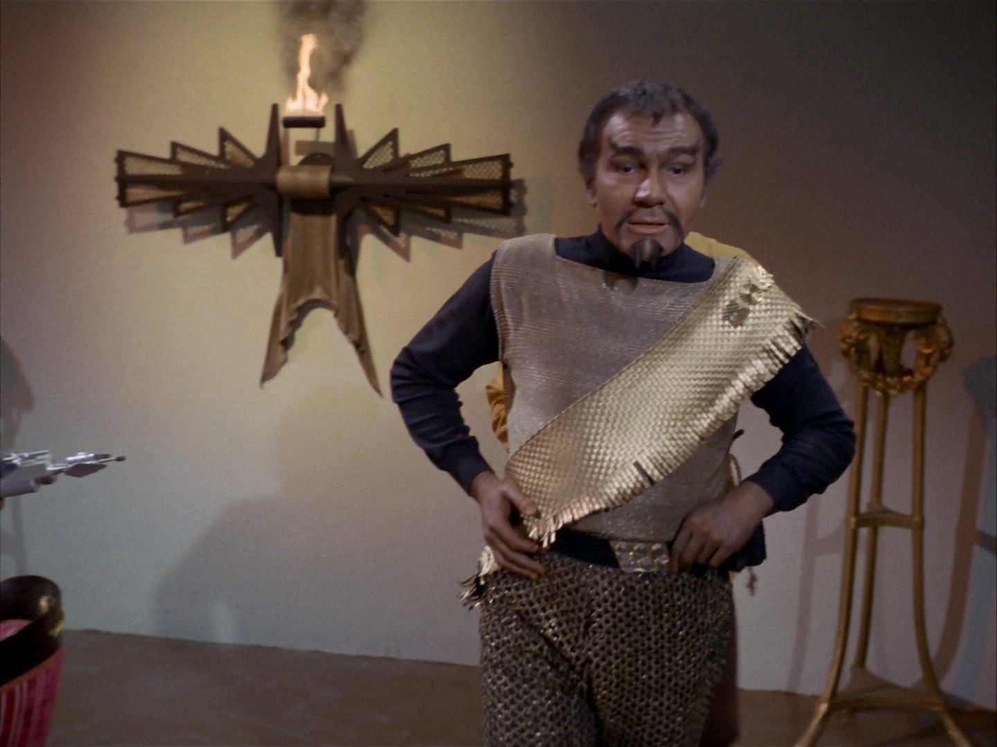
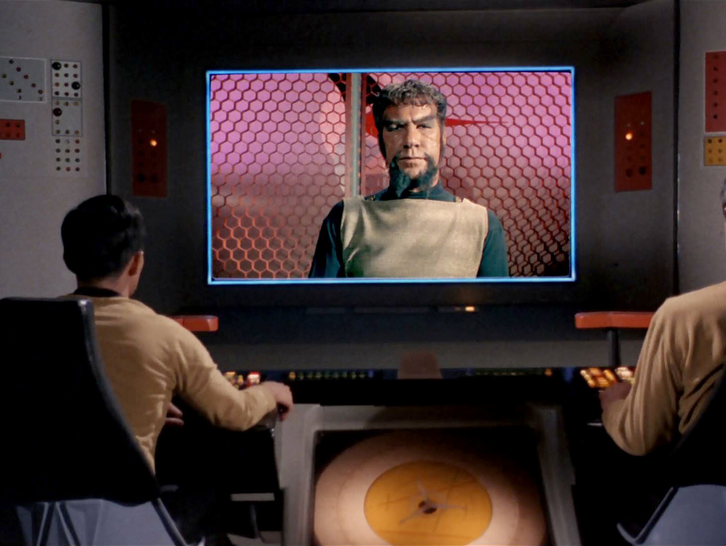
A similar symbol can also be found as a badge on Kor's sash. Kang wears the same sash in "Day of the Dove", and finally it is part of Worf's uniform throughout the first season of TNG. The only difference to the TOS Klingons is that Worf wears his sash on his right shoulder.

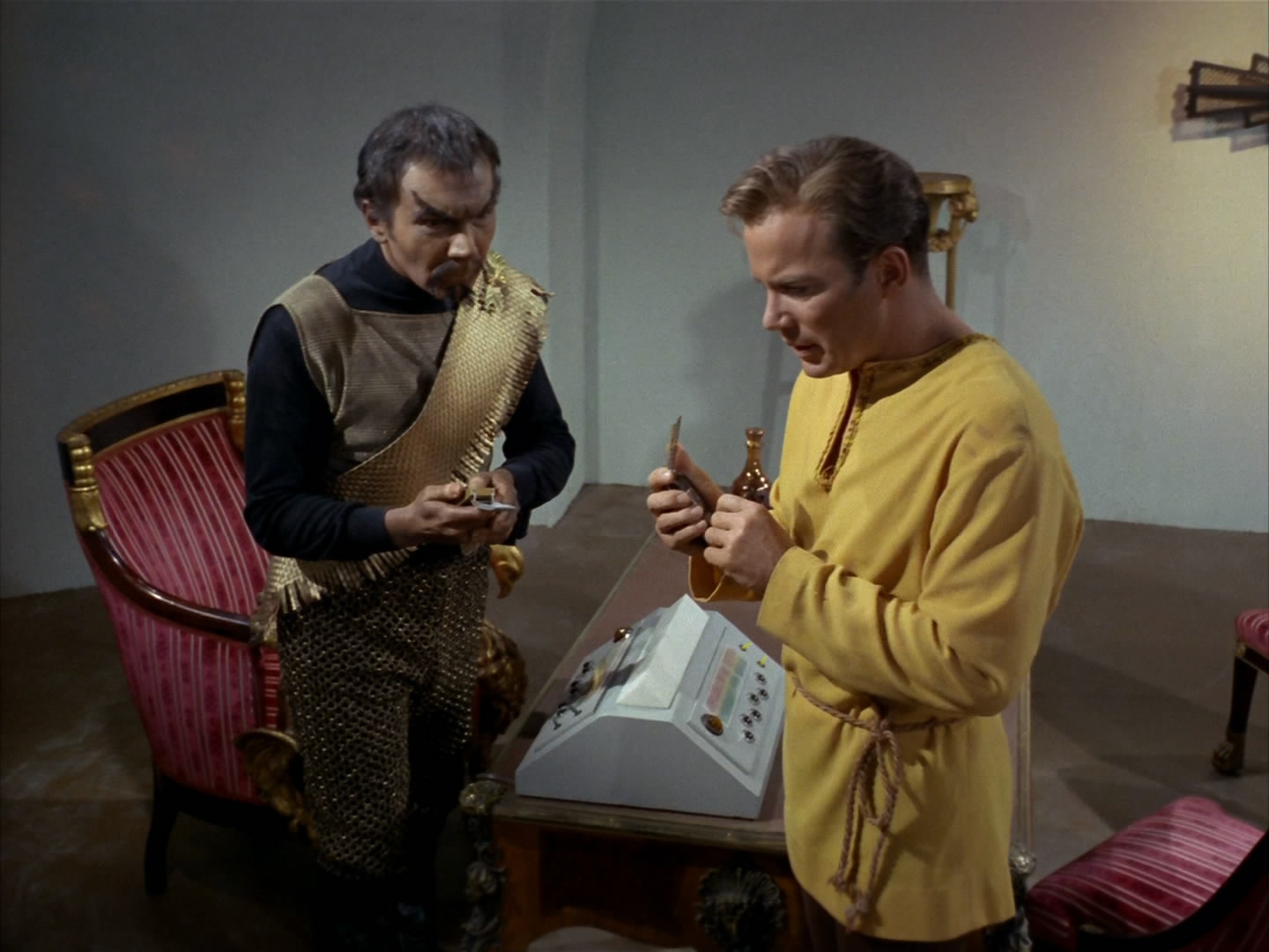
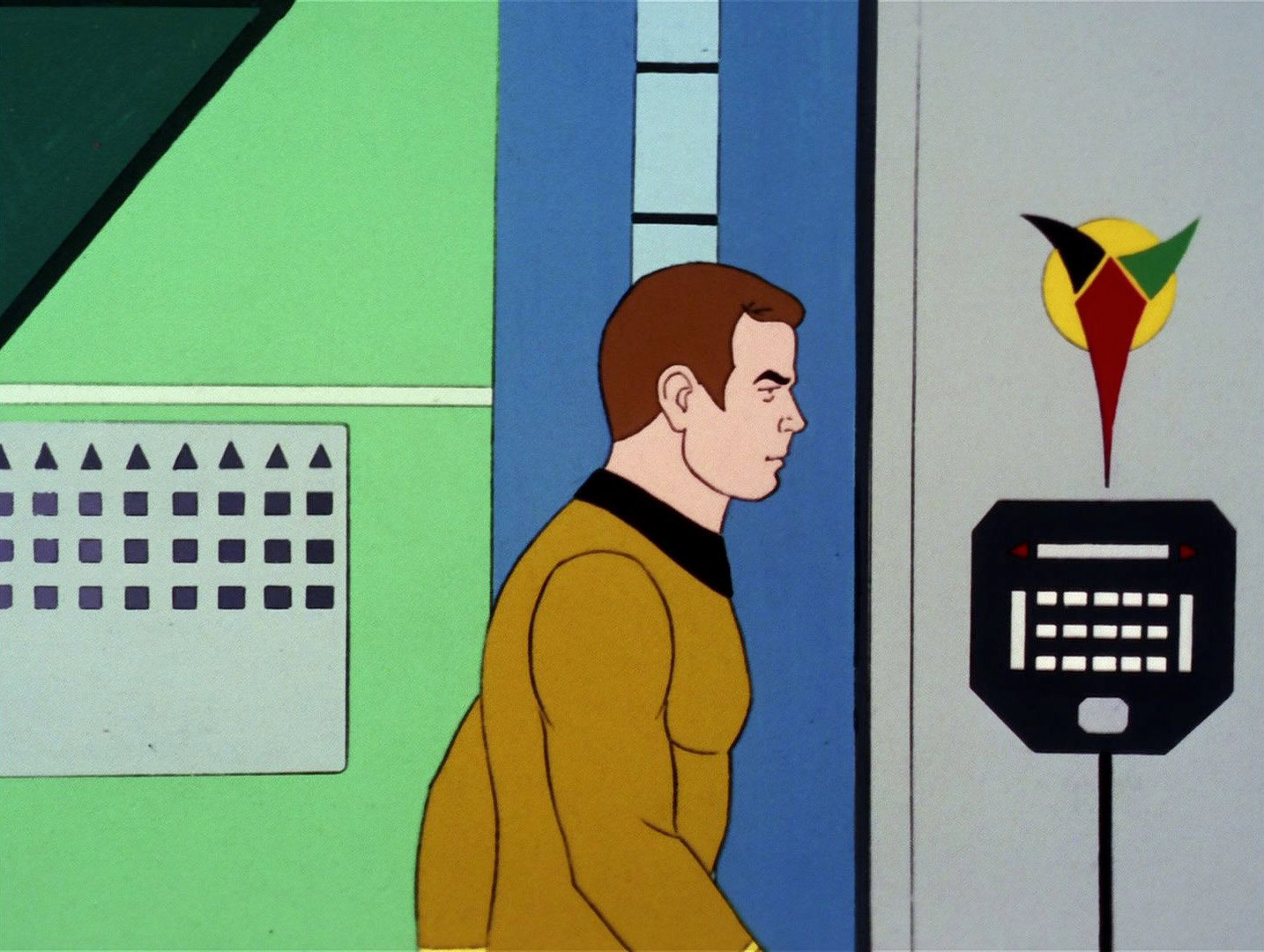
The familiar Klingon emblem appears for the first time in "Elaan of Troyius". However, we can still see the old one from "Errand or Mercy" on one occasion in the episode. Kirk is holding up a Klingon silver-golden communicator whose lid is adorned by the emblem. Actually, Kor was using such a communicator already in "Errand of Mercy", we just couldn't recognize the emblem that was probably already there.
 More than 57 years after its original appearance TOS: "Errand of Mercy", the old emblem can be seen as a symbol or decoration above the door to the Klingon Oversight Council Chambers in LOW: "A Farewell to Farms".
Colorful Emblems
Original pale emblem
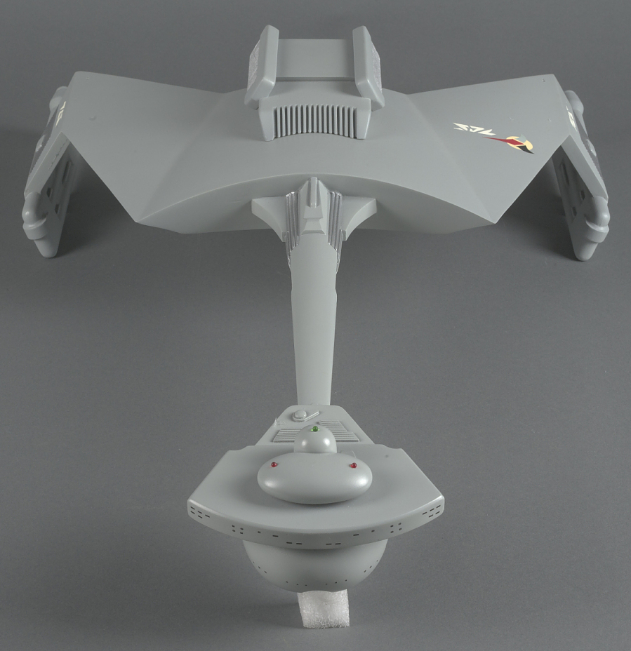
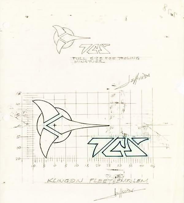
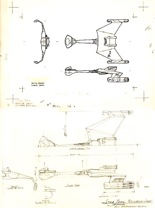
![]() The commonly known trefoil-like emblem can be seen in TOS: "Elaan of Troyius" behind the Klingon commander. It also adorns the hull of the D7-class battlecruiser that makes its first appearance in the episode as well, although this detail is not really recognizable in the not yet remastered version of the episode. It is noteworthy that in both cases the emblem in "Elaan of Troyius" is horizontally oriented (meaning that the one on the hull points inward instead of forward) because Matt Jefferies sketched it up this way and definitely meant it to be shown like this. All later variations (including the ones from the prequel Star Trek Enterprise) are upright though.
The commonly known trefoil-like emblem can be seen in TOS: "Elaan of Troyius" behind the Klingon commander. It also adorns the hull of the D7-class battlecruiser that makes its first appearance in the episode as well, although this detail is not really recognizable in the not yet remastered version of the episode. It is noteworthy that in both cases the emblem in "Elaan of Troyius" is horizontally oriented (meaning that the one on the hull points inward instead of forward) because Matt Jefferies sketched it up this way and definitely meant it to be shown like this. All later variations (including the ones from the prequel Star Trek Enterprise) are upright though.
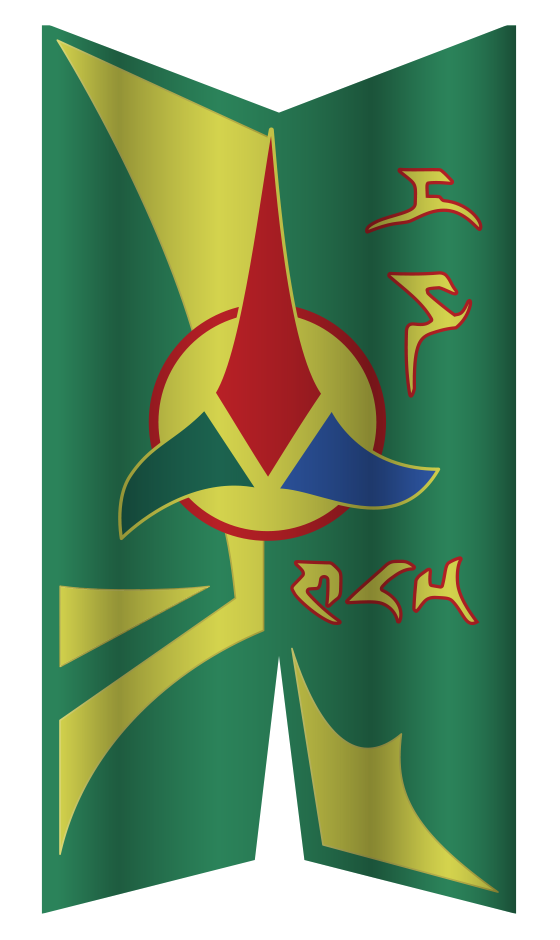
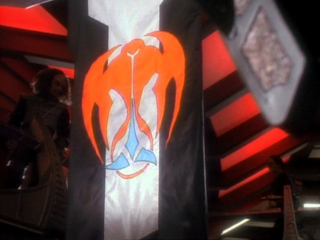
Regarding the colors of the emblem, the reconstructions usually show a red/blue/green trefoil on yellow ground. In "Elaan of Troyius", and still in the remastered version, however, it looks more like red, dark teal and pale teal on pale yellow. The same colors can be seen on photos of the D7 model. We may come to the conclusion that these pale colors are the authentic ones at the time of TOS.
Original red/blue/green/yellow emblem
![]() As already mentioned, the familiar colorful emblem was quite pale when it first appeared in TOS: "Elaan of Troyius". It will be in vivid colors in all of its later incarnations in TAS, TMP, DS9 and even Enterprise.
As already mentioned, the familiar colorful emblem was quite pale when it first appeared in TOS: "Elaan of Troyius". It will be in vivid colors in all of its later incarnations in TAS, TMP, DS9 and even Enterprise.
In TAS: "More Tribbles, More Troubles", the colorful Klingon emblem as we know it today can be seen, now with definite green and yellow instead of the previously pale colors. At this time, the colors may still be ascribed to the medium. TAS, like other animated series of the time, uses a very vivid palette (that famously includes pink) that would correspond to less saturated colors in TOS. For the first time, the red tip of the symbol can be seen pointing up. In TAS: "The Time Trap", on the other hand, it appears with a still different orientation: upside down! (More precisely, green and blue are also switched.) We may surmise that this was a one-time mishap, as we can see the correct emblem in the same episode as well.
The K't'inga-class cruisers in "Star Trek: The Motion Picture" have the colorful version of the logo, but now pointing forward (which corresponds to "upward" when shown on a wall). Also, the colors are much more vivid than they used to be on the D7. Both changes may have been influenced by the look of the emblem in The Animated Series that had been produced a few years earlier.
![]() Inside the Bird-of-Prey in "Star Trek: The Search for Spock" we can still see a colorful emblem, with a similar arrangement of the colors (red and dark blue on a green circle), but in a distorted and blunt variation. Actually, this variation showed up as soon as in the Star Trek: The Motion Picture Peel-Off Graphics Book, released in 1979, here with an all-red trefoil. This is much like the first monochrome version. It is possible that the emblem was created already for "Star Trek: The Motion Picture" and was just not visible in the movie on the Klingon bridge, or it is an inaccurate depiction that was erroneously taken as the basis for the one on Kruge's bridge.
Inside the Bird-of-Prey in "Star Trek: The Search for Spock" we can still see a colorful emblem, with a similar arrangement of the colors (red and dark blue on a green circle), but in a distorted and blunt variation. Actually, this variation showed up as soon as in the Star Trek: The Motion Picture Peel-Off Graphics Book, released in 1979, here with an all-red trefoil. This is much like the first monochrome version. It is possible that the emblem was created already for "Star Trek: The Motion Picture" and was just not visible in the movie on the Klingon bridge, or it is an inaccurate depiction that was erroneously taken as the basis for the one on Kruge's bridge.
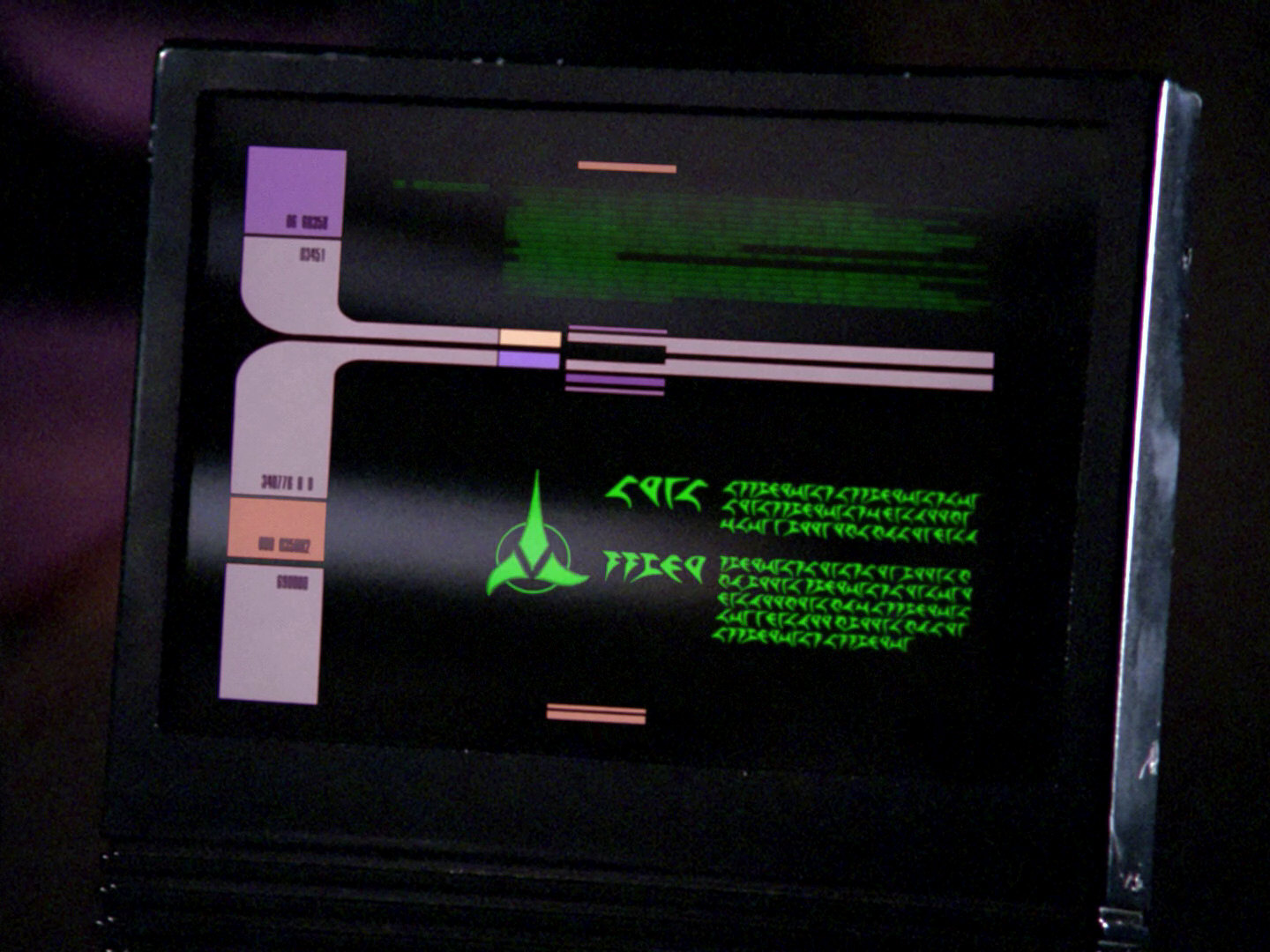
We can see the colorful emblem in the 24th century as well, although it has mostly been replaced by the various monochrome versions by then. It is painted on the hull of the Vor'cha attack cruiser (first seen in TNG: "Reunion") and also appears on the Voodieh class (TNG: "All Good Things"). The colors are clearly red, blue, green and yellow. When the model was slightly rebuilt again to the Negh'Var, the colors were changed in a way that the trefoil was all-red, but still on a solid yellow circle. Colorful emblems also show up on displays in DS9: "Apocalypse Rising" and in "The Emperor's New Cloak".
![]() The colorful emblem even appears on Star Trek Enterprise. We can see it in ENT: "Judgment", on the desk as well as on the chair of the judge, so it predated TOS. Note the peeling paint on the apparently ancient desk!
The colorful emblem even appears on Star Trek Enterprise. We can see it in ENT: "Judgment", on the desk as well as on the chair of the judge, so it predated TOS. Note the peeling paint on the apparently ancient desk!
Colorful emblem with blue and green switched

 Furthermore, the colorful emblem appears on a banner in DS9: "You Are Cordially Invited" and on a display in "Tears of the Prophets". But on these two occasions, the colors blue and green are switched. The left spike that points down (on all other emblems ever seen) is green instead of blue, the right one is blue now. We can tell for sure that we see the reverse of the banner (so the left, downward spike is on the right) because the Klingon writing is the wrong way round. The color choice is most likely an error of the Art Department but is not negligible because we can see it twice (three times if we count in the upside-down version from TAS: "The Time Trap").
This rare variation also shows up in ENT: "The Augments"
Red/blue/blue/green emblem
![]() We can see an old-style emblem during the "Klingon celebration" as decoration of the mugs in VOY: "Barge of the Dead", albeit just in B'Elanna's imagination. At the first glance, the color combination looks like the familiar red, blue and green on yellow. But actually the colors are one red and two dark blue spikes on a green circle. Also, the emblem is not properly aligned (the circle is placed too low relative to the trefoil). Perhaps these errors were deliberate cues at the time because B'Elanna only dreams of Klingon traditions that she doesn't know much about? Yet, we can see the same mugs again, this time for real in "Prophecy". Curiously and most likely intentionally, the colors are the same as on Kruge's bridge in "Star Trek III". Since this variation, as odd as it is, appeared twice, it may be justified to accept it as authentic.
We can see an old-style emblem during the "Klingon celebration" as decoration of the mugs in VOY: "Barge of the Dead", albeit just in B'Elanna's imagination. At the first glance, the color combination looks like the familiar red, blue and green on yellow. But actually the colors are one red and two dark blue spikes on a green circle. Also, the emblem is not properly aligned (the circle is placed too low relative to the trefoil). Perhaps these errors were deliberate cues at the time because B'Elanna only dreams of Klingon traditions that she doesn't know much about? Yet, we can see the same mugs again, this time for real in "Prophecy". Curiously and most likely intentionally, the colors are the same as on Kruge's bridge in "Star Trek III". Since this variation, as odd as it is, appeared twice, it may be justified to accept it as authentic.
Michael Okuda tells us about the colorful variations in modern Star Trek, and specifically about the one on the mug:
"I tended toward single-color uses of the emblem for reasons of production practicality, but sometimes went back to the colors used in the AMT kit, or the big yellow triangle seen in ST3."

Monochrome Emblems
Red decorative emblems on gray or with yellow ring
![]()
![]()
![]() For the appearance of the ship now known as "H.M.S. Bounty" in "Star Trek: The Voyage Home" the complete bridge was rebuilt, and the former colorful emblem was replaced with a monochrome version. The new artwork was created by Michael Okuda, who tells us:
For the appearance of the ship now known as "H.M.S. Bounty" in "Star Trek: The Voyage Home" the complete bridge was rebuilt, and the former colorful emblem was replaced with a monochrome version. The new artwork was created by Michael Okuda, who tells us:
"Yes, I did all the control panel graphics and the signage in the Klingon ship in ST4. I did not design the physical control panels or the video displays in that set, but did all the static backlits and the signage."
I did make an effort to maintain consistent use of the Klingon emblem art from Star Trek: The Motion Picture, as this seemed to be the highest quality art that I could find at Paramount when I started on Star Trek. That version appears to have been drawn specifically for use on the wings of the Klingon battle cruisers in that film. I tended toward single-color uses of the emblem for reasons of production practicality, but sometimes went back to the colors used in the AMT kit, or the big yellow triangle seen in ST3.
I did do some early variations on the ST:TMP art, mainly simplifying the outlines around the background circle. Again, this was largely for production practicality, but also for visual clarity."
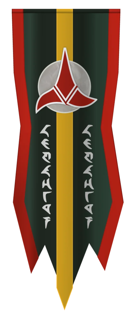
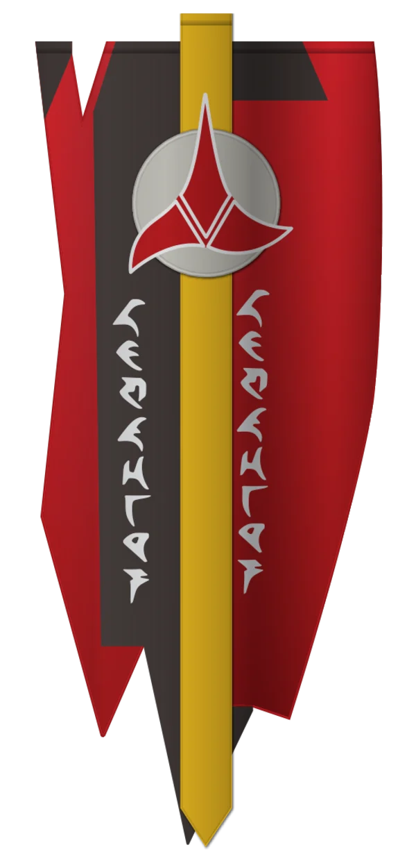 Starting with "Star Trek: The Voyage Home", monochrome trefoils will appear on countless occasions in Star Trek movies, TNG, DS9, Voyager and Enterprise, with dozens of permutations of red, black, white and sometimes yellow. Either the colors of the emblem have no significance in Klingon culture (quite unlike on European coats of arms), or the exact meaning of the different colors never becomes obvious.
Some colors are more common than others, especially on the central symbol, the trefoil. This element is customarily red whenever it appears as a floor or wall decoration, on flags or as an official seal on a viewscreen, usually on a solid white or gray circle that sometimes has a black outline. In DS9: "Inter Arma Enim Silent Leges" and "When It Rains", we can see symbols with a yellow outline of the trefoil. The same variation appears on (Cardassian) monitors of the Dominion-Cardassian Alliance. On the viewscreen logos in TNG: "Redemption I" and in DS9: "Broken Link", as well as on the wall emblem in ENT: "Judgment", the circle is not solid, but appears as a yellow ring.
A classic red-on-white variation also appears on a box on the holographic Klingon Bird-of-Prey in PRO: "Kobayashi". The trefoil is not quite correctly centered on the white circle. The transcription of the faux Klingon letters is "ration" (actually "ratIon")!
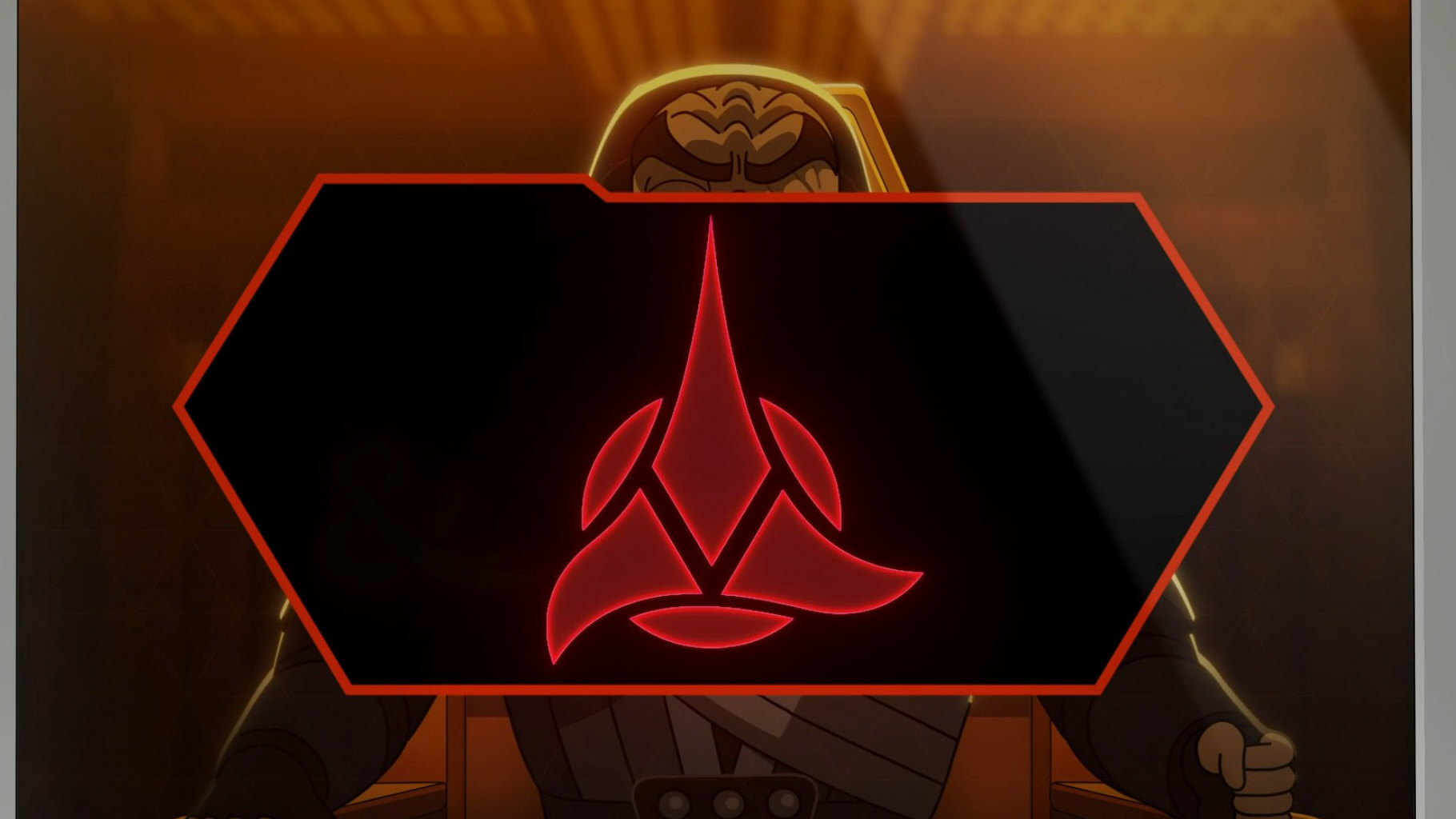
Red emblems can be seen in several different places in LOW: "A Farewell to Farms" (besides occasional black ones). The big red wall emblem in the Klingon Oversight Council is much like the one that appeared in the courtroom in ENT: "Judgment".
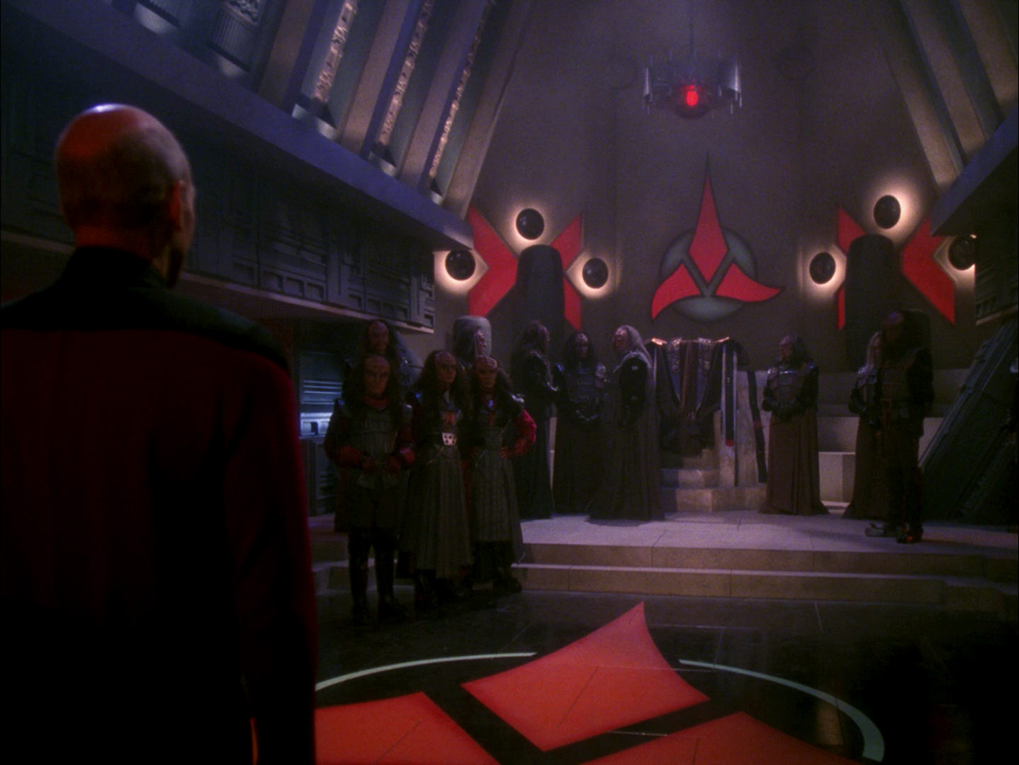
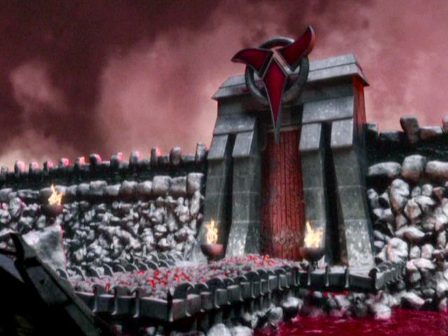
TNG-style red illuminated emblem
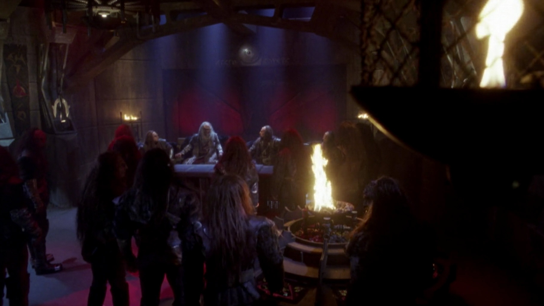
![]() At the time of TNG, the most prominent variation of the Klingon emblem is a big red backlit panel, which appears in several episodes, most notably on Qo'noS in "Sins of the Father" and "Redemption I+II". A similar lighted wall emblem was created for DS9: "The House of Quark" but with somewhat different proportions of the trefoil and with a red backlit ring instead of a black outline.
At the time of TNG, the most prominent variation of the Klingon emblem is a big red backlit panel, which appears in several episodes, most notably on Qo'noS in "Sins of the Father" and "Redemption I+II". A similar lighted wall emblem was created for DS9: "The House of Quark" but with somewhat different proportions of the trefoil and with a red backlit ring instead of a black outline.
Red/solid yellow emblems
![]()
 Another common variation for decorative emblems, banners or hull emblems is the red in a solid yellow circle, which looks a bit like the colorful logo on the K't'inga. It can be seen on two banners in TNG: "Firstborn", along with other emblems. Here, we can still make out a white edge around the red trefoil. In DS9: "Apocalypse Rising", this variation is visible with a plain red trefoil on the outside of the station as well as in the assembly hall. Maybe the yellow color specifically represents this outpost or the military branch it belongs to. Then again, yellow is not easy to distinguish from white (especially considering the dim lighting of Klingon interiors), so this slight variation likely doesn't have a specific significance.
As already mentioned, the red/yellow color combination can also be found on the hull of the Negh'Var but is barely recognizable on screen. Furthermore, we may see red emblems on yellow in DS9: "Blaze of Glory" and "Time's Orphan". These two are pale yellow and might actually be white, but they seem to be inspired by the colors used on the Negh'Var and Ty'Gokor. Finally, another emblem in these colors shows up in ENT: "Sleeping Dogs".
A banner seen in ENT: "Broken Bow" and "Unexpected" is possibly red on yellow as well, rater than red on white.
Red/orange emblem
 A curious color variant can be seen only at the beginning of DS9: "Broken Link". It is a red emblem on a solid orange circle, the only time this color is used for the Klingons. Yet, we have to concede that the orange looks similar as the yellow with red illumination on the wall emblem in the upcoming season premiere, "Apocalypse Rising" (see above), so there may be a certain consistency between the two episodes.
Red/red emblem
An emblem similar to the red ones on many monitors is visible in the footage of the game "Bat'leths & BiHnuchs" (but actually in a Ferengi knock-off) in LOW: "The Least Dangerous Game". The difference is that the red circle is solid here. The proportions are somewhat different too, as the trefoil is enlarged and slightly shifted up.
Red/yellow display emblems
![]()

![]() On displays, the Klingon logo often appears in a simplified form, sometimes in just one color such as all-red. Two-colored combinations of red and yellow are more common, however. In TNG: "A Matter of Honor", we can see a yellow logo with a red outline and a yellow ring. At the time of DS9, the standard combination on monitors is a red emblem on a yellow ring, not only on Klingon ships but also on Deep Space 9. This color variation likely originates in "Star Trek Generations".
On displays, the Klingon logo often appears in a simplified form, sometimes in just one color such as all-red. Two-colored combinations of red and yellow are more common, however. In TNG: "A Matter of Honor", we can see a yellow logo with a red outline and a yellow ring. At the time of DS9, the standard combination on monitors is a red emblem on a yellow ring, not only on Klingon ships but also on Deep Space 9. This color variation likely originates in "Star Trek Generations".
All-red emblems appear infrequently, not only on monitors such as in TNG: "Yesterday's Enterprise", but also notably on the floor on K'mpec's ship in TNG: "Reunion". Interestingly, we can see all-red emblems on two different occasions in DS9: "Soldiers of the Empire", although they are otherwise rare in DS9.

Yellow emblems
![]()
 On a couple of occasions we can see an all-yellow emblem in the form of a sticker (such as on Gowron's chair or Spock's monitor). A very similar sticker appears in several places on the Klingon ship in ENT: "Sleeping Dogs", with a pentagonal instead of a hexagonal red field. Furthermore, a yellow Klingon emblem can be seen on the banner that Quark's dabo girls erroneously unfold on the occasion of Bajor's upcoming admission to the Federation in DS9: "Rapture".
Black "Star Trek VI" emblems
![]()
![]()
 For the Khitomer Conference in "Star Trek: The Undiscovered Country", two versions with a black emblem were created, one on white ground and one with a white border on red ground. The first consistently appeared on a red flag or on another red backdrop created, so both "Star Trek VI" variations are very reminiscent of the swastika flag of Nazi Germany. Although, until 2017, it had appeared like this only in this one movie (on at least six distinct flags, banners or wall emblems), the "Klingon Nazi flag" theme has gained widespread popularity in fan art and is used as the representative Klingon symbol in many publications and on many websites.
Michael Okuda on a possible significance of the color choice in "Star Trek VI" or of other variations:
"No, we did not have an intentional pattern for variations on the color of the Klingon logo. At least, I didn't."
 A banner with a possibly similar color combination (besides additional symbolism) is barely visible in DS9: "Tacking Into the Wind". Two identical red banners with a white circle like the one from "Star Trek VI", but with a black outline (instead of yellow), can be seen in the courtroom in ENT: "Judgment".
 Black-on-white Klingon emblems on red background like in "Star Trek VI" also appear in Lower Decks, maybe as a result of their representativeness having been vastly overstated in the internet. We can see them in the Klingon district in "Envoys" and aboard the Bird-of-Prey Che'ta' in LOW: "wej Duj". Most notably, there is a banner on the ship with a pattern similar to the one in the courtroom in the movie.
We can also see black and red emblems in a few places in LOW: "A Farewell to Farms" (besides the more prominent red ones), including banners with this pattern.

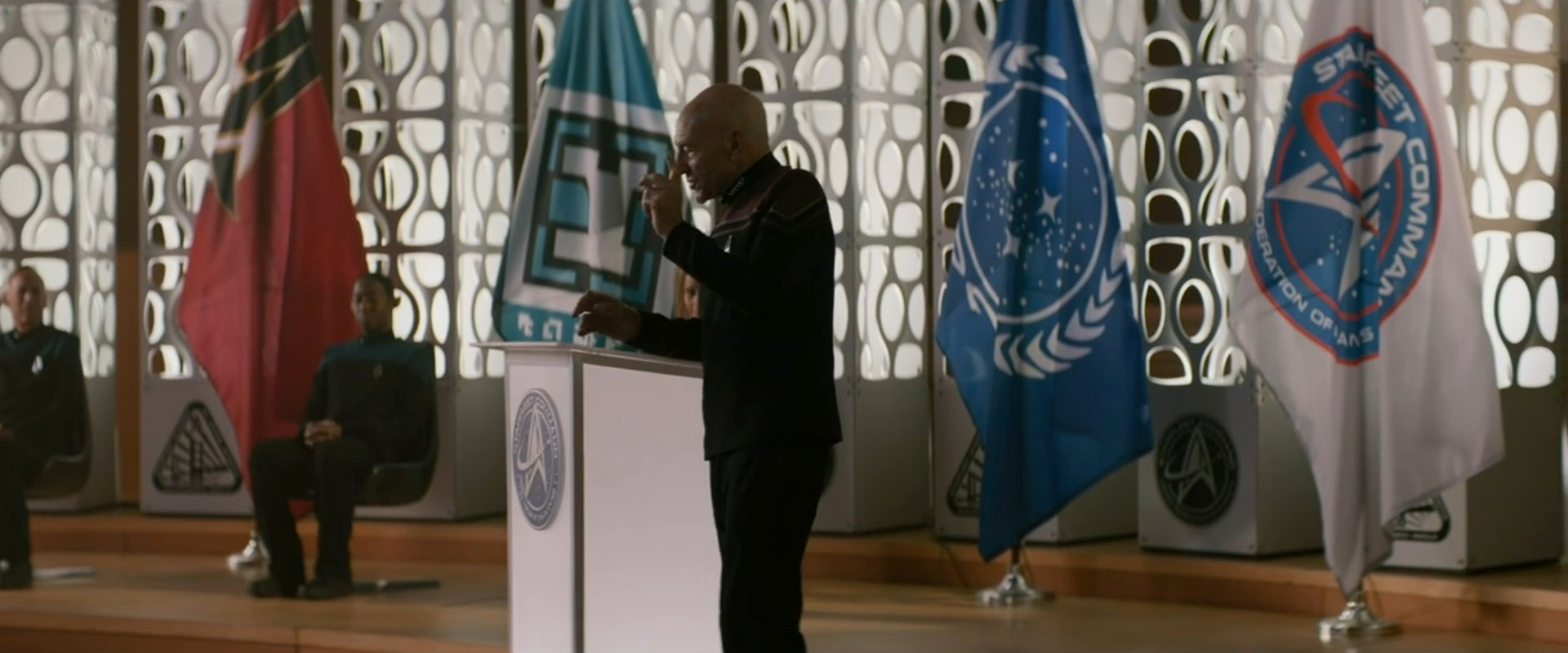
 A flag very similar but not quite identical to the one from the conference room in "Star Trek VI" appears on the stage in PIC: "The Star Gazer" as Picard gives his address to the cadets. It is unlikely that the Klingons are Federation members now. The flag may have been included to represent Klingon cadets.
Other black emblems

![]()
![]()
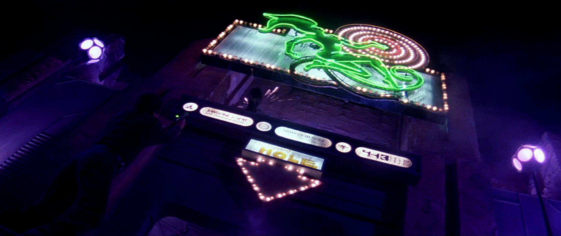
![]() Other than in "Star Trek VI", solid black Klingon trefoils are comparably rare. We can see one on white ground on the backlit welcome sign on Nimbus III, side by side with the Federation and the (TNG-style) Romulan logo. On Klingon monitors with the traditionally black background, on the other hand, the equivalent would be a white logo (and since white is not actually used, rather a yellow one). But even in printed or painted form there are few black logos, and each of them seems to appear just once. The emblem on the Great Hall is black on the matte painting created for TNG: "Sins of the Father", although the emblems inside the building are red in the same episode. We can also see occasional black emblems (instead of white or yellow) when they appear on a red background. Black cargo stickers appear in DS9: "Whispers" (on green ground) and in "Profit an Loss" (on yellow). Black emblems on pentagonal stickers can be seen on a chair in "Star Trek Generations" and on a console in DS9: "Return to Grace". A hexagonal variation appears in DS9: "Blood Oath". These are the same two kinds of stickers on which the logo was yellow on other occasions, as seen above.
Other than in "Star Trek VI", solid black Klingon trefoils are comparably rare. We can see one on white ground on the backlit welcome sign on Nimbus III, side by side with the Federation and the (TNG-style) Romulan logo. On Klingon monitors with the traditionally black background, on the other hand, the equivalent would be a white logo (and since white is not actually used, rather a yellow one). But even in printed or painted form there are few black logos, and each of them seems to appear just once. The emblem on the Great Hall is black on the matte painting created for TNG: "Sins of the Father", although the emblems inside the building are red in the same episode. We can also see occasional black emblems (instead of white or yellow) when they appear on a red background. Black cargo stickers appear in DS9: "Whispers" (on green ground) and in "Profit an Loss" (on yellow). Black emblems on pentagonal stickers can be seen on a chair in "Star Trek Generations" and on a console in DS9: "Return to Grace". A hexagonal variation appears in DS9: "Blood Oath". These are the same two kinds of stickers on which the logo was yellow on other occasions, as seen above.
 A black emblem appears on a banner in DS9: "Unce More Unto the Breach". It cannot be spotted in the episode itself, but the prop photo clearly shows the emblem at the bottom of the banner.
Neutral emblems
![]() The color of the Klingon emblem is sometimes adapted to the surrounding text and graphics on a screen or wall display. We see a white (or perhaps pale purple?) version on a monitor or backlit panel in TNG: "Heart of Glory". Here, the Klingon captain may want to express his appreciation of the Federation-Klingon alliance by displaying both emblems, and with no colors that could look dominant. One more of the rare appearances of a white emblem is on a paper printout in "Star Trek: The Undiscovered Country" (the production design of this one movie really loved showing obsolete technology).
The color of the Klingon emblem is sometimes adapted to the surrounding text and graphics on a screen or wall display. We see a white (or perhaps pale purple?) version on a monitor or backlit panel in TNG: "Heart of Glory". Here, the Klingon captain may want to express his appreciation of the Federation-Klingon alliance by displaying both emblems, and with no colors that could look dominant. One more of the rare appearances of a white emblem is on a paper printout in "Star Trek: The Undiscovered Country" (the production design of this one movie really loved showing obsolete technology).
The Federation as well as the Cardassians use basically the same variations of Klingon symbols on their monitors as the Klingons themselves. But in the sixth and early seventh season of DS9, we can see strangely colored Cardassian variants on a couple of occasions. It appears that the Cardassians adapted the enemy emblem (just like the Starfleet and Romulans ones) to their pastel color palette.
An all-green variation can be seen on a monitor in TNG: "Conspiracy", surrounded by text and graphics that are the same color.
The Klingon emblem is also green when it can be seen in the genetic lab on Noble Isle in PRO: "Masquerade". All other symbols on the display are plain green too, so this is not a new variation but just another styling choice.
Plain metal emblems


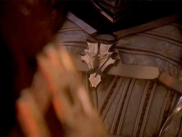
 The emblem sometimes comes in the form of unpainted cast metal. Young Jeremy Aster an be seen with a big Klingon badge at the end of TNG: "The Bonding". Also on TNG, we can see an arm badge with a hexagonal outline. The more notable Klingon arm badge (and communicator) is introduced in DS9 and appears countless times since about the fourth season. The same badge adorns a box in DS9: "Sons and Daughters".
The Order of the Bat'leth that can be seen in DS9: "Apocalypse Rising" has the trefoil painted black on the otherwise plain metal, also without the ring. The badge, the Star of Kahless, that Martok receives in DS9: "When It Rains" is adorned by a black emblem without the ring likewise.

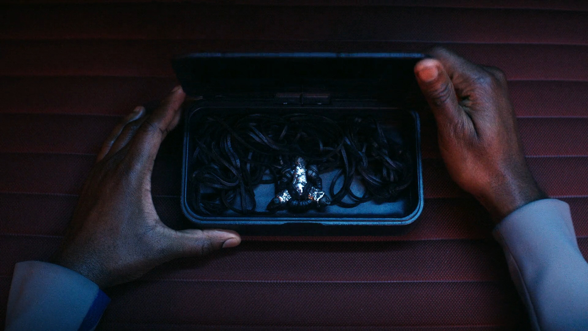
 An embossed Klingon emblem can be found as soon as on the first bat'leth that Kor, Worf and Jadzia rediscover in DS9: "The Sword of Kahless", albeit without a ring or circle. Additionally, the shape of this early trefoil was made to look a bit crude, and obviously intentionally so, compared to the later variations.
![]()
![]() An engraved emblem shows up on the artifact in VOY: "Barge of Dead", albeit just in B'Elanna's imagination. Here, the emblem and the circle are not correctly aligned, and just as in case of the mug emblems from the same episode, this may be intentional, as a cue that it is just a dream. Also in "Barge of Dead", we can see an authentic Klingon emblem as a watermark on a (scanned) old document.
An engraved emblem shows up on the artifact in VOY: "Barge of Dead", albeit just in B'Elanna's imagination. Here, the emblem and the circle are not correctly aligned, and just as in case of the mug emblems from the same episode, this may be intentional, as a cue that it is just a dream. Also in "Barge of Dead", we can see an authentic Klingon emblem as a watermark on a (scanned) old document.
![]() More embossed Klingon emblems appear on the consoles of the Klingon bridge in ENT: "Judgment".
More embossed Klingon emblems appear on the consoles of the Klingon bridge in ENT: "Judgment".
Unusual emblems
![]() The same logo with a "3D effect" can be seen on a Klingon bridge in DS9: "Dramatis Personae", on a decorative console or wall panel on a Klingon BoP in DS9: "Soldiers of the Empire" and once more on Deep Space 9 in DS9: "Once More Unto the Breach". A similar logo appears on the very playful "jukebox" computer interface in ENT: "Broken Bow".
The same logo with a "3D effect" can be seen on a Klingon bridge in DS9: "Dramatis Personae", on a decorative console or wall panel on a Klingon BoP in DS9: "Soldiers of the Empire" and once more on Deep Space 9 in DS9: "Once More Unto the Breach". A similar logo appears on the very playful "jukebox" computer interface in ENT: "Broken Bow".
In DS9: "Apocalypse Rising", Gul Dukat can be seen wearing a strange Klingon shoulder patch just after he has boarded his Bird-of-Prey. It is a white emblem, whose central spike is widened and is blunt on the bottom.
The emblem appears upside down on Kahless's throne in TNG: "Rightful Heir" (obviously put together from three red and one gray pieces of felt). In VOY: "Barge of the Dead", we can see an upside-down emblem at the gate of Gre'thor, here with a specific reason as it symbolizes the Klingon hell. The sequence takes place in B'Elanna's imagination, but she must have seen depictions of Gre'thor, so the orientation may be authentic.
Mirror Universe emblems
More on a side note, the Klingon-Cardassian Alliance in the Mirror Universe is symbolized by the combination of a Cardassian with a Klingon emblem, as first seen in DS9: "Crossover". On this emblem the Cardassian component is clearly dominant, both in terms of size and of the style and color choice.
Abramsverse emblems
 The familiar Klingon logo also shows up in "Star Trek Into Darkness", here somewhat unusually as a uniform chest badge.
Discoverse emblems
 The Klingon emblem of Star Trek Discovery is basically the same monochrome emblem that we know from the 22nd as well as from the 24th century of classic Star Trek. It appears on several Starfleet tactical displays as well as on the Vulcan "learning domes" in "The Vulcan Hello", where it is customarily all-red. In the prologue, the trefoil was still hollow, since "Context is for Kings" it is solid on Starfleet displays. Only in "Will You Take My Hand?" we can spot a yellow emblem with a red circle as on many DS9 monitors.
Discovery Klingons don't seem to be fond of showing off their emblem. It appears in this function on just two occasions in the first season. The first time is on the spacesuit of the Torchbearer in DIS: "The Vulcan Hello" where Burnham's computer identifies it as "Klingon" and highlights it in red. The emblem also appears on the hull of a Klingon "Bird-of-Prey" in "Will You Take My Hand?" (and curiously not on any ship in any previous episode of the series). The color combination (black trefoil with white outline on red circle) on the Discovery BoP is the one previously used on the standalone emblems (without flag) in "Star Trek VI". As already mentioned, this canonically uncommon variation has been very popular in fandom well before "Will You Take My Hand?" was released. It may have been chosen for Discovery by picking the most common result for "Klingon logo" returned by Google.
In the second season, the emblem appears on L'Rell's uniform.

We can see a similar embossed emblem on L'Rell's lectern in "Point of Light". A stylized version with just the trefoil can be spotted on the abdication document in the same episode.
Other than that, the logo shows up on a snack bar on Qo'noS in "Will You Take My Hand?" and on the T'Sang game board in the same episode.
The emblem can also be seen in the Mirror Universe, on a fuel canister in DIS: "The Wolf Inside".
Classic red Klingon emblems appear in Strange New Worlds, notably in "Shuttle to Kenfori".
In Starfleet Academy, Klingon activities are advertised on screens, using the common all-red emblem from the 24th century, as already in Discovery and Strange New Worlds (although it is 800-900 years in the future and may look different). A medallion in the shape of the emblem can be seen in SFA: "Vox in Excelso".
Conclusion
Summary of the variations
The proportions of the familiar Klingon trefoil emblem as first seen in "Elaan of Troyius" have remained unusually consistent in all incarnations of Star Trek (the only exceptions being the distorted one inside the Bird-of-Prey in "Star Trek III" and B'Elanna's inaccurate hallucinations in "Barge of the Dead"). Since "Star Trek: The Motion Picture", also the orientation (with the long tip pointing upward) is almost always the same, although other orientations may have a specific meaning such as "upside down" represents Gre'thor, the Klingon concept of "hell".
The emblem is usually red for official use such as in government buildings but the color may have no significance in Klingon culture. The background definitely doesn't. Red may have been chosen for the trefoil most of the time simply because it looks most impressive. On ship hulls, we can sometimes see more colorful emblems, in red and yellow and sometimes with blue and green too. The latter, colorful variation is usually attributed to the 23rd century but can be repeatedly observed in the 24th century as well.
In TOS: "Errand of Mercy" we could still see a different emblem, even on the official Klingon proclamation. But it is not far-fetched to assume that it is the emblem of the House of Kor or some kind of military medal (considering that Kang and Worf, who wear the same symbol, rather don't belong to the House of Kor).
The most representative Klingon emblems
![]()
![]() If we were to pick two "typical" variations of the Klingon emblem, it would be:
If we were to pick two "typical" variations of the Klingon emblem, it would be:
- "TOS-style" colorful emblem, with blue on the left and green on the right, and rather not the one-off original version with the pale colors
- "TNG/DS9-style" emblem with red on a solid gray circle (or with a yellow ring), as it can also be seen on Enterprise
We should also keep in mind that both variants appear in more than one era and there is nothing such as a "23rd century emblem" or a "24th century emblem".
The red on solid yellow emblem is common too but overall appears less frequently. The various monitor emblems in yellow or red and especially the smaller ones are likely just stylized depictions that were created to be simple and easily recognizable, as are many of the black variations. The two variations of the "Klingon Nazi flag" from "Star Trek VI", finally, account for roughly a third of all Google image searches for "Klingon emblem". But while they are very popular in fandom, they are hardly representative of the Klingon Empire, although they eventually appeared in Discovery and in Lower Decks.
See Also
Alpha and Beta Quadrant Emblems A-K
The Evolution of the Alliance Emblem - exhaustive survey of all variants
Credits
Some screen caps from TrekCore. Thanks to Randolph Guthrie for the hint about the emblem in "More Tribbles, More Troubles" and to Rob Minnes for spotting some more examples. Many thanks to Mike Okuda for answering our questions.


