


The Evolution of the Kazon Emblem
by Jörg Hillebrand, Bernd Schneider and Brad Wilder
Appearances of the EmblemConclusion
![]() The Kazon were featured as soon as in Star Trek Voyager's pilot episode. However, it would be a while before their logo, designed by Wendy Drapanas, appeared on screen in its final form. We can also find this final version printed in the Star Trek Encyclopedia (2nd edition).
The Kazon were featured as soon as in Star Trek Voyager's pilot episode. However, it would be a while before their logo, designed by Wendy Drapanas, appeared on screen in its final form. We can also find this final version printed in the Star Trek Encyclopedia (2nd edition).
This logo consists of three Kazon letters, where the left letter looks like a strongly rounded, mirrored "E", the middle letter like a slightly angular, mirrored "E" and the right letter also like an "E", but with rounded and slightly more angular areas. The middle and right letters each have three dots. Above and below these three letters are two lines, which become thicker towards the center of the logo. Above or below these lines, in turn, there is a further line in the middle with an arrowhead pointing to the inside of the logo.
In the following, all appearances of the emblem, as well as variants and preliminary stages of the same are listed in chronological order.
Appearances of the Emblem
Caretaker
The pilot episode does not yet show the emblem, although we can already see various Kazon characters and ships. Curiously, the two large water containers that Janeway beams down from Voyager to the Ocampa homeworld are marked with Kazon characters, although the containers are definitely from Voyager's inventory.
We can already recognize the characteristic E-shaped and slightly rounded letters, which in some cases have multiple dots. The very rounded E-shaped letter, which appears on the far left in the logo, is not yet visible here.
State of Flux
In this episode, we see a Kazon ring that can be used as a weapon. On this ring we can find the right and the middle letter of the Kazon logo, but the other elements are missing.
In addition, a Kazon console appears for the first time in this episode. However, this is only dimly lit and can be seen from a distance, so no logo is recognizable. However, this console is similar in design to the later-seen Kazon designs that contain the logo, so it is quite possible that the final Kazon logo was already present in "State of Flux".
Initiations
![]() In the second-season episode "Initiations", the logo is almost completely visible for the first time. Here it appears as an illuminated wall relief and can also be seen in orange and green on the floor of the Kazon-Ogla ship.
In the second-season episode "Initiations", the logo is almost completely visible for the first time. Here it appears as an illuminated wall relief and can also be seen in orange and green on the floor of the Kazon-Ogla ship.
Looking at the illuminated wall logo, we can see that all three Kazon letters are present. However, the horizontal lines are missing, three of which are above and below the letters. In addition, it is noticeable that one of the middle bars of the left, strongly rounded "E" here is significantly longer than the other middle bar and is tapered. Finally, the logos were placed upside down on one of the two walls on the Kazon ship.
![]() Regarding the large round emblem on the floor, it is a colored variant. The full Kazon logo, including the three letters and the six horizontal lines, appears in green on an orange oval. On closer inspection, however, we realized that nothing is as it seems. The three letters have only a passing resemblance to the actual letters. Instead of the thin lines, the letters are very coarse, missing the dots in the two right letters. In addition, the upper half of the right-hand letter is just as strongly rounded as the left-hand letter, and not square, like the lower half of the letter. The upper and lower, central horizontal lines too look very different. Here, the arrowheads protrude significantly further into the middle of the logo and are connected to the letters. In addition, there are even larger arrowheads on the opposite side of the lines, which protrude outward. Rather than being just inaccurate, maybe this somewhat different logo is the Kazon-Ogla version? The real-world reason for the large letters could be that they were certainly made from adhesive film. Larger letters were easier to attach and would not peel off as quickly during the battles that took place in this area in the episode.
Regarding the large round emblem on the floor, it is a colored variant. The full Kazon logo, including the three letters and the six horizontal lines, appears in green on an orange oval. On closer inspection, however, we realized that nothing is as it seems. The three letters have only a passing resemblance to the actual letters. Instead of the thin lines, the letters are very coarse, missing the dots in the two right letters. In addition, the upper half of the right-hand letter is just as strongly rounded as the left-hand letter, and not square, like the lower half of the letter. The upper and lower, central horizontal lines too look very different. Here, the arrowheads protrude significantly further into the middle of the logo and are connected to the letters. In addition, there are even larger arrowheads on the opposite side of the lines, which protrude outward. Rather than being just inaccurate, maybe this somewhat different logo is the Kazon-Ogla version? The real-world reason for the large letters could be that they were certainly made from adhesive film. Larger letters were easier to attach and would not peel off as quickly during the battles that took place in this area in the episode.
Maneuvers
![]() In its final form, the Kazon emblem first appeared in this mid-season 2 episode. Here, we can see the complete logo first on the hull of the Kazon armored shuttle ("torpedo"), printed in orange. Playing with the contrast of the screen cap, we can see that this logo actually looks exactly as in the Encyclopedia, and as originally designed by Wendy Drapanas.
In its final form, the Kazon emblem first appeared in this mid-season 2 episode. Here, we can see the complete logo first on the hull of the Kazon armored shuttle ("torpedo"), printed in orange. Playing with the contrast of the screen cap, we can see that this logo actually looks exactly as in the Encyclopedia, and as originally designed by Wendy Drapanas.
We also get to see close-ups of Kazon consoles for the first time, with numerous other Kazon letters, all of which have design similarities to the already familiar three letters.
Above one of the consoles another full Kazon logo comes into sight. On closer inspection, however, it is noticeable that the entire logo is mirrored vertically. This can be seen above all in the position of the dots of the middle letter and in the fact that the longer curve of the left letter is above and not below. However, the middle letter also has a discrepancy. The lower of the two middle bars (in the original orientation) is clearly too long. Again, this is not the final version of the Encyclopedia emblem.
In the shuttlebay of the Kazon ship we can also see the illuminated wall panels from "Initiations". Just like in the earlier episode, one of the middle bars of the left letter is too long and the logo partially appears upside down.
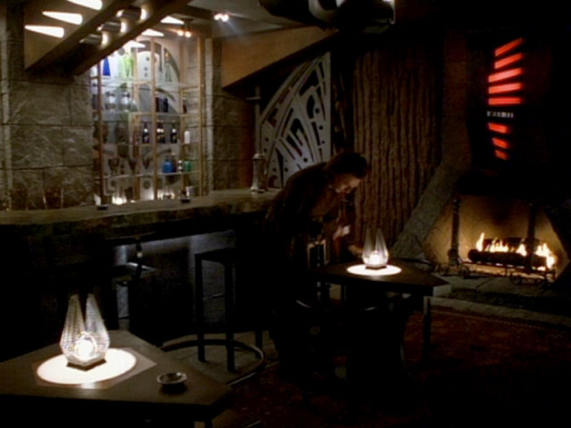
Alliances
This episode features numerous green Kazon letters in the bar and in the conference room on Sobras. These letters also have slightly larger circles in addition to the small circles.
A recurring symbol can be seen on the small tables in the bar and on the large conference table. Perhaps this is the logo of Sobras or the Kazon Pommar logo (the faction that invited to the conference on this planet). Elements of this symbol and the other components of the Kazon logo also appear on metallic wall elements, which can be seen in various places on the inside and the outside of the building on Sobras.
Both the small tables with the distinctive logo and the perforated wall elements were featured in later Voyager episodes. The tables reappeared in "Fair Trade" on the Nekrit Station and the wall elements were visible in the bar on the Mikhal Outpost in "Darkling".
In one scene, there is also a close-up of a Kazon console. The logo appears on a light green, triangular field. On closer inspection, however, we can recognize that the logo is horizontally mirrored here. All other elements seem to be correct.
Investigations
We can see the Kazon logo for the last time in this episode. Here, the wall panels that were originally created for "Initiations" were reused in a corridor. However, the panels were rotated 90 degrees clockwise, so the logo is on the side. Again, we can recognize the much too long upper middle bar of the left (now upper) letter, so it is clearly the unchanged panels from "Initiations".
We also see different Kazon consoles once again, as well as the console with the horizontally mirrored logo, which already showed up in "Alliances". The logo is only barely recognizable, but comparing the arrangement of the colored fields to the left and right of the logo, we can identify it as the same console. After this episode, the Kazon logo should never reappear.
Conclusion
The Kazon logo, in its exact originally designed and often reproduced form, can only be seen on screen in a single place (on the hull of the Kazon torpedo) in a single scene in VOY: "Maneuvers". In other episodes, it is not yet complete, it comes with slightly different letters or is horizontally/vertically mirrored or upside down.
The Kazon emblem also appears on the hull of the Kazon raider/fighter model. However, it is not clearly recognizable in any of the various episodes this ship appears in.


