


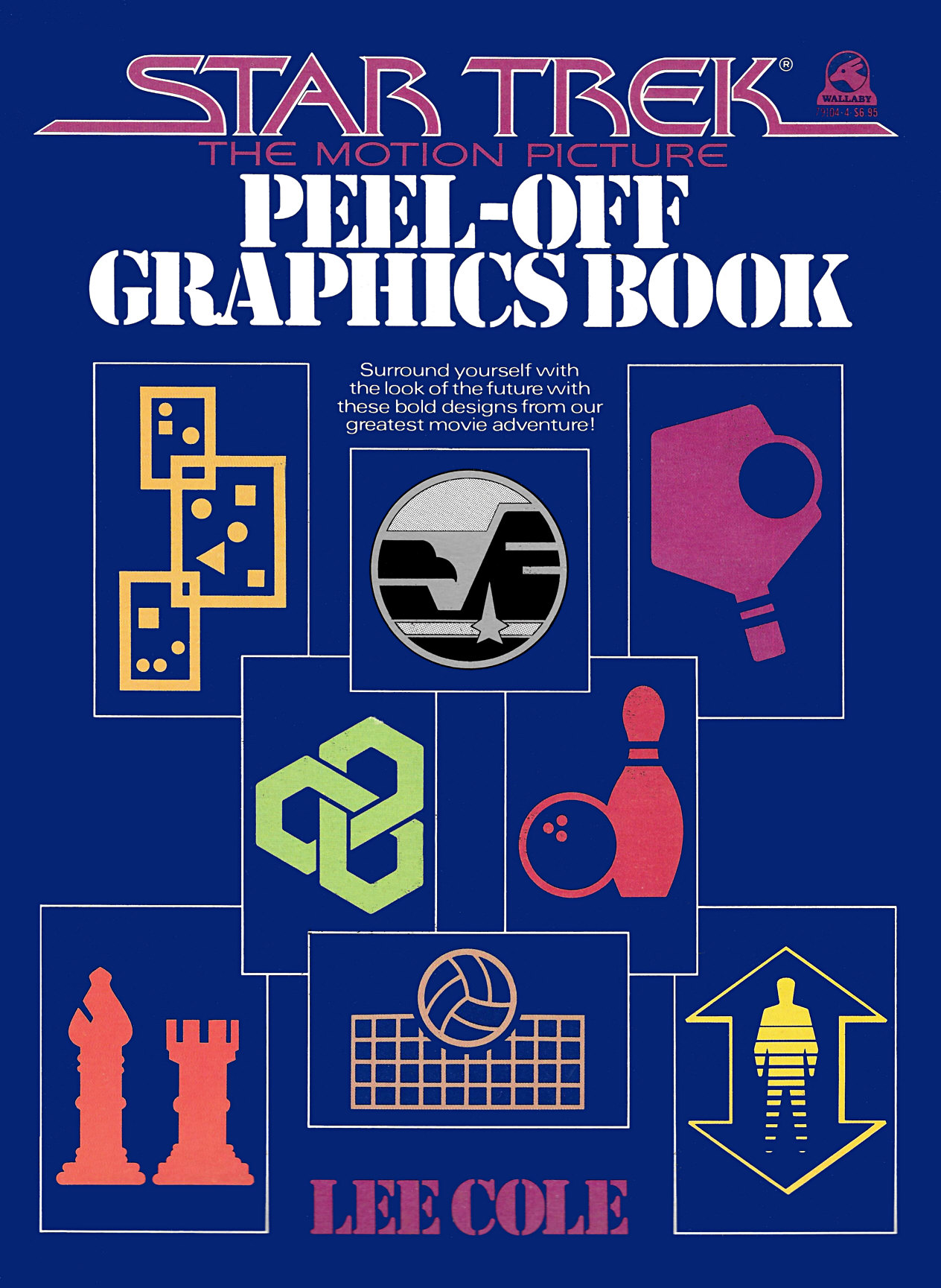
Pictograms from the Star Trek: The Motion Picture Peel-Off Graphics Book
by Jörg Hillebrand, Bernd Schneider and Brad Wilder
History of the PictogramsCanon AppearancesConclusion
For "Star Trek: The Motion Picture", a number of logos or pictograms were designed for 23rd century Earth and the Starship Enterprise. Rick Sternbach and Lee Cole were tasked with the design of this futuristic iconography. Many of the pictograms appeared as stickers in the Star Trek: The Motion Picture Peel-Off Graphics Book. This article identifies the logos depicted in the book in the TOS movies and later appearances on Star Trek.
History of the Pictograms
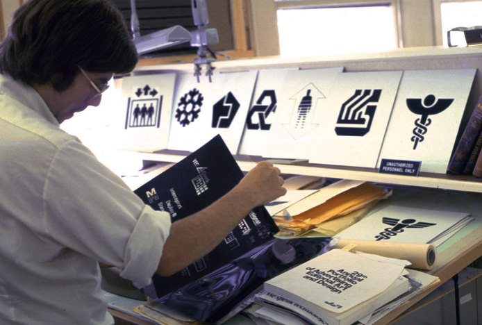
Rick Sternbach tells us how he got the job as senior illustrator on "Star Trek: The Motion Picture", his first of many jobs on Star Trek:
"In October 1977 I visited a number of studios during a trip out from Connecticut. One of those studios was Paramount, where the Phase II production had been moving along, though slowly, and Production Designer Joe Jennings was a straight shooter with me in saying that he didn't have anything for me at the time. I did get to meet with Mike Minor (illustrator) and John Cartwright (lead set designer), and left my info and SF and space art samples. Long story short, Joe invited me to come in when TMP was announced, I attended the press conference on stage, and was on the production that afternoon. My title was a senior illustrator under Mike Minor (and ultimately Joe), so I was there to draw whatever was needed to show how sets and props and such could look prior to building. I did marker sketches of the corridors and transporter room and airbrush art of Main Engineering. Lee Cole had established the look of the controls during Phase II, so when I started helping out with the backlit panels, I followed her stylistic lead. Harold Michelson replaced Joe Jennings, who went to work on Shogun, so I reported to Harold with sketches and suggestions for the remainder of the time there. Along with the techy controls, we did indeed do piles of inked logos and informational placards for the different sets, to visually tie everything together."
Rick Sternbach says about his inspiration for the pictograms:
"I can't say there was any one inspiration. Various logos and graphic styles mixed about in my head from the 70s. The general idea was to present a simple, quickly identifiable shape for each department. Of course, not every logo made instant sense within the film, but we knew what they were and where they would be placed."
When asked if any of the logos had drastically changed from the initial idea to their final appearance, Rick said:
"I don't recall any logos where we had a real progression from one concept to the next to a final. Some logo ideas were drawn up a few at a time and a lucky one got picked. A lot of these got drawn up and turned into final silkscreened adhesive stickers and metallic plates and attached to set walls and such without a lot of changes, at least while I was there on TMP. I suspect we were trusted to know what we were doing, something that carried over into TNG not that many years later."
Many of the designs ultimately didn't make it into "Star Trek: The Motion Picture" in the end or were not recognizable on screen. Shortly after the release of the film, a book the Star Trek: The Motion Picture Peel-Off Graphics Book was published, however. This book contains many of the pictograms designed for the film as stickers.
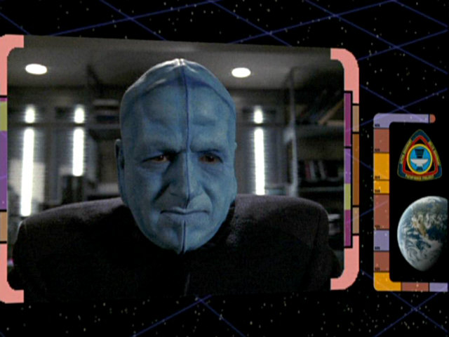
Even though many of the original designs did not show up in the first Star Trek feature film, they were seen in "Star Trek II: The Wrath of Khan" and "Star Trek III: The Search for Spock" and, to a lesser degree, in still later Star Trek films. Some of the designs even made it into the Star Trek TV shows, from TNG all the way to Enterprise. The logo that was seen most often is the Starfleet Medical logo. We have dedicated a separate article to this design, so it will only be dealt with in a rudimentary fashion here.
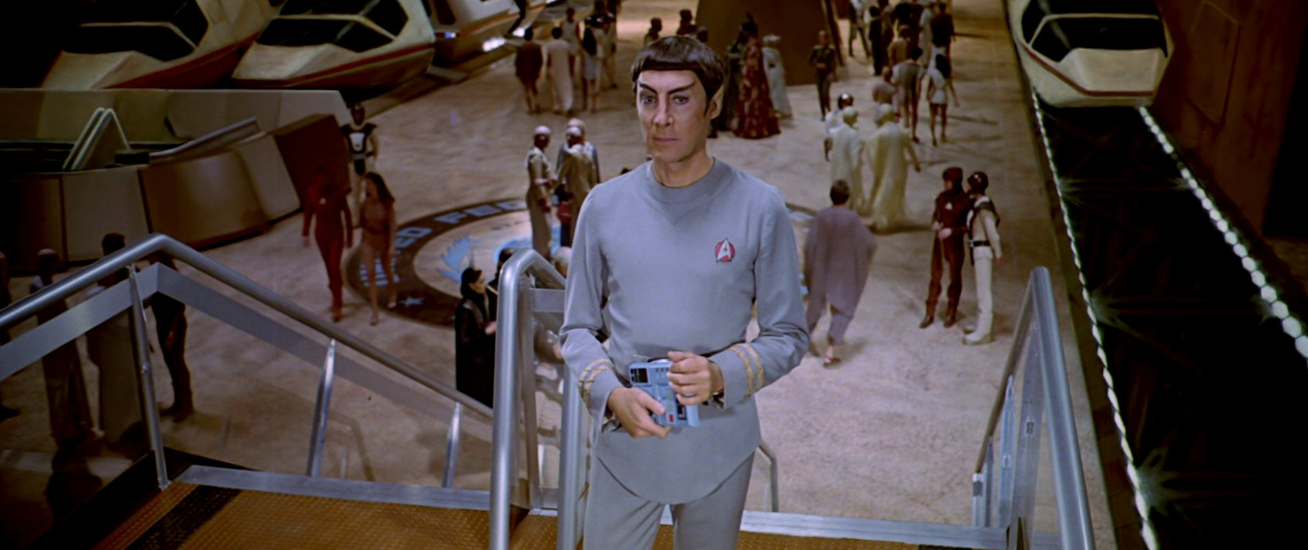
Of the original TMP pictograms, we have been able to identify 27 in the Star Trek films and TV shows so far. We will provide a scan from the above mentioned book for each logo that actually appeared on screen and will then add screenshots showing the various appearances of said logo. We focus on the logos in the same order they appear in the book so it starts with the logo that appeared most often in the first four Star Trek films, the United Federation of Planets Starfleet Headquarters logo.
Canon Appearances
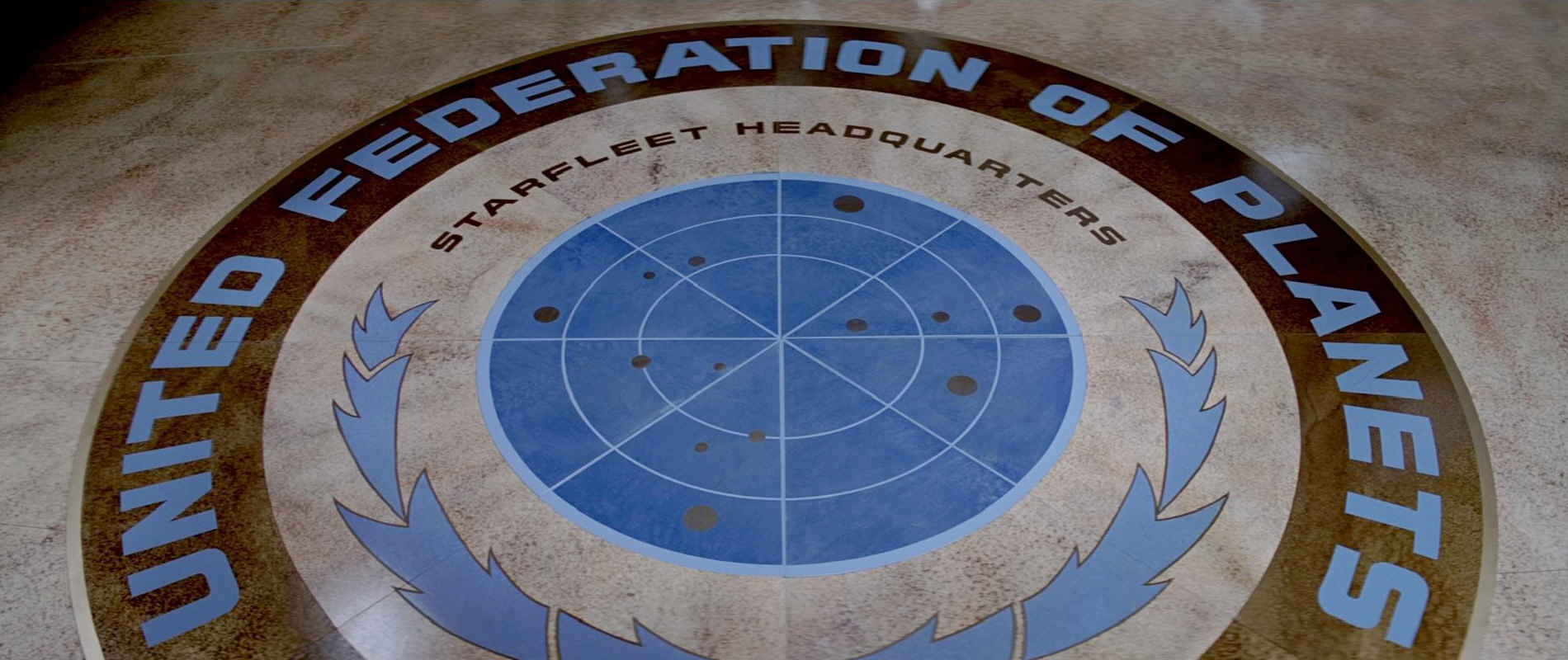
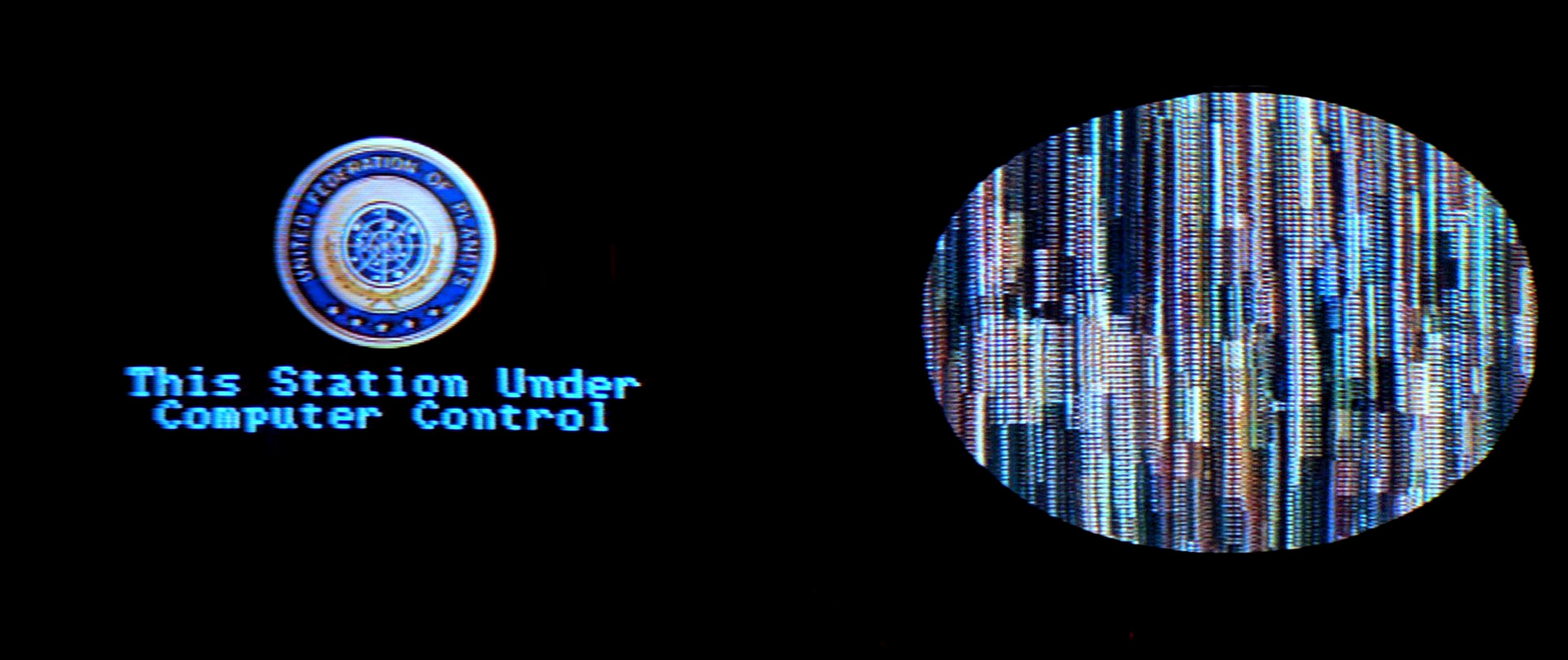
01 United Federation of Planets Starfleet Headquarters
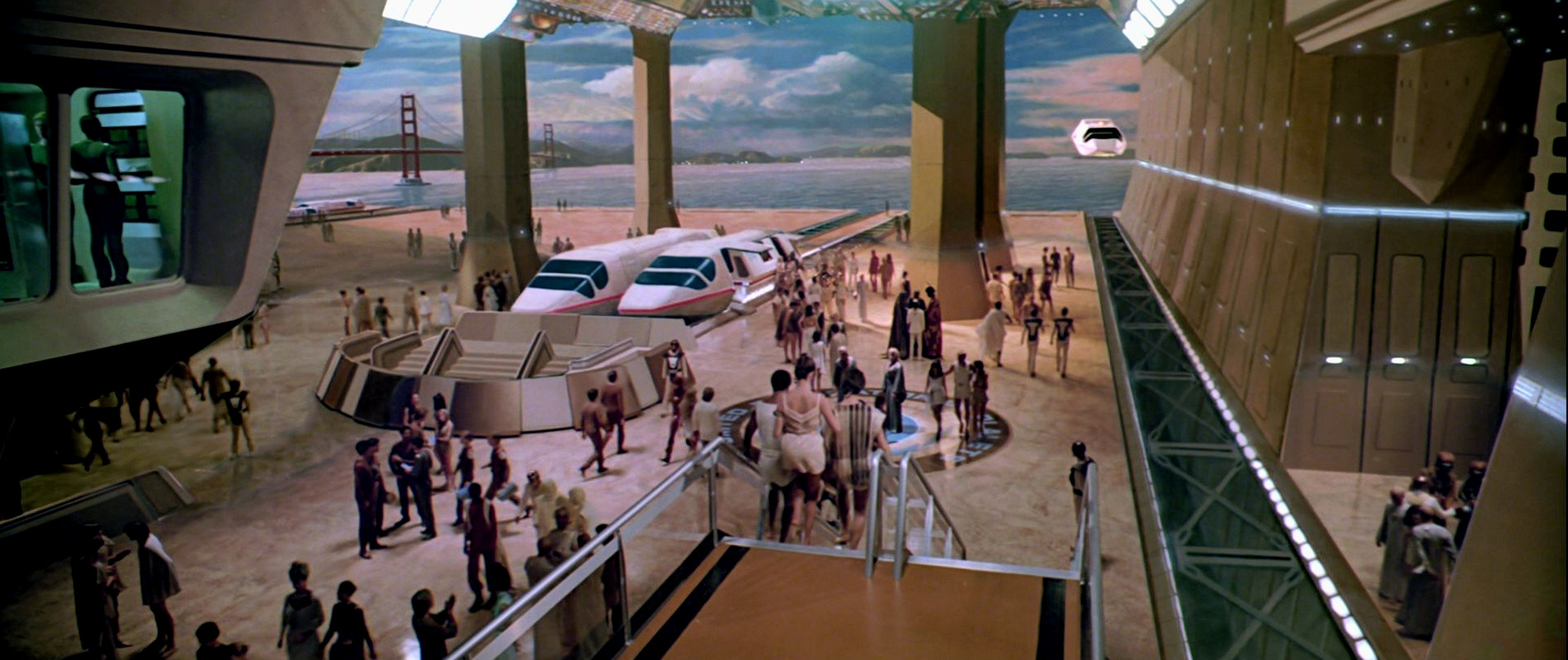
After the UFP pennant was seen in TOS: "And the Children Shall Lead", this is the second United Federation of Planets emblem ever seen on Star Trek. It appears only once as a floor emblem in the first Star Trek film and not exactly as it does in the book. The font used for the text is different and the dots, representing stars, are also spread out differently.
A few seconds later, a very similar variety of the emblem can be seen on the hull of the air tram. This time, the dots in the grid are aligned like in the book. The laurel leaves also are similar but all of the text is missing and the 5 stars are now located where usually the text "Starfleet Headquarters" is found. The words "Star Fleet Command" are now written underneath the seal.
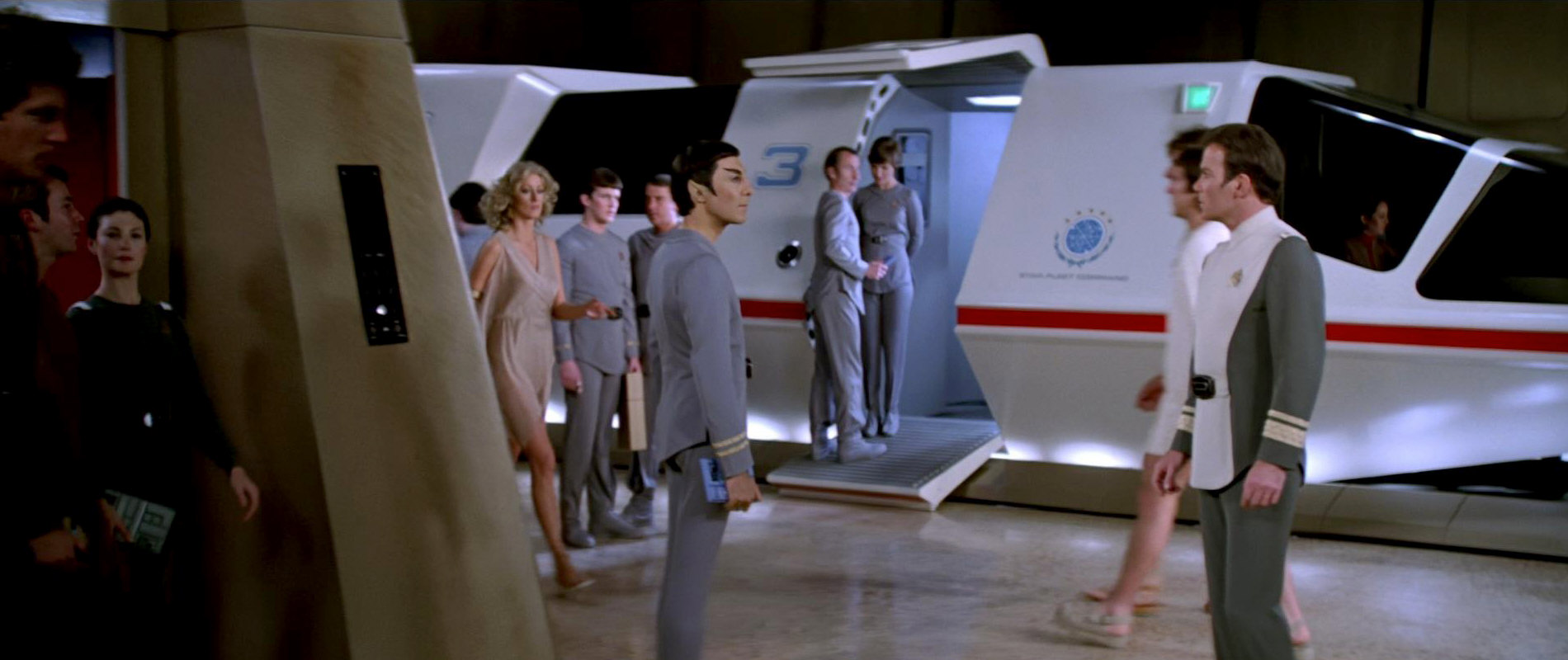
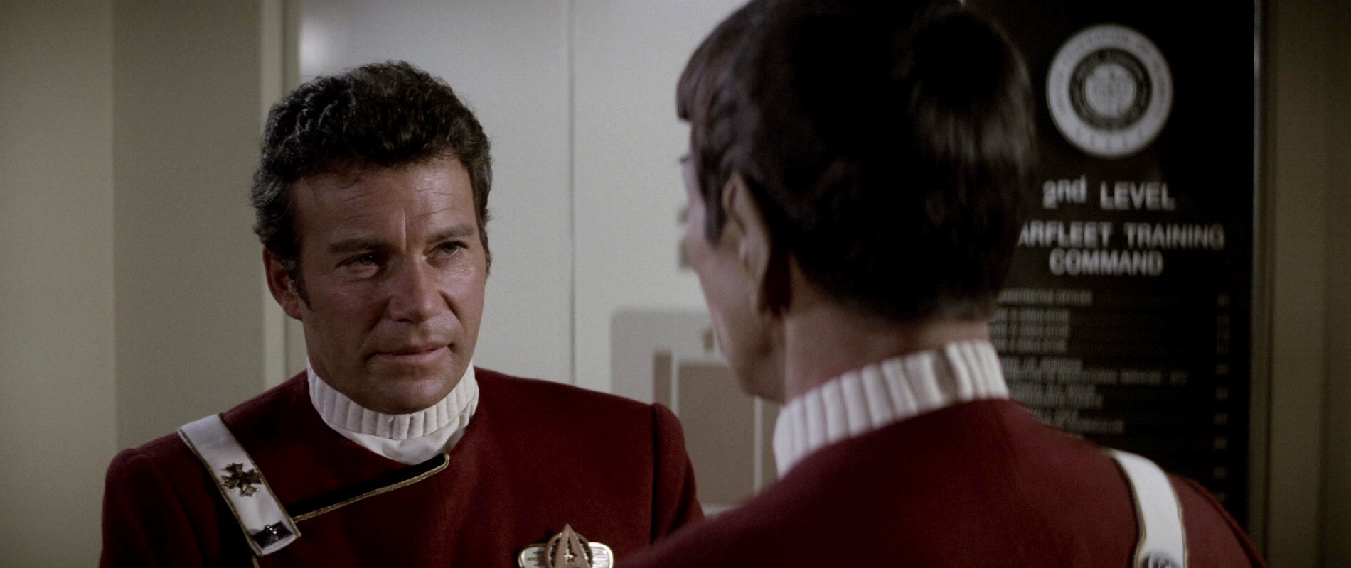
![]() In "Star Trek II: The Wrath of Khan", the seal as it appears in the book is seen in several places. It first appears on a sign at Starfleet Training Command. The logo is black and white and the whole text (including Starfleet Headquarters) is present. Next, the logo is seen on several crates and books inside cargo modules left with Khan on Ceti Alpha V. This implies that it was already in use during the first season of TOS in the year 2267.
In "Star Trek II: The Wrath of Khan", the seal as it appears in the book is seen in several places. It first appears on a sign at Starfleet Training Command. The logo is black and white and the whole text (including Starfleet Headquarters) is present. Next, the logo is seen on several crates and books inside cargo modules left with Khan on Ceti Alpha V. This implies that it was already in use during the first season of TOS in the year 2267.
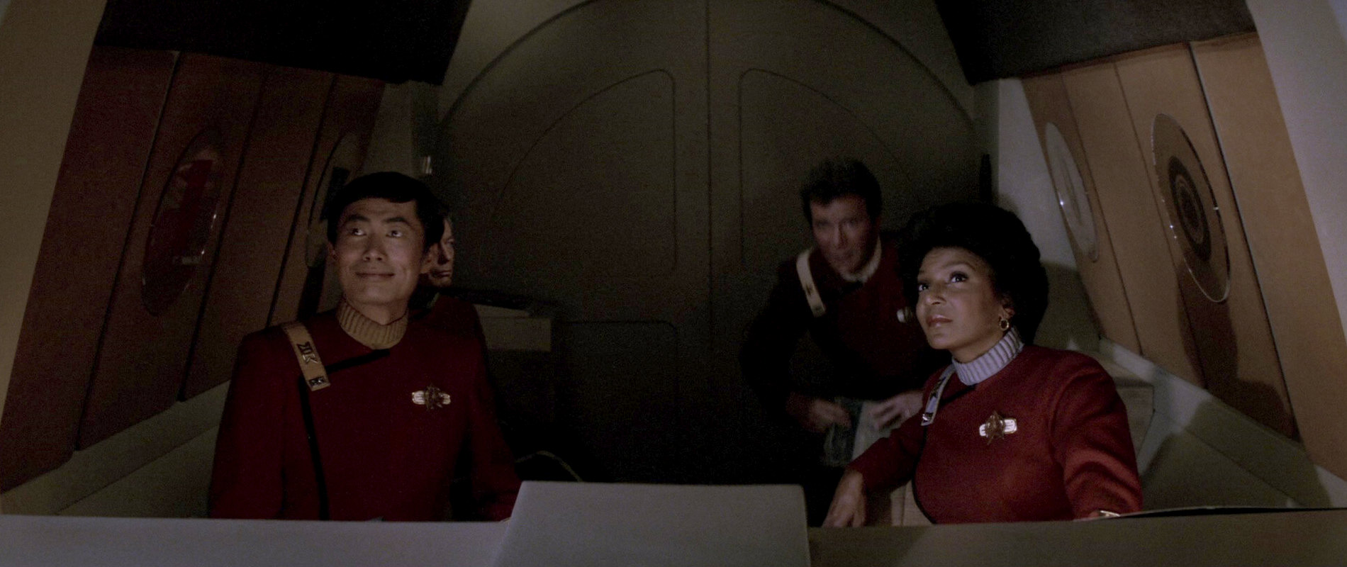
In the film, the logo is next seen twice printed in gold on a glass plate. It appears like that inside the travel pod used by Kirk, McCoy, Sulu and Uhura to travel to the USS Enterprise. When they board the ship, the same glass plate is also visible next to the docking hatch. A white plate with the seal additionally appears in Spock's quarters in this film and in Star Trek III. Finally, several yellow cargo crates in the man-made caves on the Regula planetoid also feature the logo.
In "Star Trek III: The Search for Spock", the emblem first appears as a translight graphic on the bridge of the USS Grissom. The laurel leaves of this version are hollow and no longer solid. After that, the logo is shown for the first time without the words "Starfleet Headquarters" on a monitor in Captain Kirk's apartment. The same version later appears on the bridge of the USS Enterprise, also on a monitor.
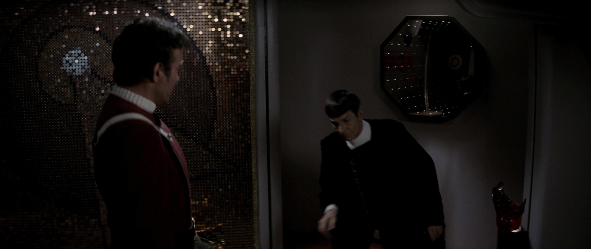
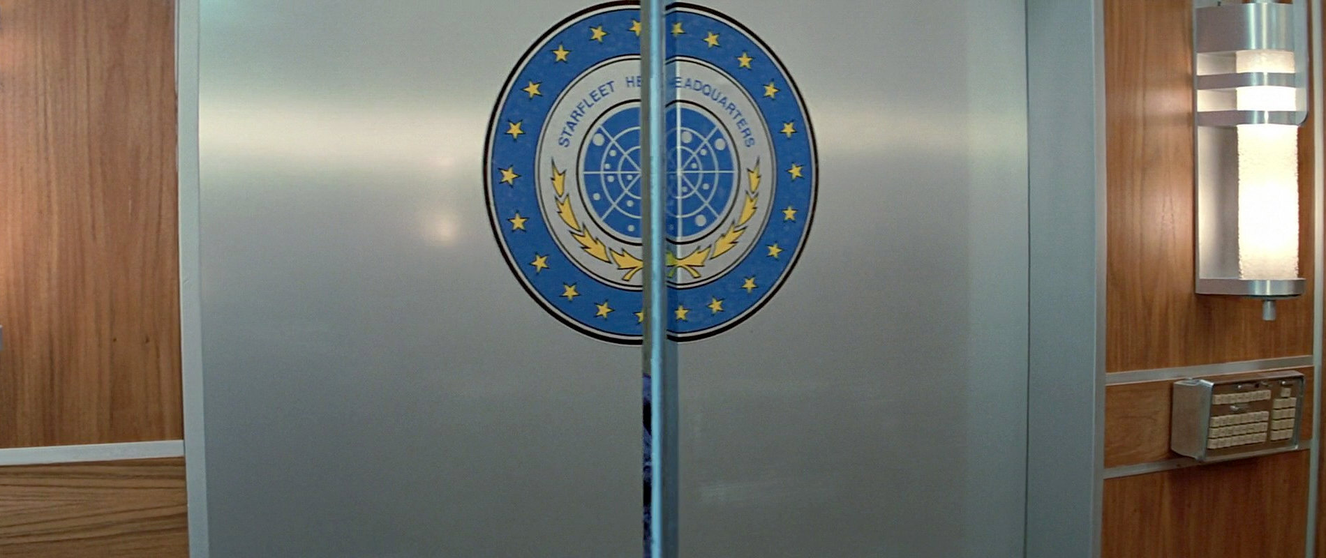
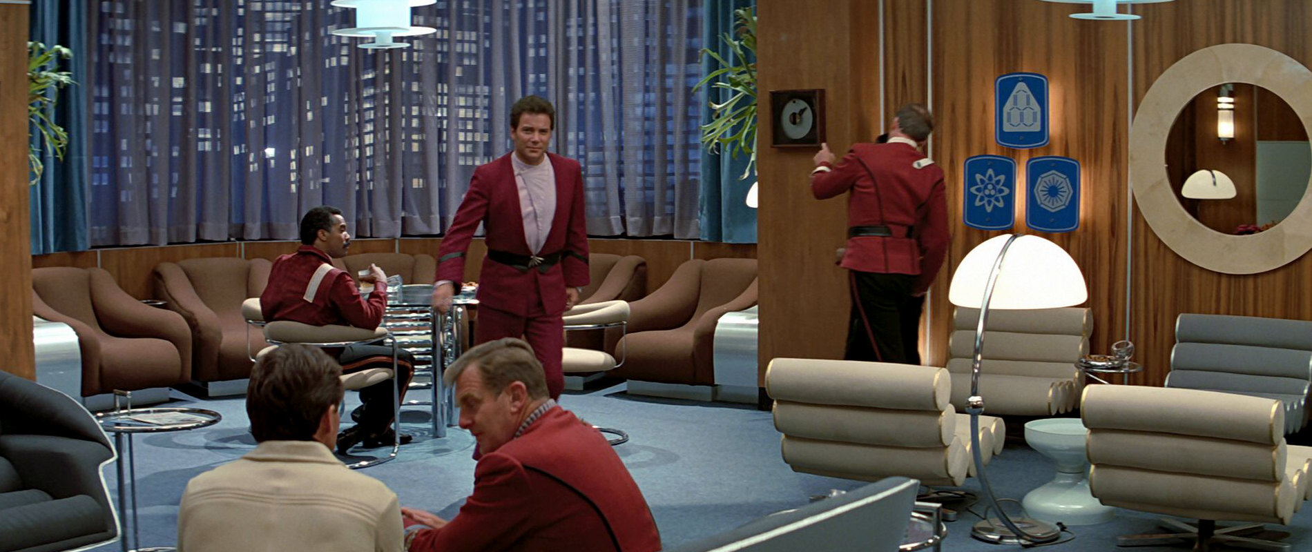
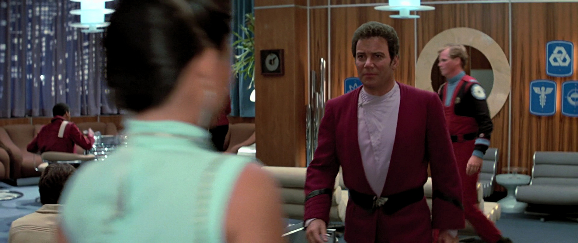
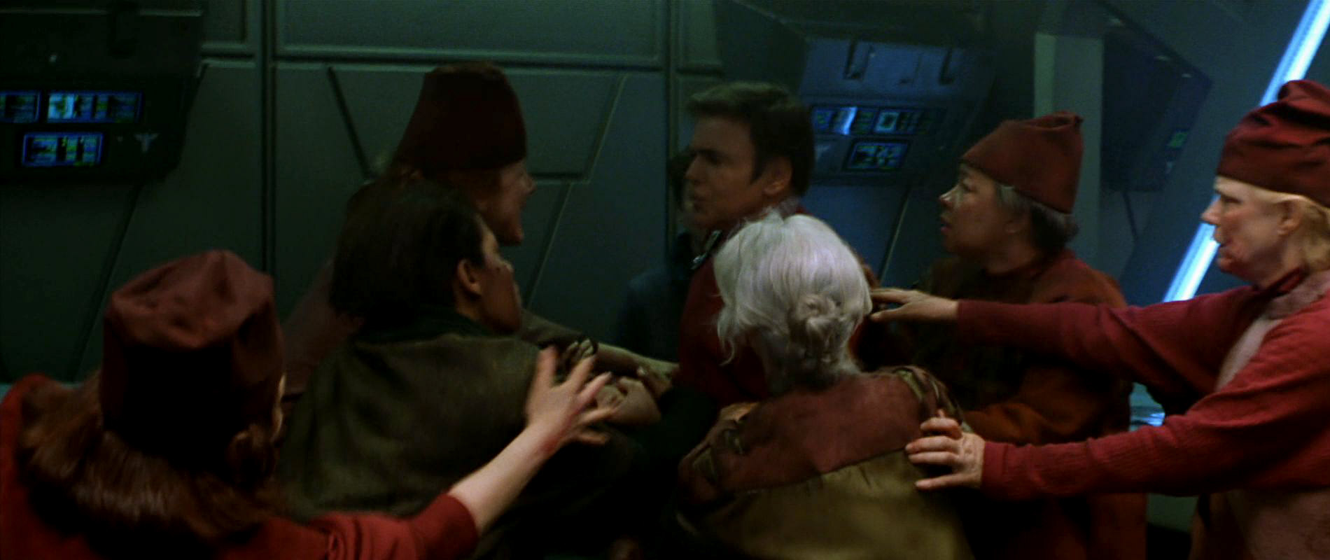
In the Officers' Lounge at Starfleet Headquarters a slightly different version of the logo appears as a large wall plaque and on the door to the lounge. The words "United Federation of Planets" are replaced by fifteen additional stars on this seal.
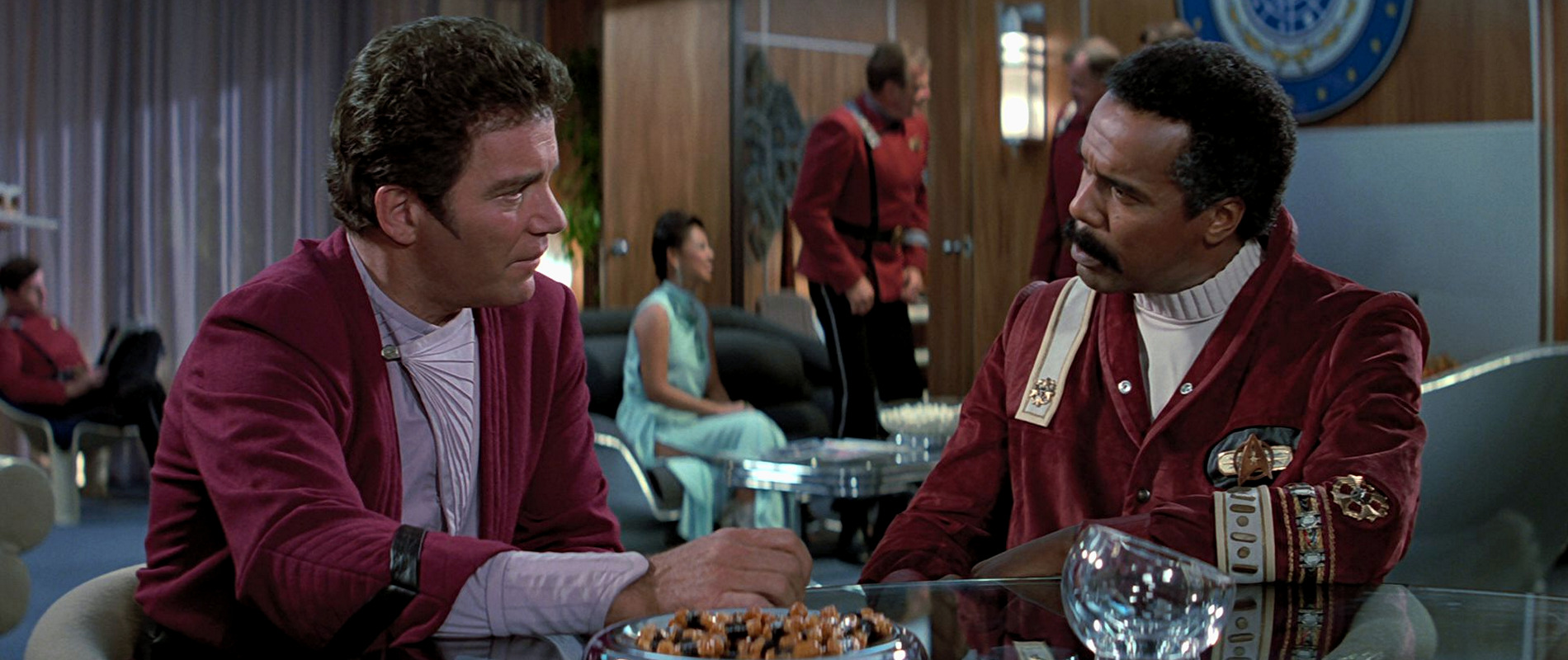
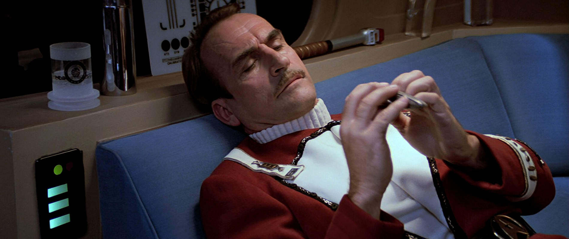
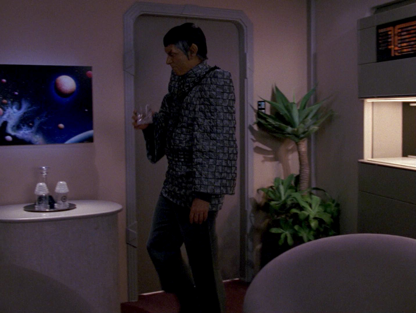
Characteristic glasses with the logo appear for the first time in the Officers' Lounge. In the scene set in the lounge, the logo is really hard to see. A little later in the film, Captain Styles is seen in his quarters aboard the USS Excelsior. One of the glasses is standing next to his bead. Here, the logo is clearly visible. The top and bottom of those glasses appear frosted. It is possible that a white cup with the logo, used by Captain Picard in "Encounter at Farpoint" was also originally created for the Officers' Lounge. One of the frosted glasses is later seen aboard the USS Tsiolkovsky in "The Naked Now".
The seal appears one more time in the third film on the ID of the civilian Federation Security agent.
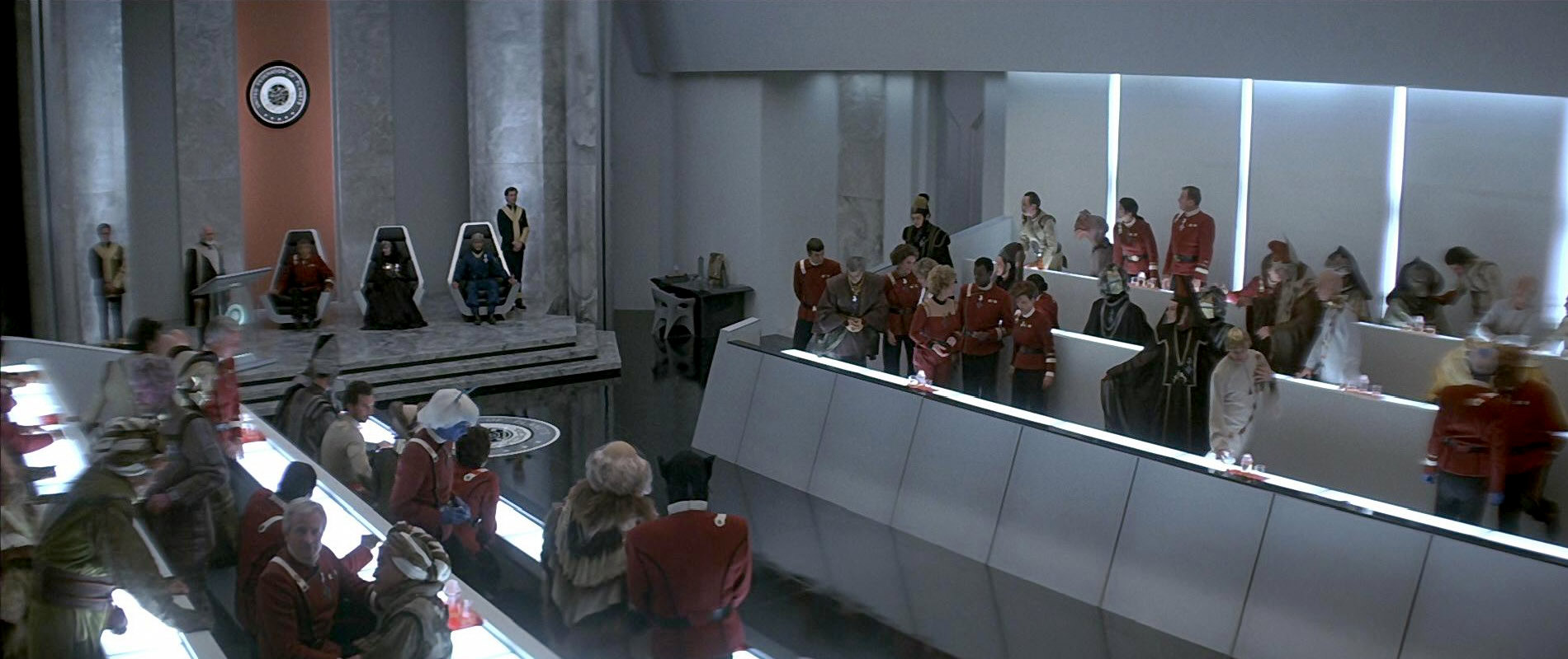
In "Star Trek IV: The Voyage Home", the emblem is only seen at the Federation Council chambers. It appears on the floor, on the wall above the Federation president and on his lectern. In each of these appearances, the word "Starfleet Headquarters" is missing. In front of the Federation delegates, several red tray with two glasses and a bottle-like glass with a removable lid each, similar to the ones from Star Trek III, are standing. These glasses do not feature any of the frosting like the glasses in the previous film so they might have been newly created. Only the middle glass with the lid features the logo. This lid is similar in appearance to the top of the Romulan Ale bottle from "Star Trek II: The Wrath of Khan".
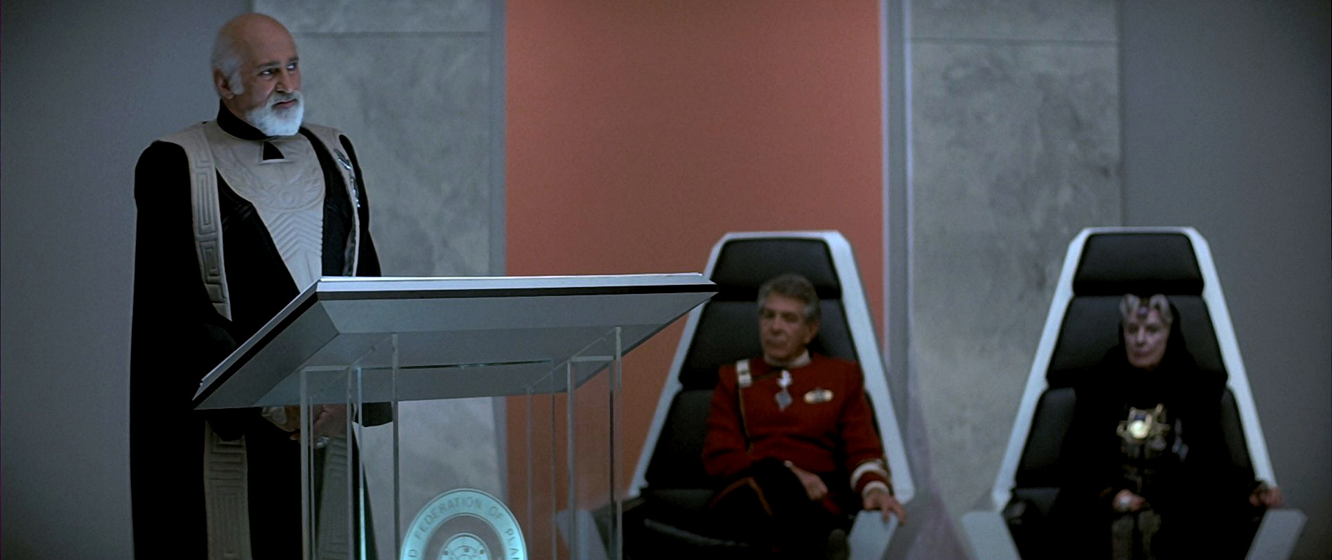
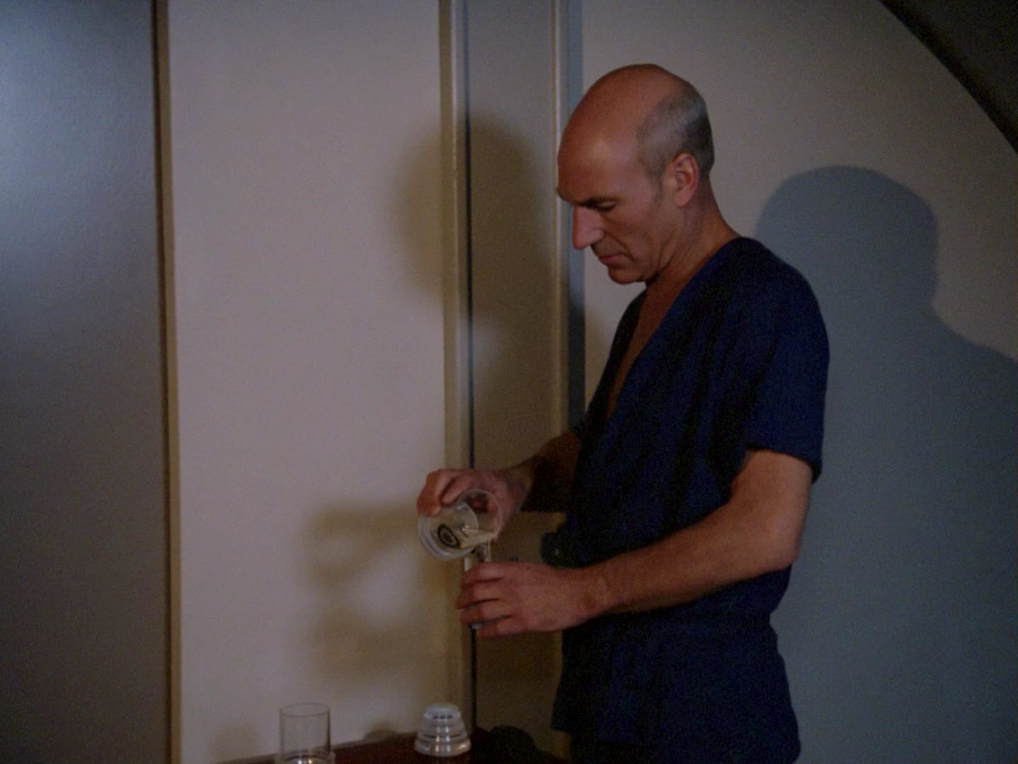
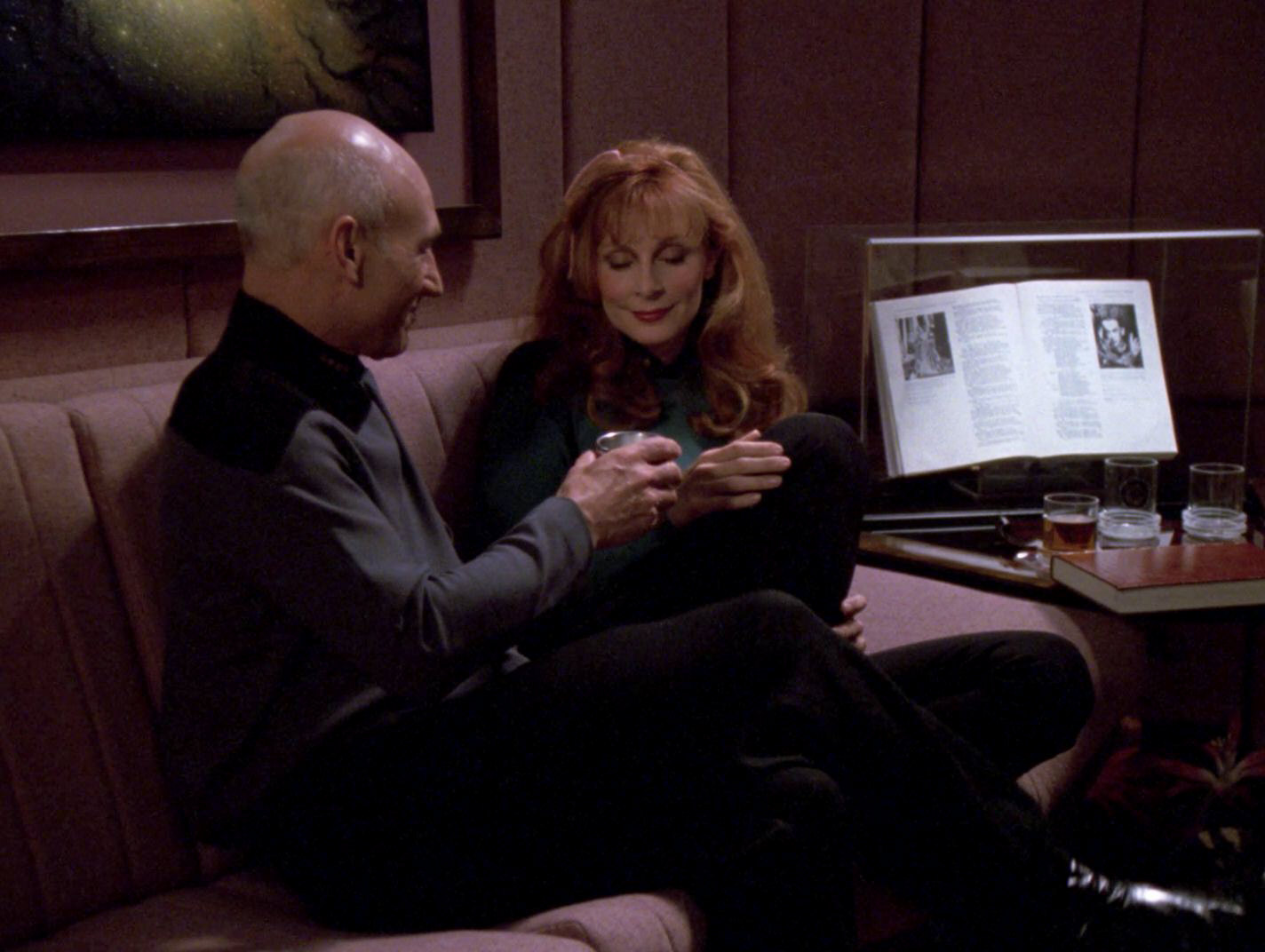
Some of the all-clear glasses (with and without lids) appear in later TNG episodes, usually in Picard's ready room. In some early TNG episodes, the glasses also show up in other locations aboard the USS Enterprise-D. A red tray with three glasses, one of them with a lid, is seen in Riker's quarters in "Haven". In "Conspiracy", Picard pours a glass of water from one of the glasses with a lid into one if the regular glasses (without the logo) in his quarters. A glass with a lid and a separate lid next to it are seen in Data's quarters in "The Measure of a Man". Two glasses with the logo and a lid appear on a silver tray in Admiral Jarok's guest quarters in "The Defector".

In the first 3½ seasons of TNG, a red tray with two glasses and one glass with lid and logo in the middle (exactly as they appeared in "Star Trek IV") were usually standing in front of Picard's Shakespeare book in his ready room. When the room was redecorated to serves as Will Riker's future ready room in "Future Imperfect", the table with the glasses and the book were removed and replaced by a plant. It seems that when everything was returned to the way it looked before, the lid somehow got lost because ever since then, only three glasses (the middle one with the logo but without a lid) were seen in his ready room.

After these appearances, the TMP-style seal is never seen again in any of the later Star Trek films, as by the time of "Star Trek V: The Final Frontier" the 24th century Federation emblem, introduced in the first season of TNG, is used. Interestingly, in "The Mind's Eye", Geordi is drinking from a glass very similar to the ones from "Star Trek III" and "Star Trek IV", but this glass is fully frosted and features the 24th United Federation of Planets emblem.
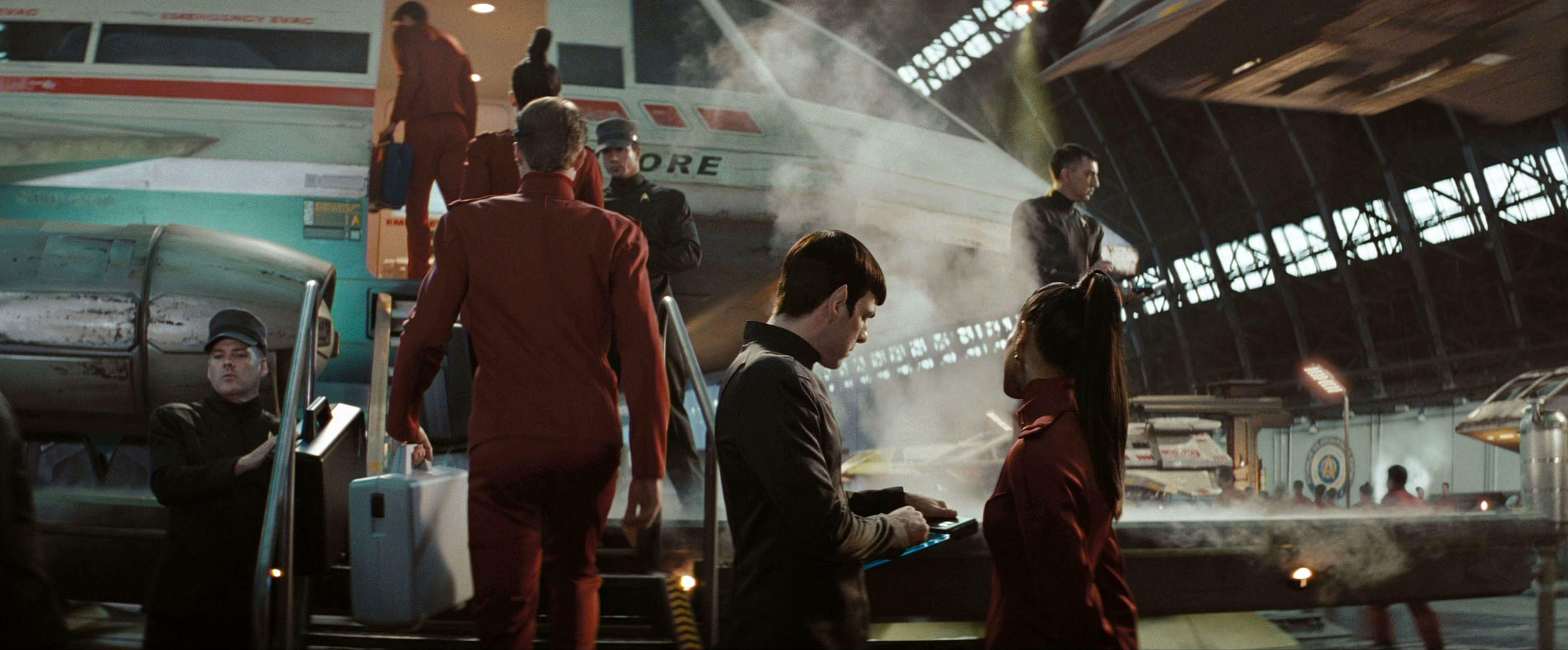
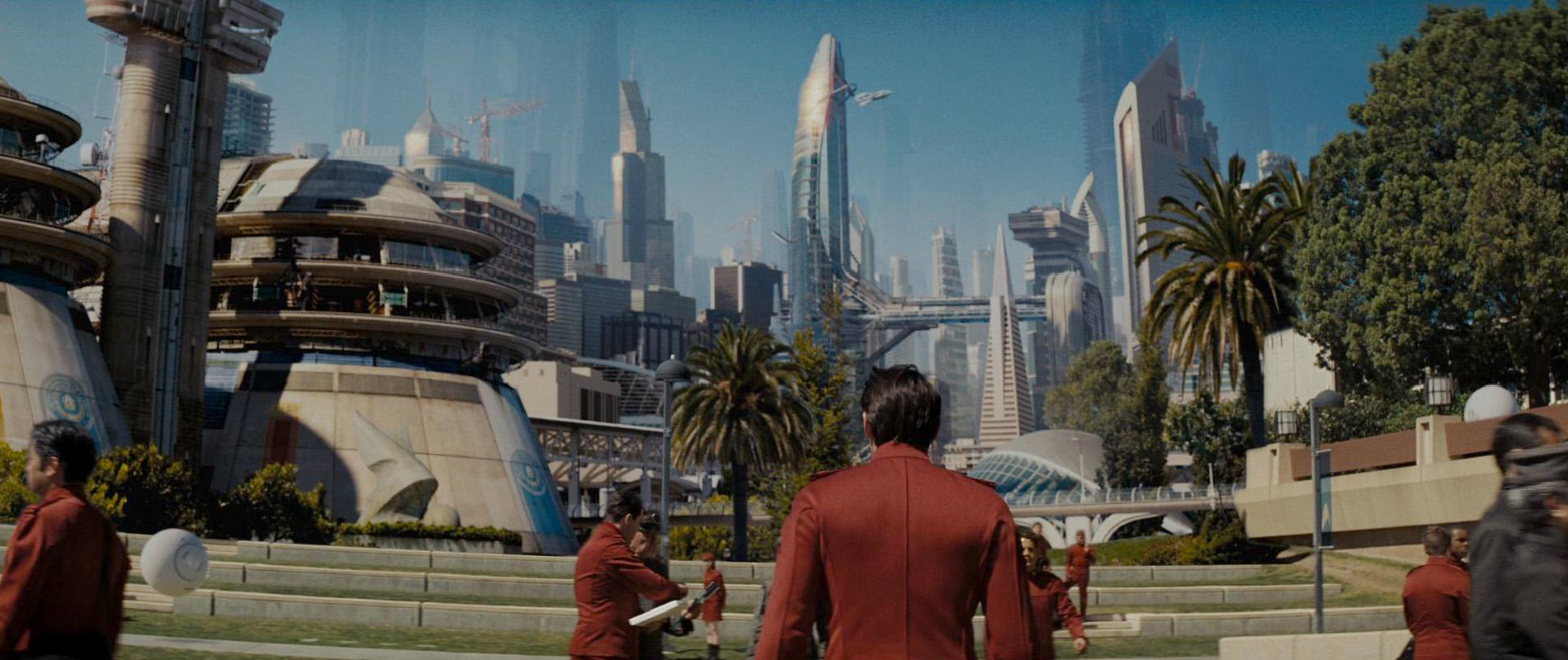
 A modified version of the logo, with a Starfleet delta at the center instead of a grid with stars, does appear in "Star Trek (2009)". It can be spotted outside of the Riverside Shipyards in Iowa, inside the large shuttle hangar in San Francisco and outside a building at Starfleet Academy.
See The Evolution of the Federation Emblem for further variations, and particularly the ones since TNG.
02 Klingon battle craft
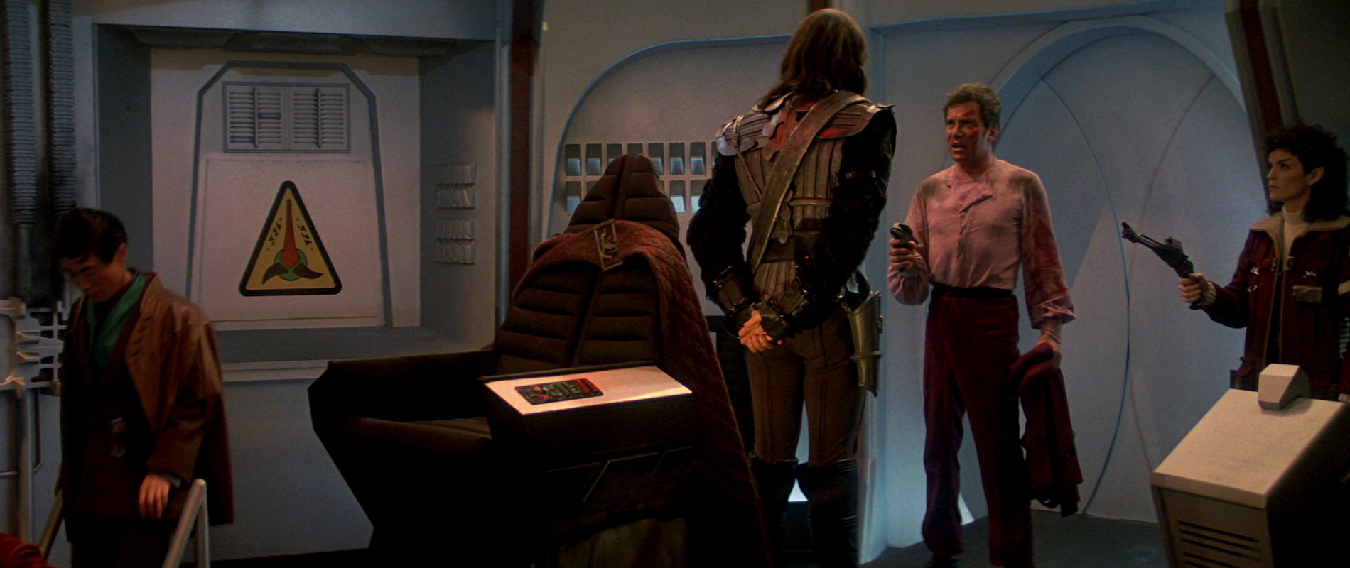
![]() As hard as we tried, we could not find this logo in the first Star Trek feature film, for which it was purportedly created. Instead, it appears only once, on the bridge of Kruge's Klingon Bird-of-Prey in "Star Trek III: The Search for Spock". As can be seen, the colors were modified slightly, as the lower two spikes of the logo are blue instead of red. Apart from that (including the Klingon writing and the rounded upper spike) the logo is identical.
As hard as we tried, we could not find this logo in the first Star Trek feature film, for which it was purportedly created. Instead, it appears only once, on the bridge of Kruge's Klingon Bird-of-Prey in "Star Trek III: The Search for Spock". As can be seen, the colors were modified slightly, as the lower two spikes of the logo are blue instead of red. Apart from that (including the Klingon writing and the rounded upper spike) the logo is identical.
See also The Evolution of the Klingon Emblem.
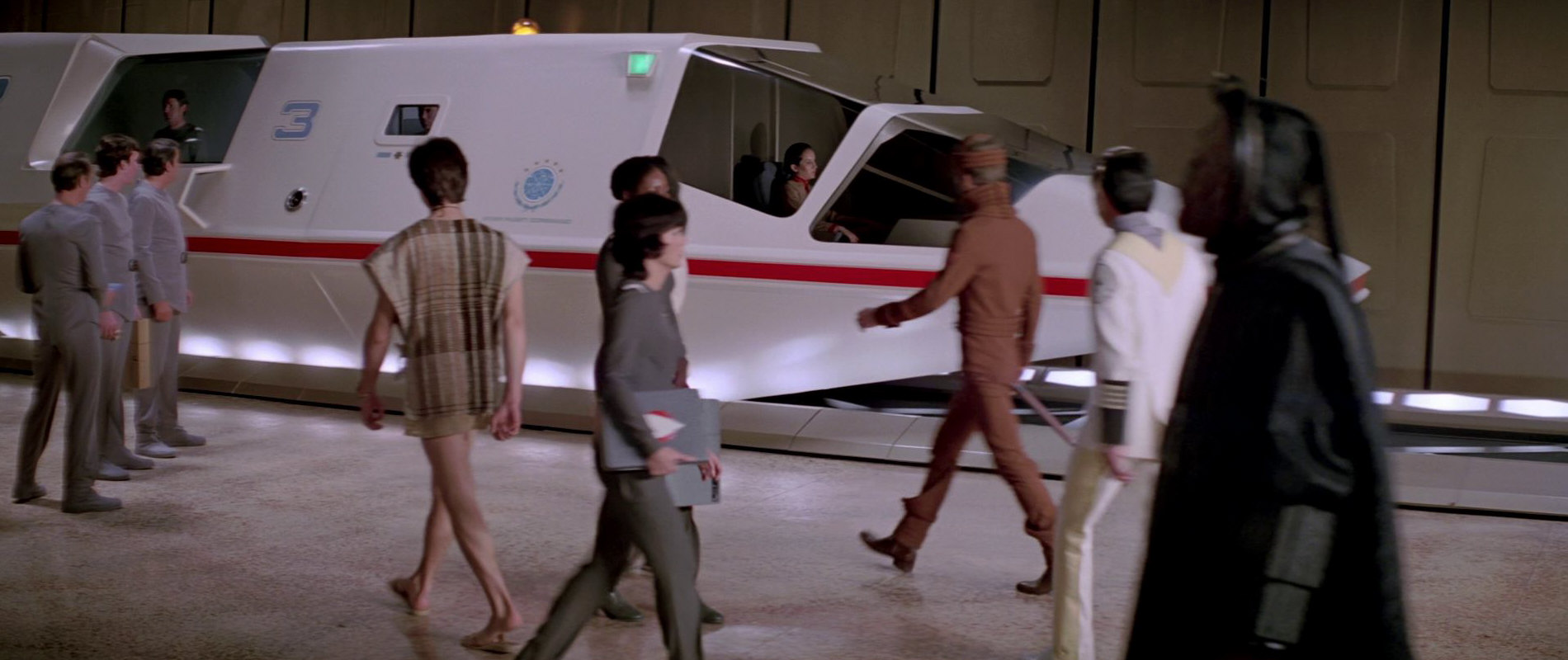
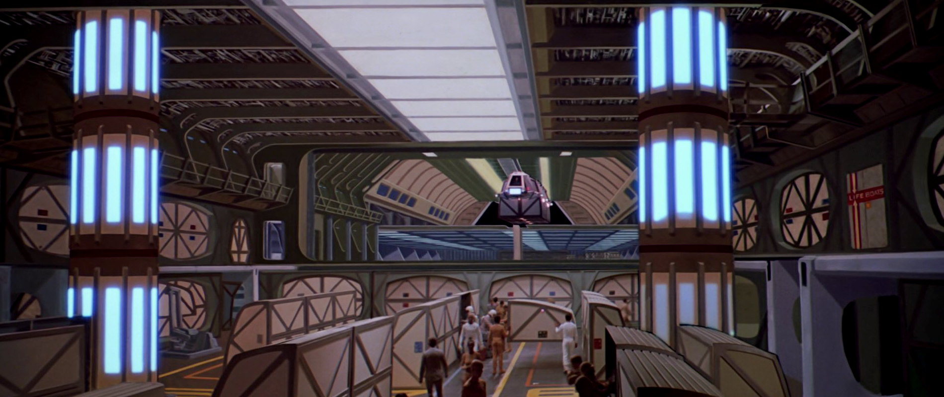
03 San Francisco Sky Tram Port
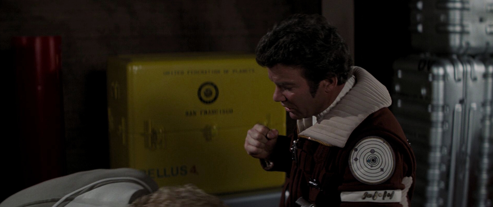
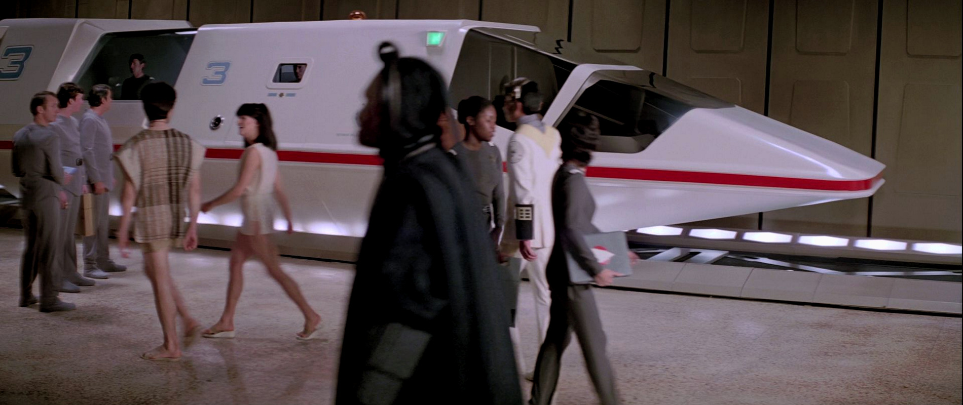
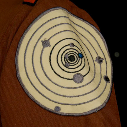
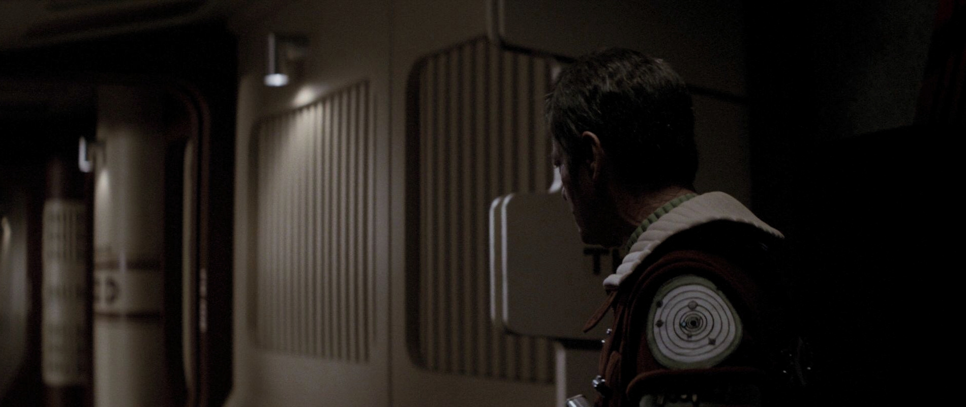
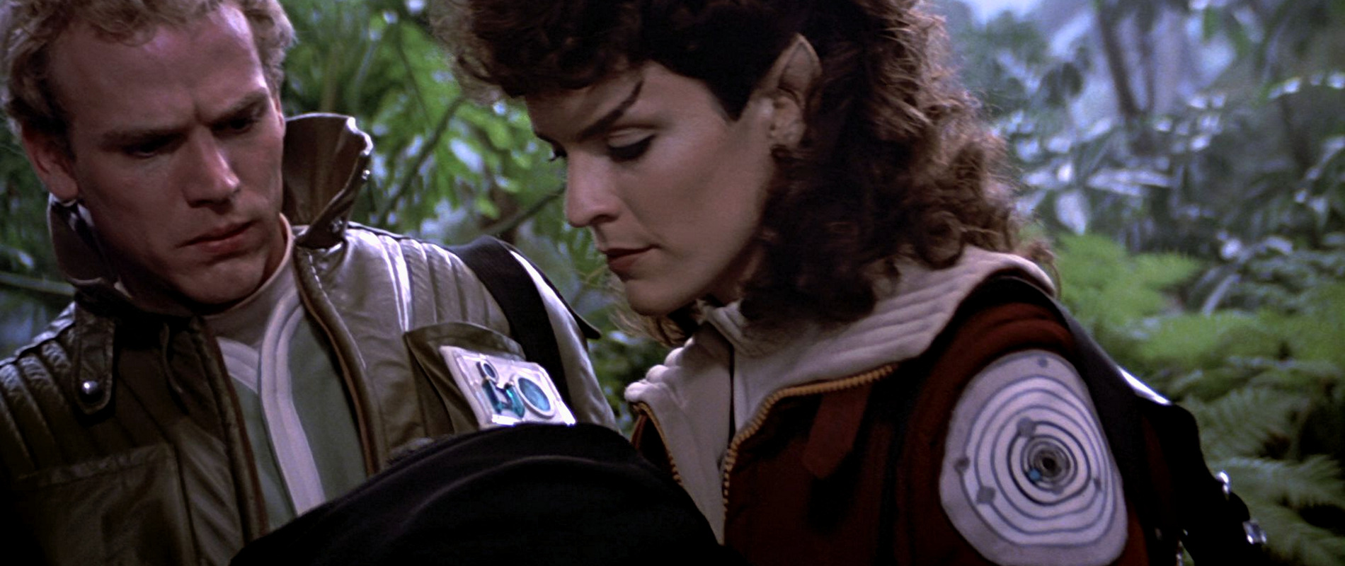
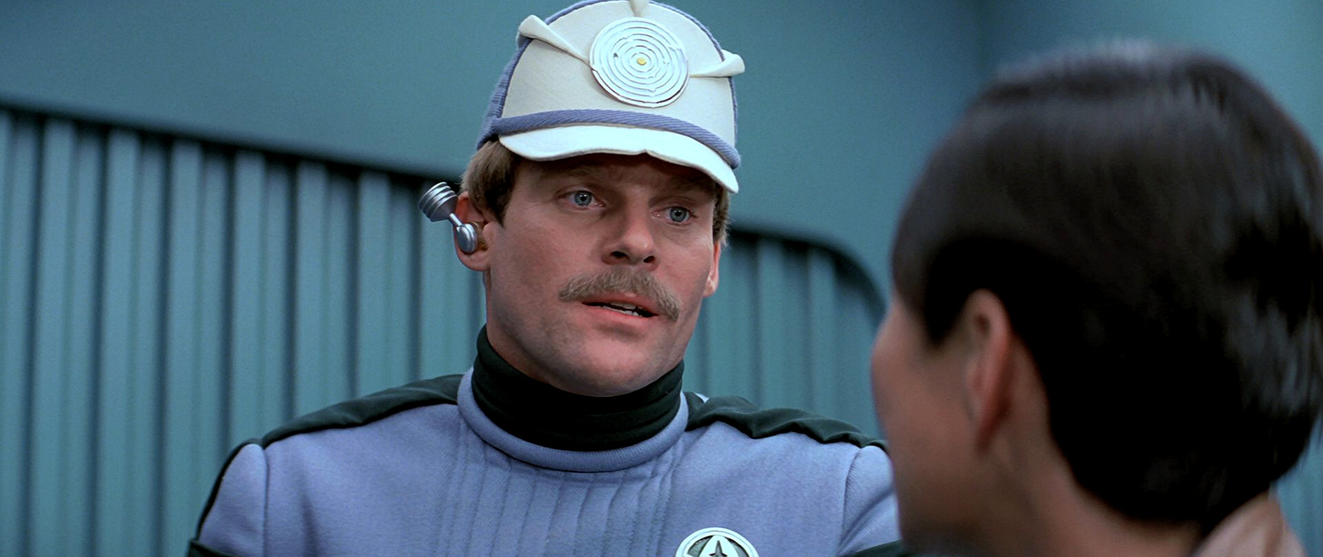
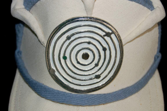
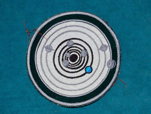
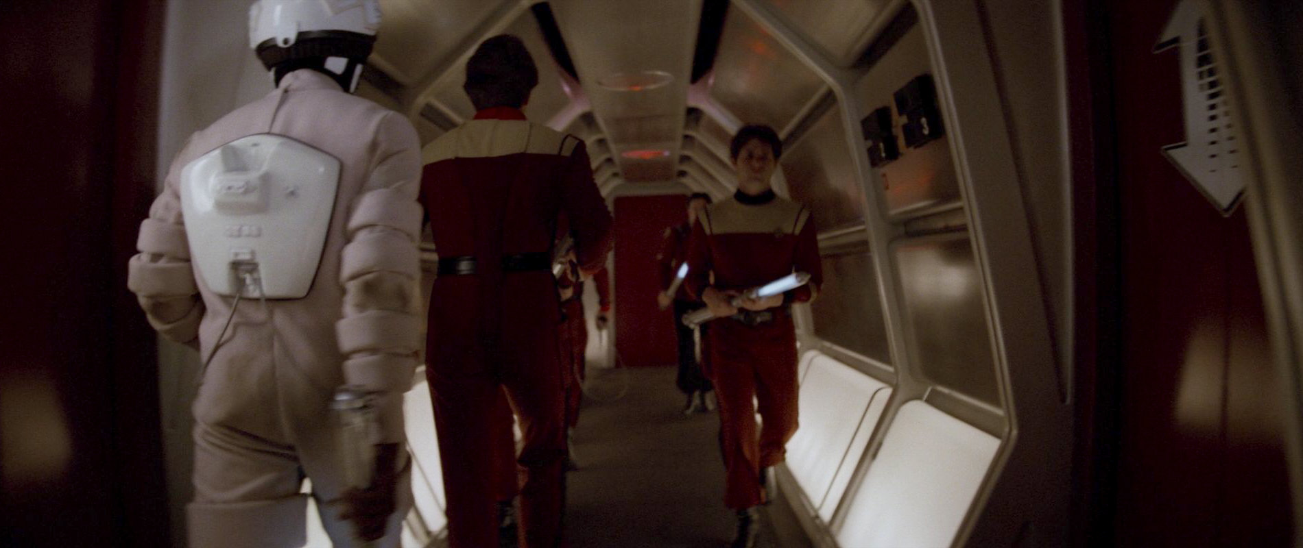
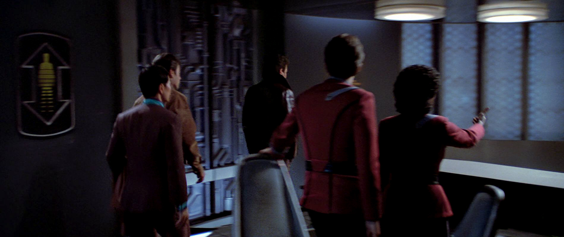
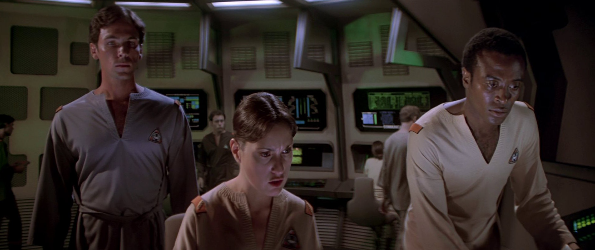
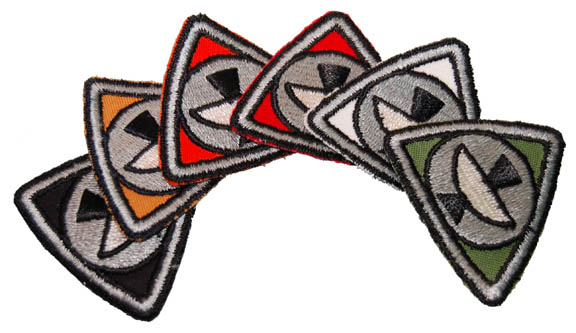
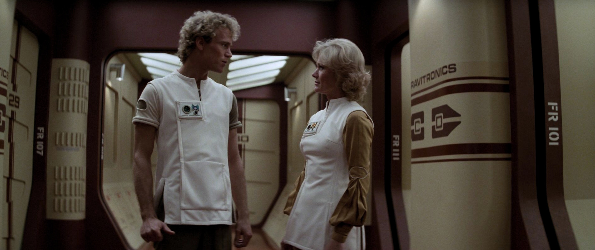
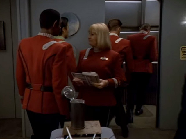
![]() Everybody immediately recognizes this pictogram from the away mission jackets first seen in "Star Trek II: The Wrath of Khan", but the logo was originally created for the first Star Trek film. As the name from the ST:TMP Peel-Off Graphics Book suggests, it is worn by some personnel at the Sky Tram Port. At the beginning of the scene set at Starfleet Headquarters, two officers wearing a brown uniform with the logo can be seen quickly walking out of frame on the left side of the screen. It's a Wrap! sold their costumes some years ago. As Kirk's air tram lands, another officer with a white uniform and the shoulder patch, wearing a headset, walks from right to left.
Everybody immediately recognizes this pictogram from the away mission jackets first seen in "Star Trek II: The Wrath of Khan", but the logo was originally created for the first Star Trek film. As the name from the ST:TMP Peel-Off Graphics Book suggests, it is worn by some personnel at the Sky Tram Port. At the beginning of the scene set at Starfleet Headquarters, two officers wearing a brown uniform with the logo can be seen quickly walking out of frame on the left side of the screen. It's a Wrap! sold their costumes some years ago. As Kirk's air tram lands, another officer with a white uniform and the shoulder patch, wearing a headset, walks from right to left.
As previously mentioned, in the second and third Star Trek films, the logo appears prominently as a shoulder patch on the away mission jacket.
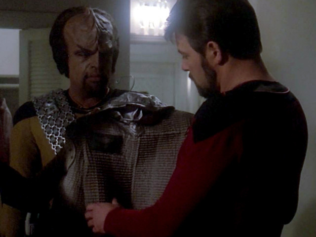
In "Star Trek III: The Search for Spock", the logo additionally appears as a shoulder patch on the waiters' uniforms in the Officers' Lounge. The Starfleet Security officers guarding Dr. McCoy also wear a metallic version of the logo on their hats.
The logo also shows up on the uniform of NASA astronaut Col. Richey in TNG: "The Royale". Though this appearance is anachronistic, it seems fitting for the mission of the Charybdis to traverse the Sol system.
It should be noted that in all cases, the color, appearance and arrangements of the sun and the planets as in the book do not match the actual patches and badges seen in the films. In all appearances of the shoulder patch that are actually visible on screen, the third planet (Earth) is blue, while all the other planets are gray.
Very similar costume patches with only eight planets, the fourth planet being blue, were sold by It's a Wrap. The listings state that security officers in the Federation Council scenes (in "Star Trek IV") wore these patches. It is really hard to make out but it is possible that one of these patches actually appears here.
04 Transporter systems
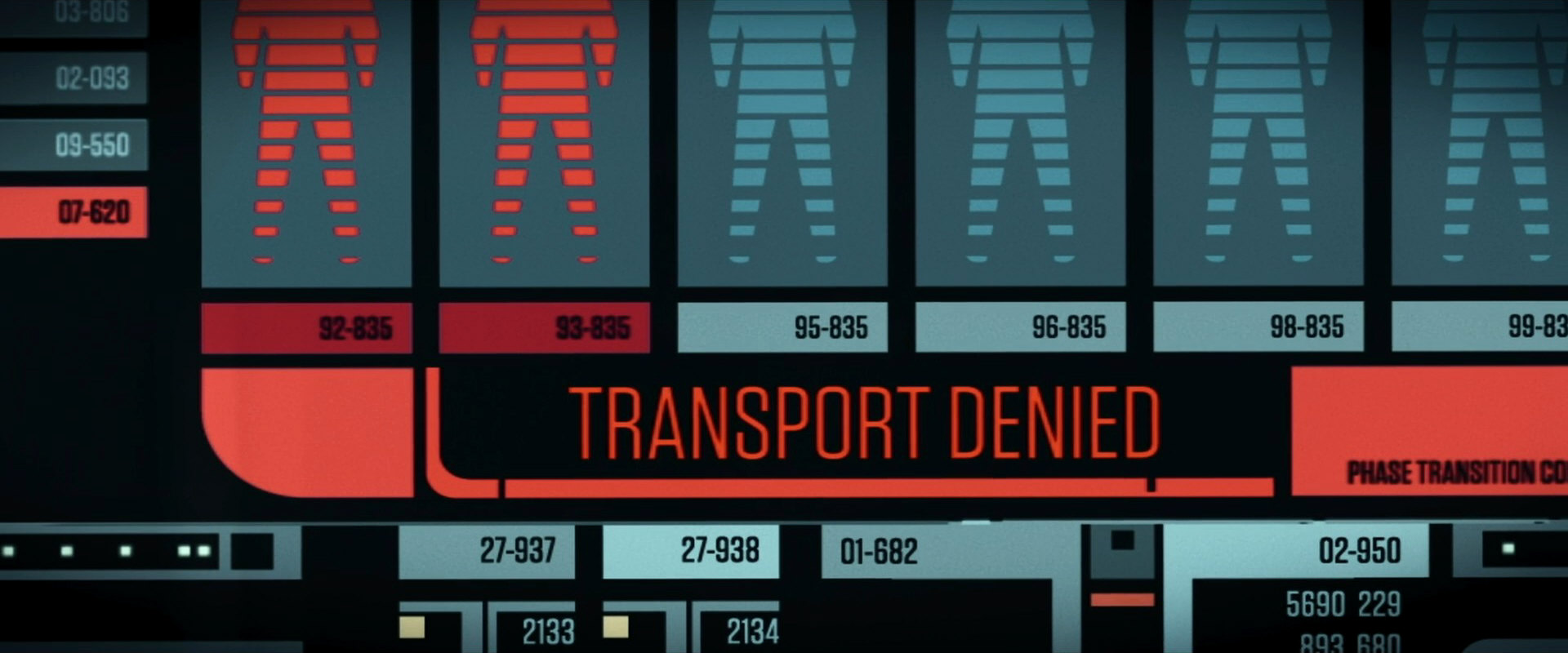
![]() This is one of a only a few pictograms in the book that are multicolored. It is the first of nine departmental logos in the book and on screen. It does not appear in the first Star Trek film but is seen ever so briefly on the transporter room door in "Star Trek II". Here, the logo is white with a black outline and figure at the center. Only the "arrow" part of the logo is actually printed on the door.
This is one of a only a few pictograms in the book that are multicolored. It is the first of nine departmental logos in the book and on screen. It does not appear in the first Star Trek film but is seen ever so briefly on the transporter room door in "Star Trek II". Here, the logo is white with a black outline and figure at the center. Only the "arrow" part of the logo is actually printed on the door.
In "Star Trek III: The Search for Spock", the logo appears as it does in the book. It is black, with a white outline and arrow and a yellow person at the center. It is seen in the Old City Station transporter room.
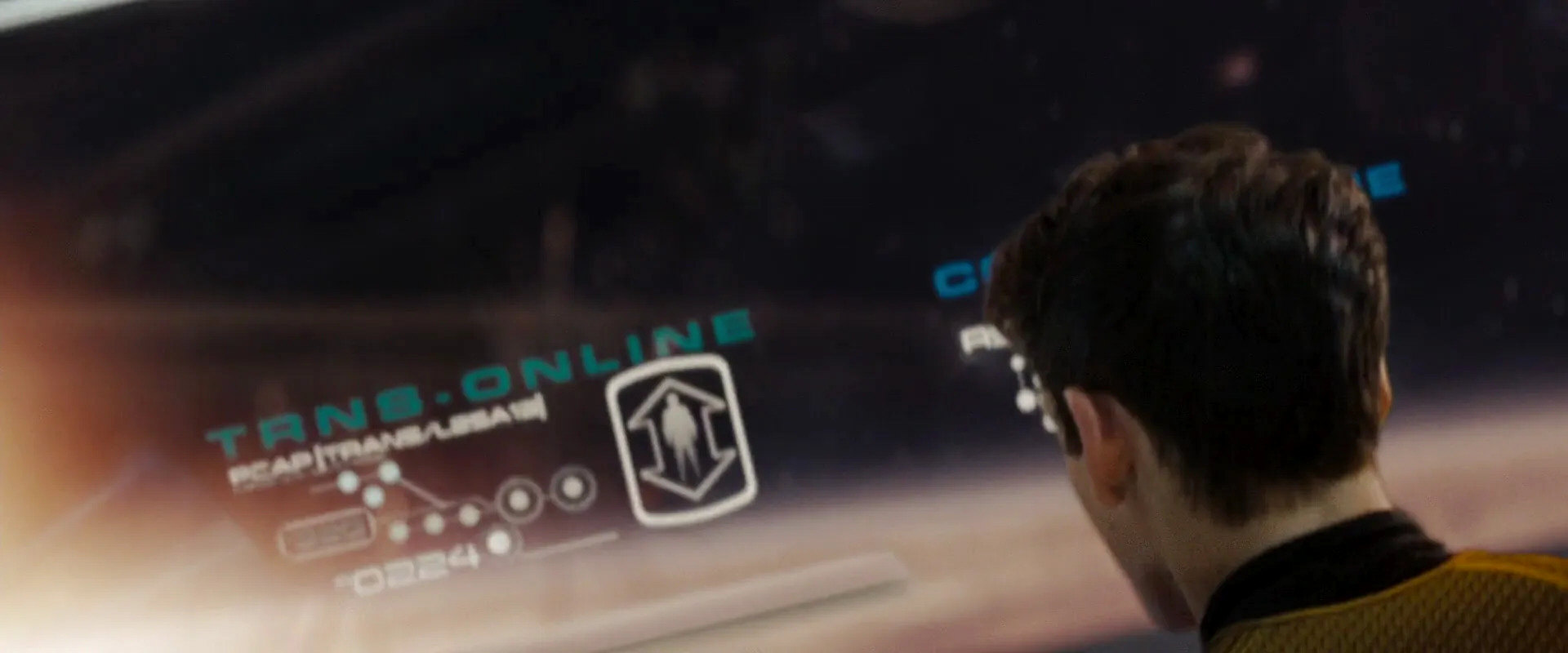
Many years later, a monochrome version of the logo shows up on Chekov's bridge console in "Star Trek: 2009" as he attempts to beam up the skydiving team.
A simplified pictogram with just the humanoid figure can be seen in the transporter room of the USS Titan-A in the third season of Picard.
This pictogram was designed by Rick Sternbach. When asked why this logo is one of a few bicolored ones in the book, he says:
"No idea. I really dealt with black and white ink art, and I only recall single colors of silkscreen printing or the ScotchCal metallic plates."
05 Epsilon Nine Starfleet Monitoring Base
![]() This logo appears in a modified form in "Star Trek: The Motion Picture" as a patch worn by the Epsilon Nine personnel. Countless color varieties of the patch, similar to the Starfleet arrowhead patch worn in the same film, were produced and later sold at auction.
This logo appears in a modified form in "Star Trek: The Motion Picture" as a patch worn by the Epsilon Nine personnel. Countless color varieties of the patch, similar to the Starfleet arrowhead patch worn in the same film, were produced and later sold at auction.

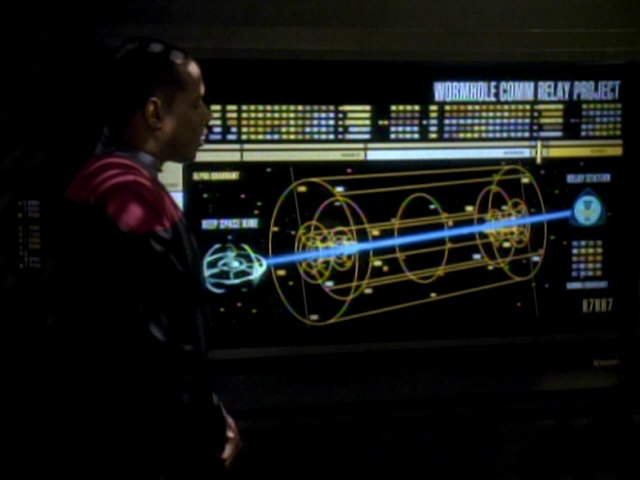
The logo, similar to as it appears in the book, was later seen twice on Star Trek series. It first appeared in DS9: "Destiny" as the logo for the Wormhole Comm Relay Project. It was later used again in VOY: "Author, Author" as the Pathfinder Project logo.
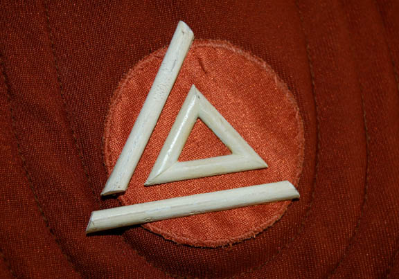
06 Damage/repair
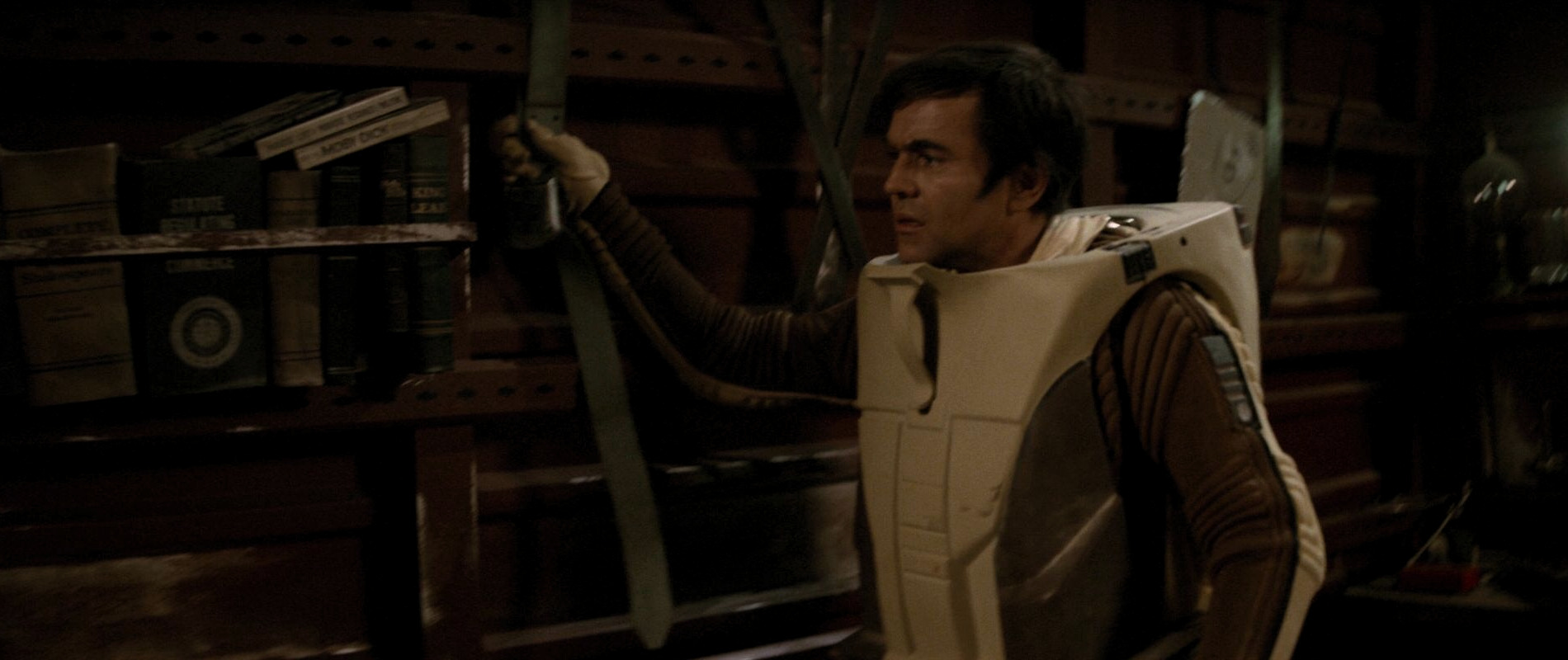
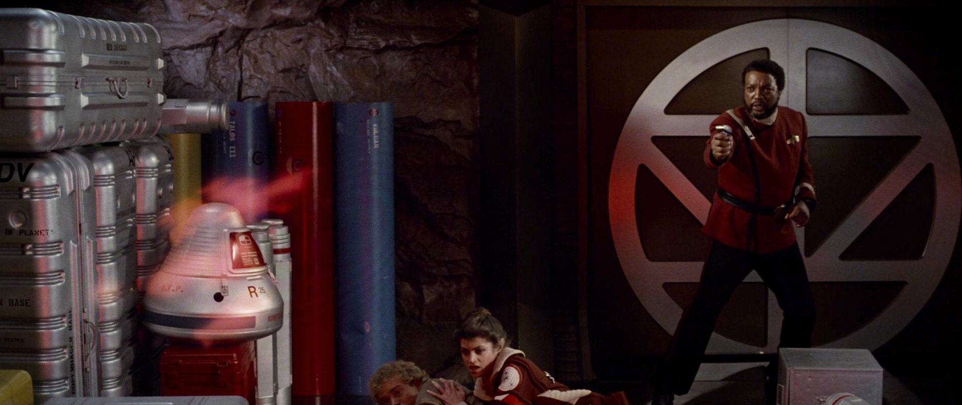
![]() This logo was really hard to find. It only appears in "Star Trek: The Motion Picture" during the air tram scene at Starfleet Headquarters. At least three officers are seen wearing a brown padded uniform with elaborate headgear. They are all shown holding a staff of some kind. A white triangle can barely be made out on the front of their uniforms, one of these was sold by It's a Wrap! some years ago. The white triangle can be identified as the Damage/Repair logo. On this uniform, it seems to consist of small pieces of wood. One of the sides of the triangle fell off over the years but it is indeed the logo from the book.
This logo was really hard to find. It only appears in "Star Trek: The Motion Picture" during the air tram scene at Starfleet Headquarters. At least three officers are seen wearing a brown padded uniform with elaborate headgear. They are all shown holding a staff of some kind. A white triangle can barely be made out on the front of their uniforms, one of these was sold by It's a Wrap! some years ago. The white triangle can be identified as the Damage/Repair logo. On this uniform, it seems to consist of small pieces of wood. One of the sides of the triangle fell off over the years but it is indeed the logo from the book.
 Like several other pictograms from the book, "Damage/repair" appears on Enterprise cargo crates in Strange New Worlds.
This logo was designed by Rick Sternbach. When asked what it depicts, he says:
"Don't recall. Maybe it was just a solid-looking tool shape."
07 Engineering
![]() One would expect this pictogram to show up much more in the Star Trek films (especially since there are many fan-made versions of it), but it is only seen ever so briefly in the second and third films.
One would expect this pictogram to show up much more in the Star Trek films (especially since there are many fan-made versions of it), but it is only seen ever so briefly in the second and third films.
As Kirk races to Engineering at the end of "Star Trek II: The Wrath of Khan" he runs past a door with the logo. The pictogram appears without the shield surrounding it and is colored white on orange. In "Star Trek III: The Search for Spock", it is one of several logos on the walls of the Officers' Lounge. Here it appears as it does in the book, only in blue instead of black.
Like several other pictograms from the book, "Engineering" appears on Enterprise cargo crates in Strange New Worlds. It is only recognizable in 4k in "Memento Mori", behind the railing, close to the centerline of the cargo bay.
This logo was designed by Rick Sternbach. When asked whether the engineering logo depicts a stylized warp core, Rick responded:
"Not specifically; it was meant to show high energy being confined and utilized."
08 Security
![]() This logo appears in two places in "Star Trek: The Motion Picture". It is displayed four times on the monitors of the security station, manned by a Rhaandarite ensign. The black logo usually appears on a white background but depending on the alert status of the ship, the background could also be yellow, orange or red.
This logo appears in two places in "Star Trek: The Motion Picture". It is displayed four times on the monitors of the security station, manned by a Rhaandarite ensign. The black logo usually appears on a white background but depending on the alert status of the ship, the background could also be yellow, orange or red.
The logo on a shield is briefly seen on the door opposite the transporter room as Kirk leaves after the death of Commander Sonak. In contrast to its depiction in the book, here it appears in black on a white background.
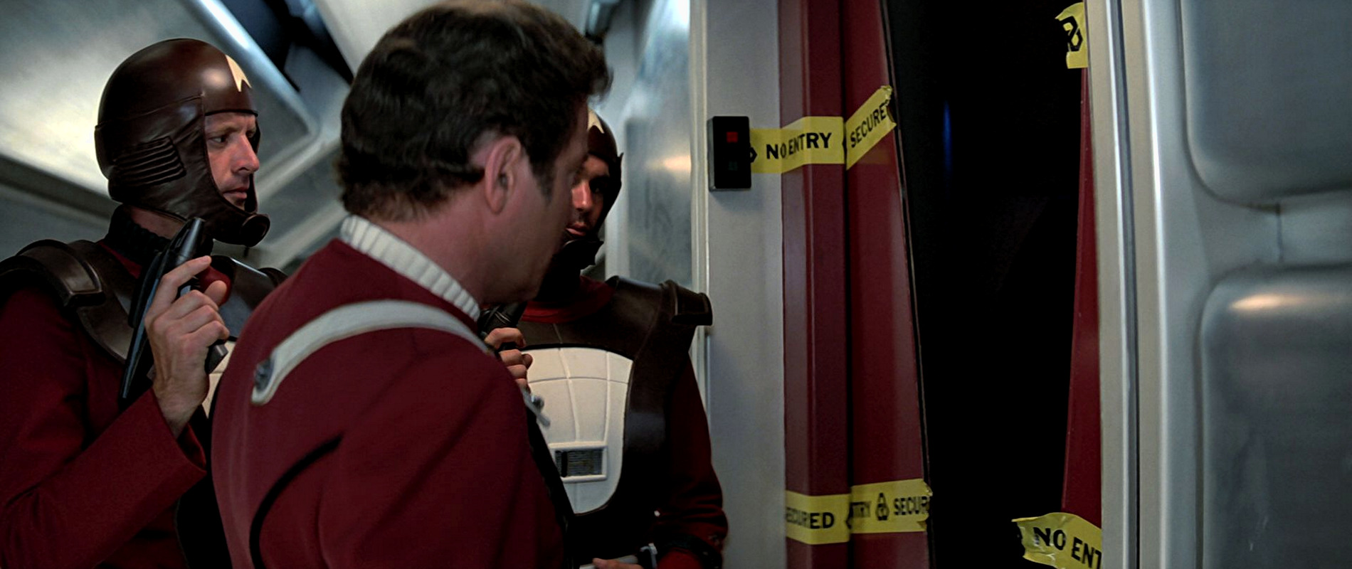
After it does not appear in the second Star Trek film, it is seen twice in "Star Trek III: The Search for Spock". Here it is visible on the yellow no entry tape preventing access to Spock's quarters. The logo also appears on a blue shield in the Officers' Lounge.
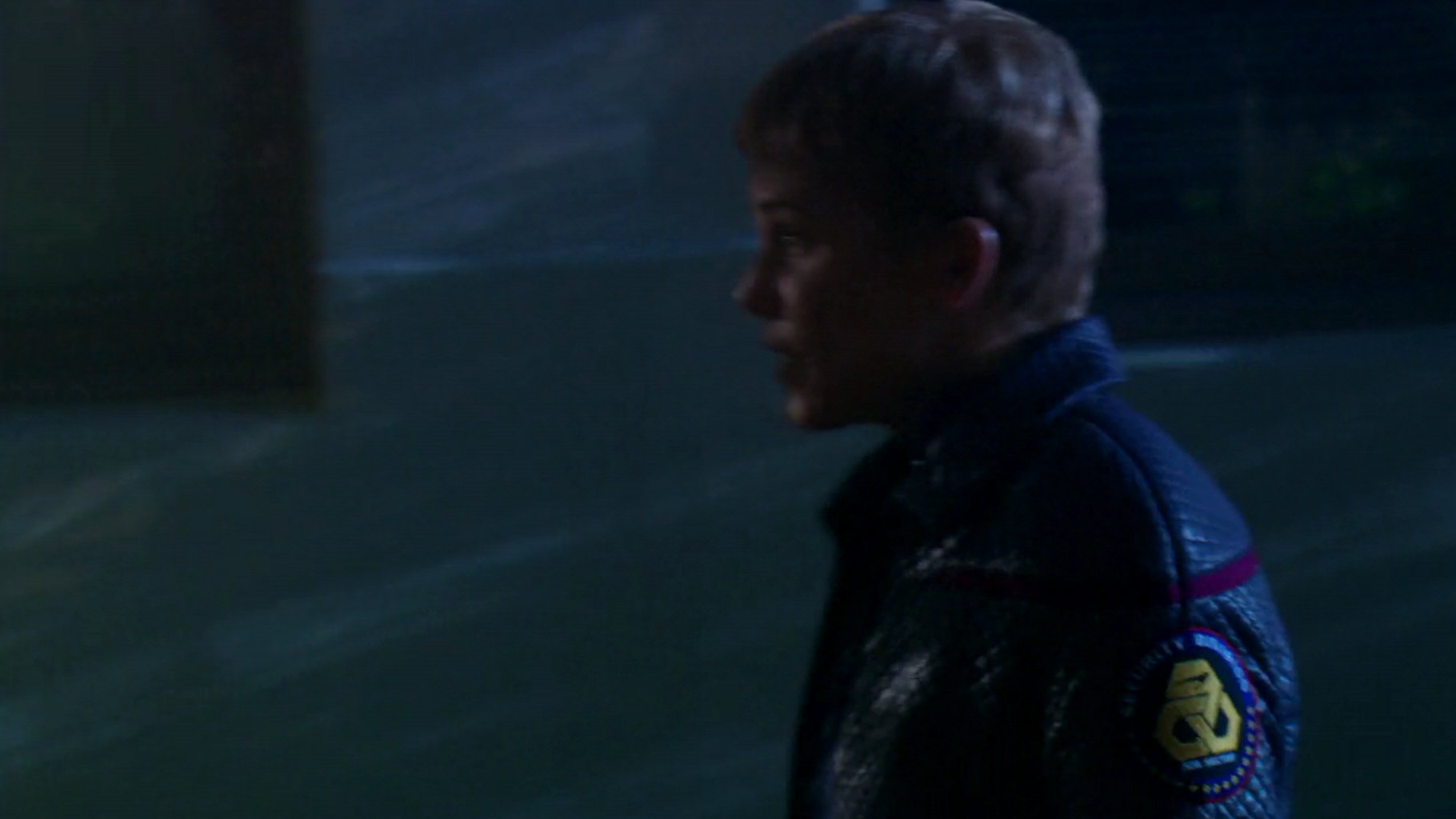
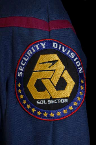
Many years later, the logo was used as the basis for the Security Division Sol Sector shoulder patch in "Affliction".
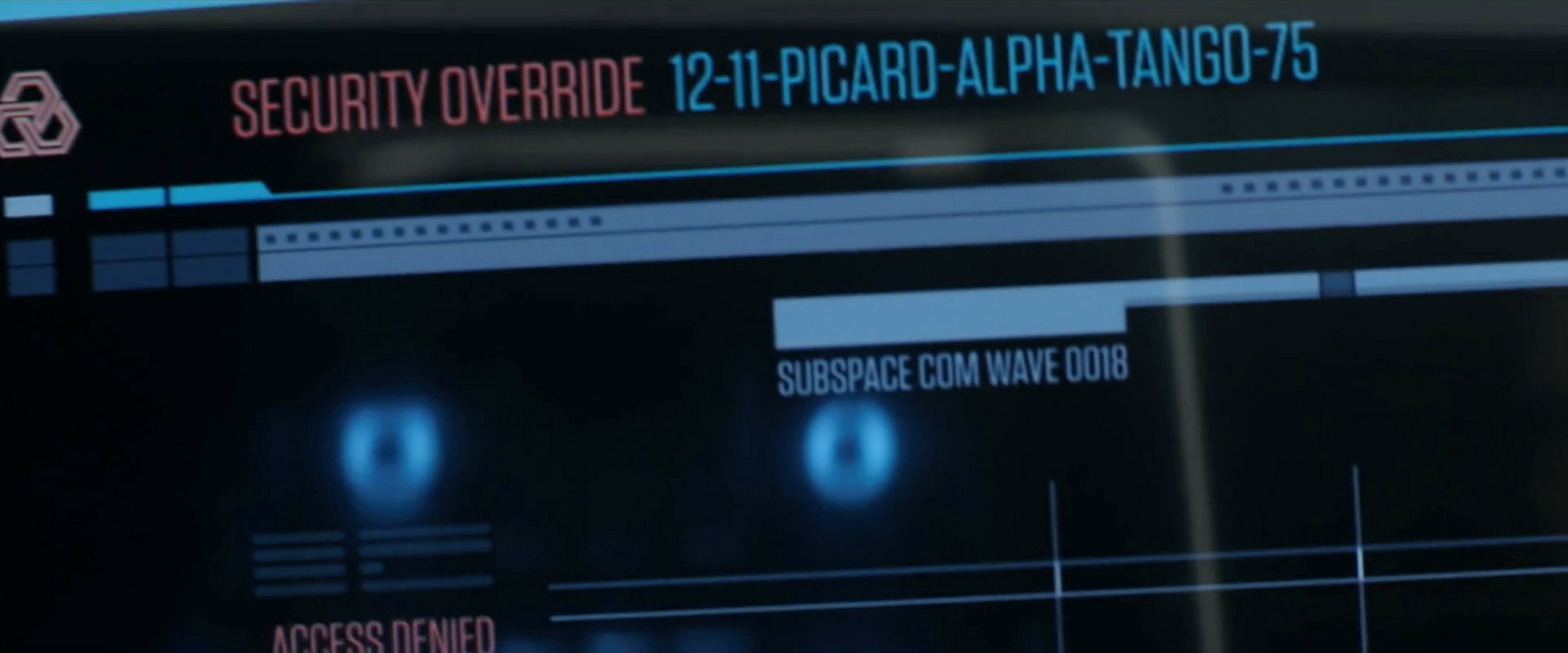
Still two decades later, the slightly modified original pictogram shows up on a display in PIC: "Surrender", after Jack has telepathically contacted Lt. Mura on the bridge to enter the security override codex.
This logo was originally designed by Rick Sternbach. We think that it looks like interlocking chains or handcuffs. Rick says:
"Sorry, don't recall specifics. Most of these were meant to convey a simple visual point, and that might have been exactly the point we were going for. :)"
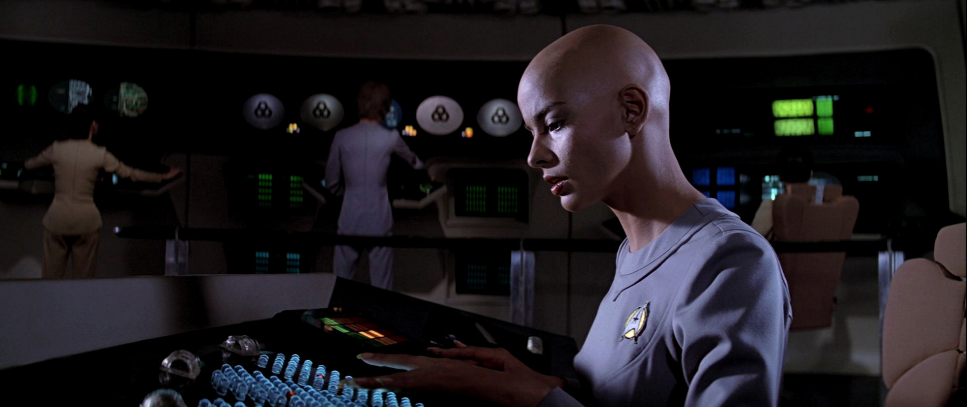
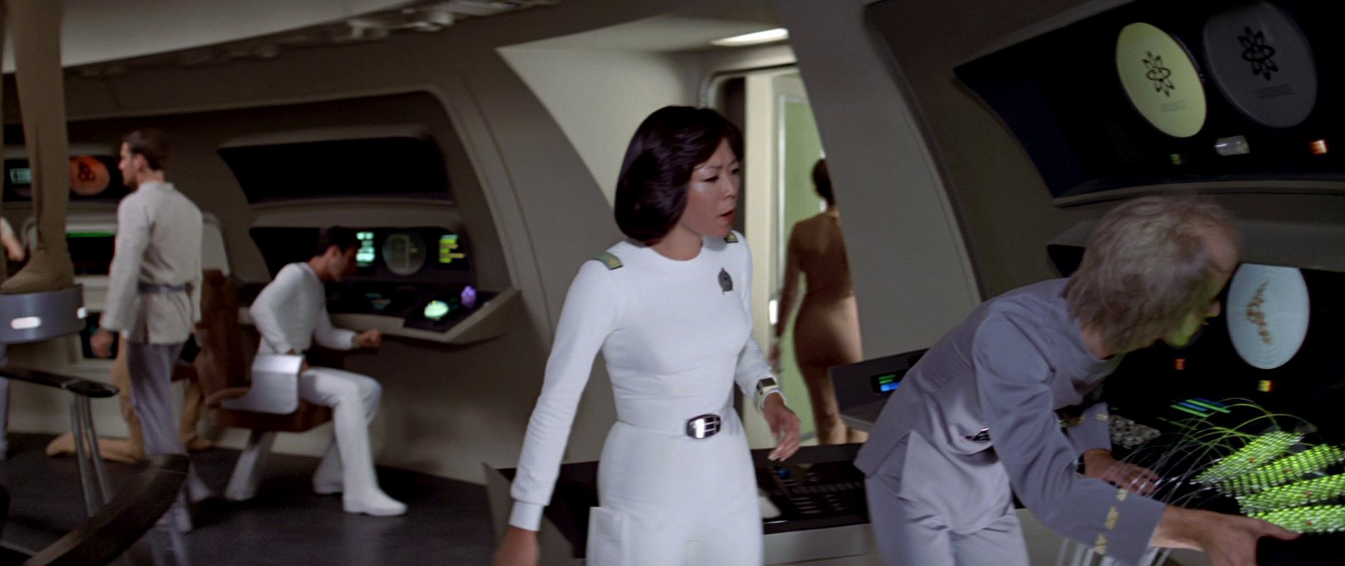
09 Science
![]() The pictogram for the Science division is only seen twice in all of the Star Trek films. It appears on two monitors of the science station very early in "Star Trek: The Motion Picture". In contrast to the Communications or Security logos, seen on bridge monitors several times over the course of the film, the Science logo only appears in this one scene as Kirk enters the bridge.
The pictogram for the Science division is only seen twice in all of the Star Trek films. It appears on two monitors of the science station very early in "Star Trek: The Motion Picture". In contrast to the Communications or Security logos, seen on bridge monitors several times over the course of the film, the Science logo only appears in this one scene as Kirk enters the bridge.
It shows up only once more, in the third Star Trek film in the Officers' Lounge. Here, it is seen on a blue shield, along with other logos of the same style.
 It took the pictogram more than 40 years to appear again, on a display on Relay Station CR-721 in PRO: "Asylum". It is used to represent to Rok-Tahk the "currently 196 branches of science" that exist according to the station's computer.
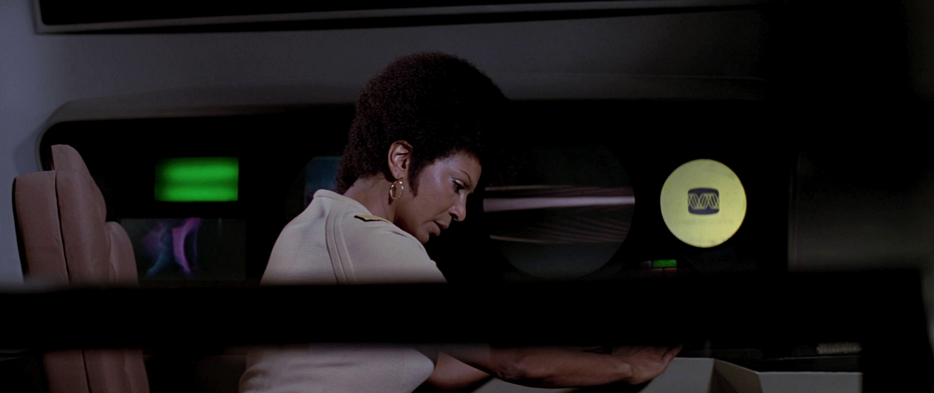
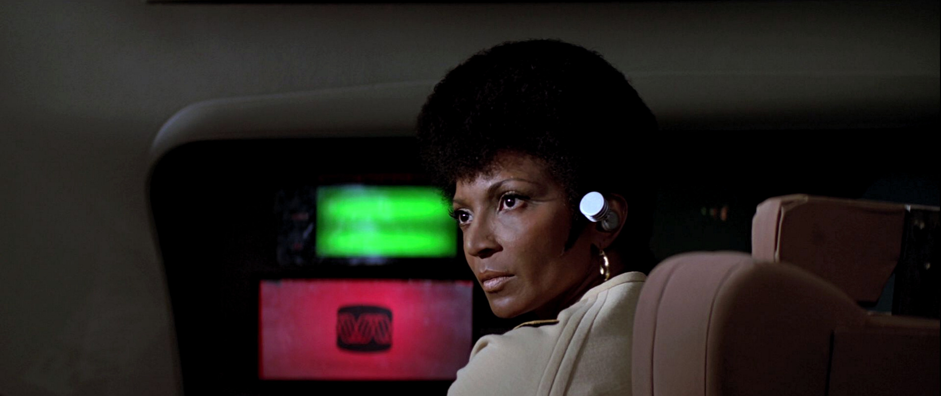
10 Communication
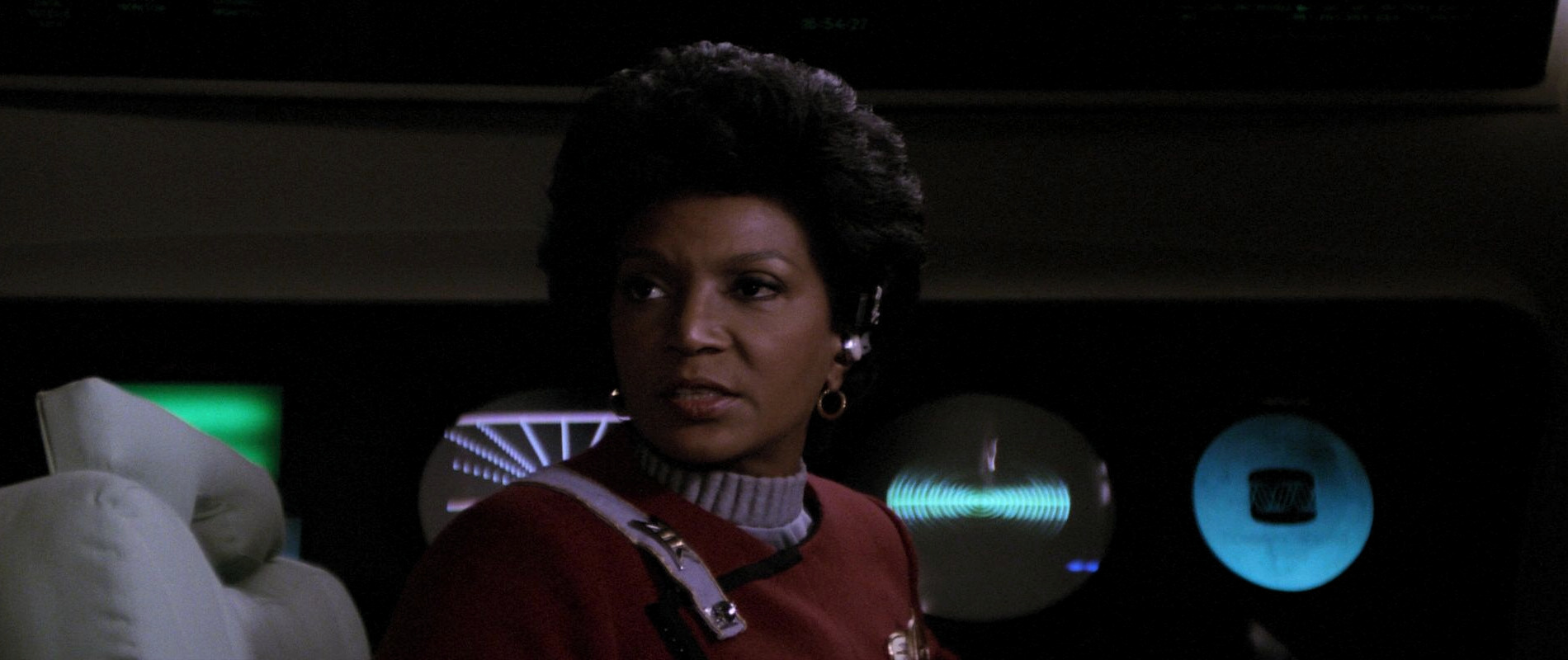
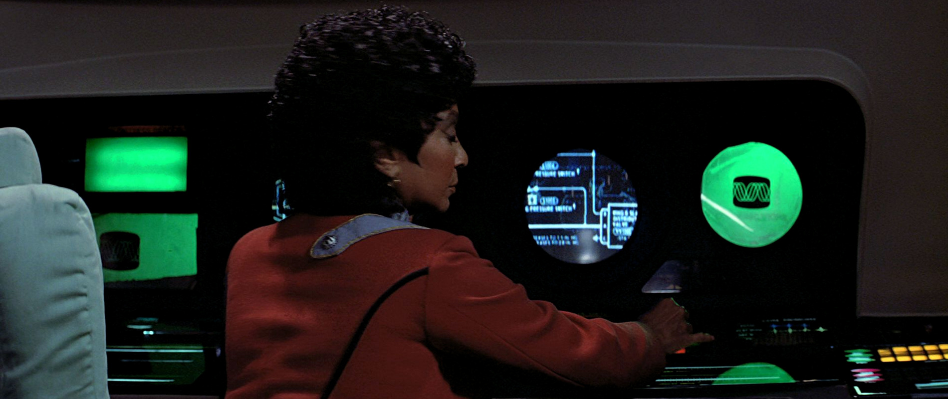
![]() The logo for the Communication division is the one that appears most often in bridge scenes in the first Star Trek films. It is visible whenever Uhura is seen working at her station. The color of the logo changes several times, depending on the alert status of the ship. It appears on two monitors of the communication stations of the USS Enterprise in the first three Star Trek films and also on the bridges of the USS Reliant in "Star Trek II" and USS Grissom in "Star Trek III".
The logo for the Communication division is the one that appears most often in bridge scenes in the first Star Trek films. It is visible whenever Uhura is seen working at her station. The color of the logo changes several times, depending on the alert status of the ship. It appears on two monitors of the communication stations of the USS Enterprise in the first three Star Trek films and also on the bridges of the USS Reliant in "Star Trek II" and USS Grissom in "Star Trek III".
The pictogram is also seen on a blue shield, way out of focus, in the Officers' Lounge in "Star Trek III: The Search for Spock".
Like several other pictograms from the book, "Communication" appears on Enterprise cargo crates in Strange New Worlds.
We can also repeatedly see the logo in the third season of Star Trek Picard, now without the stylized "CRT screen" and with differently arranged sine waveforms.
11 Environmental systems
![]() This departmental logo appears only once, in the Officers' Lounge in "Star Trek III: The Search for Spock".
This departmental logo appears only once, in the Officers' Lounge in "Star Trek III: The Search for Spock".
The logo was designed by Rick Sternbach. He tells us:
"I think the Environmental logo was based on chemical bond diagrams."
12 Weapons/defense
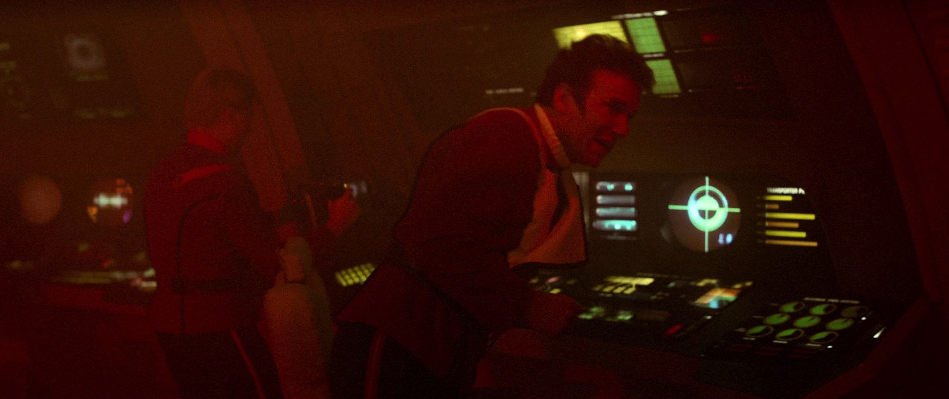
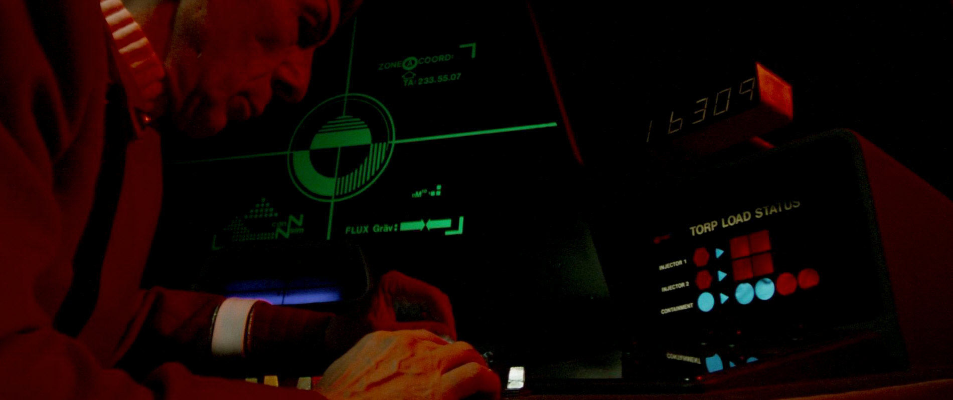
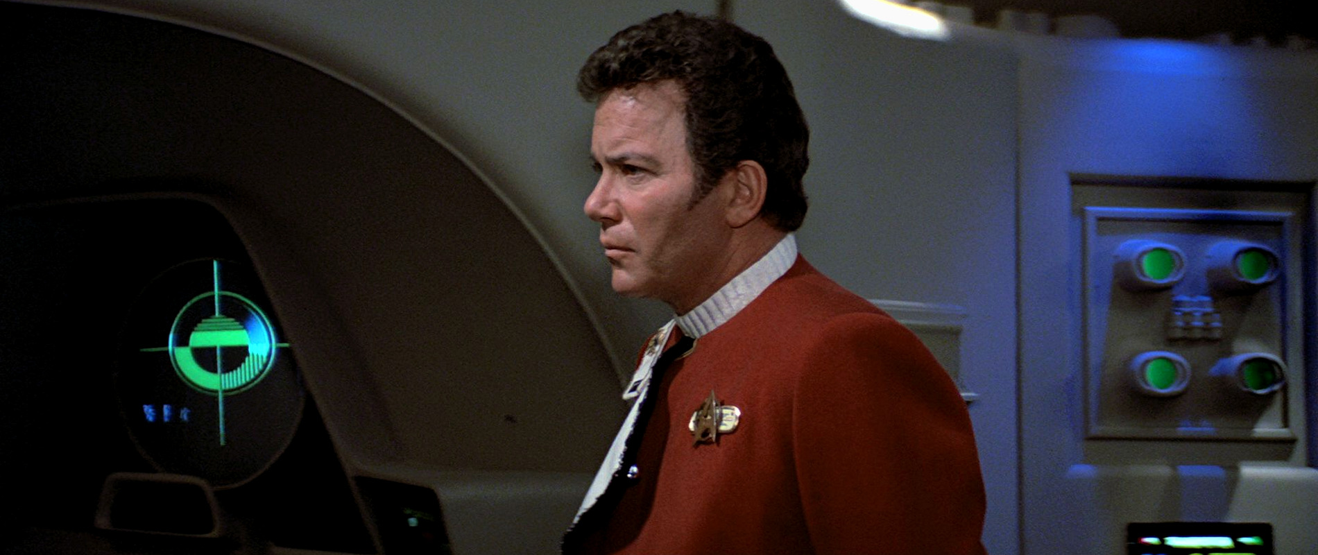
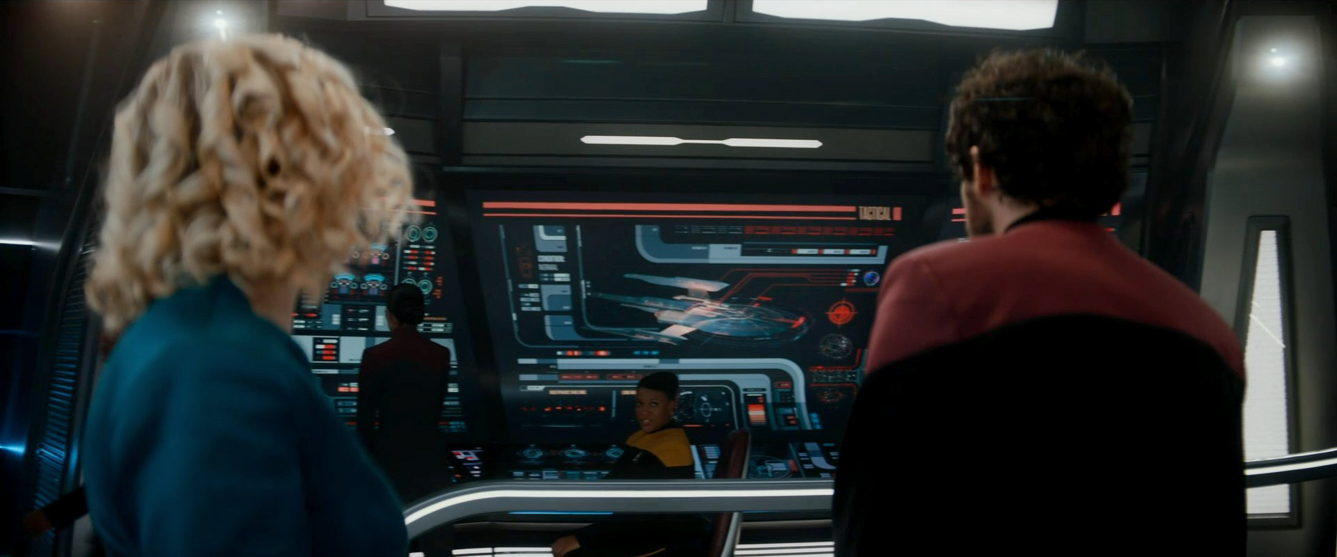
![]() This logo can be seen in the first three Star Trek films on the large master monitor of the tactical station. Sometimes it shows up as a translight, sometimes on a display monitor. It also appears at the tactical station of the USS Reliant and on several other bridge monitors of the USS Enterprise when it is battling the USS Reliant in "Star Trek II: The Wrath of Khan". Like several other logos from the Peel-Off Graphics Book, it also appears on a blue shield in the Officers' Lounge in "Star Trek III".
This logo can be seen in the first three Star Trek films on the large master monitor of the tactical station. Sometimes it shows up as a translight, sometimes on a display monitor. It also appears at the tactical station of the USS Reliant and on several other bridge monitors of the USS Enterprise when it is battling the USS Reliant in "Star Trek II: The Wrath of Khan". Like several other logos from the Peel-Off Graphics Book, it also appears on a blue shield in the Officers' Lounge in "Star Trek III".
Decades later, a slight variation of the emblem can be seen on a bridge display of the USS Stargazer in PIC: "The Star Gazer".
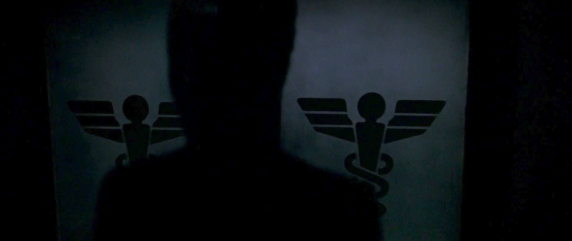
13 Medical
![]() As the Starfleet Medical logo, designed by Rick Sternbach, appeared in all the later Star Trek TV series, it will only be dealt with here briefly as the logo has its own article.
As the Starfleet Medical logo, designed by Rick Sternbach, appeared in all the later Star Trek TV series, it will only be dealt with here briefly as the logo has its own article.
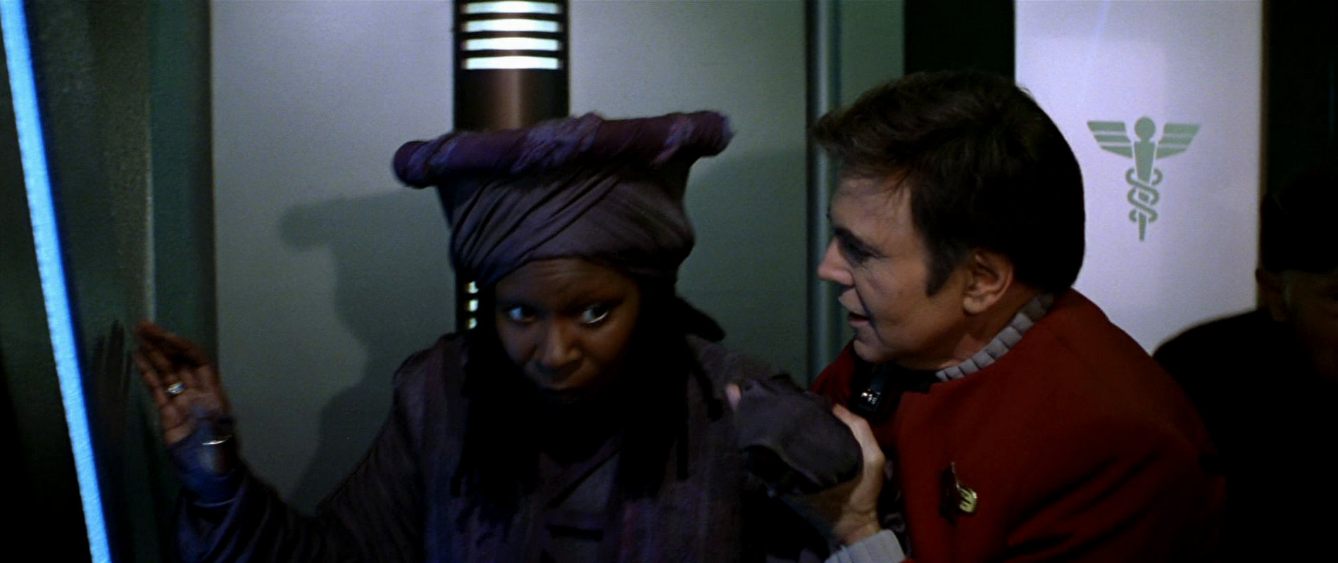
It is only seen as a uniform patch worn by Dr. McCoy and Dr. Chapel in "Star Trek: The Motion Picture". In "Star Trek II: The Wrath of Khan", the logo can be briefly spotted on a door Kirk, Spock and Saavik run past. Like the Transporter and Engineering logos, also seen on doors, it appears on its own here and not on a shield as in the book. In "Star Trek III: The Search for Spock" it is one of several logos on a blue shield in the Officers' Lounge.
The logo does not appear in "Star Trek IV" or "Star Trek V" but on Dr. McCoy's medical pouch he takes to the Klingon battlecruiser to treat the dying Chancellor Gorkon in "Star Trek VI". It is also seen on the sickbay doors of the USS Enterprise-A. In "Star Trek: Generations" we can also see it on sickbay doors and wall monitors.
See The Evolution of the Starfleet Medical Emblem for all appearances of the logo in the 24th century series and in the latest Trek shows.
In conclusion, it can be said that all nine departmental logos depicted in the book are actually seen on screen in some way or another.
14 Chief Navigator Ilia
![]() The ST:TMP Peel-Off Graphics Book features four officer's quarters door insignias, one for Chief navigator Ilia's quarters, one for the jr. engineering officer's quarters, one for Captain James T. Kirk's quarters and one for Executive Science Officer Spock's quarters.
The ST:TMP Peel-Off Graphics Book features four officer's quarters door insignias, one for Chief navigator Ilia's quarters, one for the jr. engineering officer's quarters, one for Captain James T. Kirk's quarters and one for Executive Science Officer Spock's quarters.
Only the insignia for Ilia's quarters is shown in the movie, it appears for a few frames when she enters her quarters after having talked to Commander Decker in an Enterprise corridor.
15 Circuitry cartridge
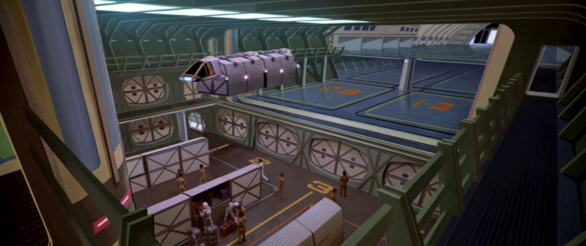
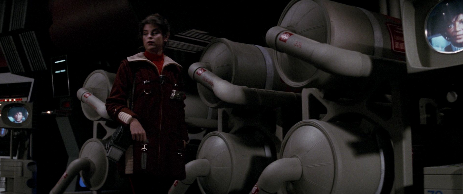
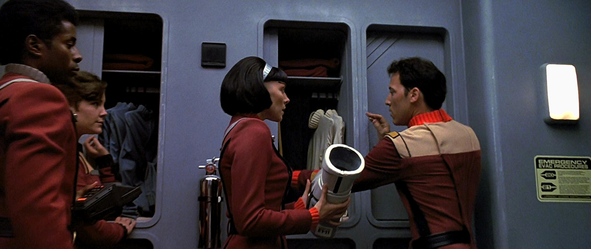
![]() The next four pictograms in the book are described as cargo labels. In "Star Trek: The Motion Picture" they are seen on cargo containers in the cargo bay. In the film, the logos cannot be clearly made out however. In "Star Trek II: The Wrath of Khan", one of the labels, the one for circuitry cartridges, also shows up in the USS Enterprise's torpedo bay and main engineering. In the book, the label appears yellow, here it is always depicted in red. If one looks really closely at the labels in the first Star Trek feature film, one can also barely make out the characteristic rectangular cartridge logo. Said logo also appears on its own on the Regula I station as a sticker on a large piece of equipment.
The next four pictograms in the book are described as cargo labels. In "Star Trek: The Motion Picture" they are seen on cargo containers in the cargo bay. In the film, the logos cannot be clearly made out however. In "Star Trek II: The Wrath of Khan", one of the labels, the one for circuitry cartridges, also shows up in the USS Enterprise's torpedo bay and main engineering. In the book, the label appears yellow, here it is always depicted in red. If one looks really closely at the labels in the first Star Trek feature film, one can also barely make out the characteristic rectangular cartridge logo. Said logo also appears on its own on the Regula I station as a sticker on a large piece of equipment.
All the cargo labels and each of their components were designed by Rick Sternbach.
16 Cargo hold locator
![]() The logo representing cargo containers is part of all four cargo labels in the book. Thus, it also appears in the cargo bay scene in the first Star Trek film. As can be seen, the four-part cargo containers in the USS Enterprise's cargo bay match the design of the logo.
The logo representing cargo containers is part of all four cargo labels in the book. Thus, it also appears in the cargo bay scene in the first Star Trek film. As can be seen, the four-part cargo containers in the USS Enterprise's cargo bay match the design of the logo.
The logo appears much more visibly in "Star Trek II: The Wrath of Khan", where it appears on several cargo crates in the artificially created corridors leading to the Genesis caves.
Like several other pictograms from the book, "Cargo hold locator" can be seen on cargo crates aboard the Enterprise in Strange New Worlds.
17 Test point
![]() The test point is also part of the general cargo label. It appears on separate stickers on a large piece of equipment on the Regula I space station. When asked whether the test point is the location where you point a scanner or tricorder to get information about what is located in the cargo crate, Rick Sternbach confirmed this.
The test point is also part of the general cargo label. It appears on separate stickers on a large piece of equipment on the Regula I space station. When asked whether the test point is the location where you point a scanner or tricorder to get information about what is located in the cargo crate, Rick Sternbach confirmed this.
Like several other pictograms from the book, "Test point" appears on many cargo crates aboard the Enterprise in Strange New Worlds.
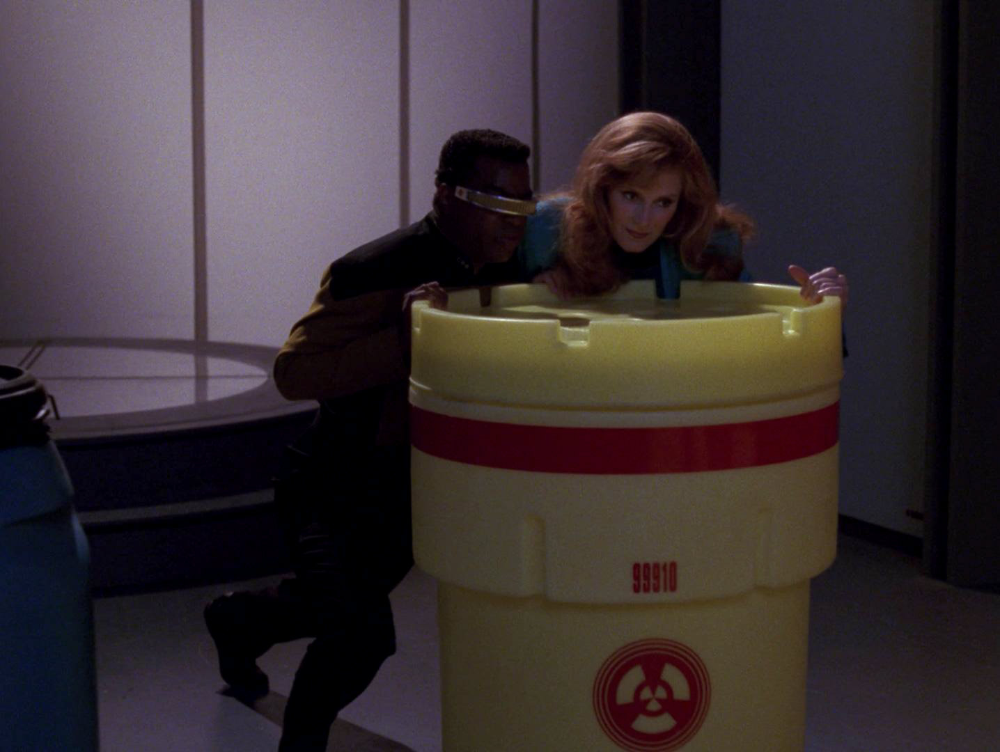
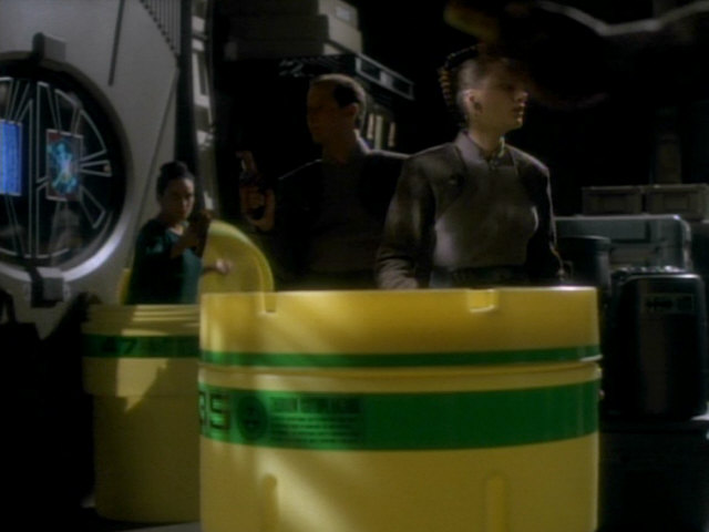
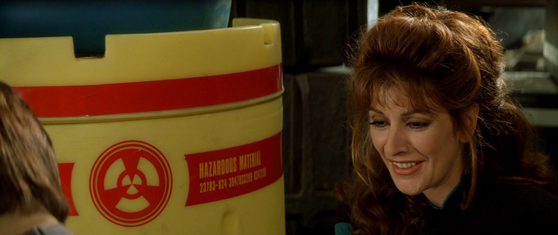
18 Perishable cultures cryogenic storage
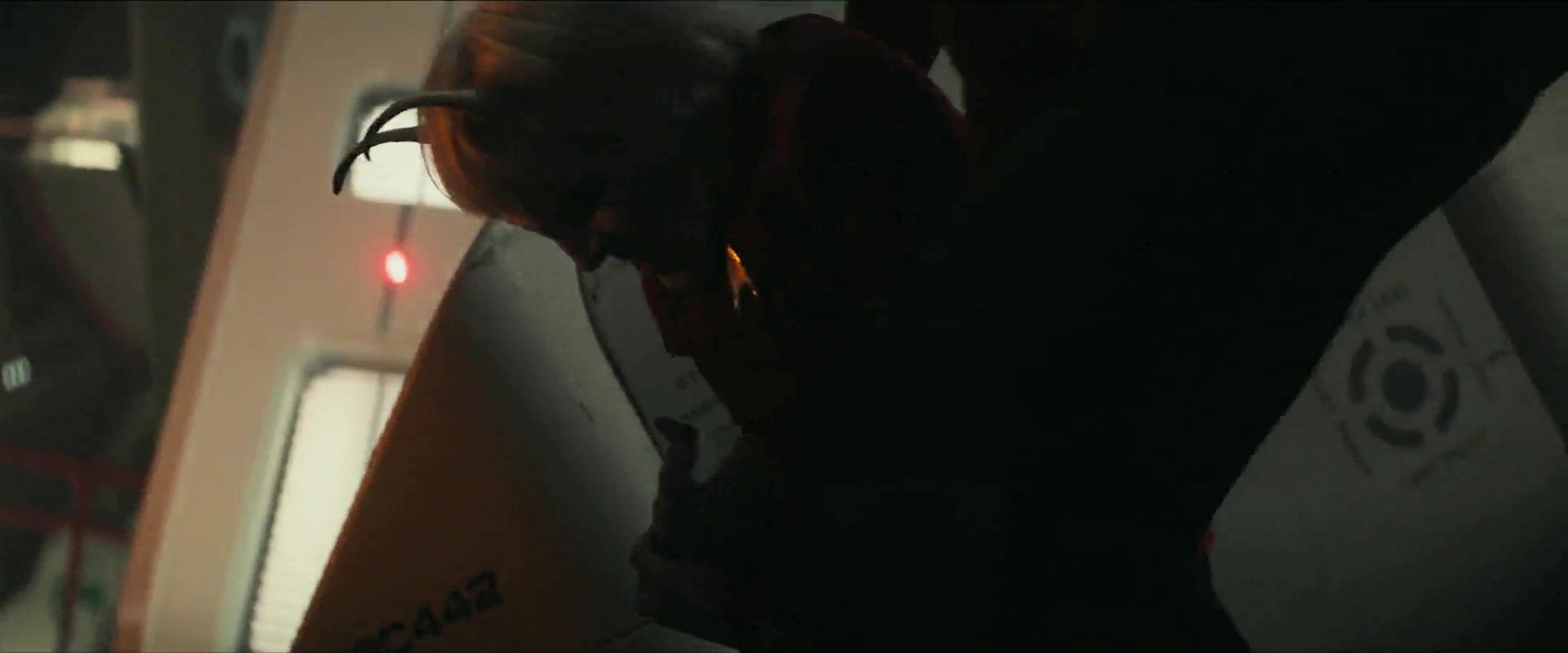
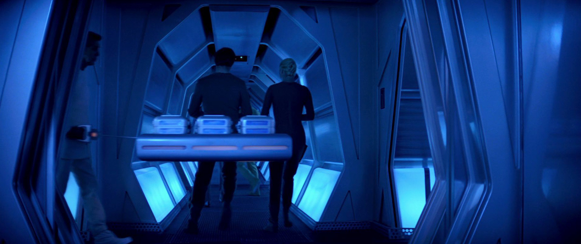
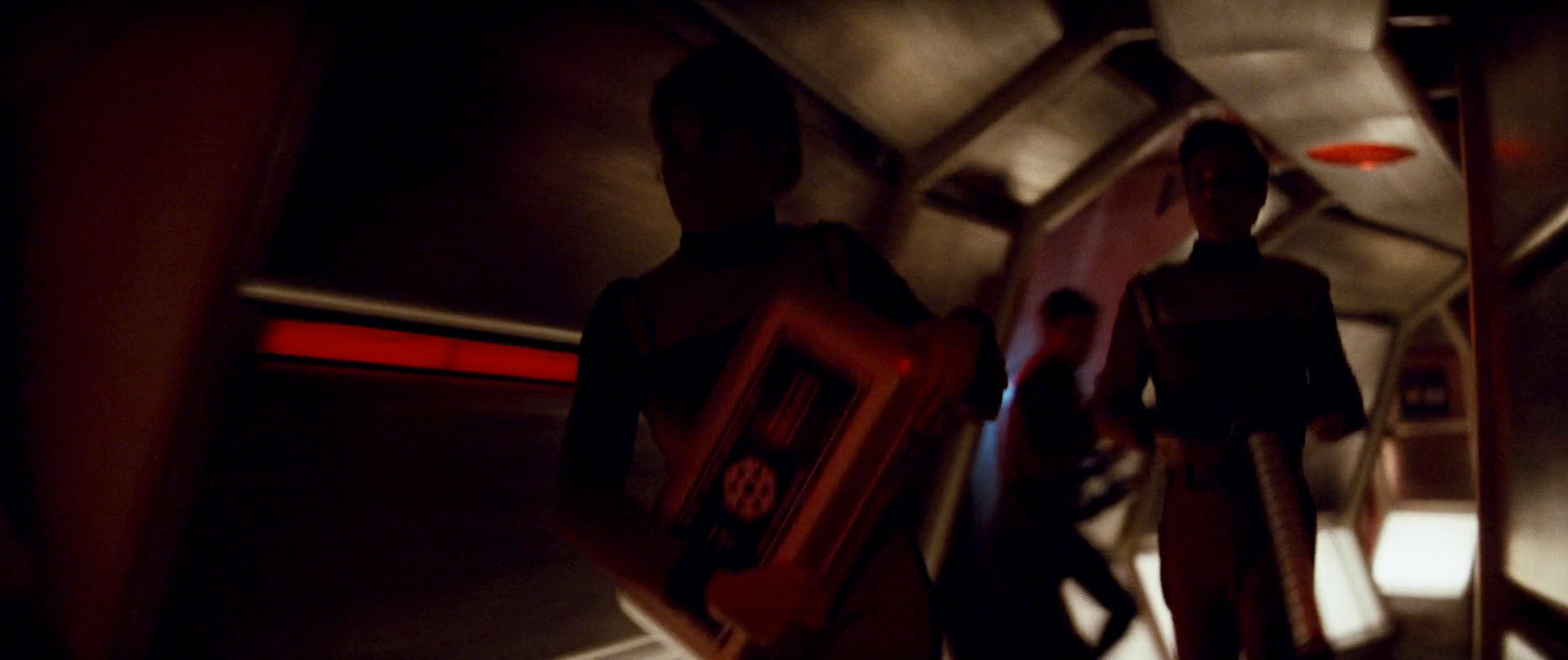
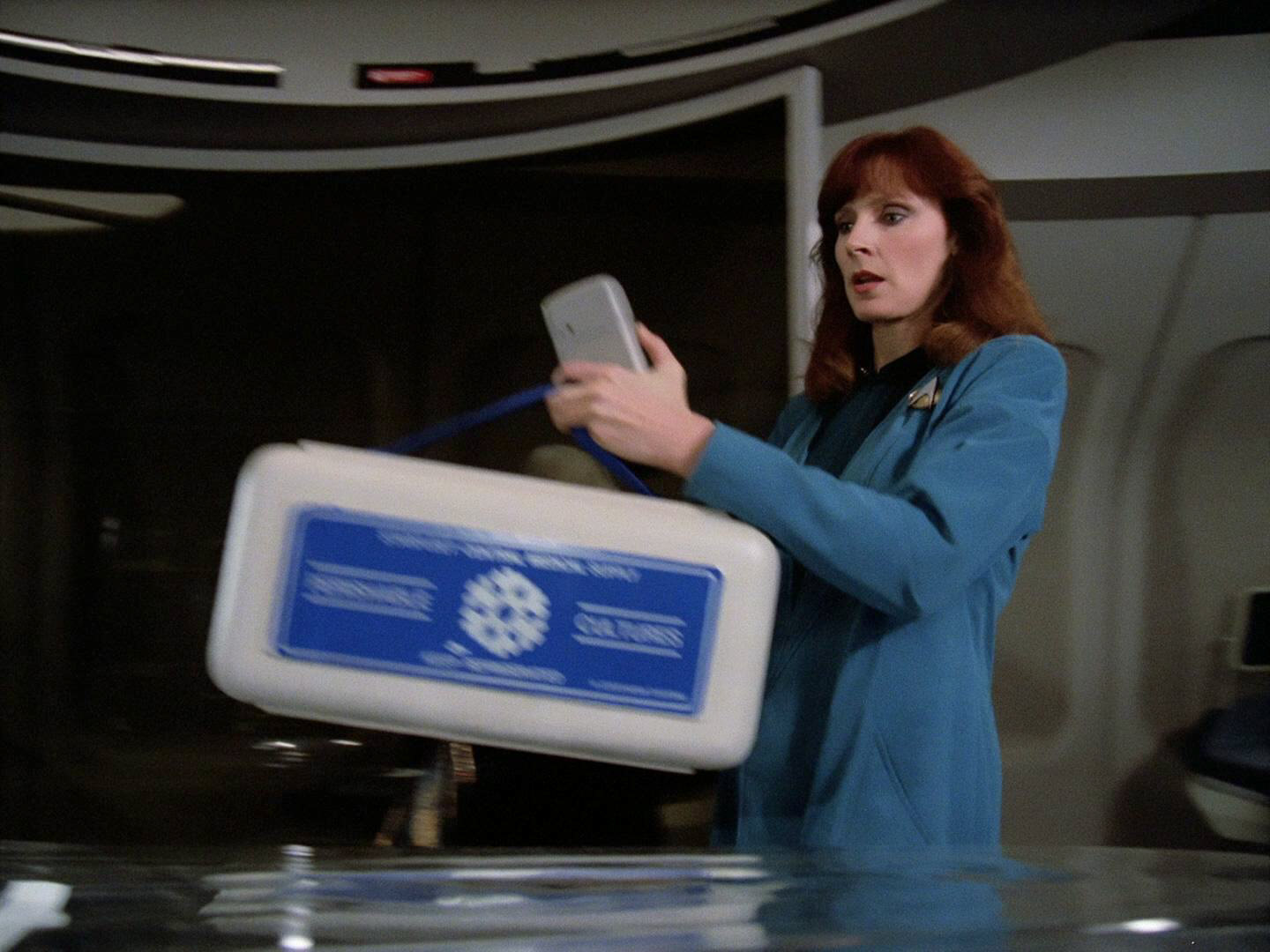
![]() The next label featuring a logo from the book that is actually seen on Star Trek is the one for perishable cultures. It includes the logo for cryogenic storage. The label shows up on large storage boxes. While the label is not visible in "Star Trek: The Motion Picture", several of the boxes are seen on an anti-grav sled in the corridor close to engineering early in the film. In "Star Trek II: The Wrath of Khan", a crew member is seen running through a corridor with one of the boxes. The label and cryogenic storage logo can clearly be seen in this brief shot.
The next label featuring a logo from the book that is actually seen on Star Trek is the one for perishable cultures. It includes the logo for cryogenic storage. The label shows up on large storage boxes. While the label is not visible in "Star Trek: The Motion Picture", several of the boxes are seen on an anti-grav sled in the corridor close to engineering early in the film. In "Star Trek II: The Wrath of Khan", a crew member is seen running through a corridor with one of the boxes. The label and cryogenic storage logo can clearly be seen in this brief shot.
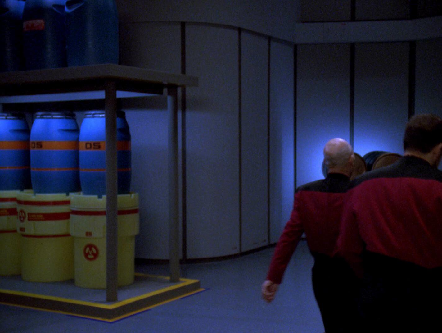
The boxes got much more screen time on TNG where they usually appeared under a shelf in sickbay. Dr. Crusher carries one of the boxes in "Encounter at Farpoint" where the label gets the most exposure. At some point in TNG season 6 between "Aquiel" and "Starship Mine", the boxes were relabeled and no longer feature the original warning label from "Star Trek: The Motion Picture" but a more generic blue label featuring the Starfleet Medical logo. One of the boxes is also seen on DS9 in "The Way of the Warrior", here still with the original logo.
Many years later, the pictogram shows up on containers on La Sirena in PIC: "The Star Gazer". It is hard to make out, but it looks like the complete "Perishable cultures" sticker with the central pictogram and the surrounding blue text field (as on Beverly's box in early TNG) later appears in the sickbay of the USS Titan-A in Picard's third season.
Like several other pictograms from the book, "Perishable cultures cryogenic storage" appears on cargo crates aboard the Enterprise in Strange New Worlds. This one is very prominent in "Memento Mori". We can see that the original pictogram was slightly modified.
The label was designed by Rick Sternbach.
19 Light cube tables
![]() The book next features three recreation deck graphics. Of those three, only one is actually seen in the rec deck scene in "Star Trek: The Motion Picture". It's the logo for the light cube tables. The label is visible as Kirk enters the rec deck for the briefing on V'ger. The directional pointer appears slightly different from the way it does in the book and the logo is mirrored. The light cube tables are briefly seen later in the film when Decker and the Ilia probe play with them.
The book next features three recreation deck graphics. Of those three, only one is actually seen in the rec deck scene in "Star Trek: The Motion Picture". It's the logo for the light cube tables. The label is visible as Kirk enters the rec deck for the briefing on V'ger. The directional pointer appears slightly different from the way it does in the book and the logo is mirrored. The light cube tables are briefly seen later in the film when Decker and the Ilia probe play with them.
The logo was designed by Rick Sternbach.
20 Directional pointer
Directional pointers with a logo inside show up on the rec deck in "Star Trek: the Motion Picture", as can be seen in the entry about the light cube tables.
A pointer with a number inside is visible next to the airlocks logo when Spock arrives aboard the ship early in the first film. Beginning in "Star Trek II: The Wrath of Khan", the pointers are also seen with numbers (aboard the USS Enterprise) and letters (the Regula I station) inside and as simple pointers without anything inside (in corridors and sickbay aboard the USS Enterprise). These pointers make a reappearance in "Star Trek VI: The Undiscovered Country" were they are seen on several labels. A similar label but without a number inside the pointer, is also seen in the crew quarters aboard the USS Excelsior in "Flashback".
The logo was designed by Rick Sternbach.
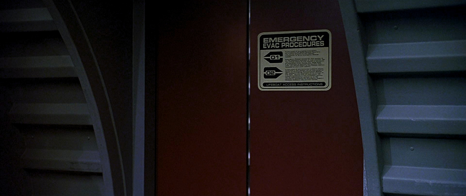
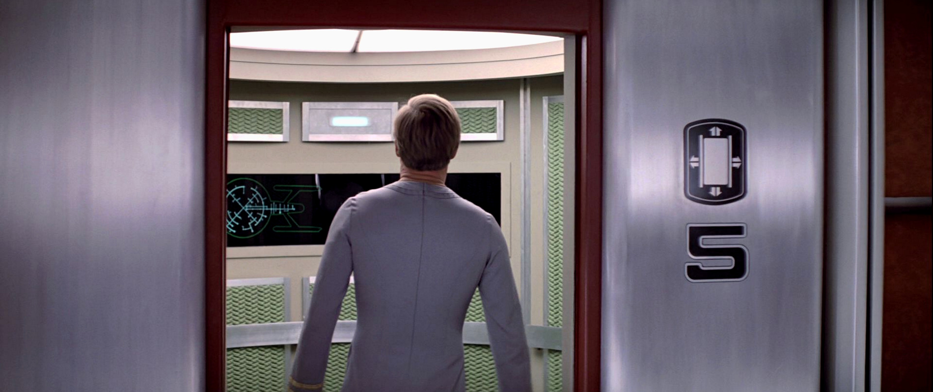
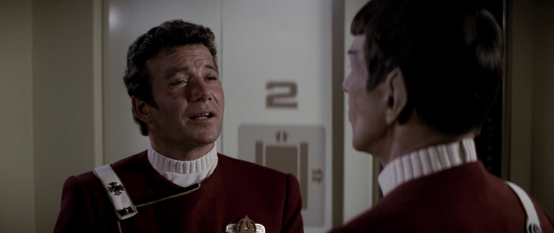
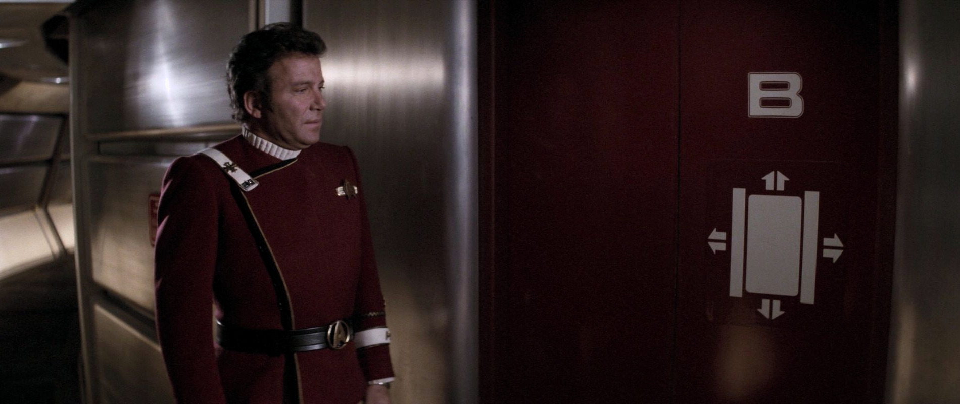
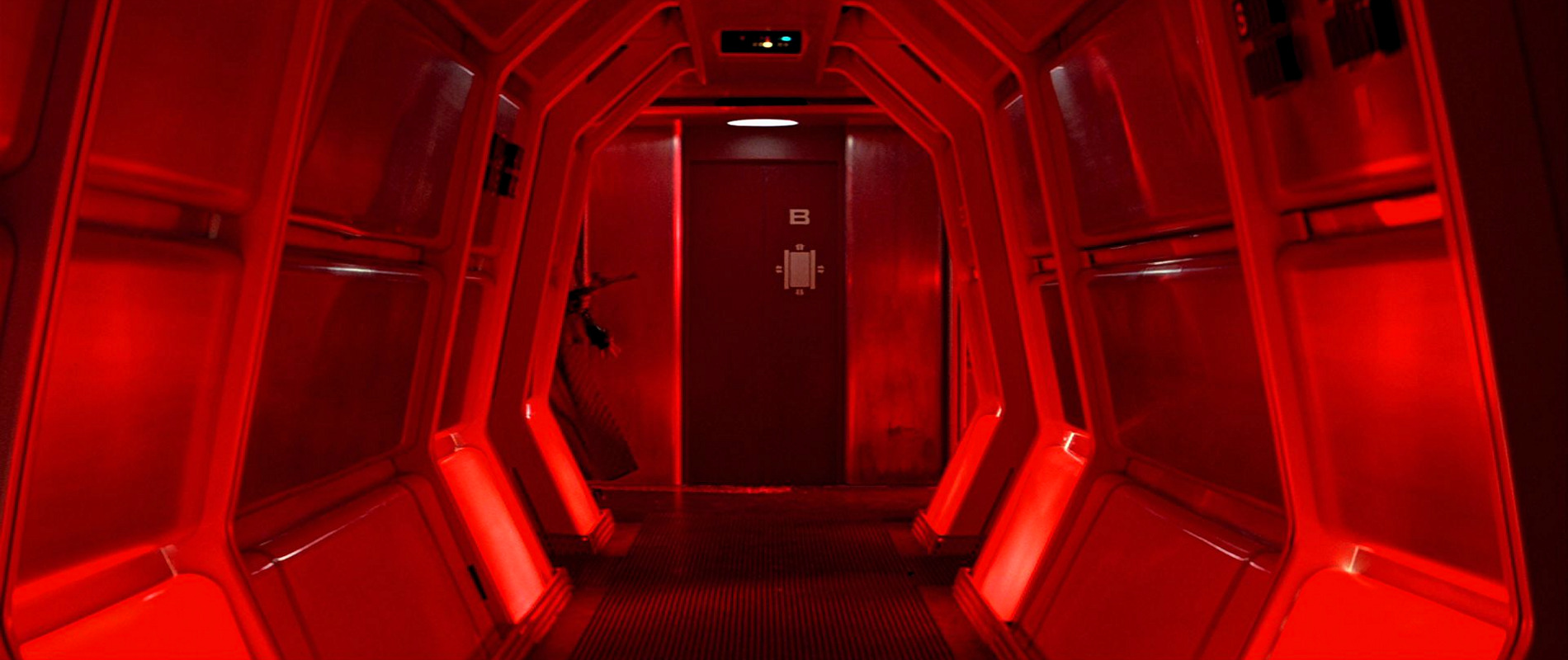
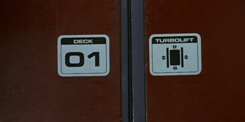
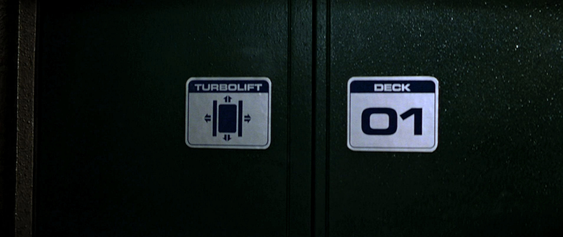
21 Turbolift
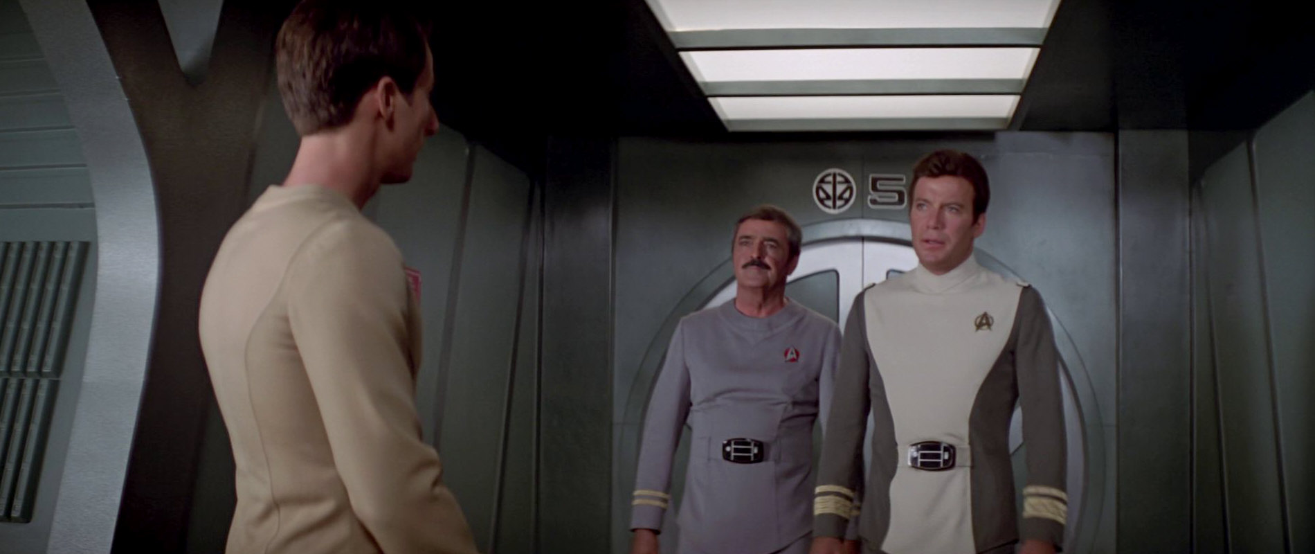
![]() This is one of the pictograms with the most screen time. In "Star Trek: The Motion Picture", it is seen next to a turbolift door (with the number 5) where it appears on a large shield, similar to the departmental logos.
This is one of the pictograms with the most screen time. In "Star Trek: The Motion Picture", it is seen next to a turbolift door (with the number 5) where it appears on a large shield, similar to the departmental logos.
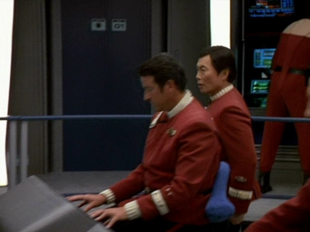
In "Star Trek II: The Wrath of Khan" the logo is seen with the letter A on the bridge turbolift doors of the USS Enterprise and USS Reliant and on the turbolift door of the bridge simulator at the beginning of the film. It also appears on turbolift doors (with the letters B and D) in corridors aboard the USS Enterprise. In addition to that, it also appears with the number 2 outside the bridge simulator at Starfleet Headquarters.
In "Star Trek III: The Search for Spock" it appears on the bridge turbolift doors with the letter A and in corridors with the letter B.
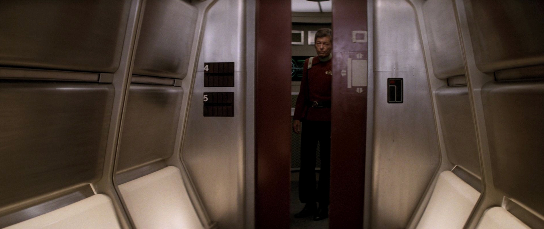
It next appears on several doors, including the bridge turbolift doors, in "Star Trek VI: The Undiscovered Country". In "Star Trek: Generations", it also appears on the bridge turbolift doors of the USS Enterprise-B. In VOY: "Flashback", it is seen on the bridge doors of the USS Excelsior and, in a very compressed version, on the turbolift display of the ship. We can also spot the logo in "Star Trek: Insurrection".

The logo was designed by Rick Sternbach.
22 Airlocks
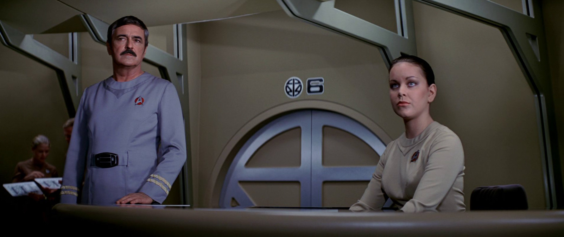
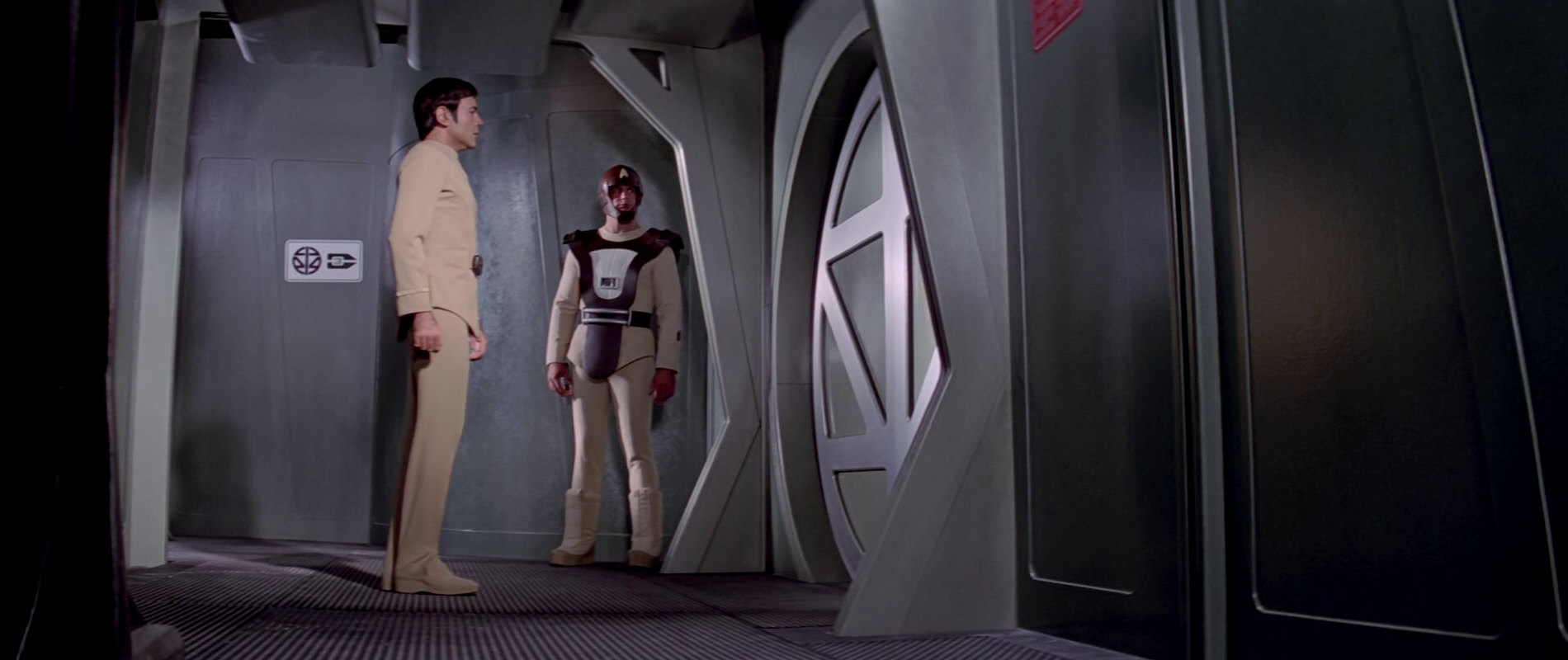
![]() The airlocks logo only shows up in "Star Trek: The Motion Picture". It appears inside the orbital office complex (next to the number 6) and inside the USS Enterprise cargo bay airlock (next to the number 5). It later appears next to a directional pointer with the number 3 at the airlock Spock uses to board the USS Enterprise. As can be seen, the logo mimics the actual shape of the round airlocks seen in all those scenes.
The airlocks logo only shows up in "Star Trek: The Motion Picture". It appears inside the orbital office complex (next to the number 6) and inside the USS Enterprise cargo bay airlock (next to the number 5). It later appears next to a directional pointer with the number 3 at the airlock Spock uses to board the USS Enterprise. As can be seen, the logo mimics the actual shape of the round airlocks seen in all those scenes.
More than 40 years later, the airlock pictogram can be seen aboard Crusher's ship Eleos in PIC: "The Next Generation".
The logo was designed by Rick Sternbach. The photo showing Rick Sternbach at work designing the logos shows a different, five-sided version of an airlock logo. He says:
"I think the five-sided airlock might have been a holdover from Phase II. The final airlock logo was drawn up based on the final lock the set designers created."
23 Radiation hazard
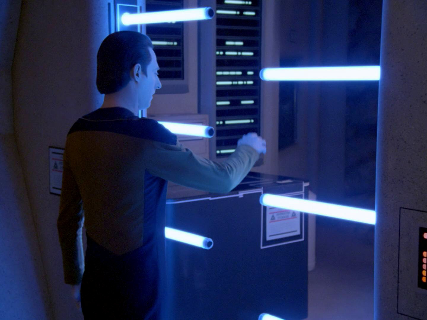
![]() The next two logos are warning labels. The radiation hazard warning label is not seen in the first Star Trek film but appears on the glass walls and doors to the dilithium reactor room where Spock perishes in "Star Trek II: The Wrath of Khan". The words "radiation hazard" can be read next to one of the logos. The label reappears on the Enterprise-D warp core in early TNG episodes and on labels in Dr. Manheim's lab on Vandor IV in "We'll Always Have Paris".
The next two logos are warning labels. The radiation hazard warning label is not seen in the first Star Trek film but appears on the glass walls and doors to the dilithium reactor room where Spock perishes in "Star Trek II: The Wrath of Khan". The words "radiation hazard" can be read next to one of the logos. The label reappears on the Enterprise-D warp core in early TNG episodes and on labels in Dr. Manheim's lab on Vandor IV in "We'll Always Have Paris".
Just like the whole set design of the famous scene from "Star Trek: The Wrath of Khan", the radiation hazard warning label was reproduced for Ensign Rutherford's "Saving the Enterprise" scenario in LOW: "I, Excretus".
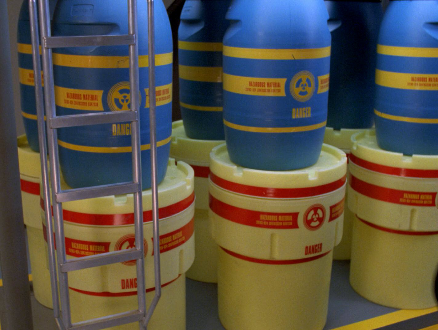
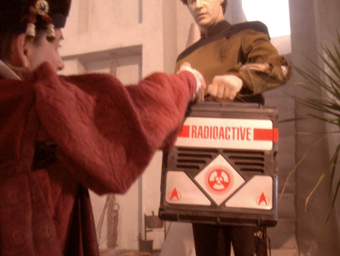
24 Thermowave hazard
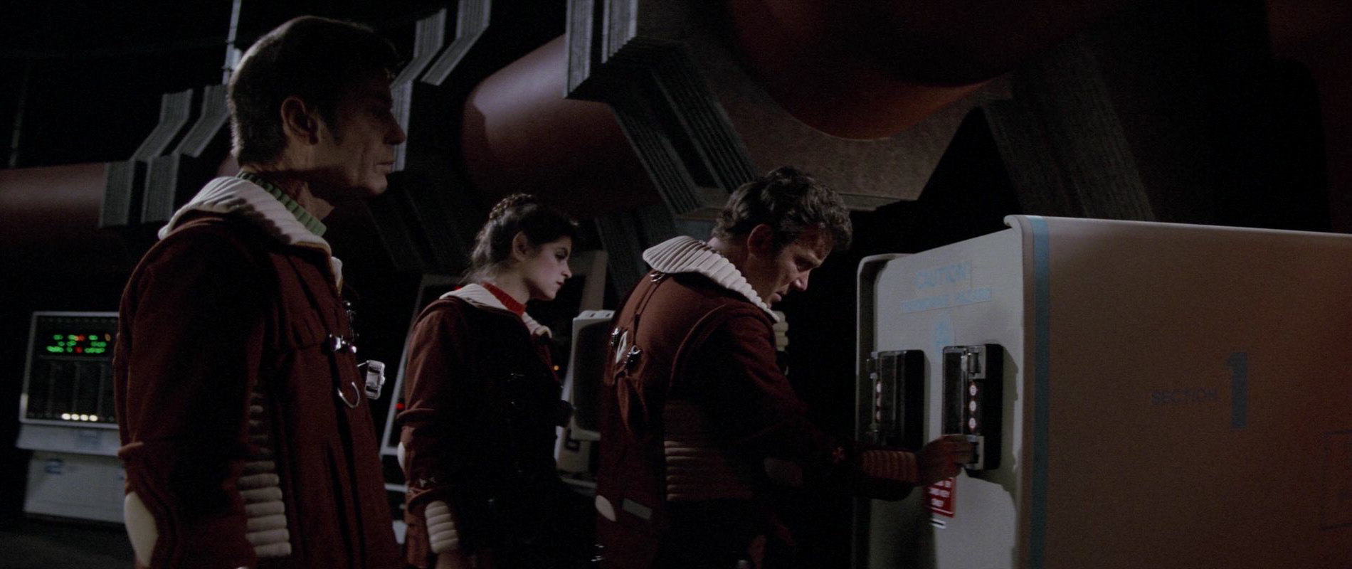
![]() The logo appears only once in the TOS movies, barely legible, on the crate Chekov hides in aboard the Regula I station in "Star Trek II: The Wrath of Khan". The words "Thermowave hazard" can be read above the logo.
The logo appears only once in the TOS movies, barely legible, on the crate Chekov hides in aboard the Regula I station in "Star Trek II: The Wrath of Khan". The words "Thermowave hazard" can be read above the logo.
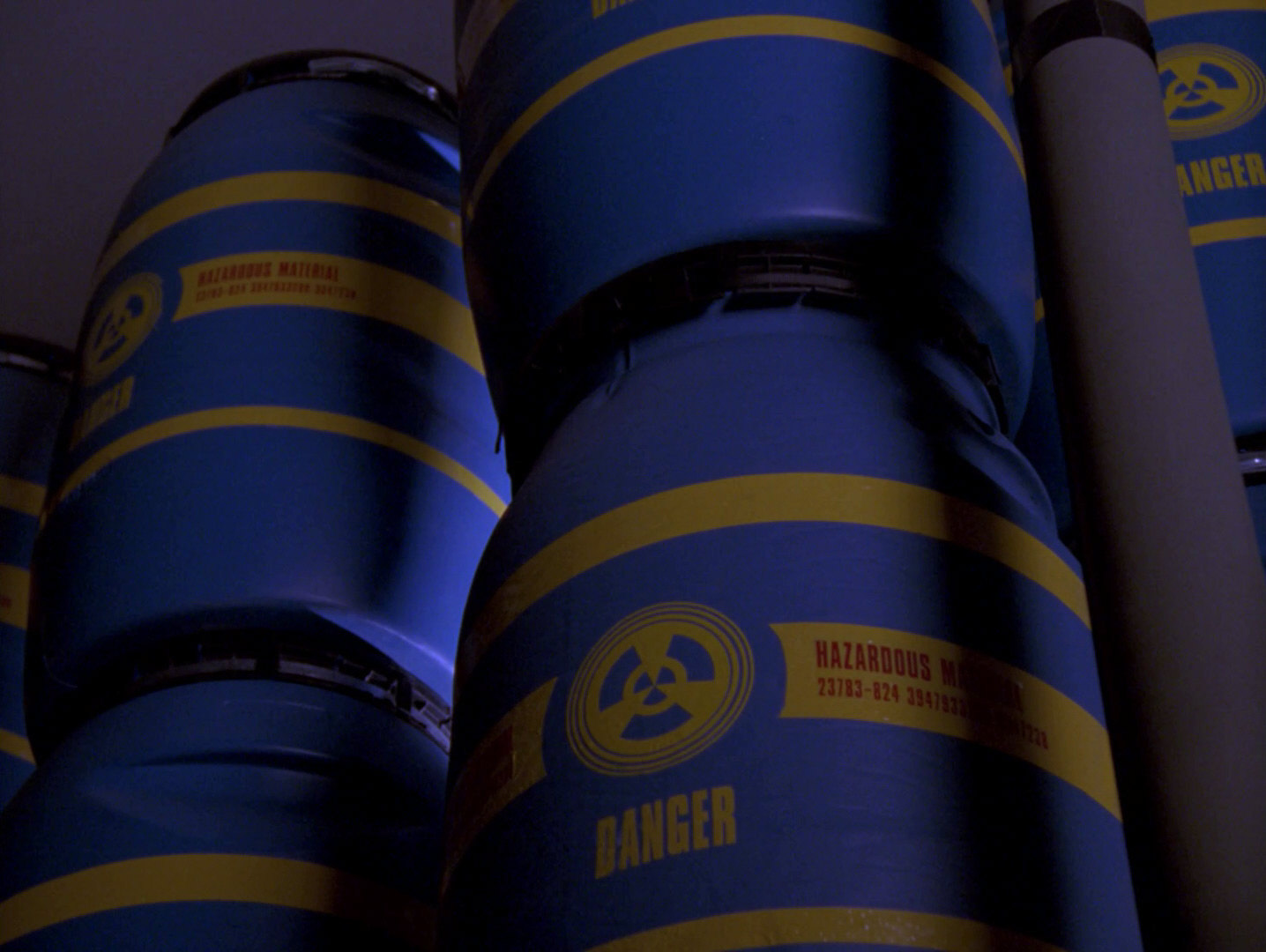
The logo saw much more screen time on TNG, where it was printed on several cargo containers, often next to the label "hazardous material". A cargo container with the logo was also seen on DS9 in "The Siege".
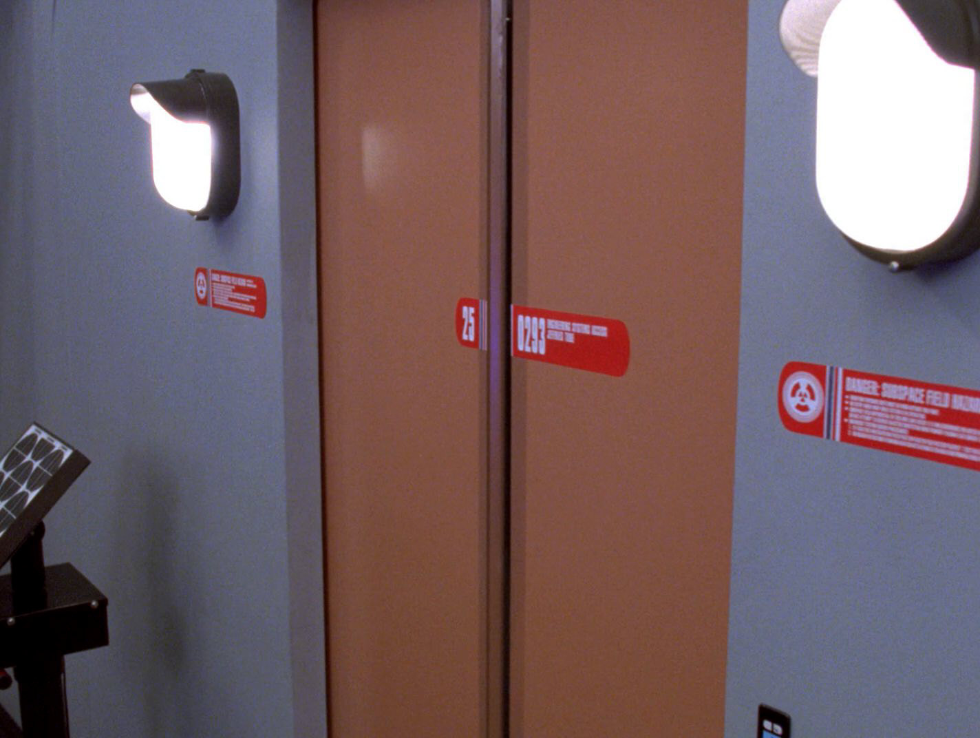
It was also printed on labels next to the doors to the nacelle control room aboard the USS Enterprise-D, featuring the words "Danger: subspace field hazard" in "Eye of the Beholder". In "Thine Own Self" it is printed on the case with radioactive metal that Data carries into the Barkonian village. The warning "radioactive" is clearly legible on the case. It thus seems that on TNG, the logo has gained a more general "danger" connotation, not limited to thermowave hazards.
25 Table tennis
![]() The following two logos do not actually appear as stickers in the book. Instead, they are just seen on the cover.
The following two logos do not actually appear as stickers in the book. Instead, they are just seen on the cover.
The pictogram for table tennis appears as part of a directional marker in in the rec deck scene. It can be spotted behind Decker as he talks to the Ilia probe. In contrast to how it is shown on the cover, in the actual film the handle of the racquet is seen pointing to the top. The logo was designed by Rick Sternbach.
26 Volleyball
![]() The volleyball rec deck logo is seen inside a directional pointer early in the film during the V'ger briefing. The logo was designed by Rick Sternbach.
The volleyball rec deck logo is seen inside a directional pointer early in the film during the V'ger briefing. The logo was designed by Rick Sternbach.
27 Unidentified rec deck logo
A so far unidentified rec deck logo is partially visible behind Decker in the scene where he talks to the Ilia probe. It could possibly be a chess logo but it doesn't match the two chess logos seen inside the book and on its cover.
28 Bowling alley
The fan extras on TMP have reported seeing the bowling alley signage (from the book's front cover) on the rec deck the day they were filming on it.
29 Life support systems
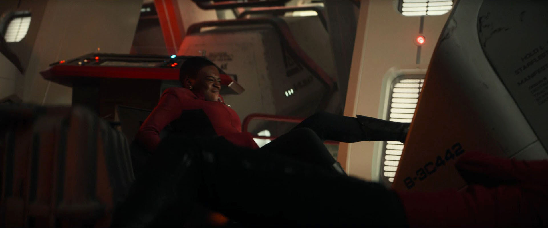
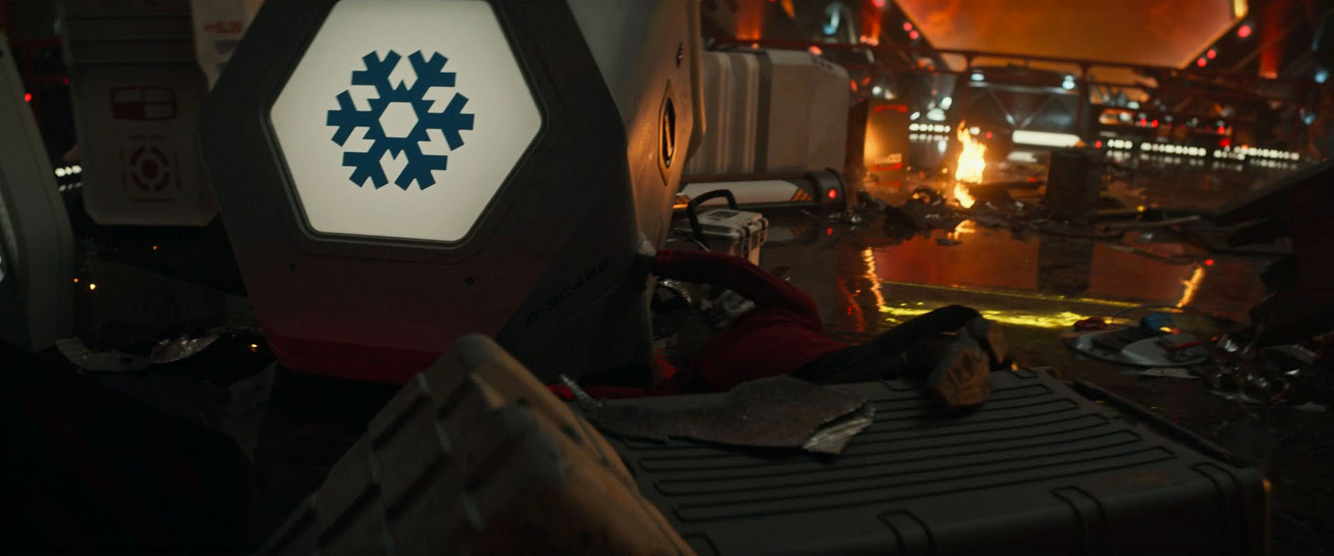
![]() The "Life support systems" pictogram never appeared in canon Star Trek prior to Strange New Worlds, more than 40 years after the book was published. It can be glimpsed in "Memento Mori" and is clearly visible for the first time in "Lift Us Where Suffering Cannot Reach".
The "Life support systems" pictogram never appeared in canon Star Trek prior to Strange New Worlds, more than 40 years after the book was published. It can be glimpsed in "Memento Mori" and is clearly visible for the first time in "Lift Us Where Suffering Cannot Reach".
30 Components
![]() Another triangular pictogram (not to be confused with "damage/repair") remains unidentified in the book. It never appeared in a Star Trek series or movie before Strange New Worlds and can be clearly seen in "Memento Mori", "Lift Us Where Suffering Cannot Reach" and "Tomorrow and Tomorrow and Tomorrow".
Another triangular pictogram (not to be confused with "damage/repair") remains unidentified in the book. It never appeared in a Star Trek series or movie before Strange New Worlds and can be clearly seen in "Memento Mori", "Lift Us Where Suffering Cannot Reach" and "Tomorrow and Tomorrow and Tomorrow".
Rick Sternbach sifted through old sketches and found out the meaning of the pictogram:
"The simple triangle logo is COMPONENTS, and the more complicated one you already have as DAMAGE/REPAIR."
Conclusion
Of all the pictograms created for "Star Trek: The Motion Picture", the one with the most screen time is the Starfleet Medical logo. The Federation seal was often seen in the first four feature films but it was replaced by the 24th century Federation emblem beginning in "Star Trek V: The Final Frontier". Other logos that are very noticeable are the turbolift logo and the directional pointer. If it weren't for the Officers' Lounge scene in "Star Trek III: The Search for Spock", some other logos would never have appeared or been seen clearly on Star Trek.
The people in the Art Department are known for paying amazing attention to detail and to the history of Star Trek. This is how some of the old logos did not only make the transition to TNG but were even unearthed after not appearing in ages. The Security logo was shown on Star Trek Enterprise some 25 years after its appearance in TMP.
Not all of the logos appear on screen exactly as they do in the ST:TMP Peel-Off Graphics Book, but the book is an unexpectedly reliable reference, and indispensable in our effort to identify and reconstruct the iconography of the 23rd century.
Credits
Thanks a lot to Rick Sternbach for taking time to answer our questions! Thanks to William Overton for the hint about the turbolift logo in "Insurrection" and to Ian McLean for the observation about the bowling alley pictogram.


