


Forgotten Alien Emblems
by Jörg Hillebrand and Bernd Schneider
Klingon
Old emblem
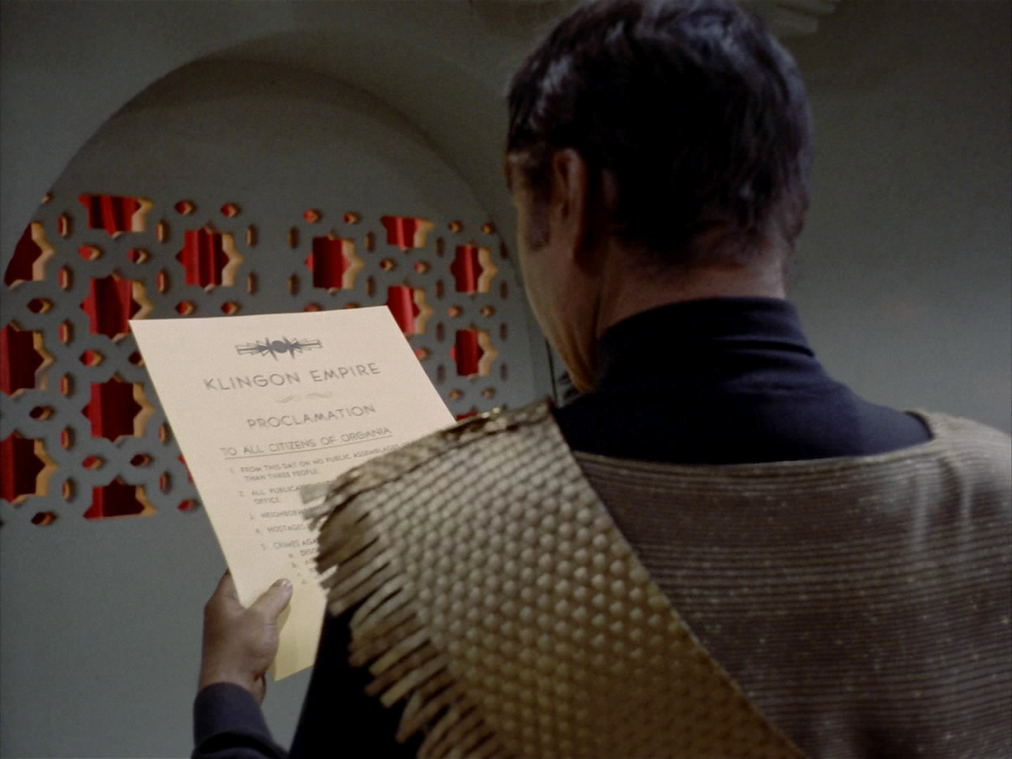
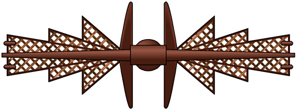 The first time that Klingons appear in Star Trek is in TOS: "Errand of Mercy", as occupying force on Organia. There is no sign of the famous Klingon trefoil emblem yet. But when Kor is holding the proclamation imposing an assembly ban on the Organians (conveniently written in English!), we can make out something like a logo on the top of the sheet. At least it would have to be something official and not just an ornament if the proclamation were human-made. The idea that the logo is indeed meant to be the emblem of the Klingon Empire (or that of the Klingon Defense Force) at the time is corroborated by an apparently wooden wall relief that serves as a torch holder in Kor's office. It has the same pattern as the logo on the sheet. Hence, it is evident that the wall ornament must be of Klingon origin and was not simply taken over from the Organians. And since the two symbols are the same, they should have a certain significance beyond being mere decoration.
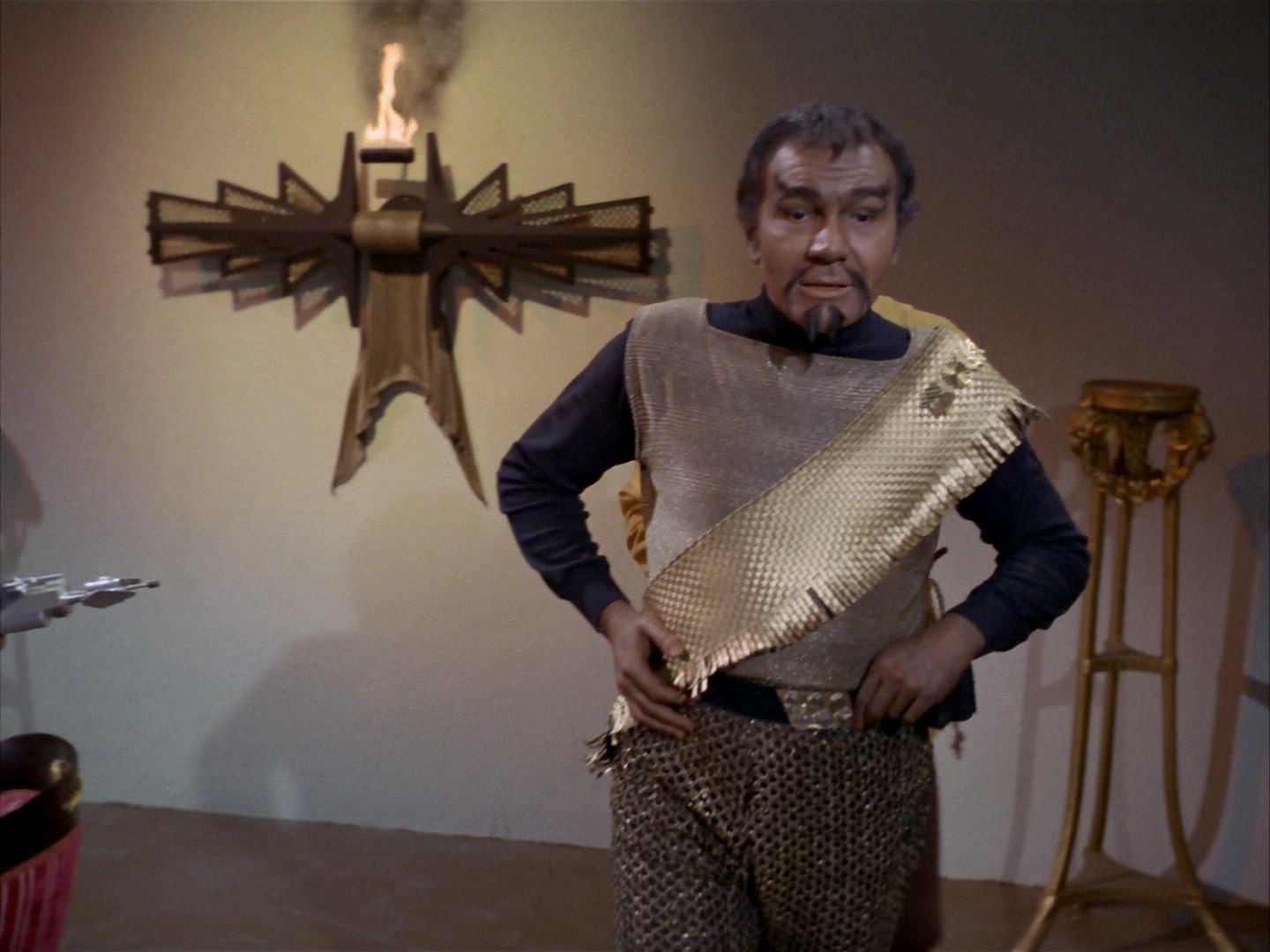
A similar symbol can also be found on Kor's sash. Kang wears the same sash in "Day of the Dove", and finally it is part of Worf's uniform throughout the first season of TNG. The only difference to the TOS Klingons is that Worf wears his sash on his right shoulder.

One half of the emblem from "Errand of Mercy" appears in "The Devil in the Dark", here painted white and apparently in the role of some technical device. "The Devil in the Dark" was the first of the two episodes to be shot, so it looks like the original Klingon emblem is a recycled part, and was not completely custom-made.
Regarding the emblem from the TOS sash, we can also see it on Chorgan's uniform in TNG: "The Vengeance Factor".
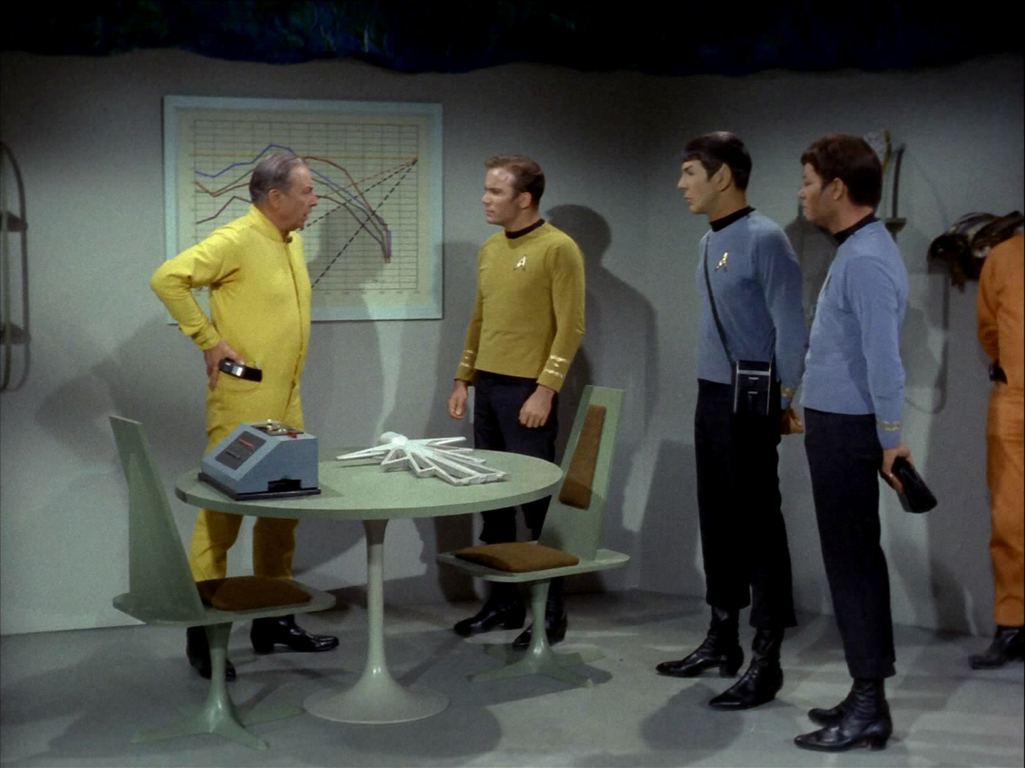
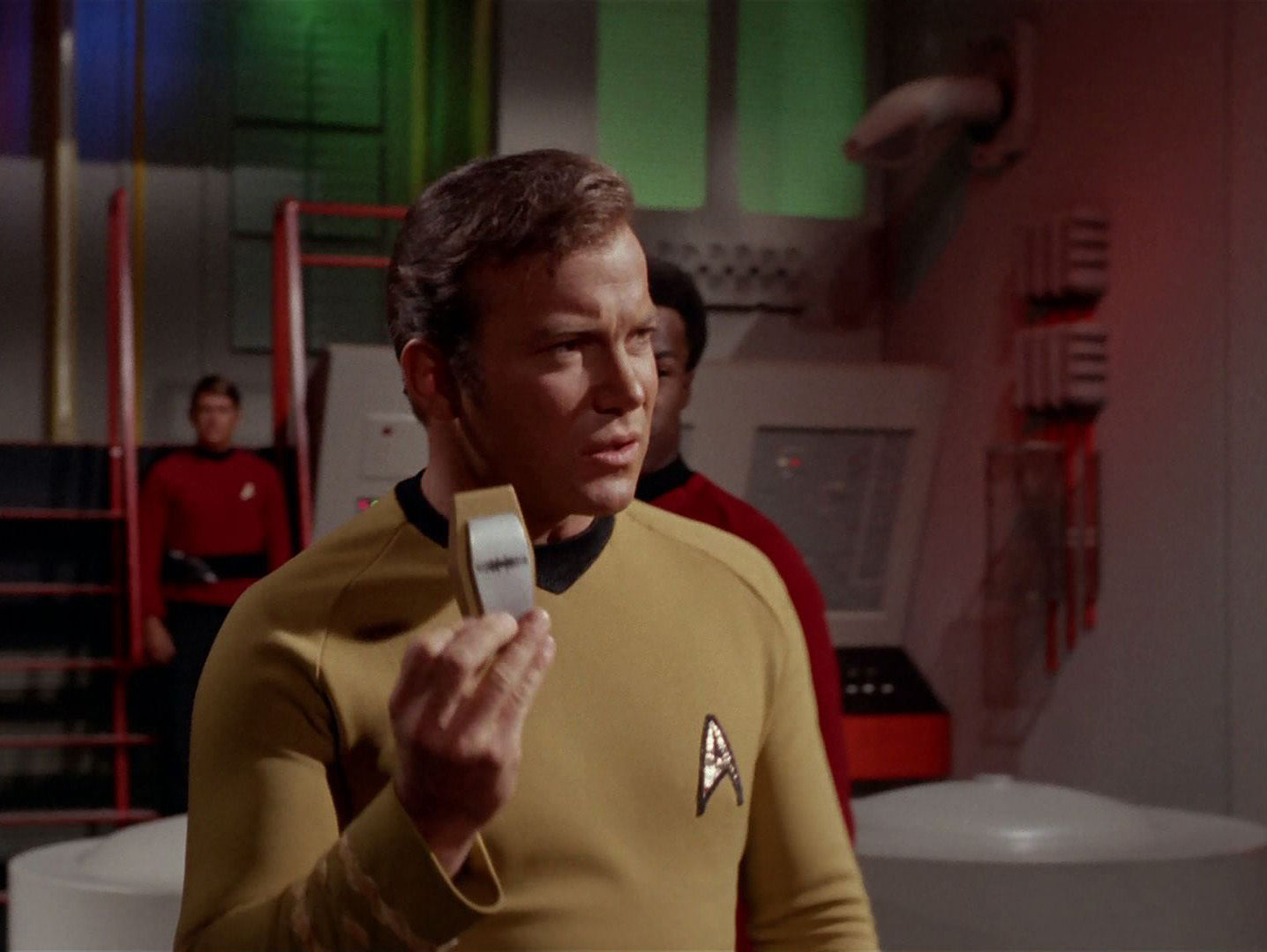
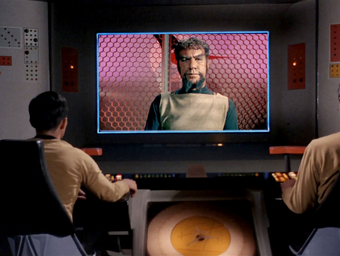
The familiar Klingon emblem appears for the first time in "Elaan of Troyius". However, we can still see the old one from "Errand or Mercy" on one occasion in the episode. Kirk is holding up a Klingon silver-golden communicator whose lid is adorned by the symbol. Actually, Kor was using such a communicator already in "Errand of Mercy", we just couldn't recognize the emblem that was probably already there.
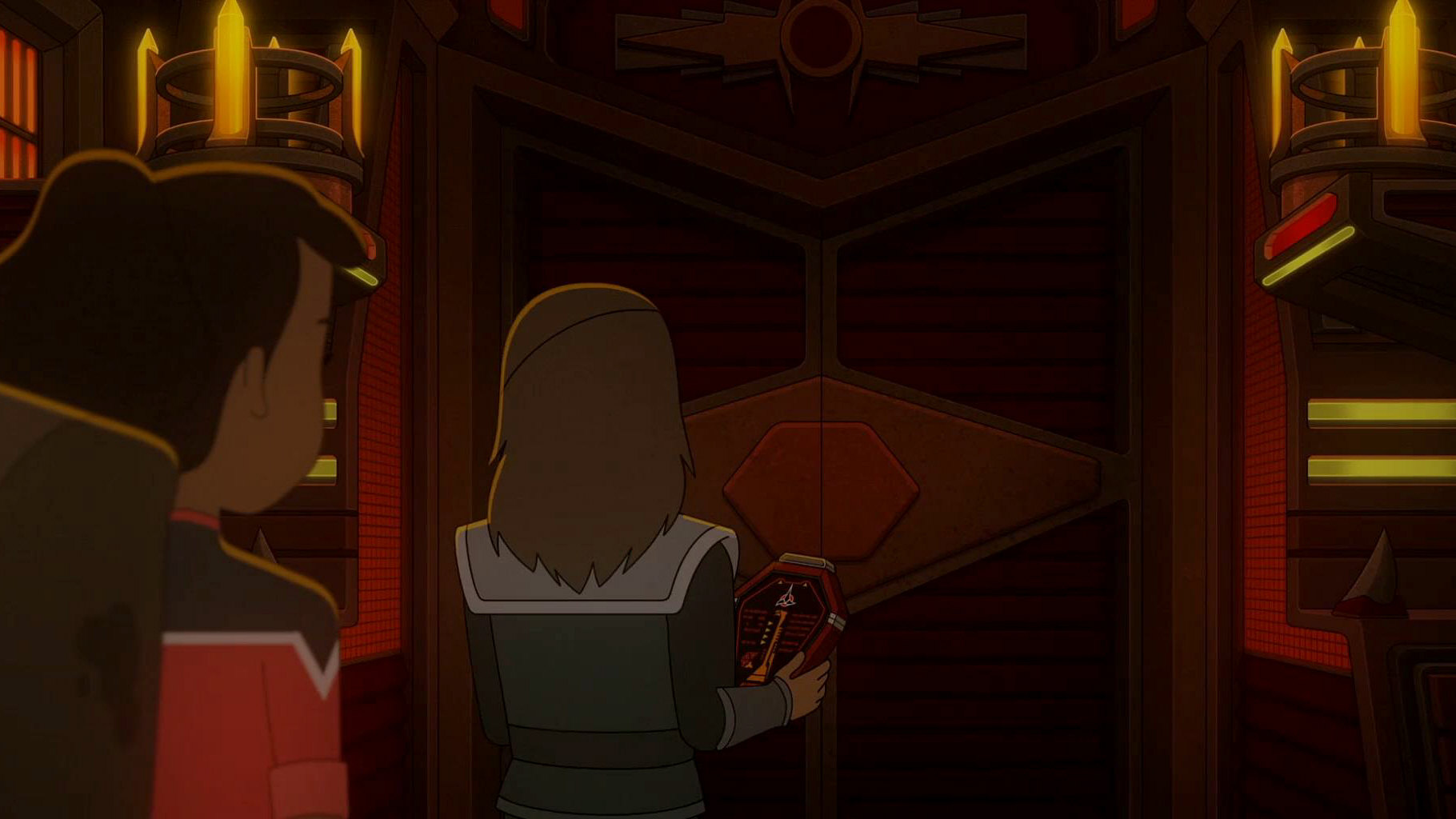
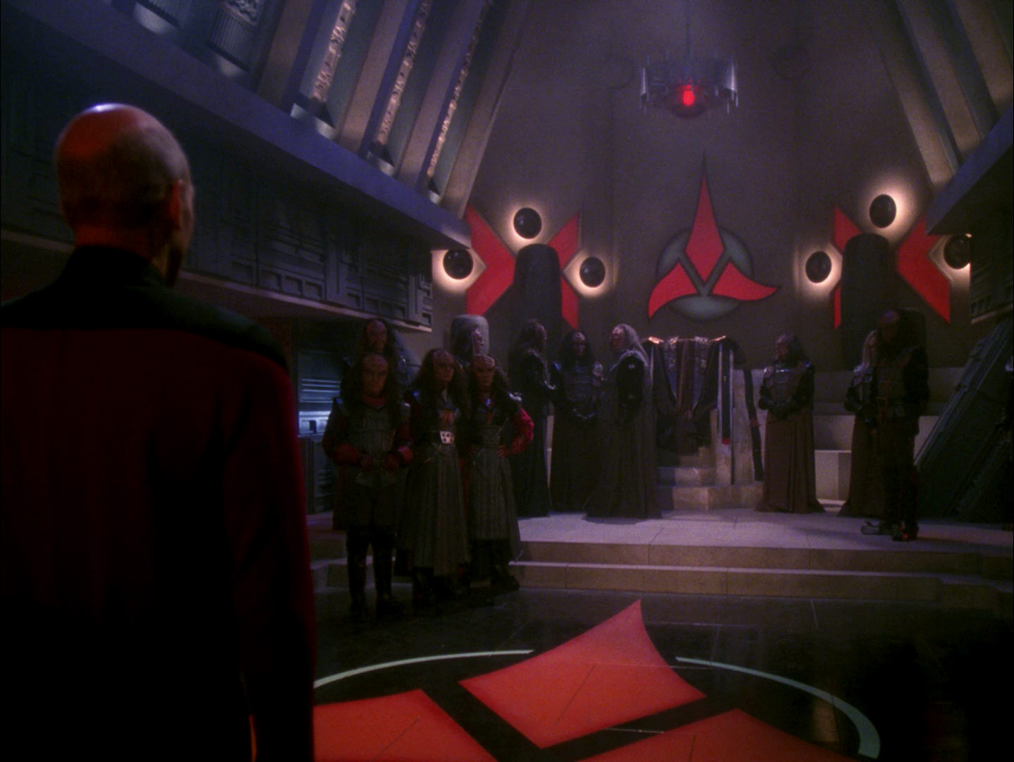
 More than 57 years after its original appearance TOS: "Errand of Mercy", the old emblem can be seen as a symbol or decoration above the door to the Klingon Oversight Council Chambers in LOW: "A Farewell to Farms".
Colorful new emblems
![]()
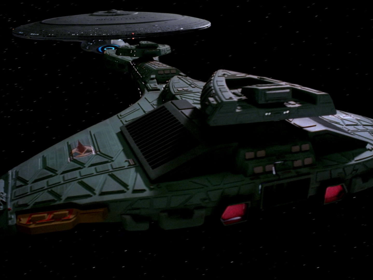
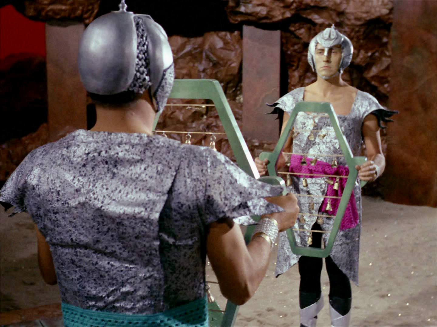
![]() The commonly known trefoil-like emblem can be seen in TOS: "Elaan of Troyius" behind the Klingon commander. It also adorns the hull of the D7-class battlecruiser that makes its first appearance in the episode as well, although this detail is not really recognizable in the not yet remastered version of the episode. It is noteworthy that both new emblems in "Elaan of Troyius" are horizontally oriented (meaning that the one on the hull points inward instead of forward), as opposed to the many later variations (including the ones from Star Trek Enterprise), all of which are upright. It may have been decided at the time of "Star Trek: The Motion Picture" to turn the emblem 90° so it would look more impressive. The K't'inga-class cruisers in this movie still have the TOS version of the logo, but now pointing forward and with much more vivid colors. The colorful trefoil appears as late as in the 24th century on a couple of occasions, such as on the hull of the Vor'cha attack cruiser (first seen in TNG: "Reunion").
The commonly known trefoil-like emblem can be seen in TOS: "Elaan of Troyius" behind the Klingon commander. It also adorns the hull of the D7-class battlecruiser that makes its first appearance in the episode as well, although this detail is not really recognizable in the not yet remastered version of the episode. It is noteworthy that both new emblems in "Elaan of Troyius" are horizontally oriented (meaning that the one on the hull points inward instead of forward), as opposed to the many later variations (including the ones from Star Trek Enterprise), all of which are upright. It may have been decided at the time of "Star Trek: The Motion Picture" to turn the emblem 90° so it would look more impressive. The K't'inga-class cruisers in this movie still have the TOS version of the logo, but now pointing forward and with much more vivid colors. The colorful trefoil appears as late as in the 24th century on a couple of occasions, such as on the hull of the Vor'cha attack cruiser (first seen in TNG: "Reunion").
Monochrome new emblems
![]()
![]() For the appearance of the ship now known as "H.M.S. Bounty" in "Star Trek: The Voyage Home" the complete bridge was rebuilt, and the former colorful logo was replaced with a monochrome version. The monochrome emblem will appear on countless occasions in Star Trek movies, TNG, DS9, Voyager and Enterprise, with dozens of permutations of red, black, white and sometimes yellow. The colors of the emblem may have no significance in Klingon culture (quite unlike on European coats of arms), or the exact meaning of the different colors never becomes obvious.
For the appearance of the ship now known as "H.M.S. Bounty" in "Star Trek: The Voyage Home" the complete bridge was rebuilt, and the former colorful logo was replaced with a monochrome version. The monochrome emblem will appear on countless occasions in Star Trek movies, TNG, DS9, Voyager and Enterprise, with dozens of permutations of red, black, white and sometimes yellow. The colors of the emblem may have no significance in Klingon culture (quite unlike on European coats of arms), or the exact meaning of the different colors never becomes obvious.
Some colors are more common than others, especially on the central symbol, the trefoil. This element is customarily red whenever it appears as a floor or wall decoration, on flags or as an official seal on a viewscreen, usually on a solid white or gray circle that sometimes has a black outline. The black emblem on white, on the other hand, is comparably rare, although it has gained popularity in recent years, especially on red flags.
For a complete investigation of all variations of the Klingon emblem, please refer to our article The Evolution of the Klingon Emblem.
Romulan
Old emblem
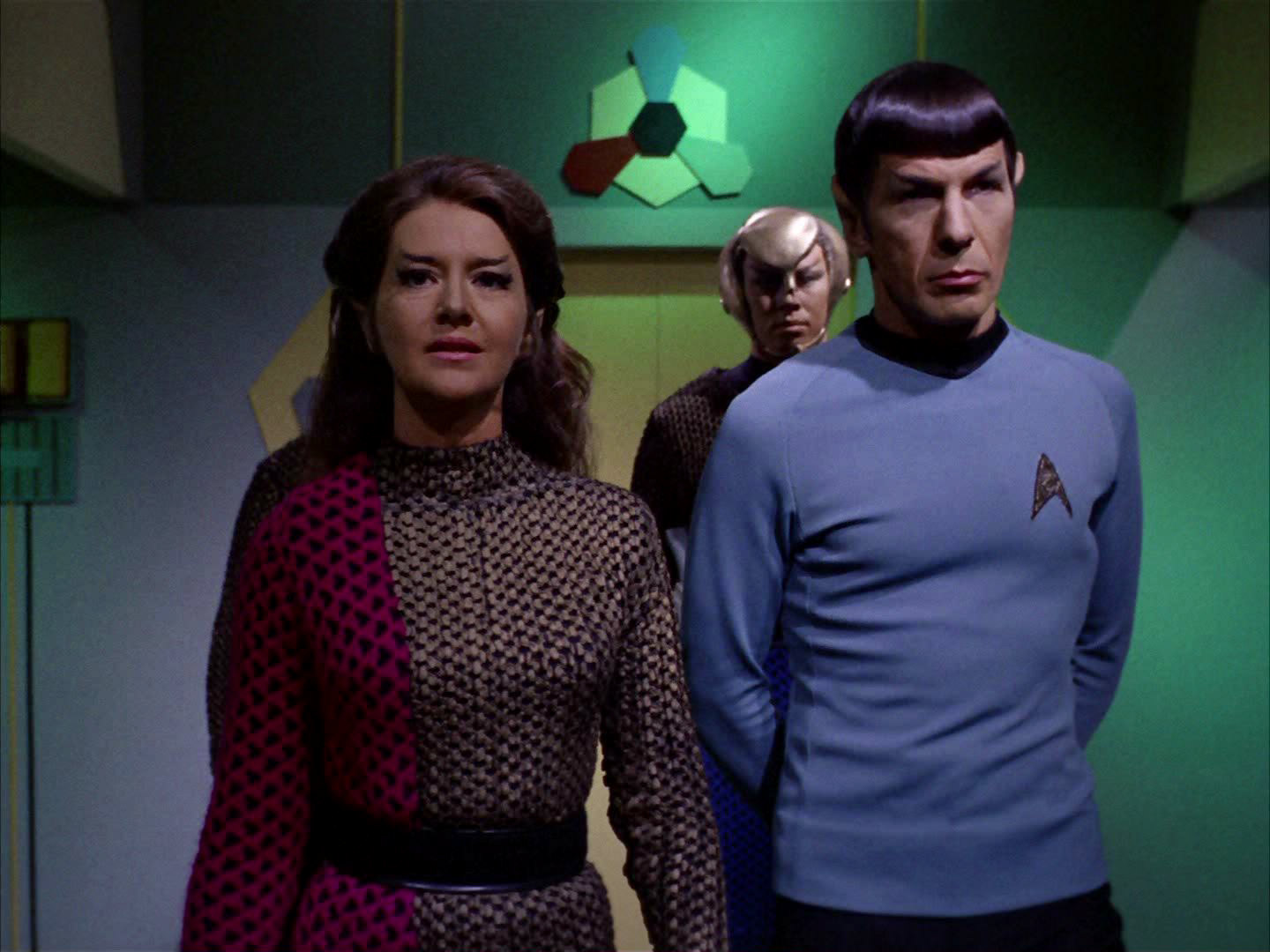
 In TOS: "Balance of Terror" there was nothing like a Romulan emblem, although the painted bird on the ship's hull that history buff Lt. Stiles already hinted at qualifies as a distinctive mark of a similar nature. Anyway, it is obscure but something like a Romulan emblem shows up in TOS: "The Enterprise Incident". It is visible only briefly in a corridor, above a door.
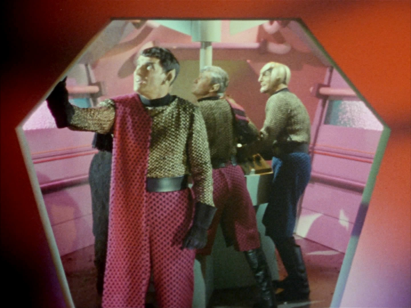
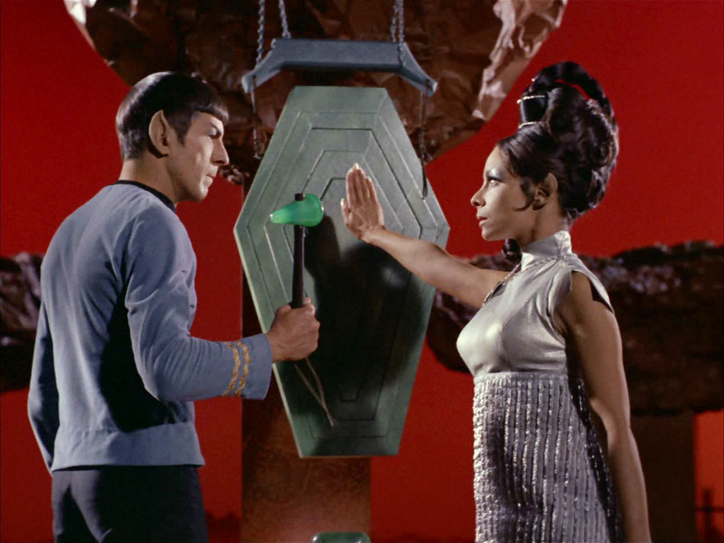
Although it may be just a decoration or a pictogram denoting a certain section of the ship, there is one reason why it was likely intended to be the Romulan emblem indeed. It looks remarkably similar to the Klingon symbol that had premiered just a few episodes earlier, in "Elaan of Troyius" (see above). It is even composed of the same colors. So whoever created this supposed Romulan emblem had a good intention to give this race more distinctiveness, but should have come up with something much more original to that end. Yet, perhaps the set designers deliberately made it look like the Klingon trefoil. The latter can be found on the ship's hull and may have been recognizable in the episode (the Romulans are using Klingon D7 cruisers in this episode). So the Romulan logo may have been made to look similar. A possible retroactive in-universe explanation is that the logo symbolizes the supposed short-lived alliance of the Romulans with the Klingons in the 2260s. The colors and their arrangement were taken from the Klingon trefoil, while the unknown individual Romulan emblem may have contributed the hexagonal shapes.
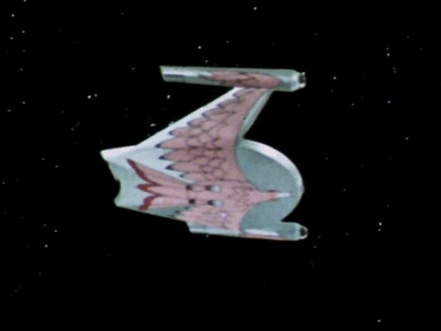
Interestingly, a hexagon already appears on a Romulan helmet in TOS: "Balance of Terror". A variety of elongated coffin-shaped hexagons can be seen in form of the cross-section of th Romulan bridge in the same episode, on Vulcan in TOS: "Amok Time" and on the Romulan ship in "The Enterprise Incident". Although they are not uncommon as a decoration is TOS, the latter hexagons shapes may have been designed to be representative of the Romulans and to match with their logo, or vice versa.
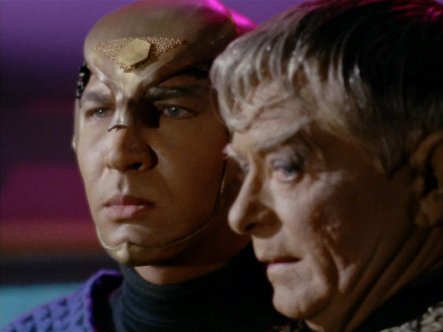
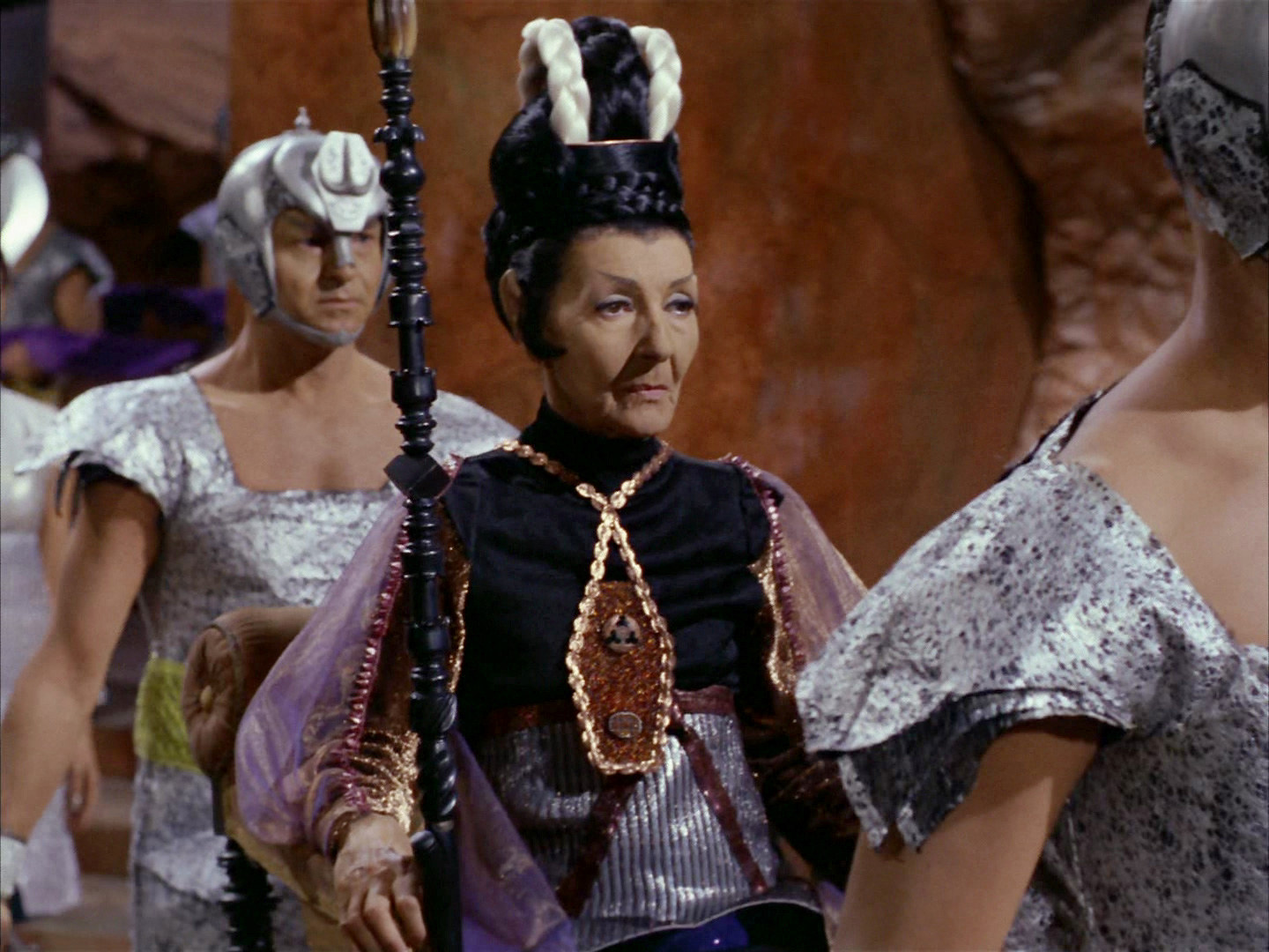

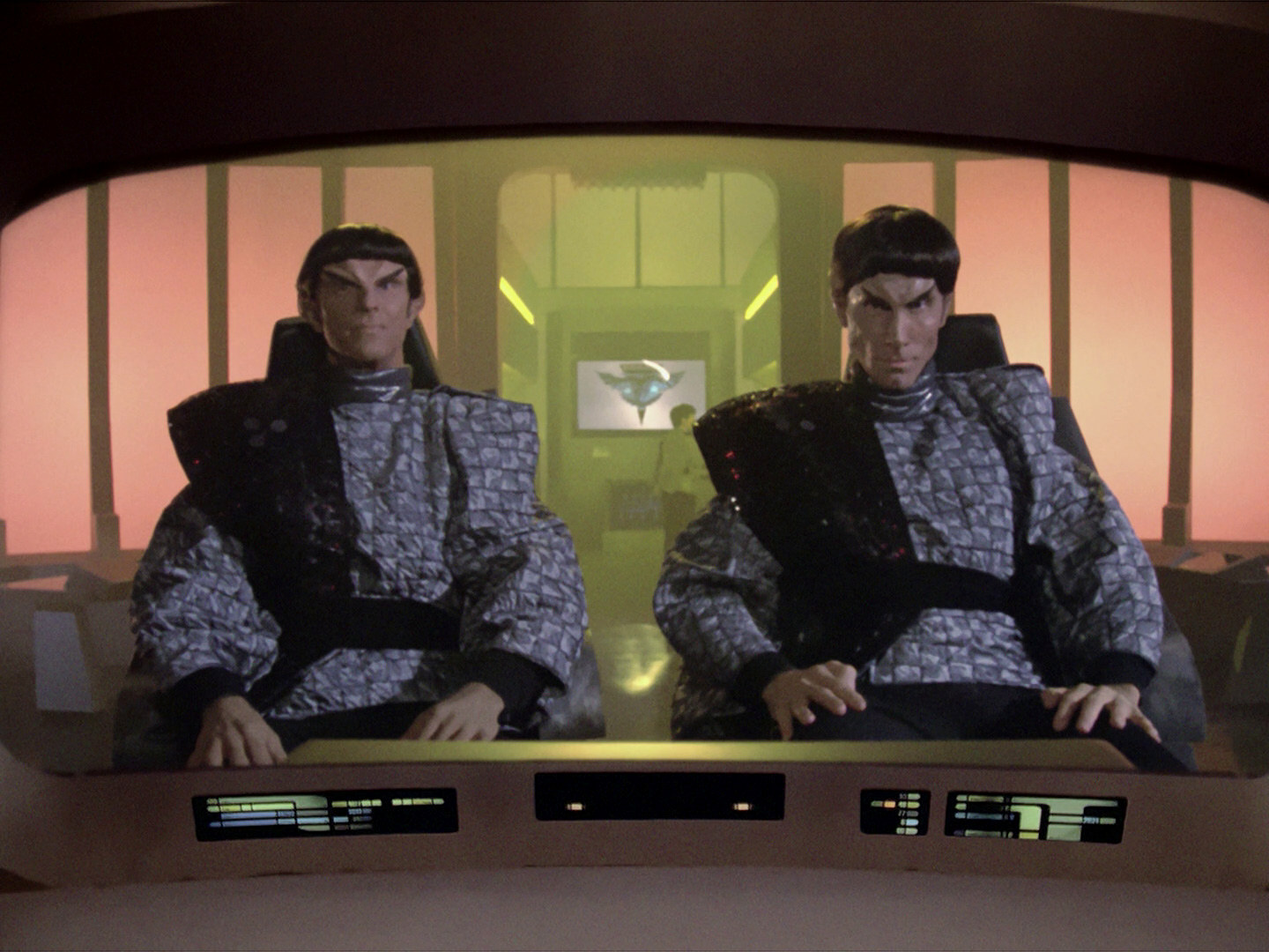
In "The Neutral Zone", which marks the first appearance of the new emblem (see below), the Romulans don't yet have insignia based on this emblem. The two officers wear drapes, with hexagonal emblems that roughly resemble the old Romulan logo from "The Enterprise Incident" but probably not on purpose.
Mike Okuda: "I knew of the logo in 'The Enterprise Incident.' Although I often tried to preserve elements from the original series, in this particular case, I thought it was too similar to the Klingon logo. I had an artist named Monte Thrasher design the predatory bird for the TNG Romulan logo."
TNG-style emblems
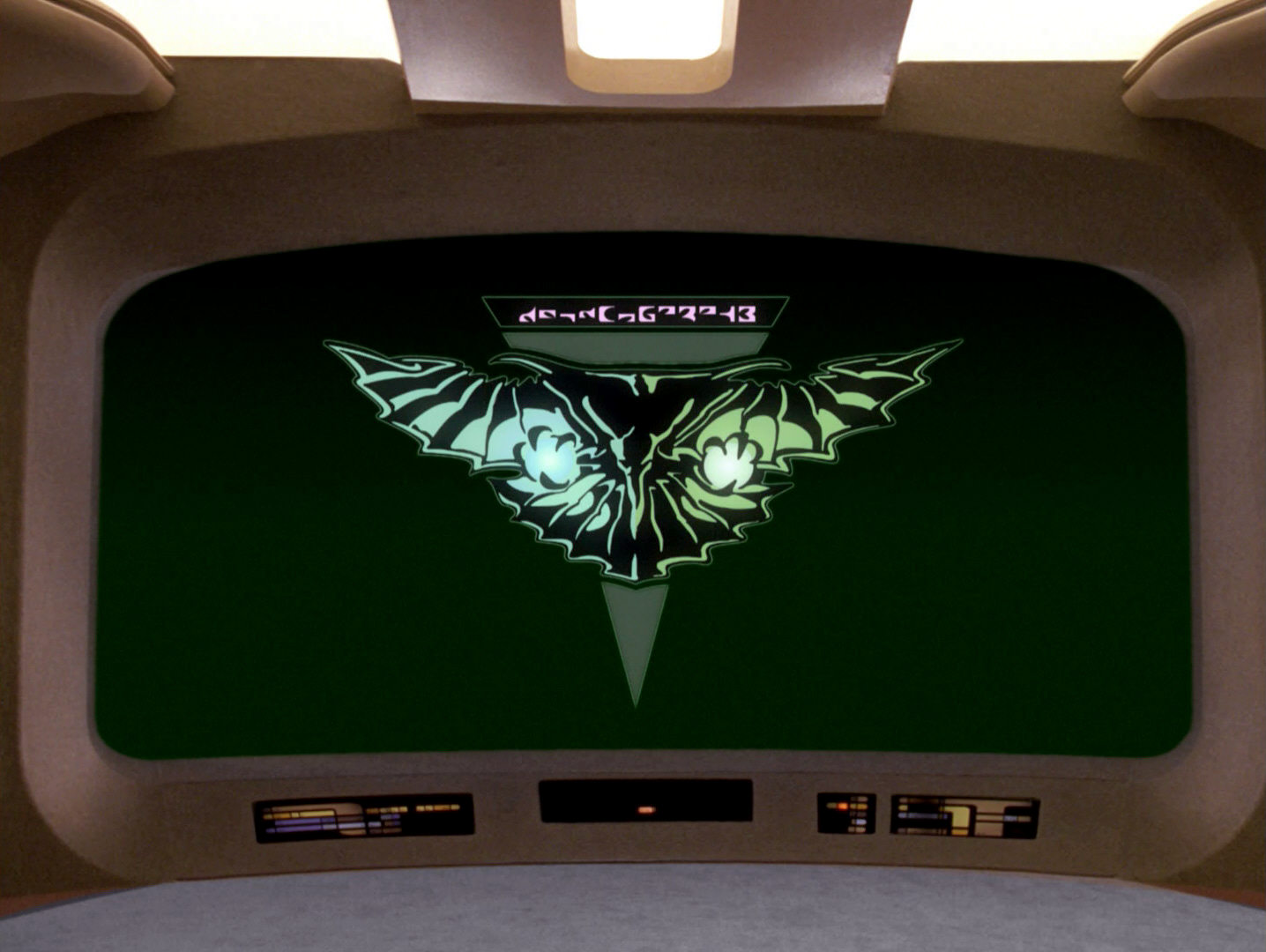
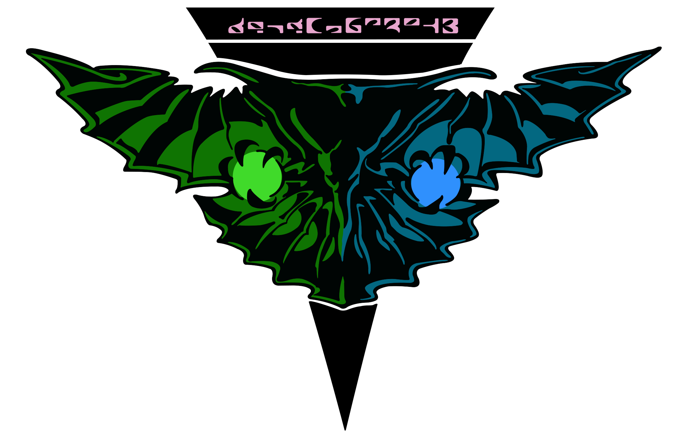 The now familiar double-headed bird-of-prey emblem of the Romulans (apparently a homage to the painting on the ship's hull in "Balance of Terror") is supposedly holding the two planets Romulus and Remus in its claws. It first appears in TNG: "The Neutral Zone" on the bridge of the Romulan Warbird (and on the ship's hull too, albeit barely visible). The emblem is most often colored in way that the left side is green and the right one is blue. These colors are reversed in TNG: "Unification II" and on some other occasions.
The TNG-style emblem does not appear in "Star Trek Nemesis". Yet, it retroactively shows up in "Star Trek: The Final Frontier" and also on Star Trek Enterprise, and can even be seen in DIS: "Will You Take My Hand?".
Nemesis-style emblems
![]()
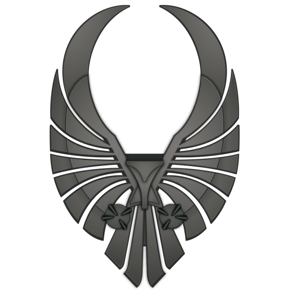 Rick Sternbach designed a new, more stylized variation of the Romulan emblem for "Star Trek Nemesis". This emblem made it into the movie in the form of the big sculpture and of the uniform insignia. It was further simplified for the floor decoration in the Romulan Senate and for a monitor logo. The stylized Romulan emblems have in common that they never appear in a specific color or even in multiple colors; they are always plain silver or gray.
We can see the "Nemesis" style also in several Enterprise episodes that re-use uniforms and the CGI cityscape from "Nemesis".
A still different emblem created on this occasion, with its raised wings and overall round shape, never appeared on screen and was only used for promotional purposes, such as in the trailers or on the DVD. Strictly speaking, this second stylized variation is non-canon at this point but like Rick Sternbach's version later appeared on Star Trek Enterprise.
For a complete investigation of all variations of the Romulan emblem, please refer to our article The Evolution of the Romulan Emblem.
See Also
The Evolution of the Klingon Emblem - exhaustive survey of all variants
The Evolution of the Romulan Emblem - exhaustive survey of all variants
Alpha and Beta Quadrant Emblems A-K
Alpha and Beta Quadrant Emblems L-Z
Credits
Some screen caps from TrekCore. Thanks to Ambassador/Ensign Q and to E.W.G. for suggestions pertaining to the origin of the TOS Romulan emblem, to Nathan for the hint about the Romulan hexagon in "Balance of Terror" and to Randolph Guthrie for the hint about the emblem in "More Tribbles, More Troubles".


