


The Visual Continuity of Star Trek
Visual Continuity in Classic Star TrekVisual Continuity in the AbramsverseVisual Continuity in the DiscoverseVisual Continuity in Picard
Star Trek has a legacy of more than 50 years. The franchise is famed for the iconic looks of its characters, species, sets, props and starships. They so far contributed greatly to the continuity of Star Trek. Every new series or movie could rely on what had been established before, especially on the visual side, but also had to respect it.
Until 2005, Star Trek's canon incarnations comprised the "classic" five series (TOS, TNG, DS9, VOY, ENT) and ten movies that were produced over the course of almost 40 years. A new movie universe produced by J.J. Abrams was launched in 2009. New Star Trek series are being produced under Alex Kurtzman since 2017, beginning with Star Trek Discovery. The two latter take many liberties regarding the visual continuity with the "classic" Star Trek. At latest the total redesign of the Klingons and other radical alterations in Discovery cross a line. While the producers of the series don't deny that they "reimagined" the looks of species and other designs in their series, they fail to provide a rationale whether visuals still have any canon value in their view, or whether they are arbitrary from now, like if Star Trek were not TV but a novel series. Some self-proclaimed "loyal" fans go as far as asserting that visual canon never existed in Star Trek!
Note that the purpose of this article is to create awareness for the significance of visual continuity in a visual medium. It serves to illustrate the existence of this kind of continuity in Star Trek (and sometimes lack thereof) in the form of various examples. Regarding the discontinuities, I will not provide explanations unless they are a part of the story or otherwise evident. Some will simply have to remain what they are in the first place: errors. While my general goal as a fan is to make the most sense of Star Trek, I expect stories as well as visuals to make sense by design. It is not my job to explain why something does not look the way it ought to.
Visual Continuity in Classic Star Trek
It is understandable that the visual continuity from one series or movie to the next one cannot always be perfect, much less over the almost 40 years from TOS to ENT. Yet, only in a few isolated cases such as the TMP Klingon redesign, visuals were noticeably and consciously altered. On the other hand, the looks of TOS were faithfully reproduced for five episodes of modern Trek, irrespective of possible concerns that they might look outdated to a "modern audience".
Bloopers
There are numerous examples of inexplicable uniform or hairstyle discontinuities in all Star Trek incarnations. However, as already outlined in the article on The Realism of (Science) Fiction, visual bloopers and similar production mistakes, in any Star Trek generation, are nitpicking issues that should not impair our suspension of disbelief. They are usually small enough to be overlooked and are not further taken into account in this article.
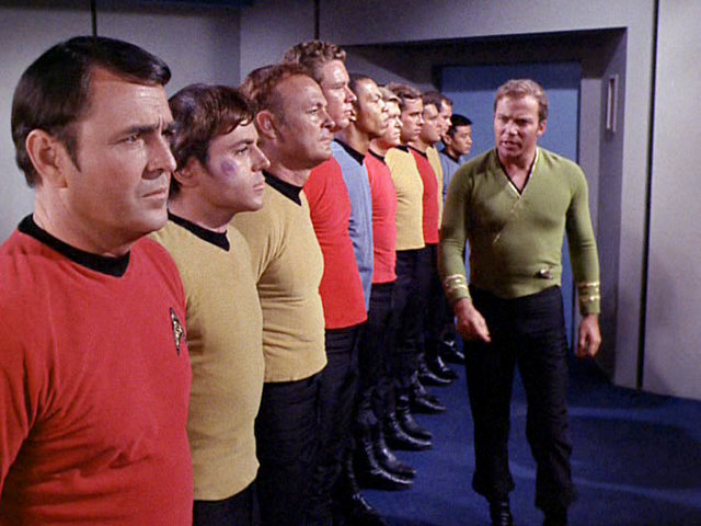
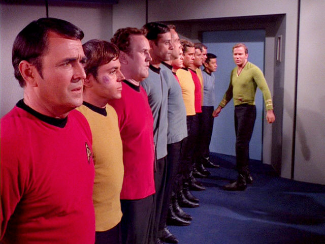
Different actors in the same role
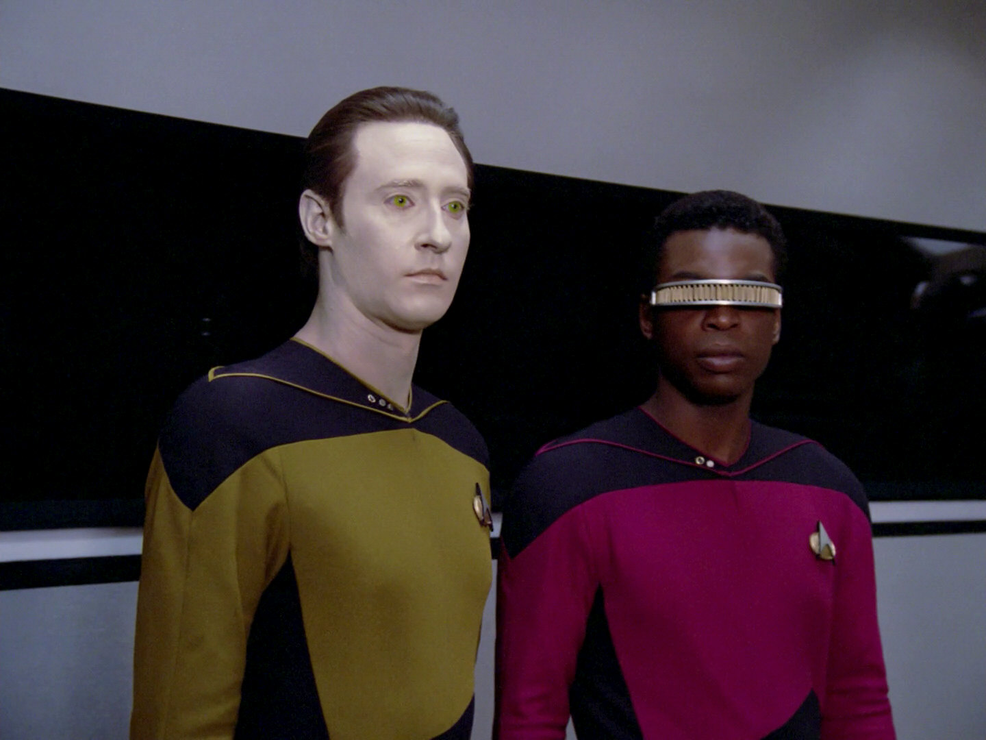
In a TV or movie series, it is often a problem to bring back a character because the actor is not available any more. It may be an option to recast the role, if the character is either not notable or is a child who can well be played by someone else at an older age. In a science fiction series like Star Trek, alien make-up may further help to obscure a recasting. Alexander Rozhenko and Tora Ziyal, for instance, were played by various child and teen actors.
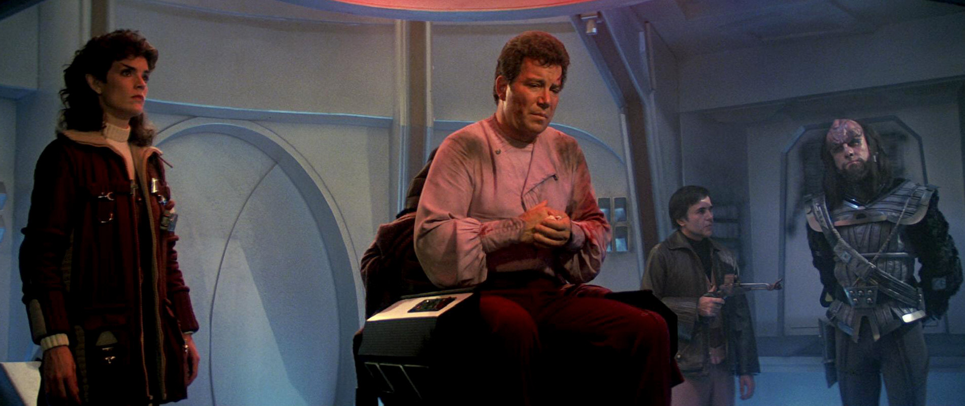
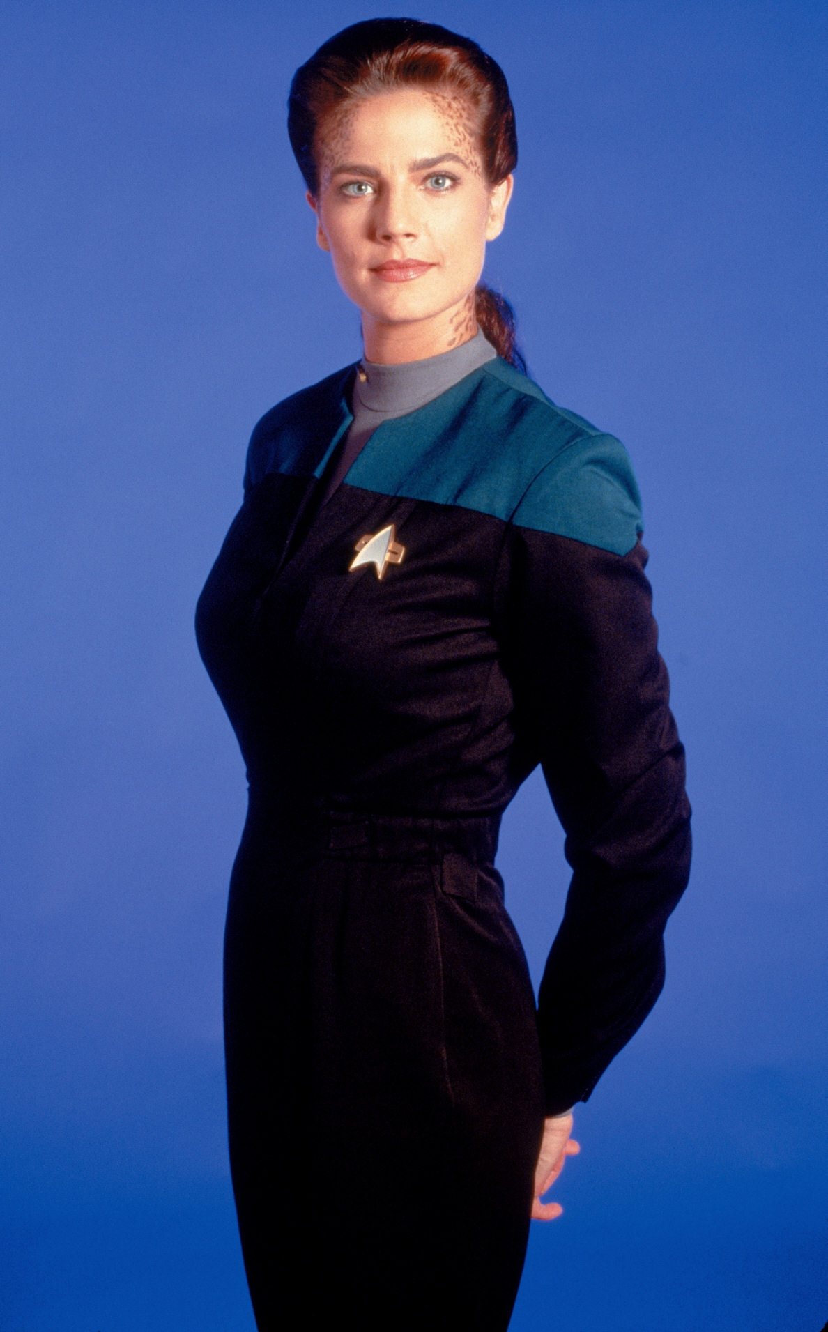
There are noteworthy and quite recognizable recastings in Star Trek, though. In "Star Trek: The Search for Spock", Robin Curtis replaced Kirstie Alley in the role of Saavik. The two women do not only look very different in their human appearances (eye color, face shape). The "new" Saavik was also given curly hair and Vulcan eyebrows that the former one didn't have for some reason.
Inaccurate set and prop reconstructions
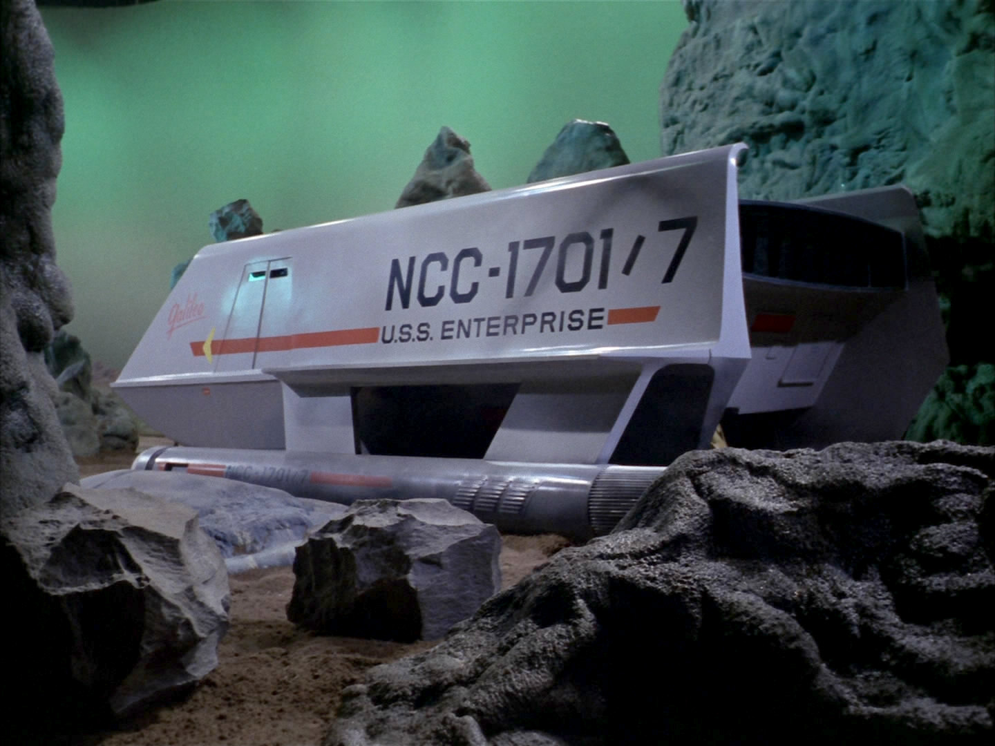
When sets or props are needed again because a story revisits a certain time or place, they often have to be rebuilt. Such a reconstruction is not always perfect, most often due to lacking documentation or lacking availability of the original parts, or to other technical or budgetary constraints.
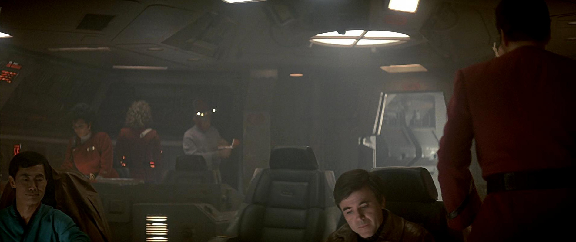
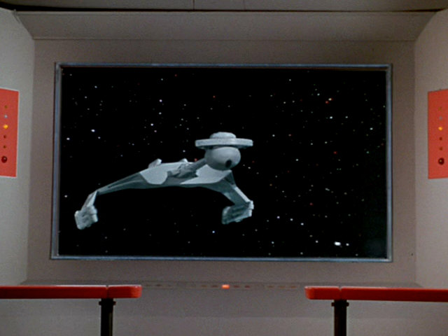
Only in rare cases sets were changed for no apparent reason, although common sense would have required them to look still the same. One notable example is the bridge of the captured Klingon Bird-of-Prey that sported a raised central captain's chair and a round access hatch in "Star Trek: The Search for Spock". In "Star Trek: The Voyage Home", the bridge layout is completely different, the central chair is gone and the hatch is angular. Yet, it is definitely not a modification made by Scotty, who still has problems to even understand the Klingon interfaces. So it can't possibly be the same room. While we may make up explanations that even on such a small ship an auxiliary bridge may exist, the question is why this clear visual continuity error was made in the first place, why it wasn't attempted to rebuild the bridge the way it was in the previous film.
Updated user interfaces
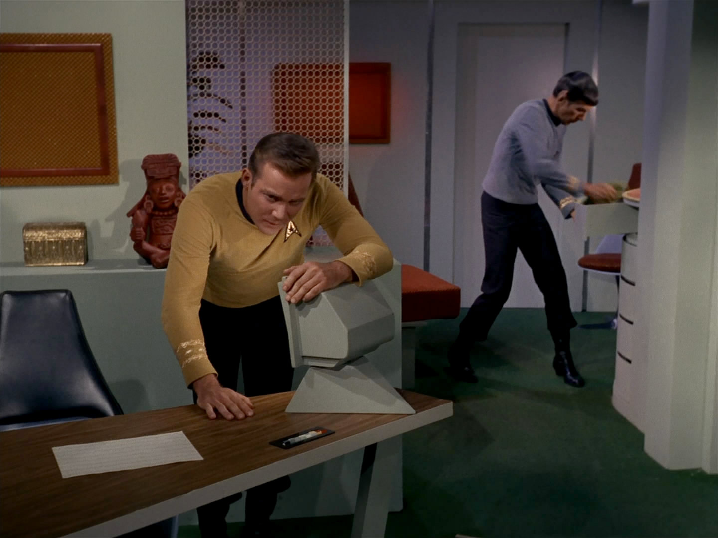
The Original Series uses the techniques of the 1960s to visualize the technology of the 23rd century. It is appropriate that in a series made in the early 2000s, the consoles of a future starship shouldn't consist of chunky push buttons, static displays and analog instruments. The user interfaces were updated for Star Trek Enterprise, to a style that reflects the real-world development while not clashing too obviously with the one shown in TOS. The consoles still have mechanical buttons, but they are combined with graphic displays as they are necessary for a proper interaction.
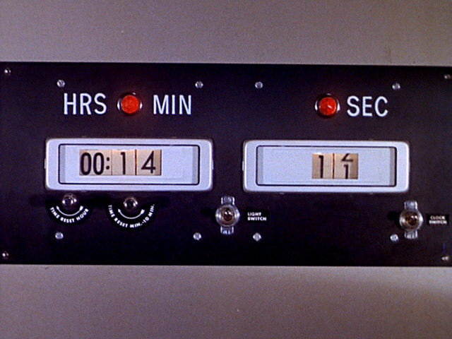
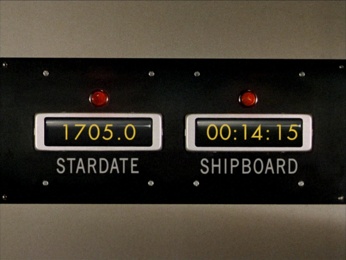
 A couple of retroactive changes were made in TOS Remastered. While overall all elements of the Enterprise bridge remained identical, the mechanical clock that is visible in TOS: "The Naked Time" was replaced with a digital version.
Enhanced visual effects
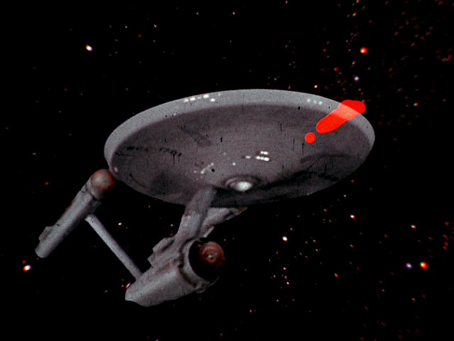
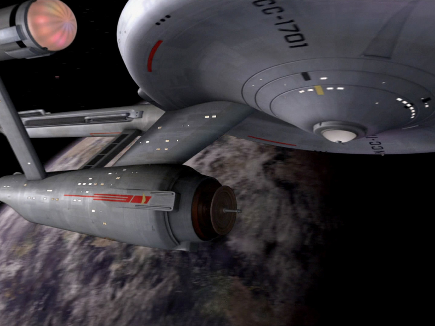
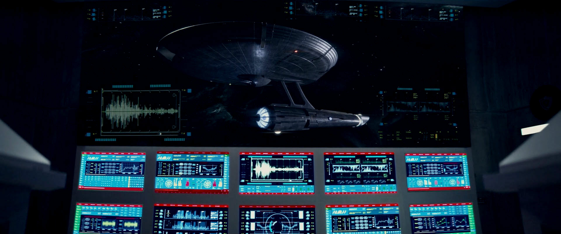
Regarding the development of VFX from the 1960s until today, we have to distinguish merely technical improvements on one hand, and stylistic changes on the other hand. Technical improvements include advanced post-processing equipment to create phaser beams and similar light effects, new filming and compositing methods for space scenes and ultimately the replacement of all analog techniques with CGI. The result is a higher image quality and, if handled with care, more realism too. It is obvious that the effects of TNG look better than the grainy ones of TOS, and the crystal clear shots in TNG-R still better than the blurred ones in TNG. It is also clear that the motion control shots of ships in TNG are a better viewing experience than the more or less static appearances of the Enterprise in TOS, and that the CGI of DS9 and Voyager (at least most of the time) lends even more realism to the space scenes.
Refined sets and models
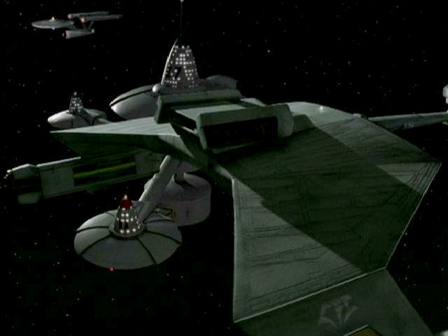
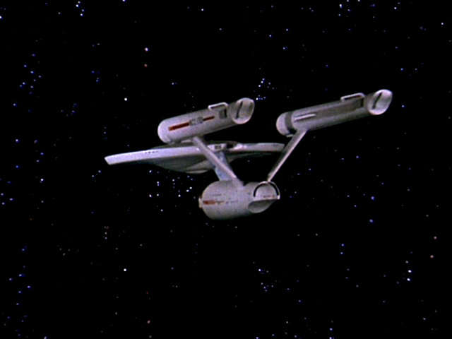
The original Enterprise studio miniature measures as much as 11ft and has a great level of detail for its time. But it lacks the kind of finish we would expect from "realistic" starships today, such as thrusters or visible hull plates. The Constitution class was never updated this way, although it may have been an option in DS9: "Trials and Tribble-ations" and ENT: "In a Mirror, Darkly I+II". The Klingon D7, on the other hand, was modified accordingly for the DS9 episode, adding a slight feather pattern to the hull, similar as the one found on other (at that time: newer) Klingon ships. In this particular example, visual continuity is not impaired at all. The particular ship of Koloth was not visible in the TOS episode "The Trouble with Tribbles", and it could well be a ship that includes features from both the D7 and the supposedly more advanced K't'inga.
An actual example for a vessel that underwent an unexplained metamorphosis is the Enterprise-D. The original 6ft model was built according to the plans of Andrew Probert and had a thin saucer rim. When Ten Forward was conceived for season 2, the new 4ft model was built with a thicker rim and a slightly different window arrangement, among other small changes. Stock footage of the 6ft model still appeared in later episodes though. This is sort of a continuity error, but it went largely unnoticed. Likewise, without the publication of the according production sketch by John Eaves probably no one would have seen in the movie that the nacelle pylons of the Enterprise-E were moved for "Nemesis".
Some fans rate the Enterprise refit as shown in "Star Trek: The Motion Picture" as a visual discontinuity or even as a "reimagination" or "reboot" of the ship known from TOS. They ignore that the extensive refit of the ship is an essential part of the film's story and as such totally plausible.
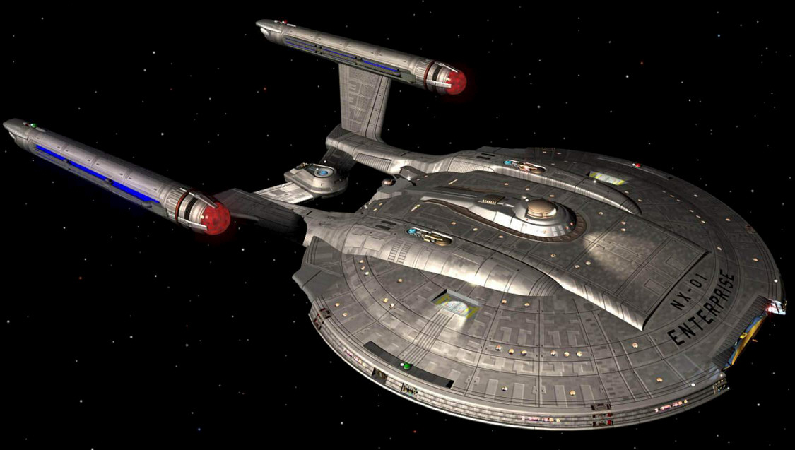
The design of Enterprise NX-01 ("Akiraprise") is a visual continuity problem of another kind. Here, the appearance of the ship doesn't clash with anything established. On the contrary, it looks odd because it is too much like a ship that would exist as many as 200 years later. Retroactively the ship design makes more sense again, because the makers of Star Trek Enterprise developed a consistent production design for the series that wouldn't let Enterprise appear as an anachronistic exception.
Generally speaking, if a real-world visual upgrade coincides with an in-universe rationale such as the refit of a starship, it is not an error. For a prequel, and especially one taking place at the time of TOS or earlier, it is difficult but not impossible to fulfill this requirement.
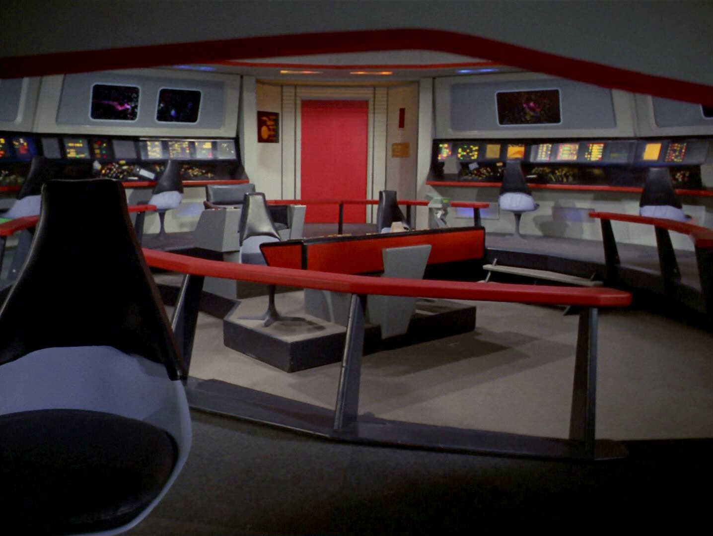
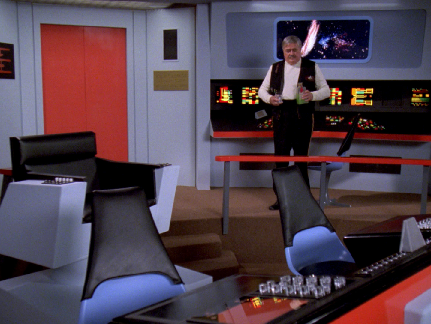
Original Enterprise bridge in TNG: "Relics"
The bridge of the original Enterprise appears in the form of stock footage and of a faithfully reconstructed partial set in TNG: "Relics". There are no concessions rooted in real-world progress, not even regarding the computer interfaces.
Sets, props and models in DS9: "Trials and Tribble-ations"
The visuals of DS9: "Trials and Tribble-ations" consist of stock footage from TOS: "The Trouble with Tribbles" that was supplemented with newly filmed scenes in partially reconstructed TOS sets, as well as with CG manipulation of the TOS footage. All props too look like they did in TOS. For the exterior shots, the Enterprise and the space station K7 were faithfully reconstructed. The only visual continuity "error" with regard to the TOS episode is a part of the story: In order to save history, the DS9 crew has to interfere, and hence appear as previously unknown personnel in historical records.
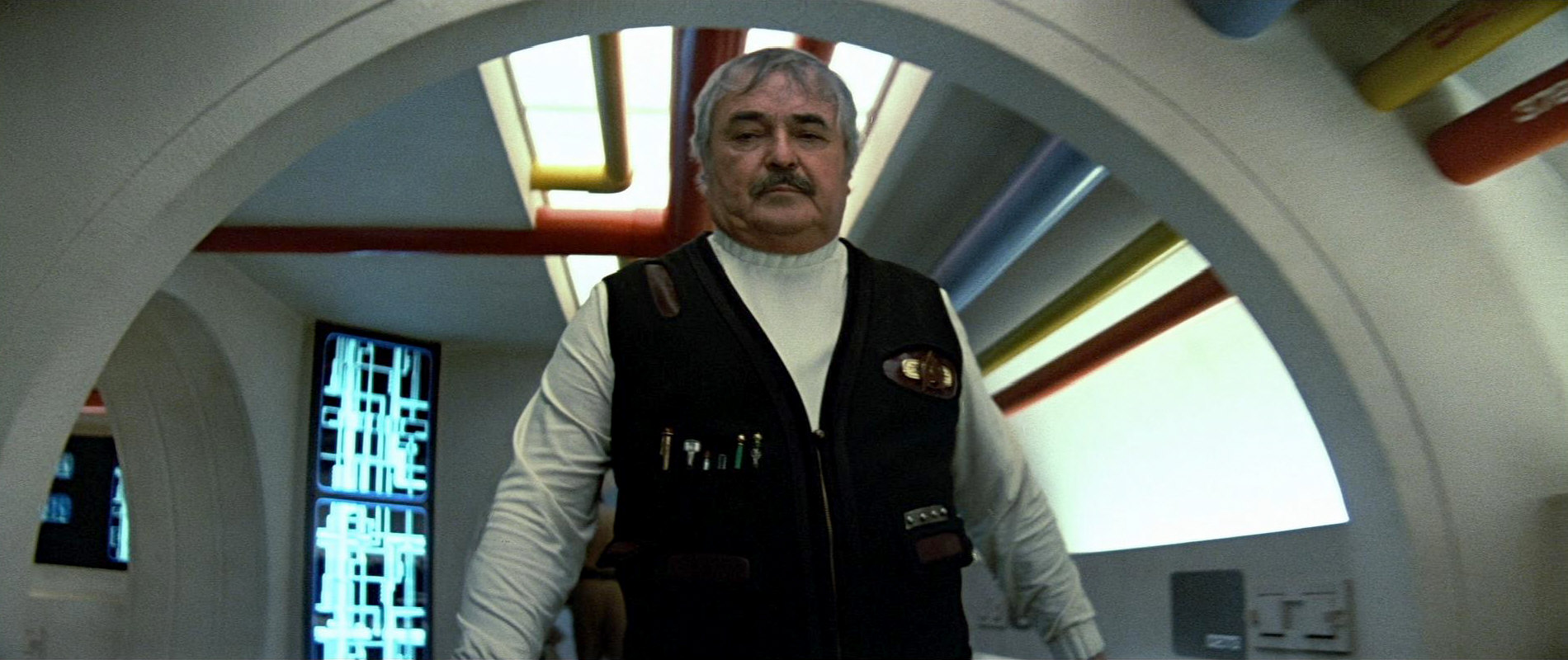
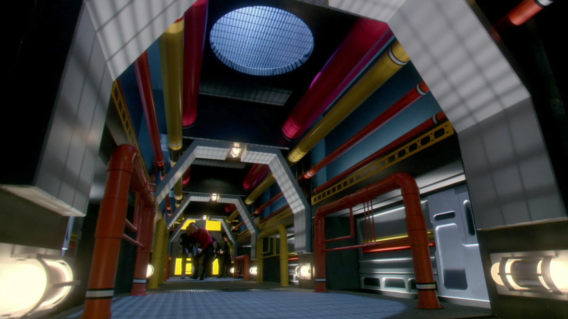
Sets, props and models in ENT: "In a Mirror, Darkly I+II"
For ENT: "In a Mirror, Darkly I+II", the complete bridge of the Constitution-class USS Defiant as well as several other rooms were rebuilt the way they looked in TOS: "The Tholian Web". Moreover, newly designed sets were constructed for the "Gorn chase" in the Jefferies tubes network that must have existed but was never seen in TOS. These sets were laid out to fit with the style of TOS and of the service corridor with its colorful tubes in "Star Trek V". Also in this episode, we can see the NX class and the unchanged original Constitution class (both as CGI) side by side.
Improved make-ups
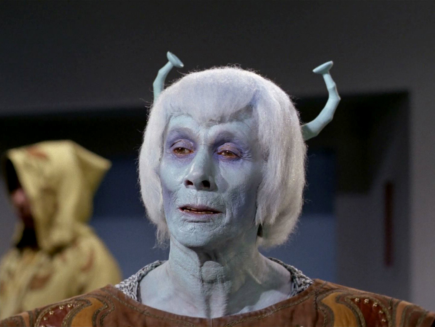
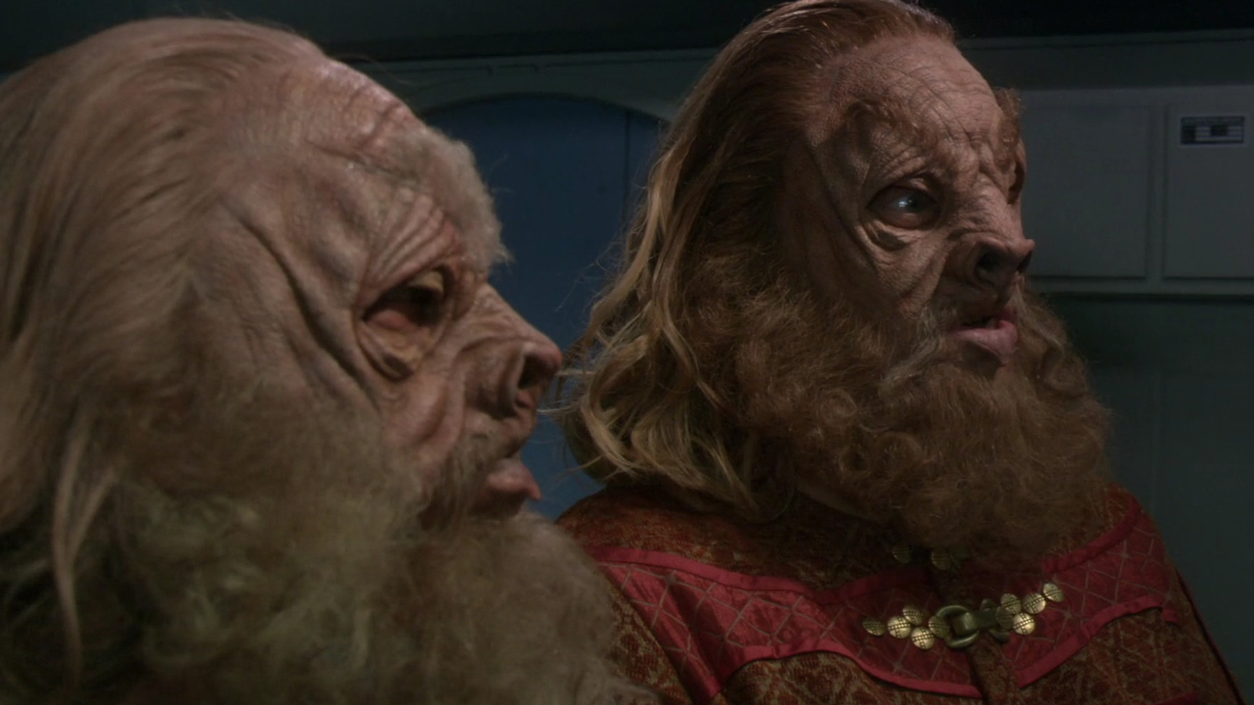
Make-up techniques have seen a great improvement since the 1960s. Many aliens of TOS look just like what they are: human actors with strange beards and appliances glued on. In classic Star Trek, however, it has become an art to remain true to the original appearance of those aliens while creating a realistic state-of-the-art make-up for their appearances in more recent series. So far, the make-up was continually refined, rather than redefined. Although the Andorian look has never been totally consistent through the ages, the make-up used in Star Trek Enterprise (now with moving antennae that were moved forward) accomplishes a visual update without creating a noticeable discontinuity.
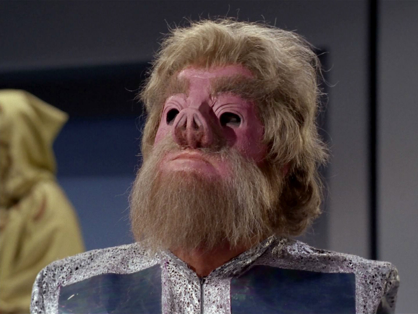
Likewise, the Tellarite make-up in Enterprise is a faithful refinement of the TOS look. The characteristic eye holes with their wrinkles, the eyebrows and the beard are still much the same. Only the shape of the nose and the lips is somewhat different now.
Gorn
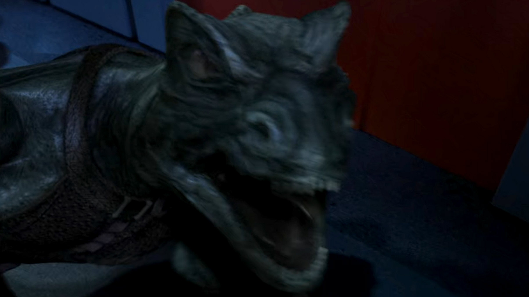
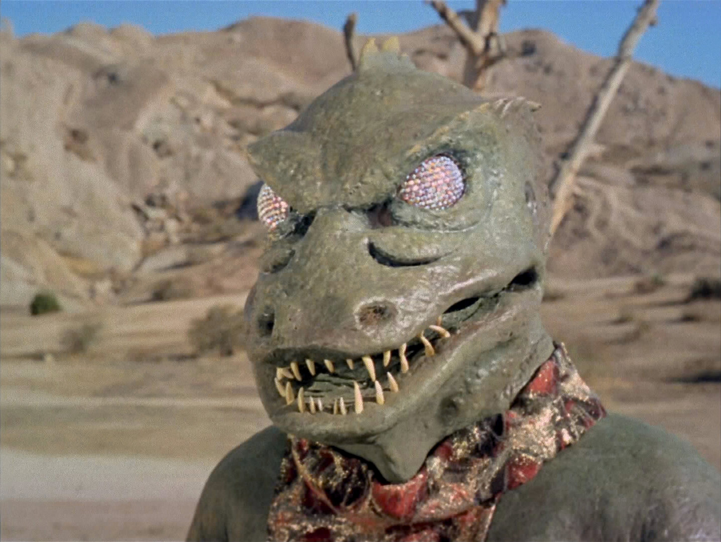
The Gorn are the only species that was reimagined for Enterprise beyond simple improvements of the make-up. The Gorn captain in TOS: "Arena" looks very clumsy because he is played by a human actor in a thick rubber costume. In ENT: "In a Mirror, Darkly II", the Gorn is computer-generated and accordingly agile. The body proportions and the features were adapted to look more like on actual reptilians, such as the slit iris instead of a faceted eye. We may be inclined to accept this as a more accurate depiction of the Gorn species.
Revised Romulan make-up for TNG
In TOS, Romulans used to look exactly as Vulcans; the pointed ears and eyebrows were the only distinguishing mark from humans. This make-up was revised for the Romulans of TNG, who were first seen in the season 1 finale "The Neutral Zone". The TNG Romulans consistently have V-shaped forehead ridges. After no Romulans had appeared in the first four TOS movies, it was decided to ignore the TNG style and go back to the flat foreheads for "Star Trek: The Final Frontier" and "Star Trek: "The Undiscovered Country". There are a couple of continuity issues with the make-up variation, such as why the Romulans have even foreheads only in the 23rd century (ENT Romulans look like in TNG) and why Spock would not raise suspicion during his extended stay on Romulus in TNG: "Unification I/II". Disregarding the comparably slight difference between the two different make-ups was an option until the launch of Picard in 2020, even though it was possible to make up explanations why we never saw diverse starship crews and dignitaries at a time.
New Trills for DS9
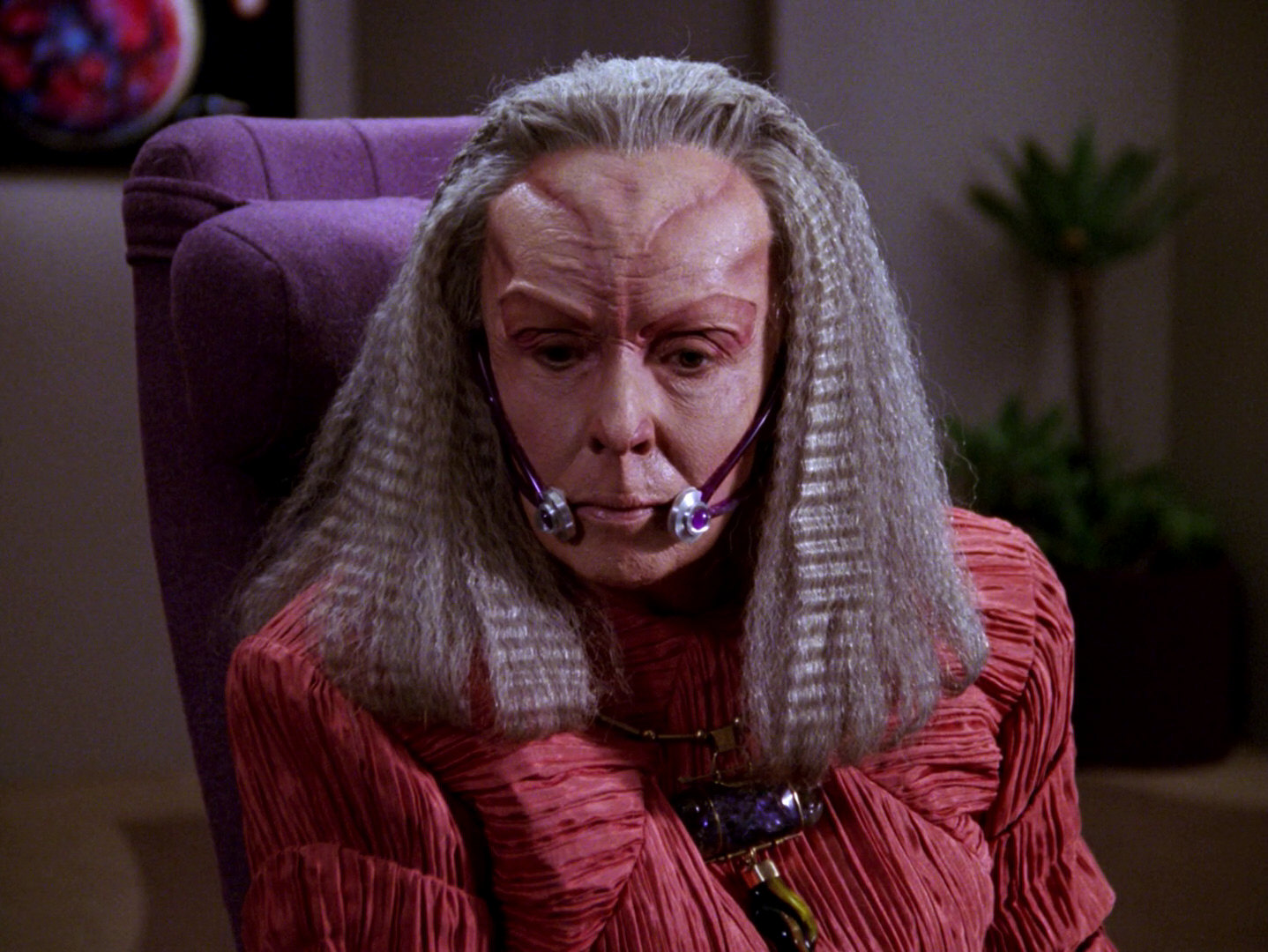
The Trills had appeared in only one TNG episode, "The Host", when it was decided that the character of Jadzia Dax should belong to this species. But it was discovered that the forehead make-up didn't look good on Terry Farrell. The Trill make-up was changed to the familiar spots, and never switched back, creating a discontinuity between the TNG and the DS9 Trills. But looking at the issues in more detail, the visuals are only a part of the problem, and perhaps not even the biggest one. If it were not for the name, we can safely say that TNG and DS9 Trills would better be completely separate species to make any sense.
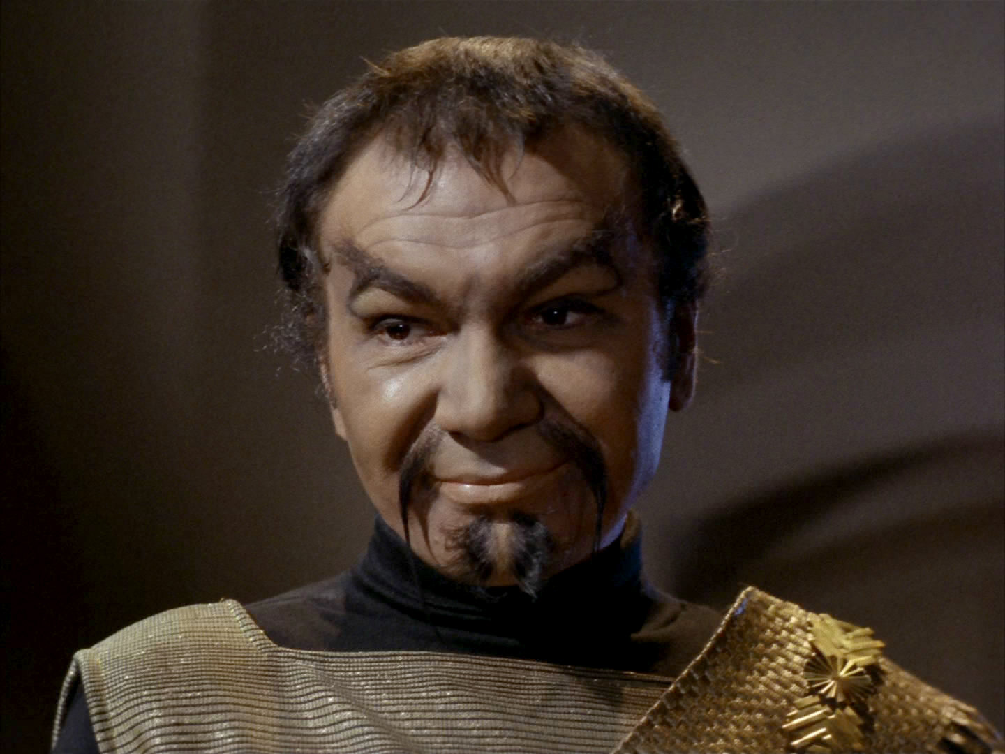
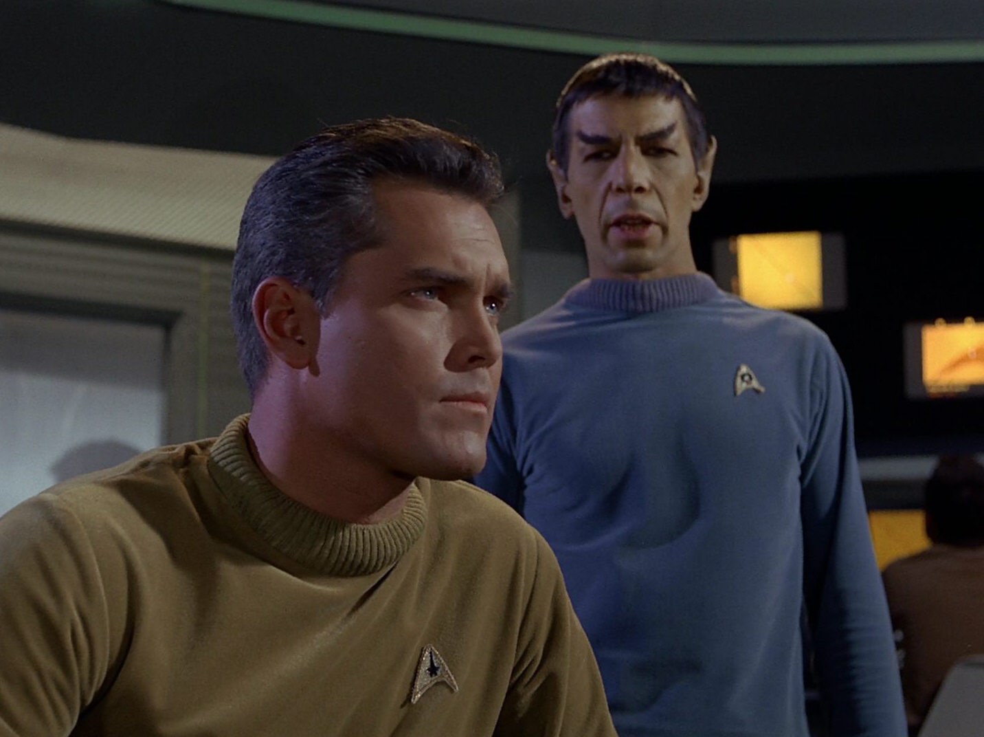
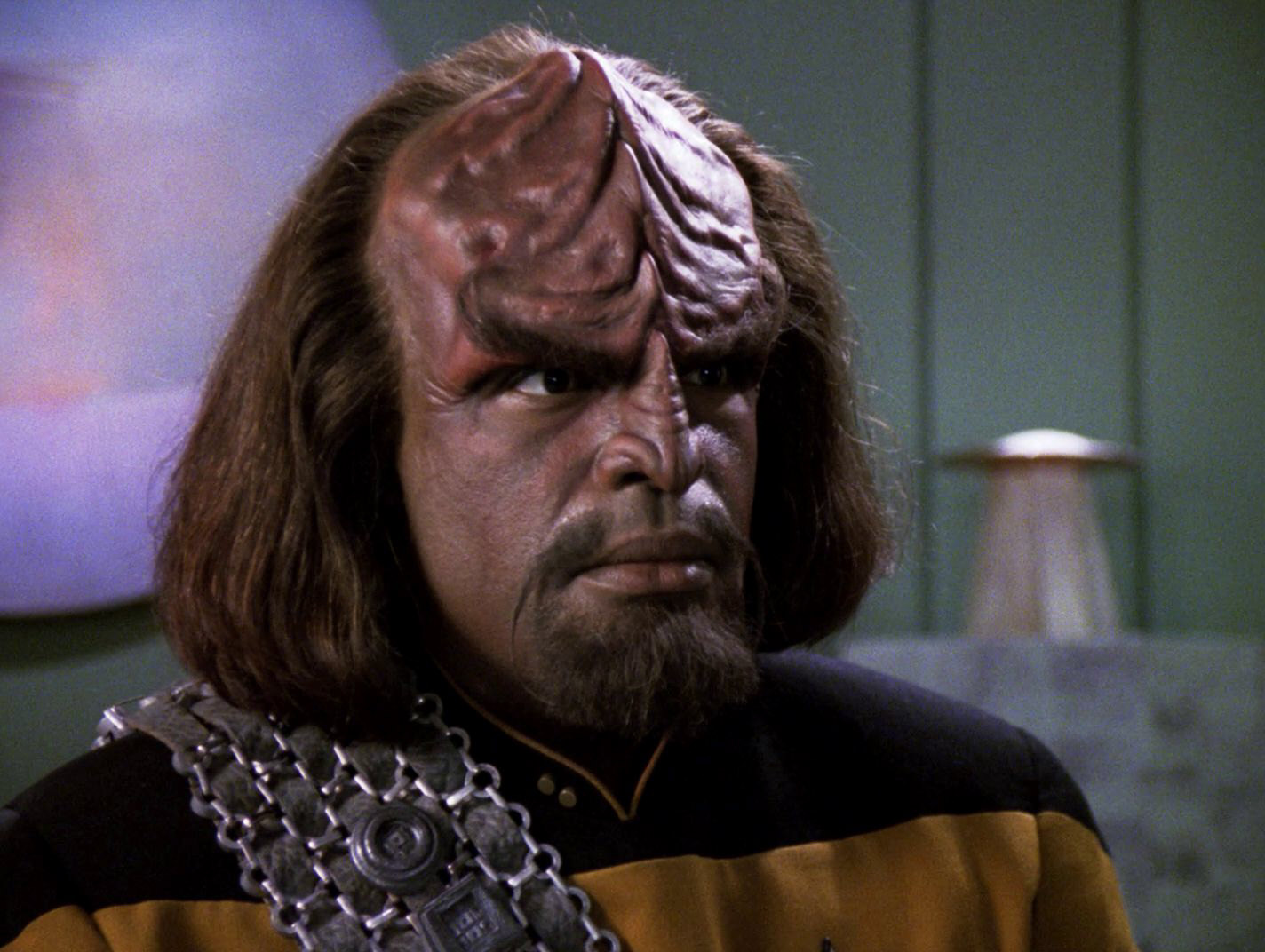
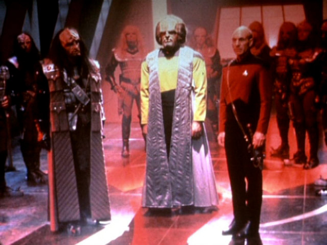
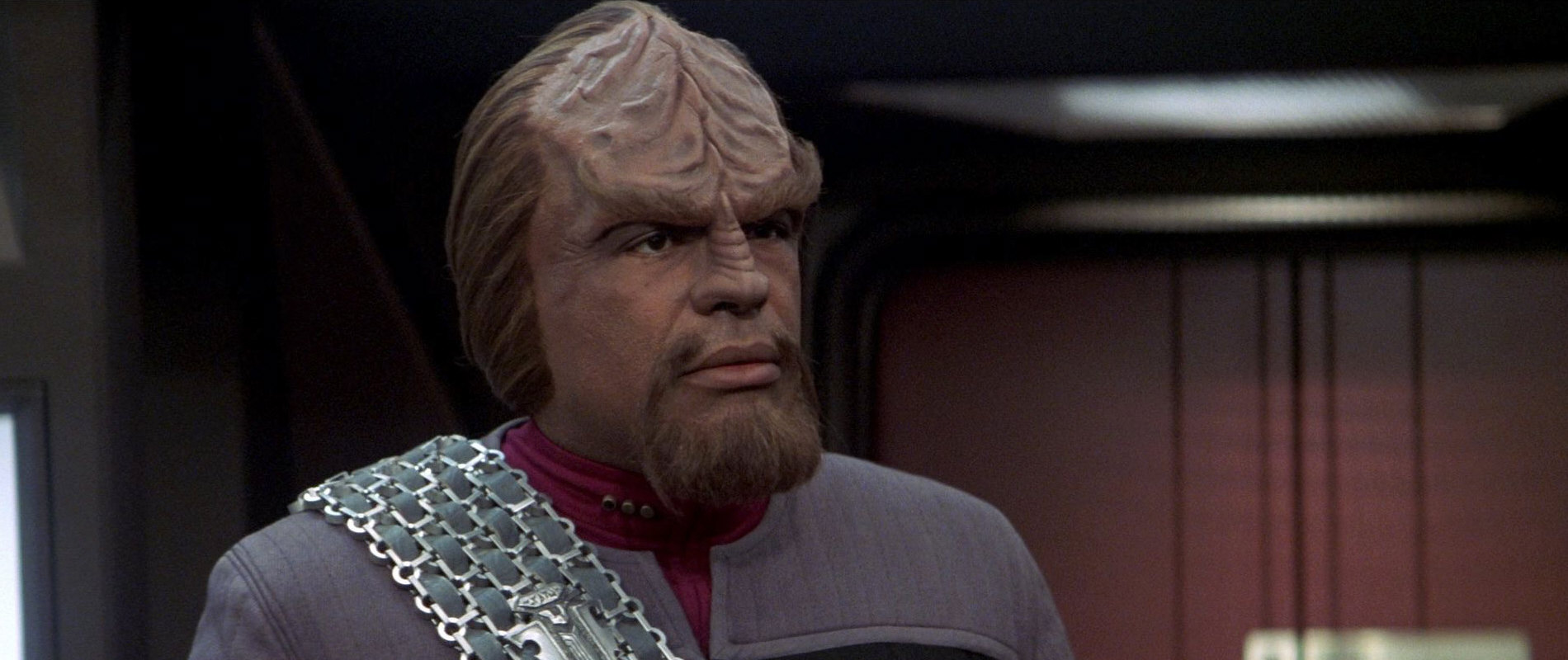
New Klingons for TMP
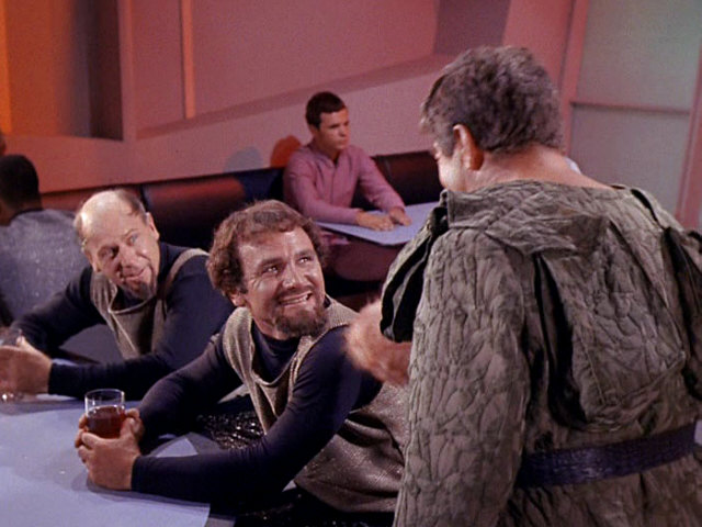
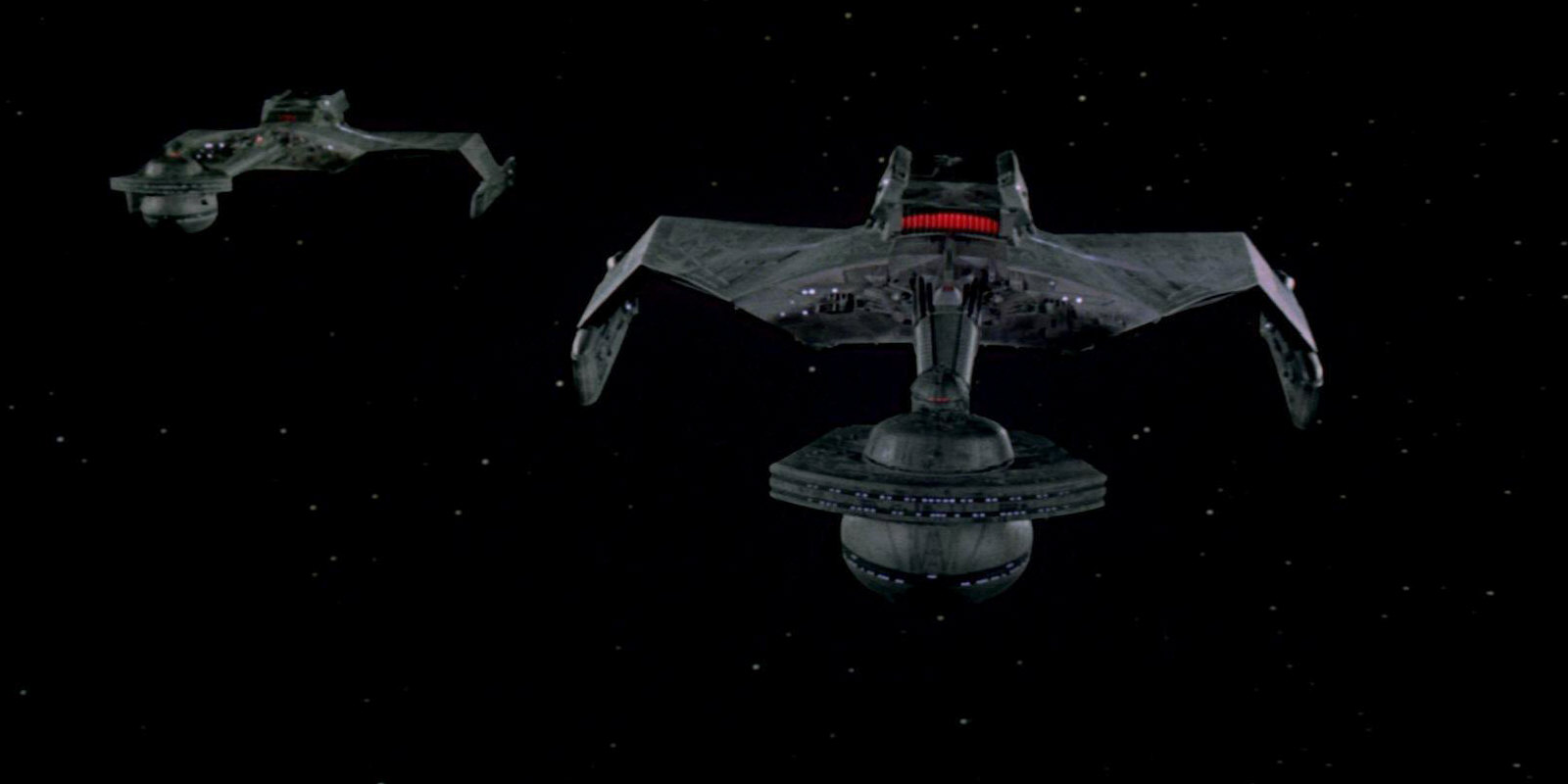
The first Star Trek feature film was made in 1979, more than 10 years after The Original Series, and with a much higher budget. Purportedly Gene Roddenberry always intended the Klingons to look more alien, which was put into practice on this occasion. Most notably, the new Klingons have forehead ridges that distinguish them from humans. No explanation as to why the Klingons look different is given. The new Klingon look remained consistent throughout TNG, DS9, VOY and ENT. For many years, until 1996, it was the obvious option for the fans to ignore this unique visual discontinuity and imagine that the TOS Klingons looked like the "modern" ones from TMP and TNG.
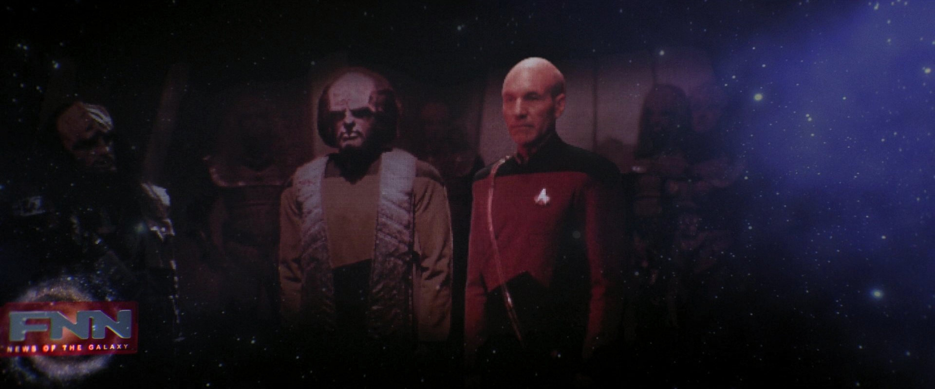
Klingon make-up in DS9: "Trials and Tribble-ations"
TNG: "Relics" already showed the original Enterprise bridge without concessions to the fashion and technology of the time. DS9: "Trials and Tribble-ations" consequentially features human-looking TOS Klingons without any make-up updates, even in newly filmed shots. Considering that Worf is sitting at a table next to the TOS Klingons (albeit with a cap that obscures his forehead ridges), the writers probably deemed necessary to not only show but even explicitly hint at the visual discontinuity, thereby creating the most famous continuity problem of Star Trek. Although "Trials and Tribble-ations" was meant to be a homage to TOS in the first place (on the occasion of Star Trek's 30th birthday in 1996), the episode established a standard for all Star Trek productions of the next ten years, that visuals are canon and must not be denied.
Klingon metamorphosis retcon in ENT: "Divergence"
The continuity of Enterprise with the previous series was rather lax in the first three seasons, not only but also on the visual side ("Akiraprise", Romulans, Ferengi, Borg, mind melds, Xindi War). In the fourth season, the stories began not only to repair the very own continuity issues of Enterprise (such as the mind melds) but also tackled the Klingon forehead problem created in DS9: "Trials and Tribble-ations". According to ENT: "Divergence", the disease introduced by genetic experiments with human augment DNA was cured with a genetic treatment in the course of which the Klingons would lose their pronounced foreheads and pass on the trait to their children.
Visual Continuity in the Abramsverse
 Visual continuity in the Kelvin Timeline films can be described as "optional". Some visuals may be reconciled with TOS, with the provision that more advanced make-up techniques, updated computer interfaces or better finish of props, sets and effects are within the acceptable range of the five classic Trek series and ten movies. Some others may be pardoned because of the timeline split. The rest doesn't fit with the established look of the era, even though it may have been well possible to design something visually closer.
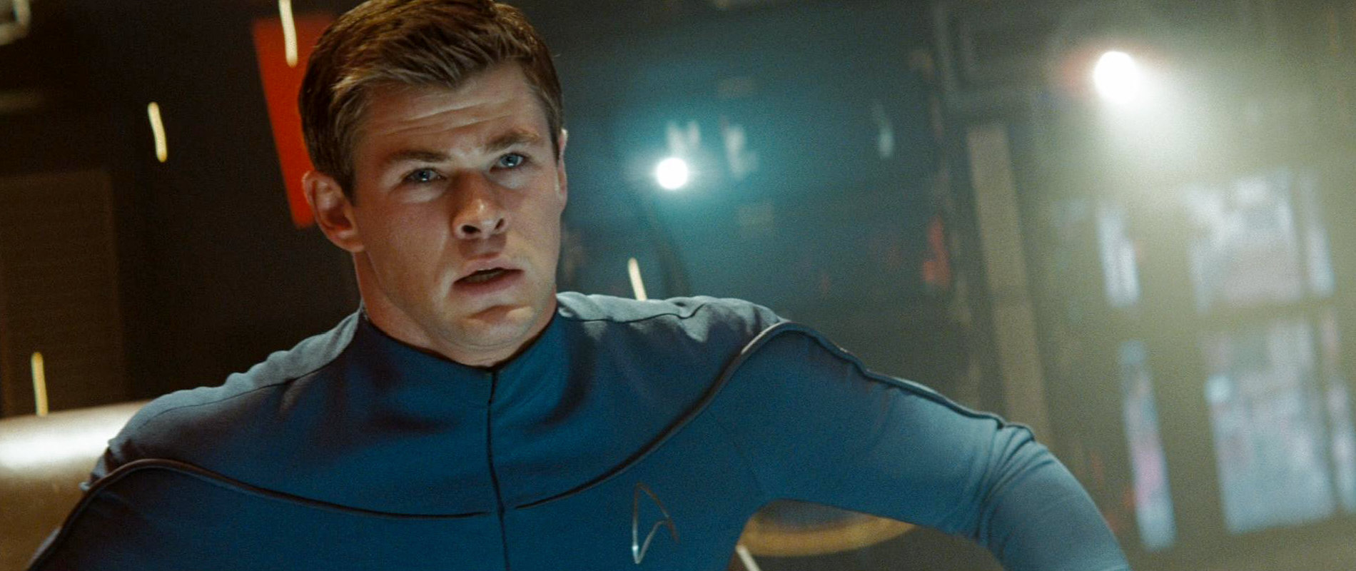
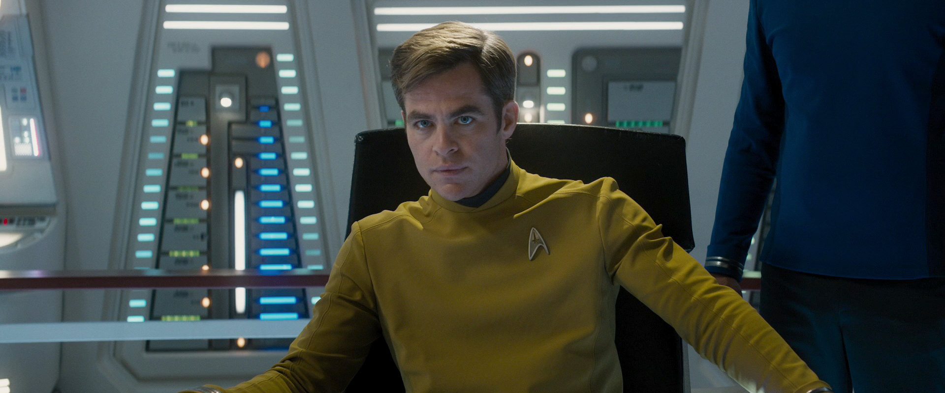
New actors
The arguably most apparent visual change in the Abrams movies is that the established characters are played by new actors. It is obvious that there was no other choice in a film series that returns to the beginning of the franchise after 40 years, rather than continuing it.
Style changes
The uniforms seen on the Kelvin in year 2233 in "Star Trek (2009)" have a roughly similar style as those in "The Cage" or in TOS. But the color of the command department is blue instead of gold (or green). It is not a problem that still 20 years earlier we don't see the exact uniforms from "The Cage". It only isn't plausible that the department colors on Starfleet ships would be totally different every 10 or 20 years.
The uniforms worn by the Enterprise crew of the Kelvin Timeline (and curiously only by the Enterprise crew, not by any other branch of Starfleet) are surprisingly close to the ones of TOS, in the original version as well as in the update for "Star Trek Beyond". This is remarkable because there is no reason why the uniforms couldn't look very different in the new timeline. It is not far-fetched to assume that the uniforms were kept the same to act as a visual bridge to TOS, to make them more relatable, because otherwise the production design of the new movies deviates from the established looks.
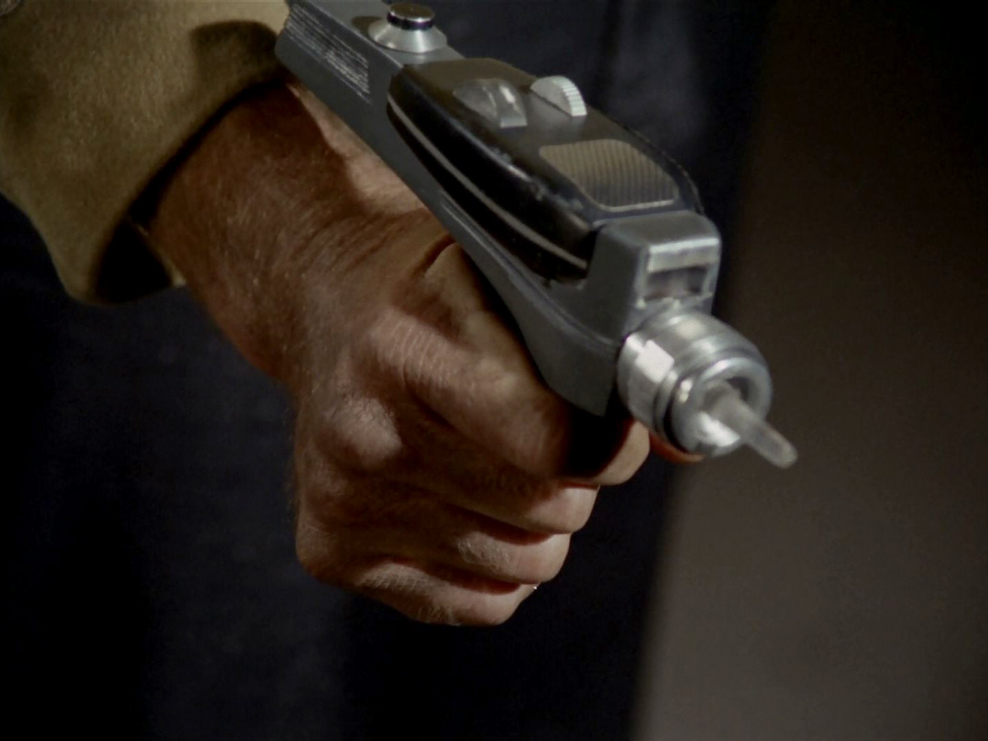
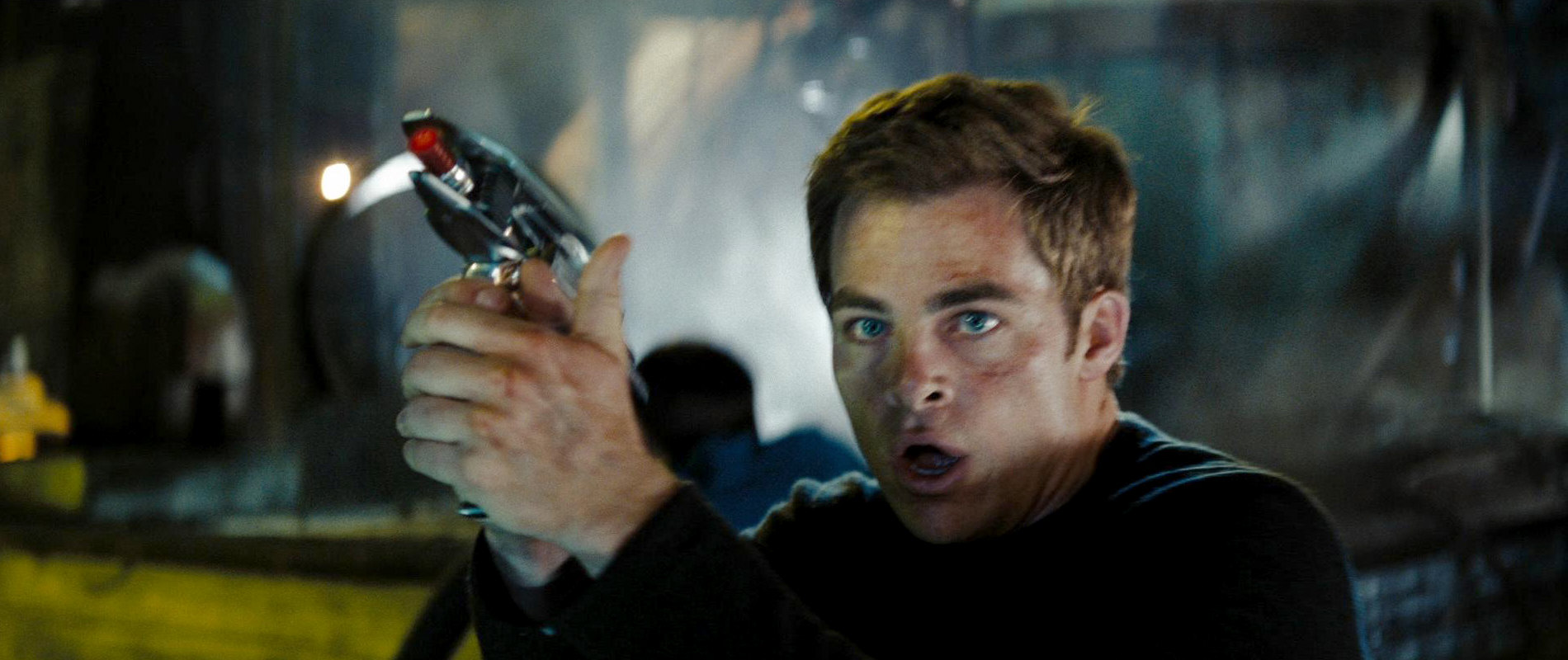
Hand-held equipment
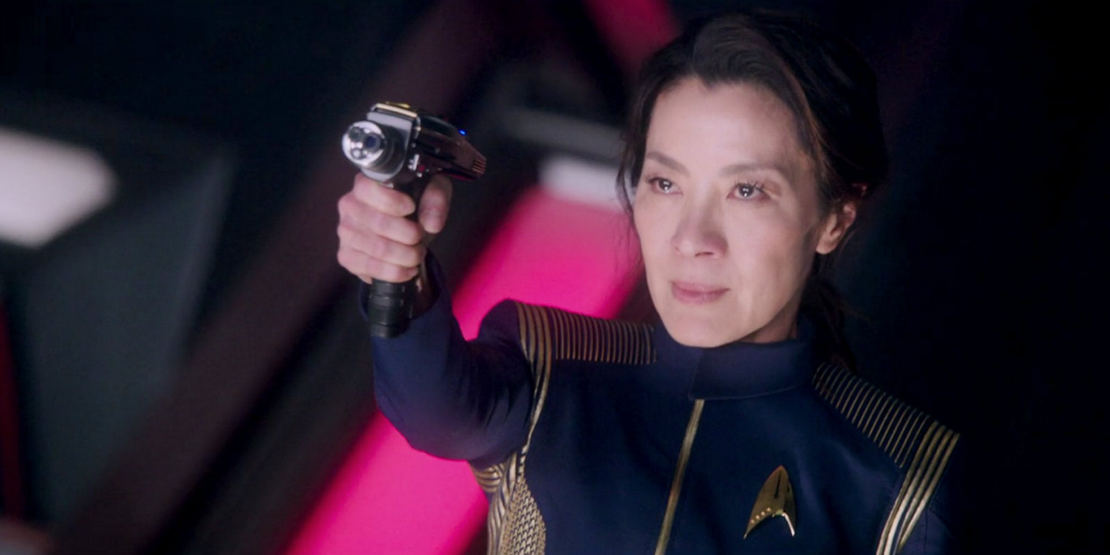
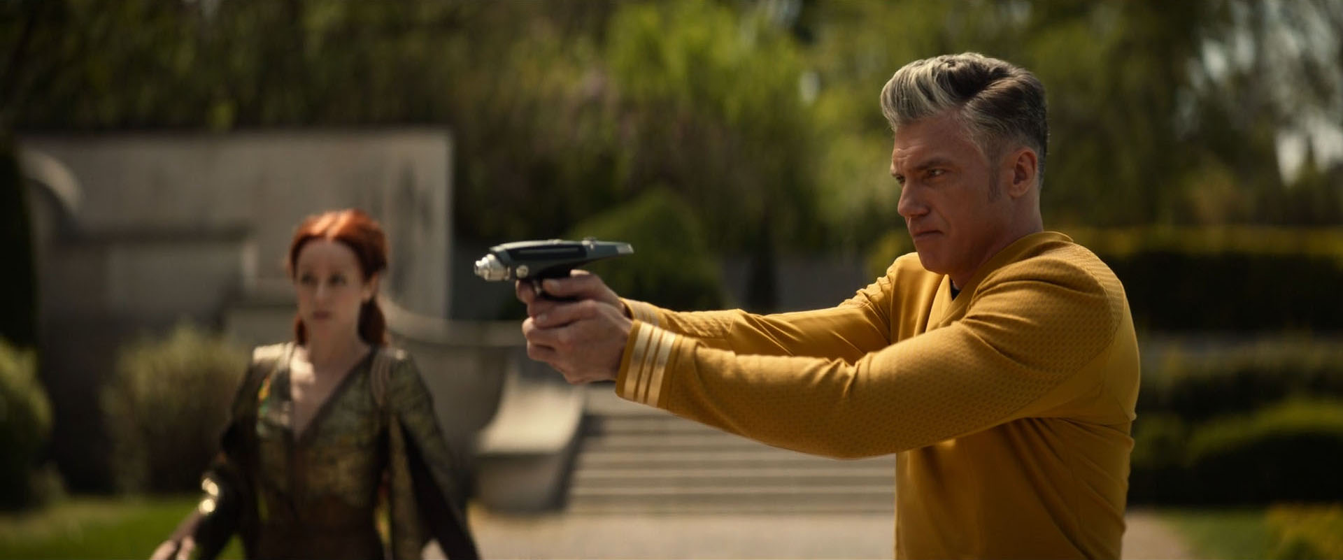
The phasers introduced in "Star Trek (2009)" with their shiny finish are very unlike those used in TOS. Of course, this may be excused with the movie taking place in a parallel timeline. Yet, those phasers are rather toy-like compared to the military issue devices seen in all other Star Trek incarnations, including Discovery.
Starship sets
The bridge of the Kelvin Timeline Enterprise does not have much in common with the one from TOS except for the basic layout. More than only the style of the user interfaces was redesigned. The new bridge looks playful and distracting, and not like a command center where the crew has a chance to focus their attention on a particular task. Also, all Abramsverse starships without exception (even the Franklin that is still 100 years older) sport a bridge window, whereas all classic Starfleet ships without exception have none.
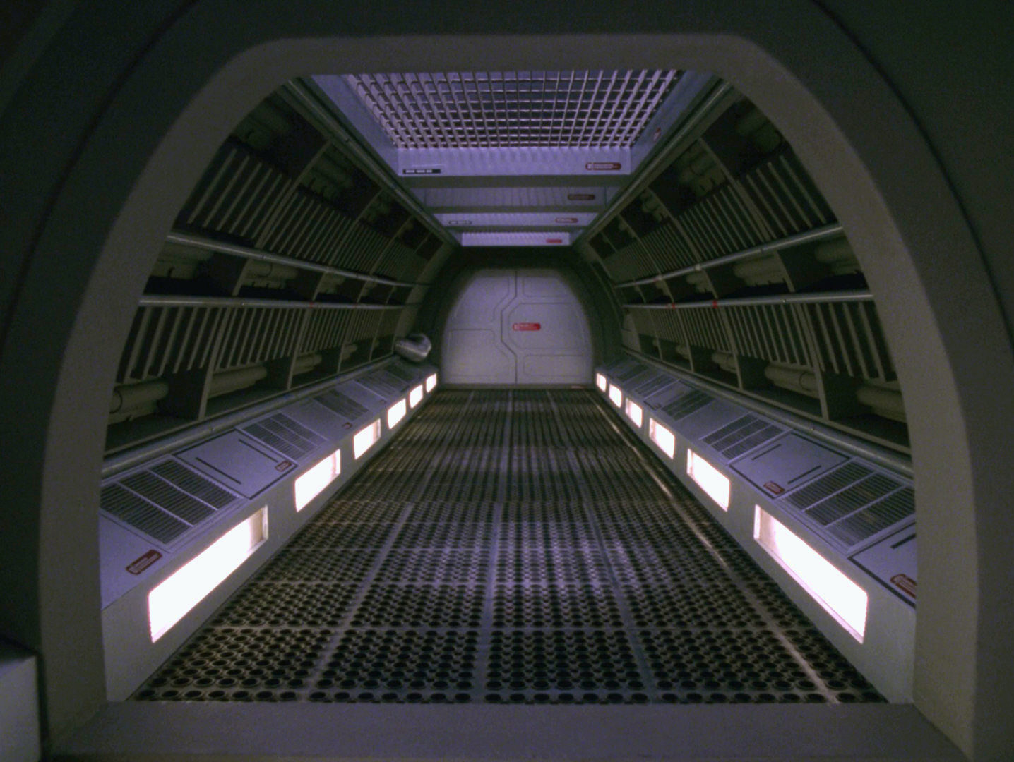
Star Trek's traditional concept of the interior design of ships was that it didn't show large exposed machinery like in a factory building, but rather distinct decks and corridors with access to the innards, like on a sea ship. The engineering set of the Abramsverse with its huge open spaces is a departure from that principle, especially since it is very low-tech (because it was filmed in a barely disguised brewery). The tanks and pipes in engineering are made for water, rather than plasma.
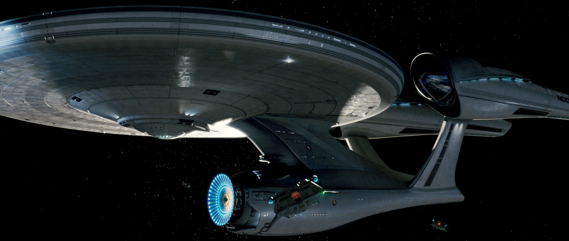
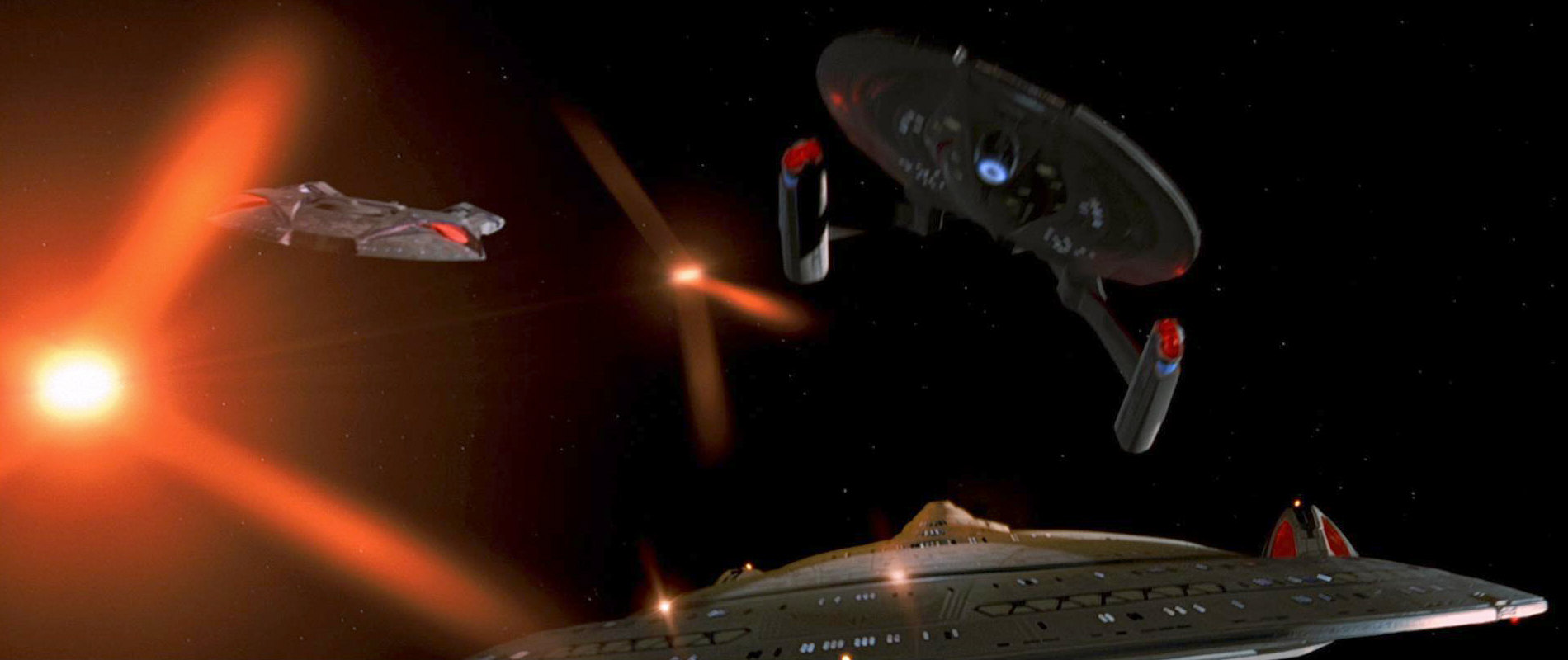
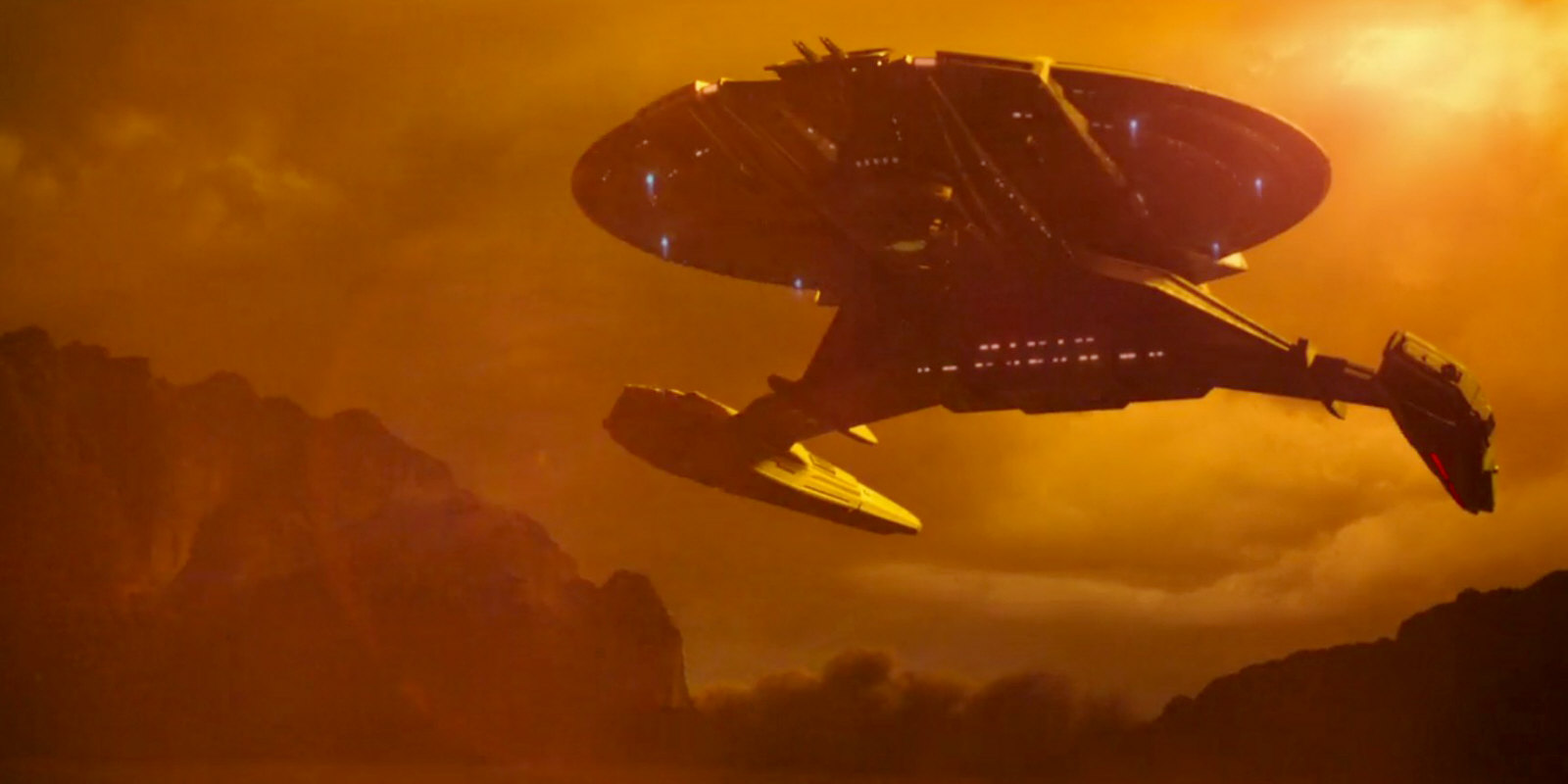
Starship designs and sizes
The starships of the Abramsverse other than the Enterprise look a lot like we would have expected from the TOS era. They have a retro style that, with a couple of concessions, may work as a step in between NX-01 and the designs of the TOS movies. The same applies to most of the shuttles. The Enterprise of all ships, on the other hand, was redesigned more radically. The fact that in the new timeline the ship was launched more than ten years later may only explain a part of the problems with this design. Ultimately the Abramsverse poses a more fundamental problem because all of its ships are supposedly many times bigger than the original Enterprise of TOS (at least if we trust in the people who scaled up all dimensions of the finished CG model of the Enterprise by a factor of two). Even the Kelvin, a surveyor that predates Nero's incursion, is reportedly a behemoth with a crew of 800.
Visual effects
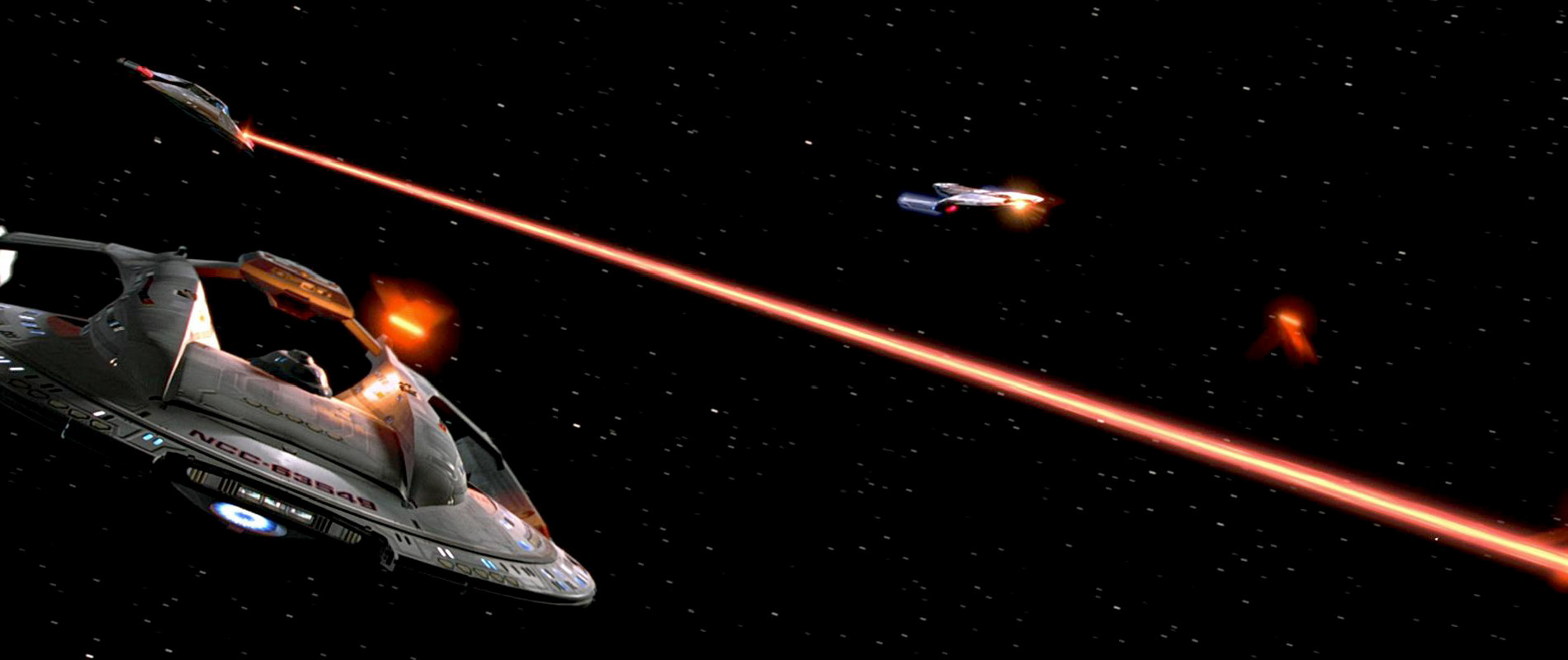
The advent of all-CGI visual effects has enabled and may even have encouraged the stylistic changes in the two latest Star Trek incarnations. The Abramsverse establishes phasers as pulse weapons and has new warp effects (actually, three different effects in the so far three movies!). Also, starships dropping out off warp now stop immediately, only a few meters ahead of the destination, defying what we used to know about warp drive and Newton's laws of motion. While not all of the new effects are errors, they give the Abramsverse a different look and feel.
Visual Continuity in the Discoverse
 Discovery redesigns Star Trek more radically than the Abramsverse did, although there is no official rationale in the form of it taking place in a parallel timeline. Many of the designs of Discovery are neither compatible with those of classic Star Trek, nor with those of the more recent Abrams movies. The most noticeable deviations are the totally new Klingon make-up and the totally new Klingon ships. But also the Starfleet ships of Discovery have little in common with what we should expect in the era, and this includes the original Enterprise.
Klingons
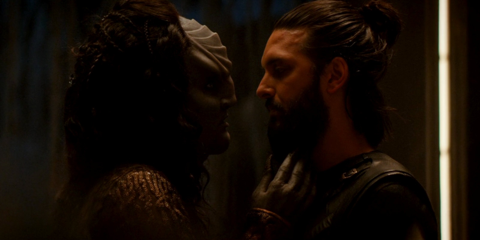
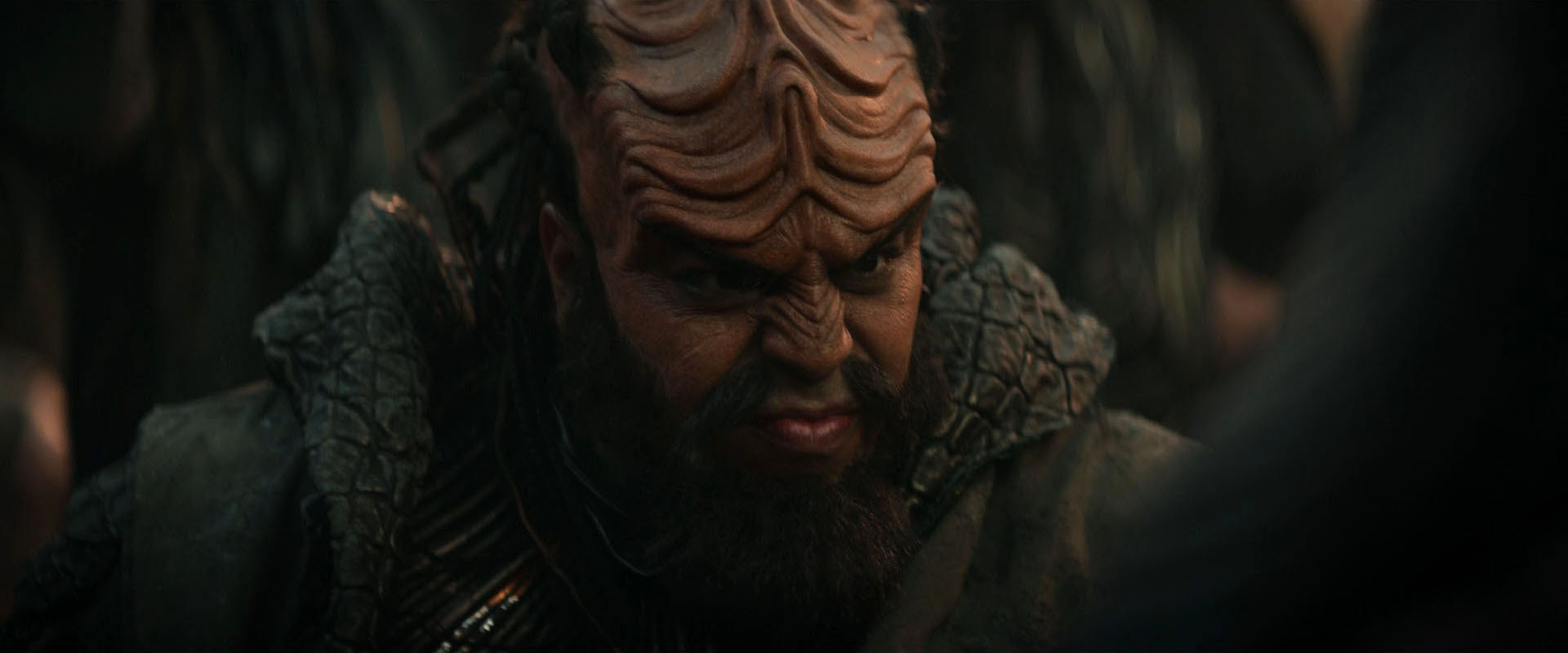
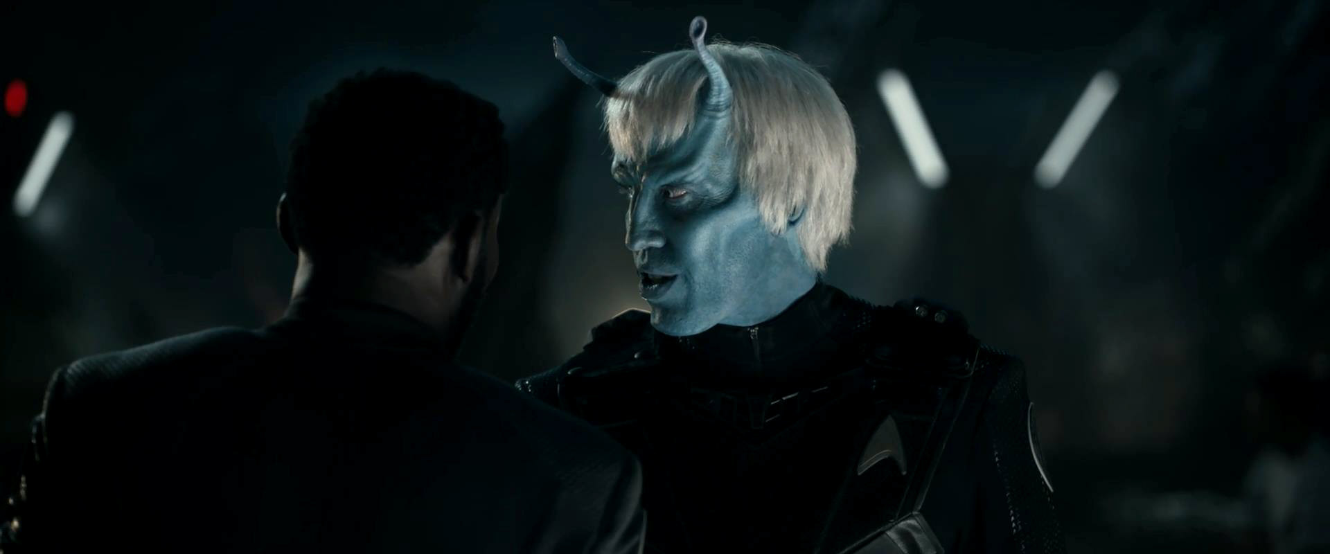
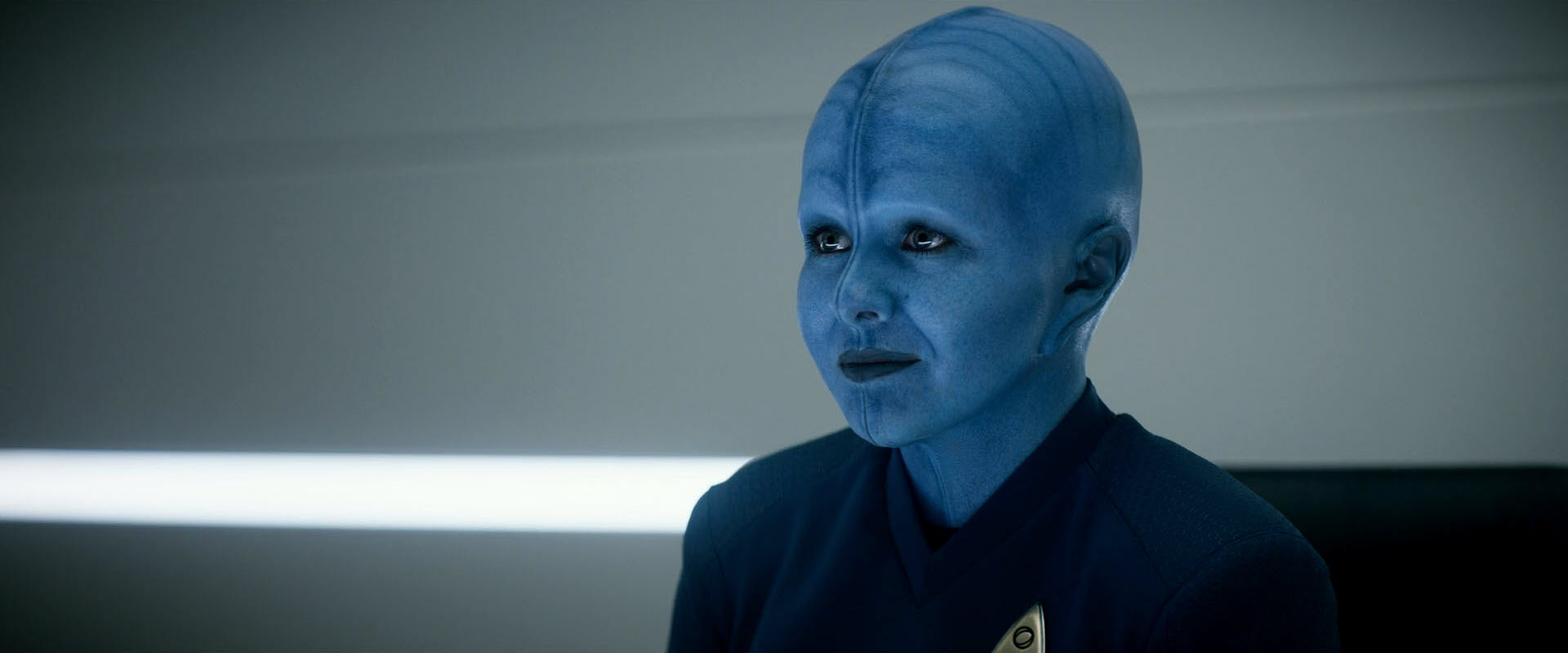
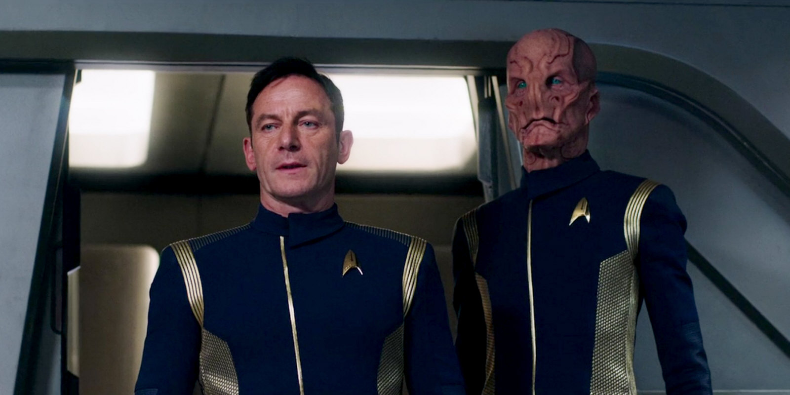
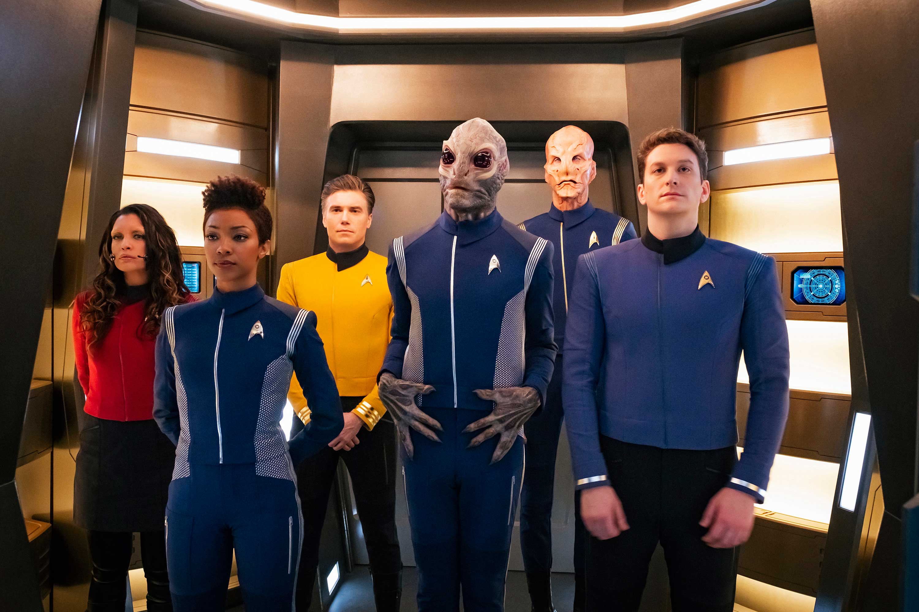
The new Klingons of Discovery have almost nothing in common with any Klingons ever seen in Star Trek (although we may label the one who appeared in "Star Trek Into Darkness" as an intermediate step). The fact that the make-up was changed before (for TMP, as already mentioned) is frequently cited as a convenient excuse for the alteration (Two wrongs make a right, eh?). However, this previous change was a smaller one, it happened in a movie that otherwise wasn't a "visual reboot", it was not denied in DS9: "Trials and Tribble-ations" and it was even retroactively explained in ENT: "Divergence". Retroactive continuity is something that the philosophy of Discovery precludes. It was initially meant to be a visual reboot and not bound by established visuals at all. The Klingons are only the most drastic example.
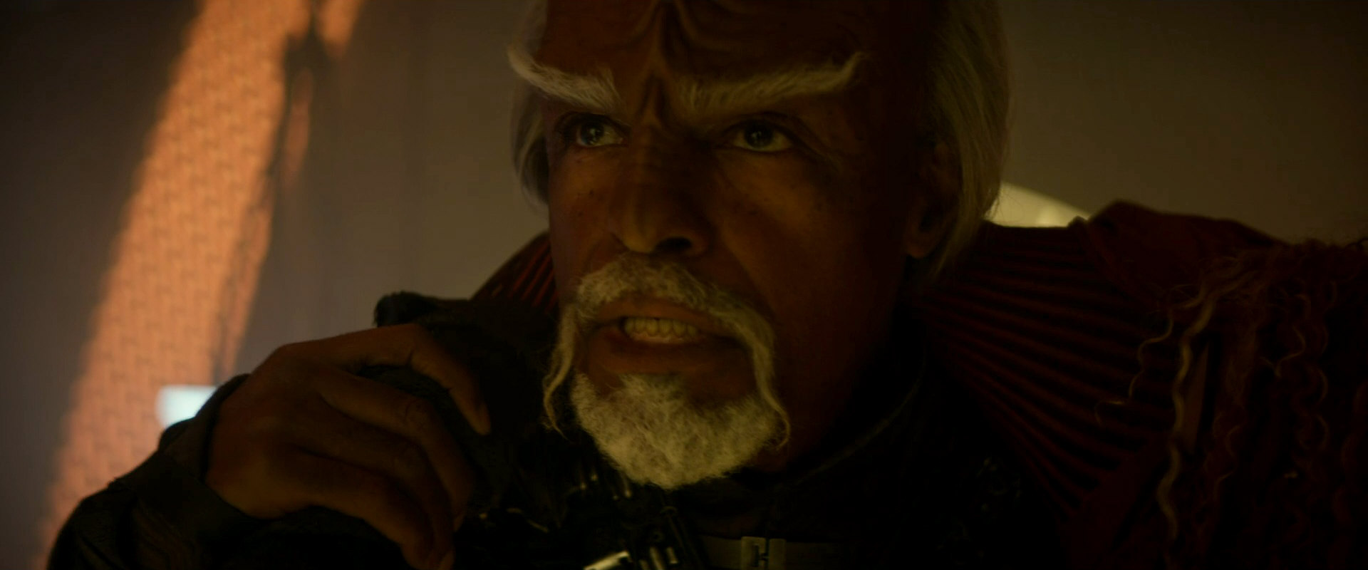
In a revision of the revision, the Klingons get back their hair for season 2, along with make-up changes to make them more relatable again. A few new characters such as Kol-Sha in DIS: "Point of Light" and the unnamed man on L'Rell's bridge in "Such Sweet Sorrow II" are given a make-up that is closer to the universally accepted look. L'Rell even loses a third of her skull volume, but this particular change remains an exception. Other "long-headed" Klingons can still be seen in season 2. The growth of hair is explained in DIS: "Point of Light" as a tradition after the end of a war, as previously suggested by Mary Chieffo at New York Comic Con. It alleviates the problem with classic Klingons a bit, at least in a biological sense. But the notion that all Klingons without exception are bald during a war is absurd, considering that the Klingons were more or less always at war in the 22nd, in the 23rd and in the 24th century and all of them always had hair (except for General Chang).
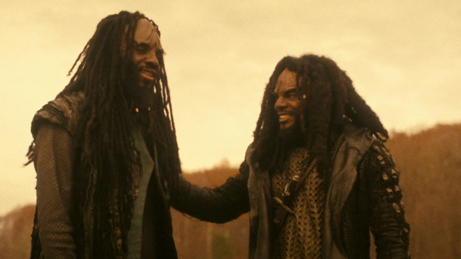
The Klingons vanished from Disocvery after the second season of the series. All members of the species that appeared in Lower Decks, Prodigy and Picard were TMP-Klingons. In the second season of Strange New Worlds, finally, the classic canon look of the species even returns to the Discoverse. All of the many Klingons we see in "The Broken Circle" and "Under the Cloak of War" and ever since, on SNW as well as SFA, are classic ones. Even though one or two in the first episode have an elongated head like in Discovery, they otherwise don't look like that, as nose, chin and ears are concerned. There is no verbal cue either that the species ever looked any different.
The official explanation for the U-turn in Klingon design is that Strange New Worlds is a new series and takes the creative freedom to do some things differently than Discovery. Although nothing was or will be retroactively changed for flashbacks using stock footage from Discovery, this may permit us to disregard the look of L'Rell and the other outliers in a greater in-universe context where Klingons are half-way consistent. In other words, we only have to acknowledge the existence of Discovery Klingons while we are watching Discovery.
Klingon starships
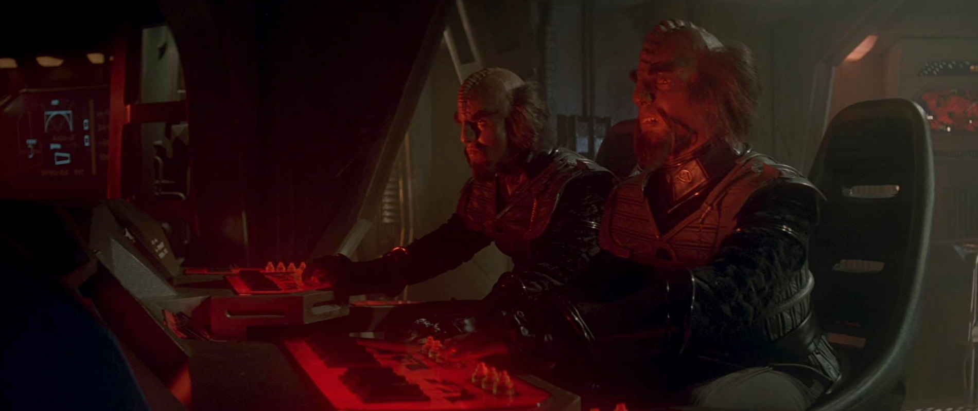
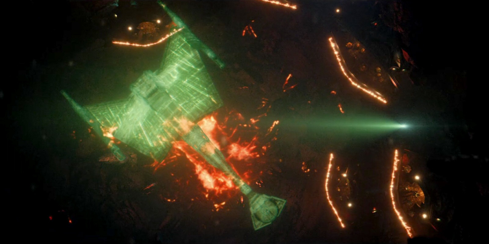
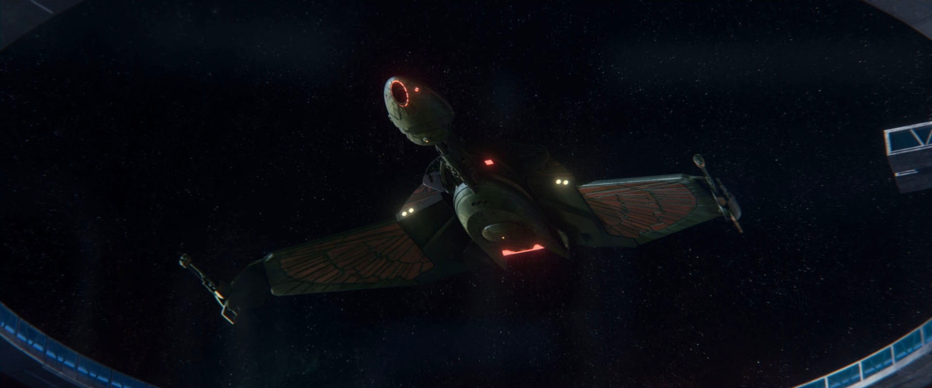
It is obvious that the Klingon ships of Discovery's first season with their Gothic and Baroque shapes don't even have the faintest resemblance to those of the five classic Star Trek series. Only some names, like "D7" or "Bird-of-Prey" are still the same, which only corroborates that Discovery was meant to be a total reboot that purposely disregards the iconic original Klingon ship designs.
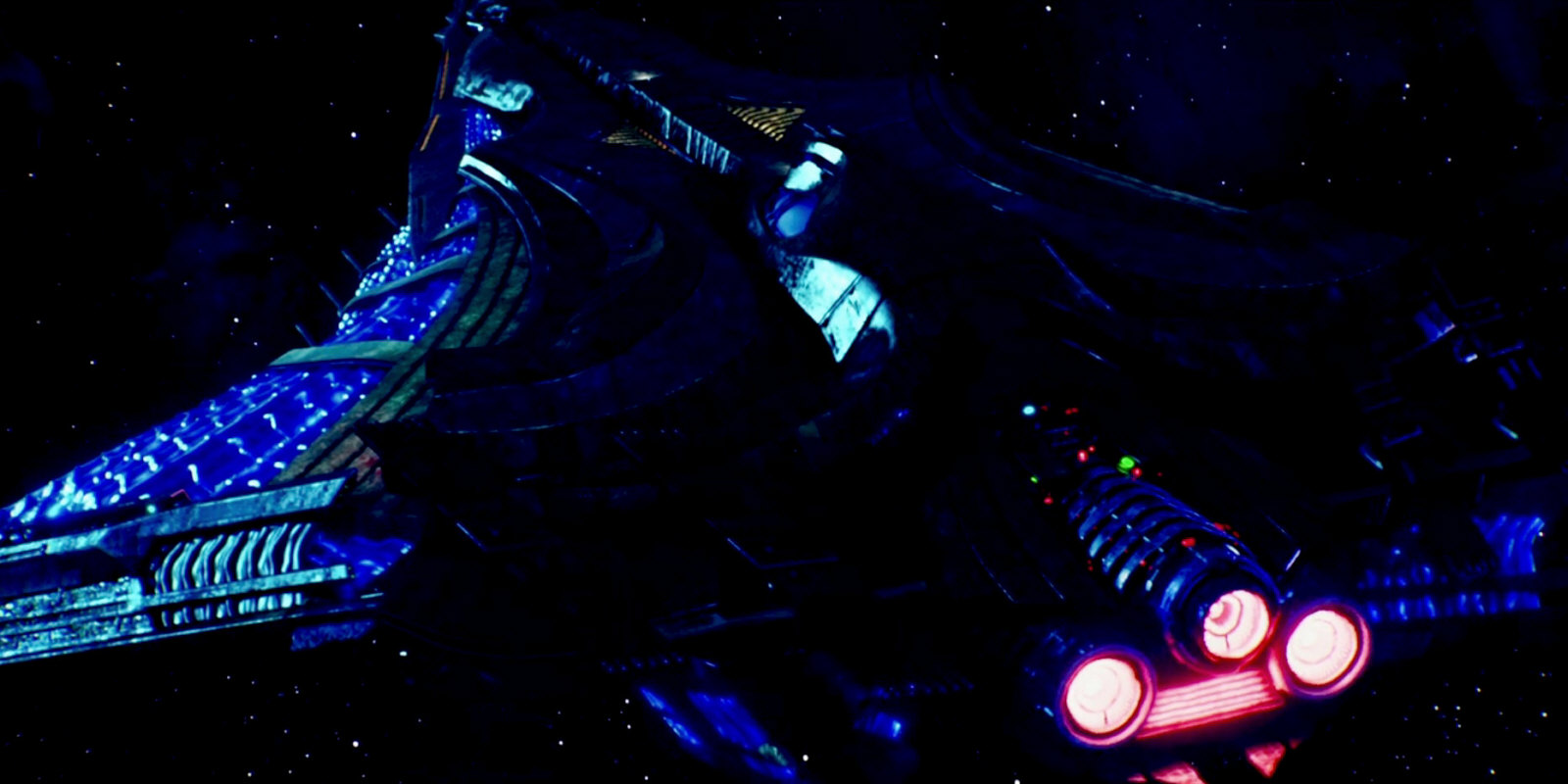
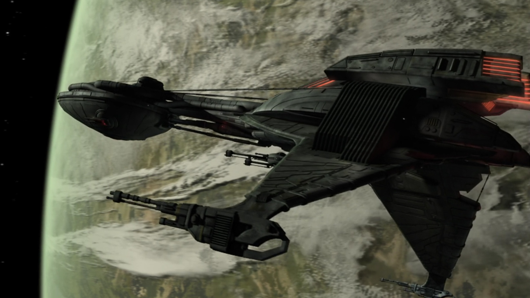
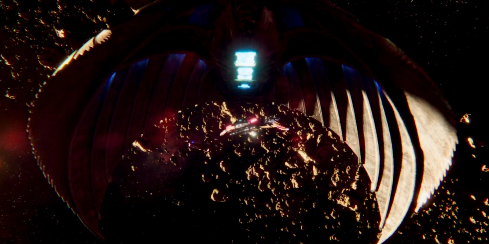
A comparably moderately "reimagined" Klingon battlecruiser is introduced in the season 2 episode "Point of Light". The design of the ship is explicitly called "D7" (although it could be a K't'inga as well), which is in direct contradiction to the alleged D7 that already appeared in "Choose Your Pain". The new D7 is supposed to be a symbol of unity of the Klingons, which implicitly means that the weird ships of season 1 were individual designs of the Klingon houses. Besides the return of the Klingon hair, this is the second major instance of backpedaling, in an attempt to reclaim at least a bit of the lost visual continuity. The question why the Klingons would switch to a totally different design lineage in one particular era of their long history, only to scrap all of them and return to traditional (and much smaller?) ships within a few years, remains unanswered.
The Enterprise
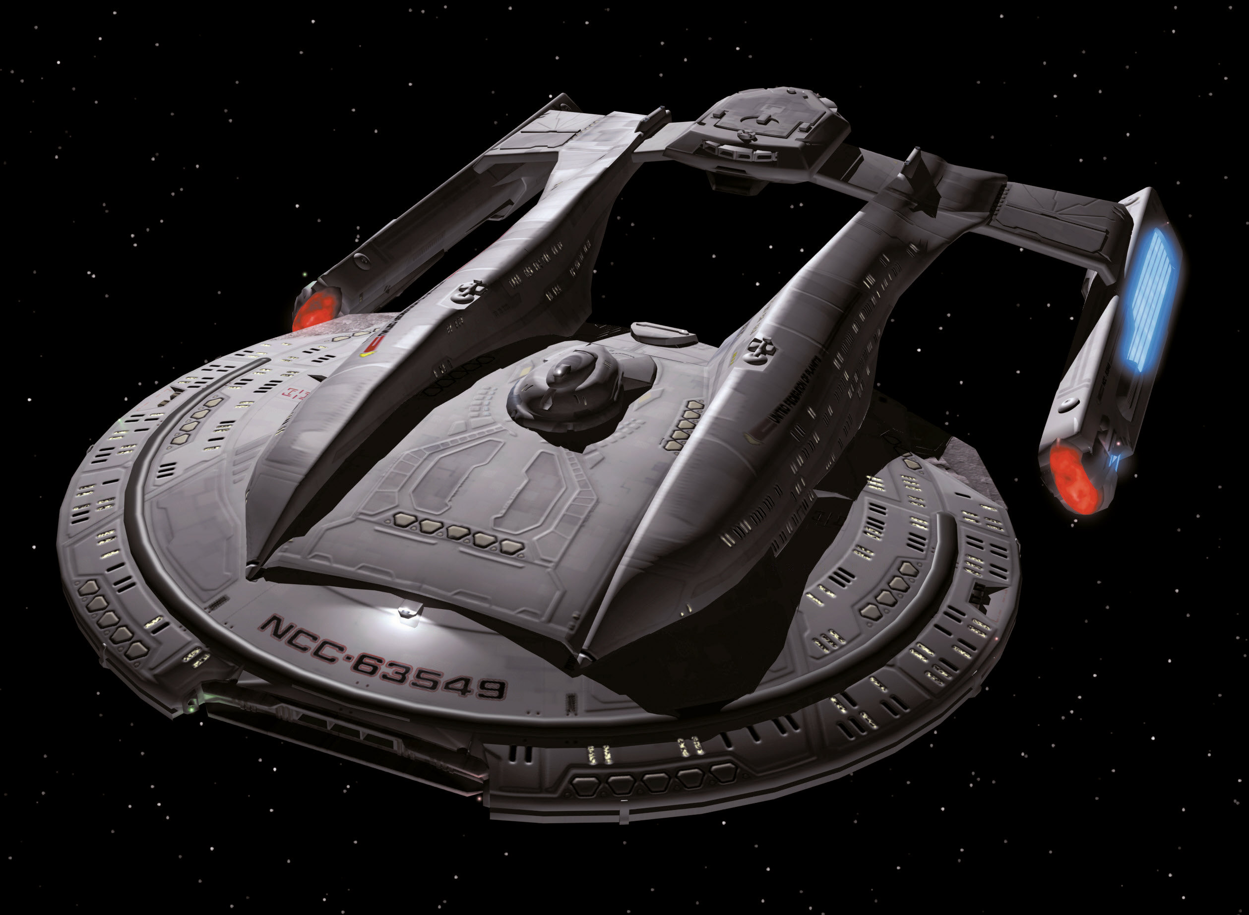
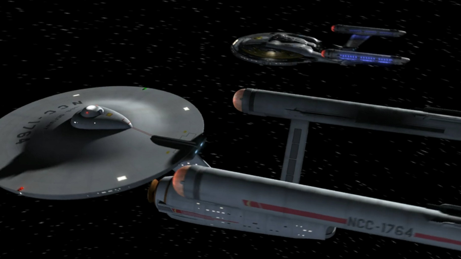
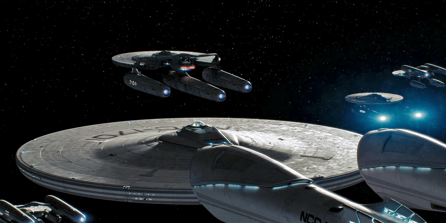
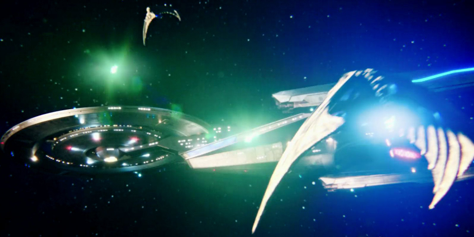
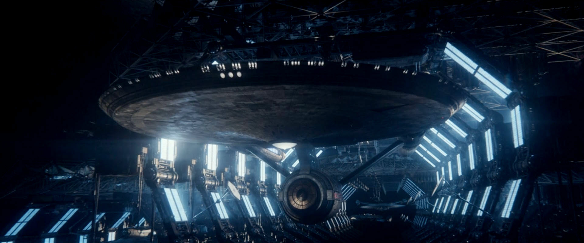
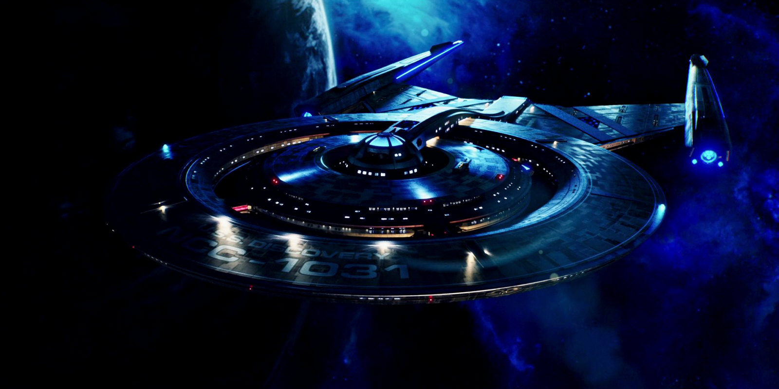
The USS Enterprise NCC-1701 was redesigned for its appearance in Discovery, purportedly to fit with the style of the series. All parts of the ship were changed not only in the details but also in their proportions. The neck, for instance, is shorter now. The impulse engines, the shuttlebay and the nacelle pylons are completely different. Many elements of this redesigned original Enterprise are reminiscent of her own refit in "Star Trek: The Motion Picture" and of Enterprise NX-01, rather than of other Discovery-style Starfleet ships though. The Enterprise was also enlarged to three times(!) its original volume, in order not to be dwarfed by the 700m+ USS Discovery and the other huge ships of the heavily reimagined universe.
A behind-the-scenes video for season 2 shows a display with orthographic views and specifications of the "new" Enterprise. Here, the ship has the exact (small) hull dimensions of the original TOS Enterprise, although this is physically impossible because the proportions of the redesign are different. The ship also has straight nacelle pylons like on the original Enterprise, although it appears with sloped pylons on screen. This display was not clearly visible in any episode though.
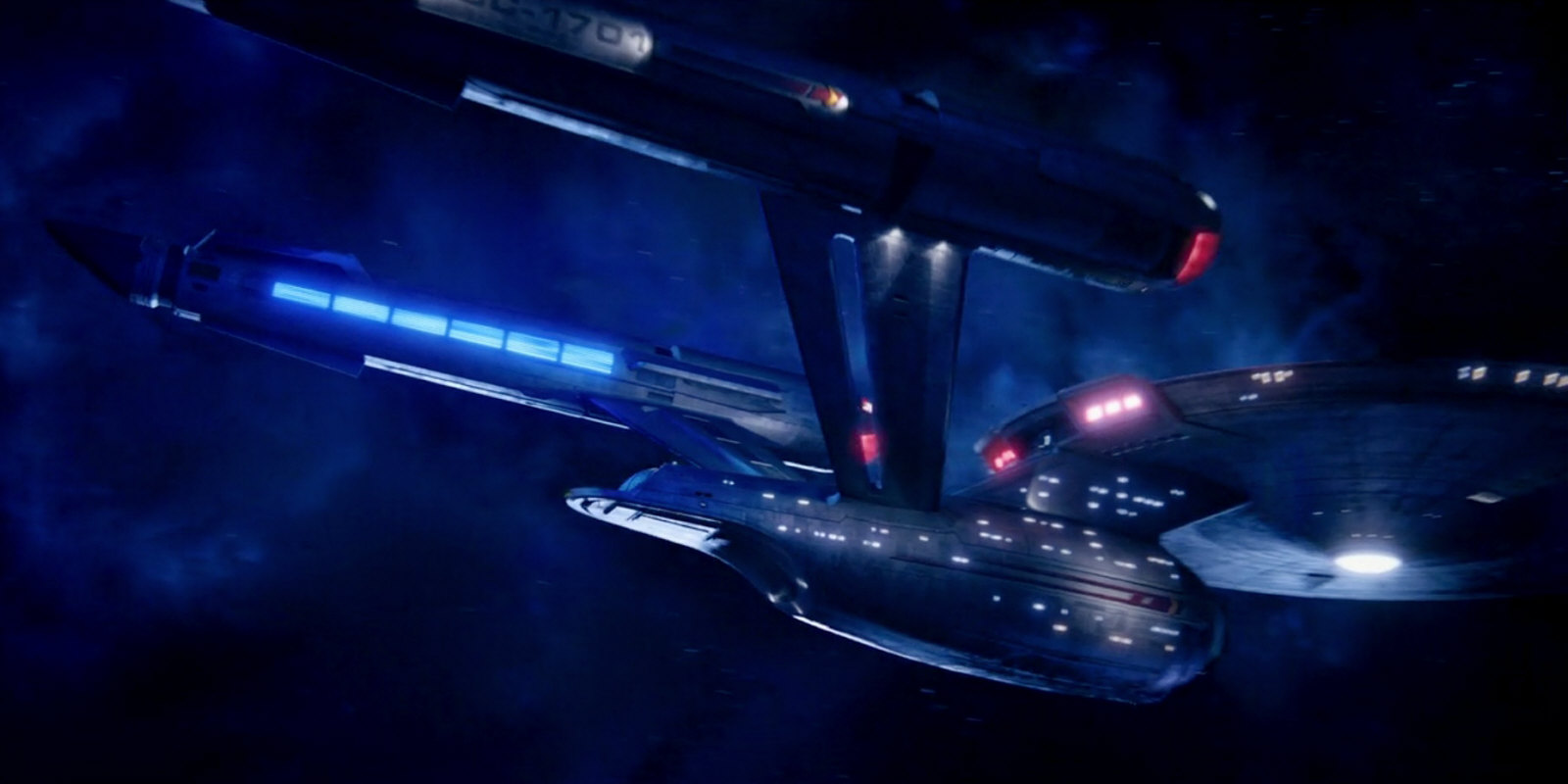
For the ship's appearance in Strange New Worlds, the Enterprise was redesigned yet again, although there is no in-universe rationale. The pilot episode "Strange New Worlds" takes place just a couple of months after the events of "Such Sweet Sorrow II". The completely overhauled Enterprise at the end of the latter episode does not yet have the many large extra windows in the saucer rim that can be found on the SNW version. The real-world reason is that new sets such as the crew lounge or the captain's quarters with large windows were designed as they didn't exist yet on the DIS-Enterprise (much less on the original design).
Other Federation starships and shuttles
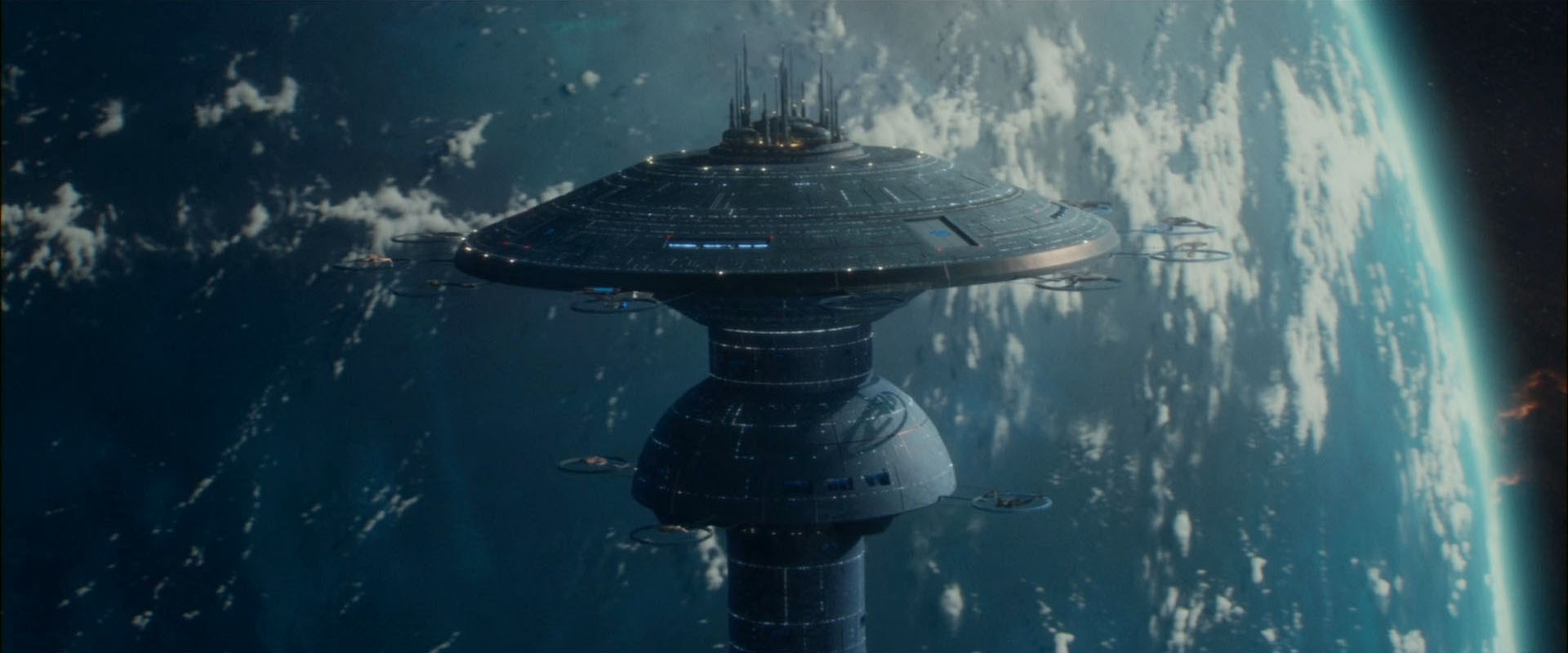
Bryan Fuller purportedly wanted all Starfleet ships of his new series to be flat and to have angular nacelles, in order to set them apart from the original Enterprise. But these are not the only features that make the Discovery ships look out of place. The designs have the defining features of the late 23rd century or of the late 24th century, and none of the Constitution class, except the deflector dish as some sort of fig leaf. Also, every single of them is bigger than the (original) Constitution class as it should exist at the time. The Discovery ship designs are not compatible with those of the Abramsverse either (although the two reboot universes have the omnipresent bridge windows in common, as well as the huge sizes of their ships). Moreover, while the angular design of the various Abramsverse shuttles was a tip of the hat to TOS, the ones of Discovery are extremely streamlined (and warp-capable as a general rule).
Strange New Worlds corrects the questionable decision to make the 23rd century Federation ships look just as advanced as if they came from the 24th century. Although such designs from Discovery can still be glimpsed, the Federation ships we see more clearly in the series follow the lines of the Enterprise. Also, the extremely streamlined Discovery standard shuttles are apparently gone for good. Starfleet in general and the Enterprise in particular are now equipped with a shuttlecraft type that is angular and is reminiscent of the one in TOS.
Some ship classes from DIS season 1 reappear in SNW season 3, now with traditional cylindrical warp nacelles like the SNW-Enterprise. The ambiguous production standards of the Discoverse allow two interpretations. This is either a retcon or correction (like the return to classic Klingon make-up), or these ships have been refitted to new in-universe standards.
Enterprise bridge
The bridge of the USS Enterprise first appears in DIS: "Such Sweet Sorrow I+II". The layout of the captain's chair and the forward console inside a deepening, the red railings and the classic chairs are supposed to evoke the look of the iconic bridge from TOS. But overall the style is closer to that of the Discovery. The bridge window is impossible to reconcile with TOS, even if we decide to put up with the other changes, with the obtrusive lighting and with the set being far more spacious. Perhaps even more notably, the second aft door and the additional corridor behind the aft consoles are drastic changes to the layout that are much more than a matter of style but have story relevance.
There are a couple of amendments to the bridge design in Strange New Worlds. The color scheme and lighting is now a bit more like in TOS. The extra corridor is gone, although it seems that there is an access to the captain's ready room that definitely didn't exist in TOS.
Other starship sets
Discovery's and SNW's starship interiors are overall a little bit more like those from the five classic series than those of the Abramsverse Enterprise. Yet, the bridge windows and the all-blue displays are very reminiscent of the Abramsverse. Overall, the sets are extremely spacious, also as the crew quarters are concerned. This sort of justifies why the ships needed to grow in size relative to classic Trek but is a very clear visual disconnection.
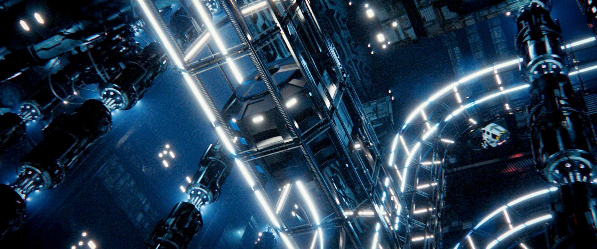
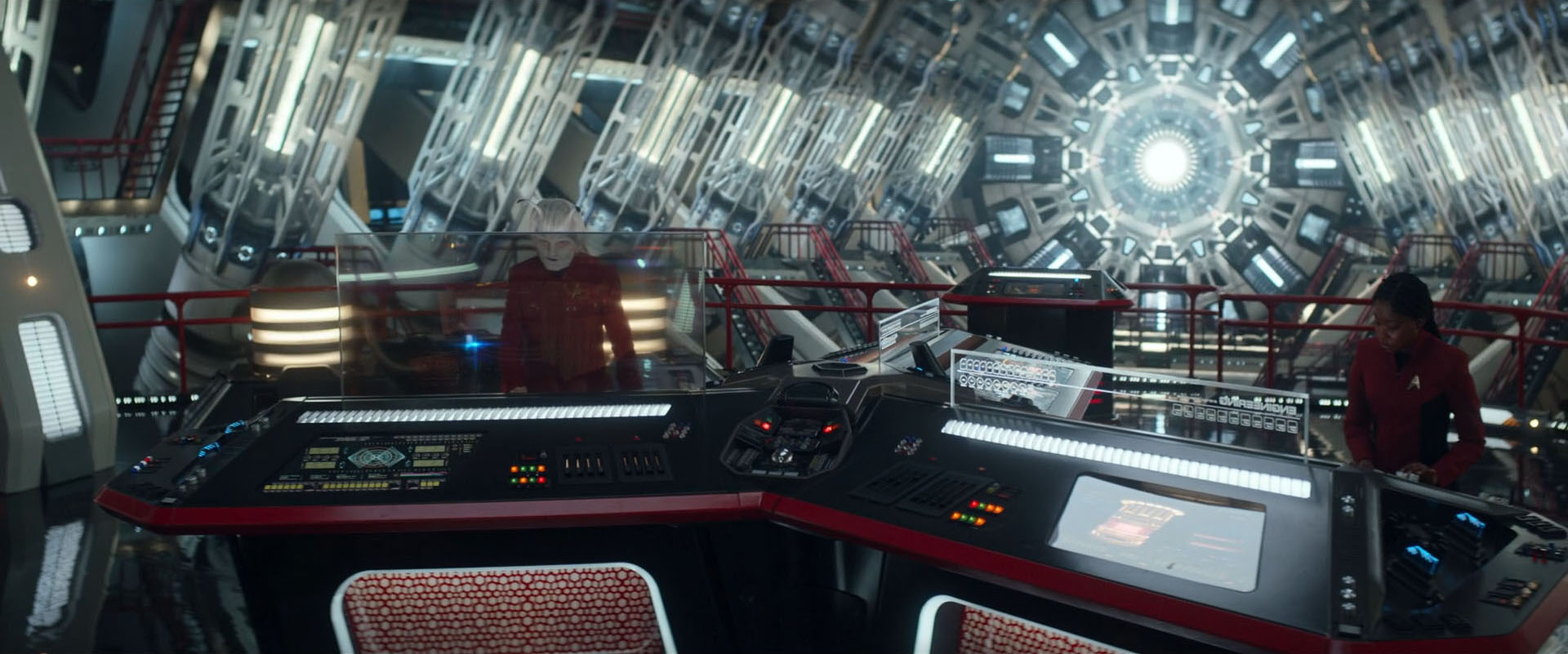
But speaking of spacious interiors, one issue still needs to be addressed. Long-time fans remember how the turbolift scene in "Star Trek V" was commonly (and deservedly) ridiculed, in which the Enterprise-A suddenly had 78 decks, counting from the bottom up. But this is nothing compared to how Discovery depicts the innards of the eponymous ship and even of the Enterprise. Both ships have no decks anywhere, and the turbolift is like a rollercoaster that runs through tens of thousands of cubic meters of empty space! Instead of crammed Jefferies tubes to access supply lines there are workbees flying through these ships! The Discovery has a second rollercoaster running back and forth in curves through the engineering hull, for the sole purpose of launching those landing pods, as seen in "DIS: Brother". And in "DIS: That Hope Is You, Part 2", the empty space inside the upgraded Discovery even measures several kilometers and contains a whole city! This is so moronic it hurts.
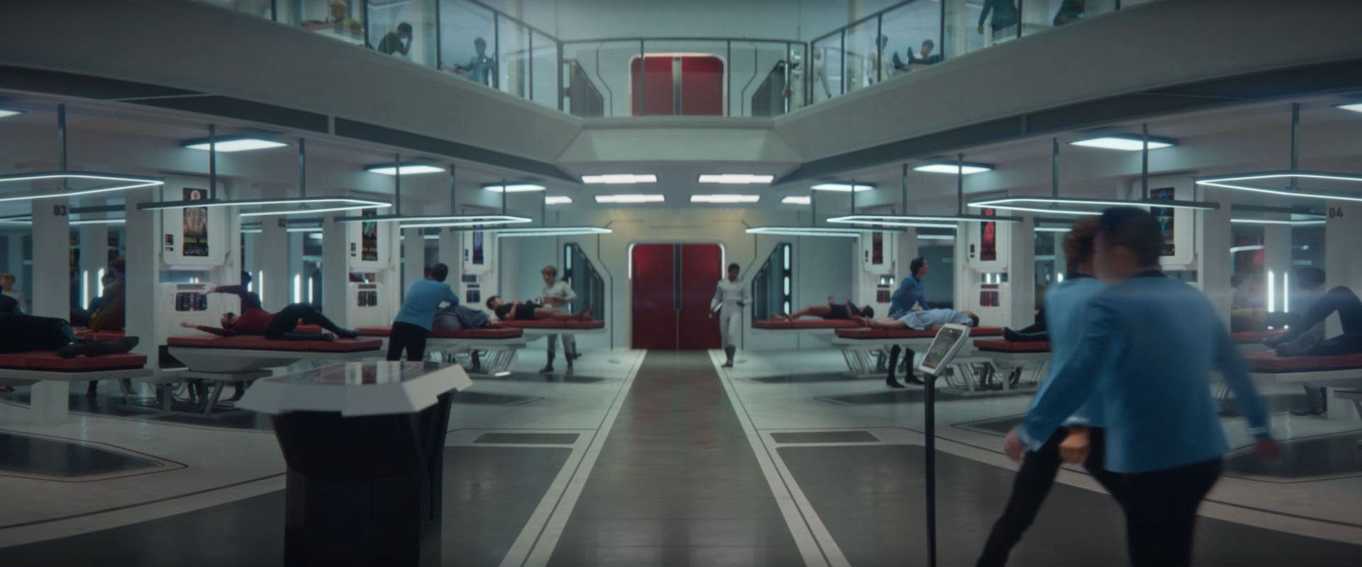
The vast empty spaces of DIS ships were deservedly ridiculed in the fan community and most likely will not reappear in Strange New Worlds. The new series has its share of extra large sets that wouldn't really fit into the original Enterprise, though. There is a new huge engineering set (that borrows from TAS) and an equally huge main cargo bay underneath the shuttlebay. Sickbay is many times as large as in TOS and has two levels. Also, there is a never seen before crew lounge with panoramic windows and a palatial captain's quarters with a cooking lounge. All corridors have a significantly increased cross-section compared to the TOS ship.
Visual effects
As already for the Abrams movies, some visual effects were altered in a way to set the series apart from the variations that existed in classic Trek. Star Trek Discovery shares the phaser bolts with the Abrams movies and the wobbly warp effect with "Star Trek Beyond". Interestingly, the phasers were switched back to the classic effect when the Enterprise is seen firing in the two parts of "Such Sweet Sorrow". Something else of note is the depiction of space in Discovery, which most of the time in the first season, even in open space, shines in neon colors. The colorful spatial phenomenon in "Lethe" (the "Disco lights") may be an extreme case, still it is symptomatic of the trend to turn up the colors in this series, probably in some attempt to let the visuals appear more attractive. From season 2 onward and in SNW the obtrusive colors of space were toned down.
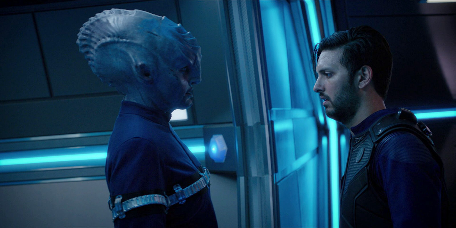
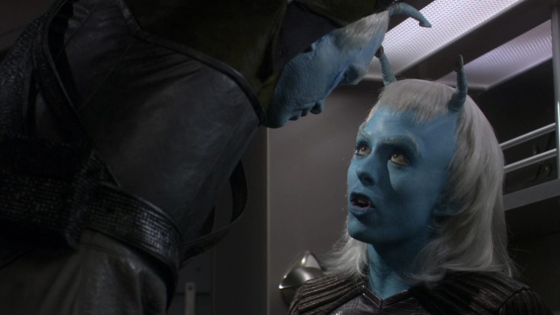
Andorians, Tellarites and Talosians
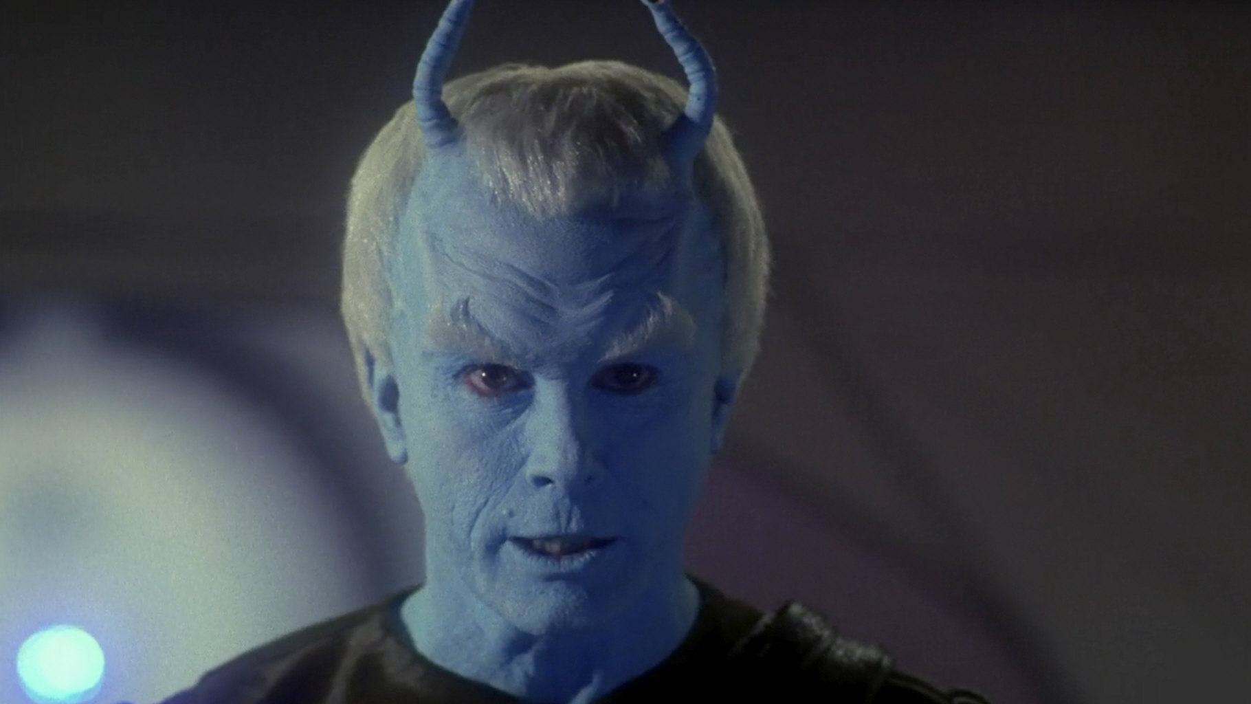
Andorians and Tellarites, as first seen in DIS: "The Wolf Inside", were altered much less drastically than the Klingons of the same series. The Andorians now have some sort of tentacles instead of eyebrows, and the Tellarites sport tusks. It's a visual canon violation albeit not a major one. We may want to pose the question what was so wrong about the well-established make-up from Star Trek Enterprise that it was abandoned. The Talosians were revised for DIS: "If Memory Serves", replacing the previously horizontal forehead bone with a vertical one.
Side note Interestingly, some background Andorians who appeared in DIS: "The Wolf Inside" did not have the "tentacles", to save costs. But this definitely more canon variation was not meant to be clearly seen.
In the second season of SNW, Tellarites and Andorians (in analogy to the Klingons) return to the classic make-up entirely (perhaps safe for background actors). The Tellarite seen in SNW: "Ad Astra per Aspera" even has three fingers, like in TOS: "Journey to Babel".
Gorn
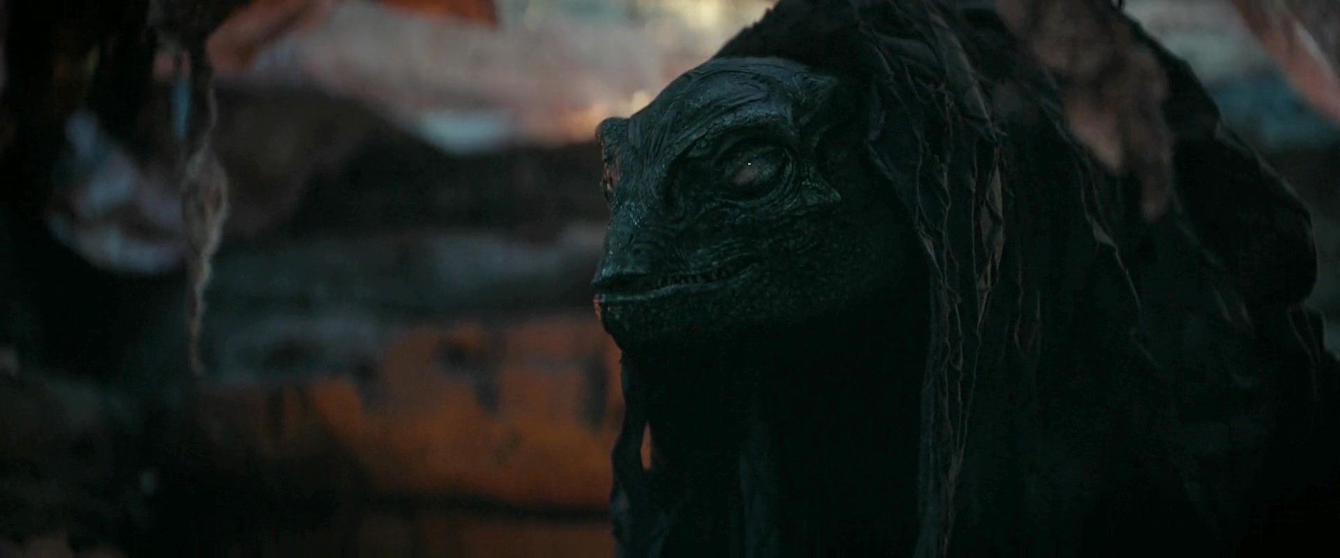
The Gorn of Strange New Worlds are the arguably most drastically altered species of the Discoverse besides the Klingons - not just on the visual side but also regarding their biology and their history with the Federation. The originally clumsy and slow reptilians from TOS: "Arena" mutate to agile monsters without the slightest humanoid traits in their appearances since SNW: "Memento Mori". The Gorn have been reimagined before for ENT, but SNW goes into a still different direction, especially with the visual (and story) references to the creature from "Alien" in "All Those Who Wander" and "Hegemony I".
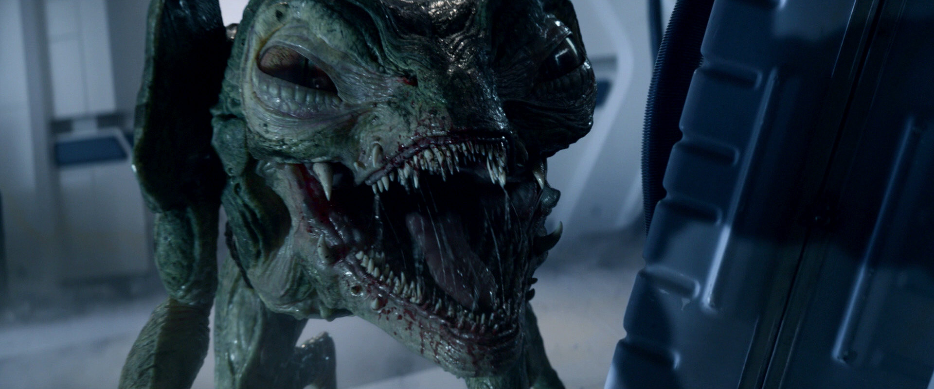
Interestingly, SNW: "Terrarium" shows an injured Gorn, who is far less agile and a little bit more in line with the Gorn from TOS, although it is not supported by changes to the CG design. Since the story is a prequel to "Arena", this was done to soften the otherwise extreme contrast between the two episodes.
Other aliens
Unlike the Andorians, Tellarites and Talosians, and in stark contrast to the Klingons, the looks of other existing aliens remained untouched, beginning in Discovery's season 2. The Barzan (Nhan, since DIS season 2), Cardassian, Lurian (both since season 3) and Trill (additionally in SHO: "The Trouble with Edward") make-ups are exactly as we know them from classic Trek.
The redesign of some established alien species continues in Discovery's fourth season, in Strange New Worlds and in Starfleet Academy. We may argue that the redesigned Ferengi, who can be seen in DIS: "Anomaly" as a Starfleet officer, has a multispecies heritage much like President Rillak. But "...But to Connect" shows a non-Starfleet Ferengi with the same new make-up and "Jinaal" yet another one, the bartender on the Discovery. The new make-up also appears on Starfleet Academy. So it is safe to say that this is how all Ferengi are supposed to look now.
The Akaali in DIS: "The Examples" and the Changeling in "All In", on the other hand, look exactly as they did in ENT: "Civilization" and in DS9, respectively. Regarding Strange New Worlds, Hemmer is an Aenar unlike those seen on Star Trek Enterprise. His look is consistent with the new make-up for Andorians on Discovery. The Bolian make-up in the series is the classic one as it used to be in later Voyager episodes. Betazoids didn't have special make-up in classic Trek but all of them without exception were recognizable because of their black irises. The Betazoids in SFA, in contrast, all have bright eyes (besides not being telepathic as a general rule any longer).

Uniforms
Star Trek Discovery throws another completely new Starfleet uniform style into the mix. Instead of any of the four basic shirt styles from "The Cage", TOS, pre-Kelvin and post-Kelvin Abramsverse, regular Starfleet uniforms in the Discoverse consist of blue uniform jackets and no clearly discernible department colors (it is hard to tell apart gold, silver and copper decoration). Perhaps this is not a big deal but another aspect that sets the series visually apart as "something different than the rest".
In DIS: "Brother", at the beginning of season 2, we can see the uniforms of the Enterprise crew, which look similar to those of TOS. This is described in the episode as a new style that has not yet been introduced on the Discovery. However, the colorful TOS shirts shouldn't be around for at least another six years in the Prime Timeline (we can see the uniforms from "The Cage" still in "Where No Man Has Gone Before", set in 2264). So the distinct "Enterprise style" is only a visual cue (just like the same anachronistic phenomenon in the Abramsverse too) and not at all a sign of true continuity.
In DIS: "Terra Firma I", Kovich shows a hologram of a time traveler in the accurate reconstruction of a Starfleet uniform from the early 2360's (TNG seasons 1 and 2). The question is why he would wear such a uniform, since he was said to have arrived in 2379. Anyway, the appearance of this uniform may indicate an exemption of the TNG era from Discovery's "visual reboot" policy of DIS, or even its ultimate (albeit not retroactive) abandonment.
Since SNW: "Strange New Worlds", there are still different new uniforms in the 23rd century. These can neither be aligned with classic Trek nor with Discovery (considering that the crew already switched to brand new uniforms just one year earlier, in "Brother"). Strange New Worlds also shows Pike wearing a reimagination of Kirk's wrap-around uniform, but of the variation that could only be seen since the second season of TOS, which is unlikely to predate TOS.
In SNW: "Among the Lotus Eaters", the three missing crewmen on the photos, as well as Zac in person, are wearing SNW uniforms, not the all-blue DIS style that was in use five years ago. We might posit that SNW downright ignores the existence of the atypical DIS uniform (just like the series already returned to classic Klingons).
Hand-held equipment
The perhaps biggest surprise about the Discovery production design is that the hand-held phasers and communicators look almost like those of TOS. The layout of the user interface of the communicators is much the same as in TOS. The display gives away that the prop is not from the 1960's but it is well possible that we just couldn't see the detailed display on the device when it appeared in TOS. The Discovery phasers even have nozzles like the lasers of "The Cage", making them appear like a totally plausible intermediate step in the weapon development. The phaser and communicator prove that keeping visual continuity in line with classic Trek is possible. Unfortunately this was not tried, or even ruled out from the outset, in other fields of the production design of the series.
The designs of the communicator, tricorder and phaser were revised for Strange New Worlds and are now even a bit closer to the originals - actually so close that we may imagine they are the same devices.
Characters
Several "legacy" characters such as Sarek, Amanda, Spock, Mudd, Pike and Number One appear in Discovery. They are naturally played by new actors. Perhaps rather than the lacking likeness, the redefinition of the characters is the bigger problem. Sarek as a warmonger is hard to accept. Strange New Worlds reimagines even more characters that are known from TOS. Besides Pike, Number One and Spock, also Uhura, Nurse Chapel, Dr. M'Benga, Kirk and Scotty are among the crew or guests. Especially Chapel is an totally different personality than she was or would be in TOS. There is also a new Admiral April and a new Transporter Chief Kyle, who are of a different ethnicity than in TAS and in TOS, respectively.
Visual Continuity in Picard
On the visual side, Star Trek Picard profits from its setting in the future. Things are allowed, even encouraged to look different and more advanced than they used to. But even as the legacy is concerned, the series does not deny and invalidate the TNG look the way Discovery systematically did with everything TOS. Looks predating Star Trek Picard were generally faithfully reconstructed and not "reimagined". The show initially had its share of visual Discovery tie-ins, but the appearance of the reboot Enterprise instead of the authentic TOS Enterprise is the only indisputable error. Also, Picard sticks with some debatable visual effects created for the Abramsverse or Discovery to appear "more modern" or "more dramatic". Overall, however, the series qualifies as "legit" and "non-rebooted".
The Enterprises
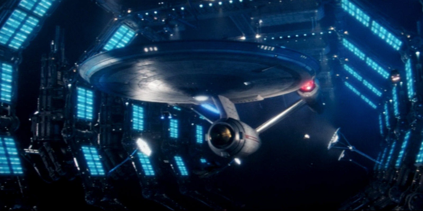
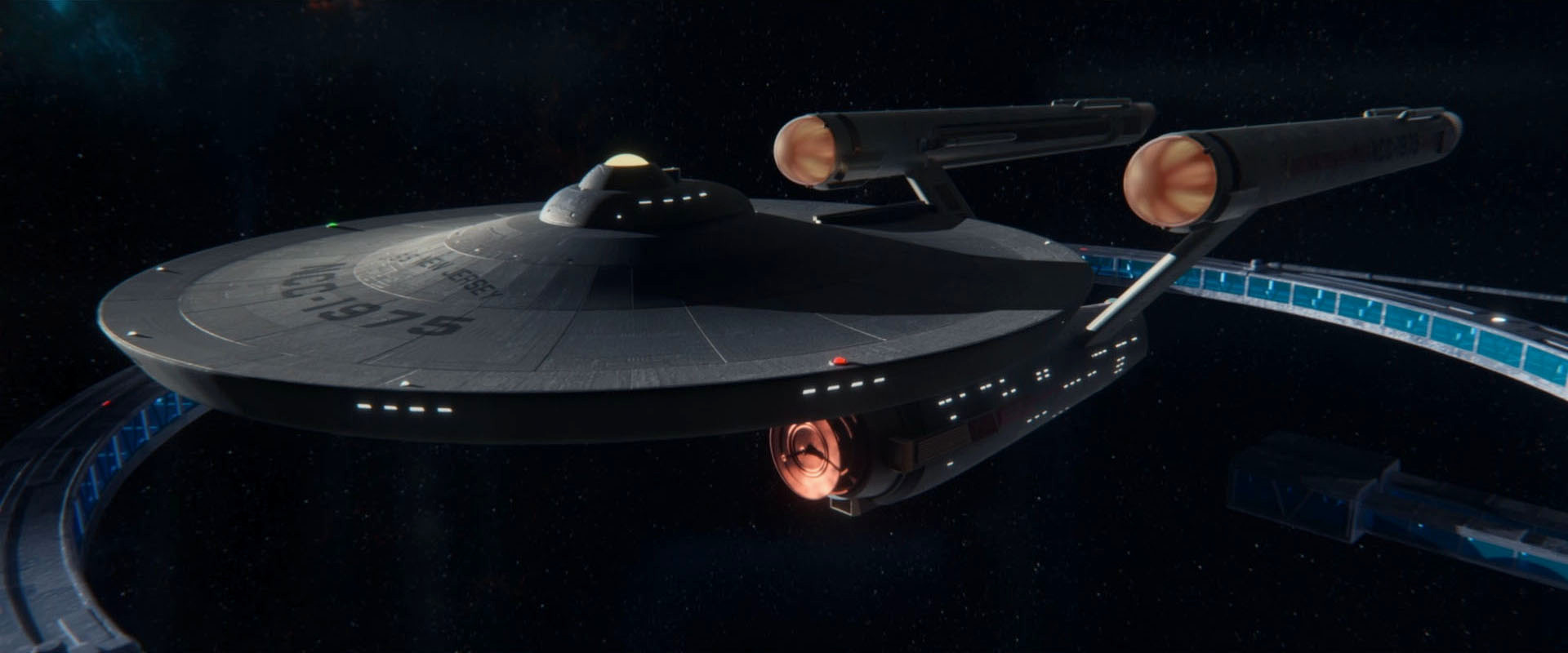
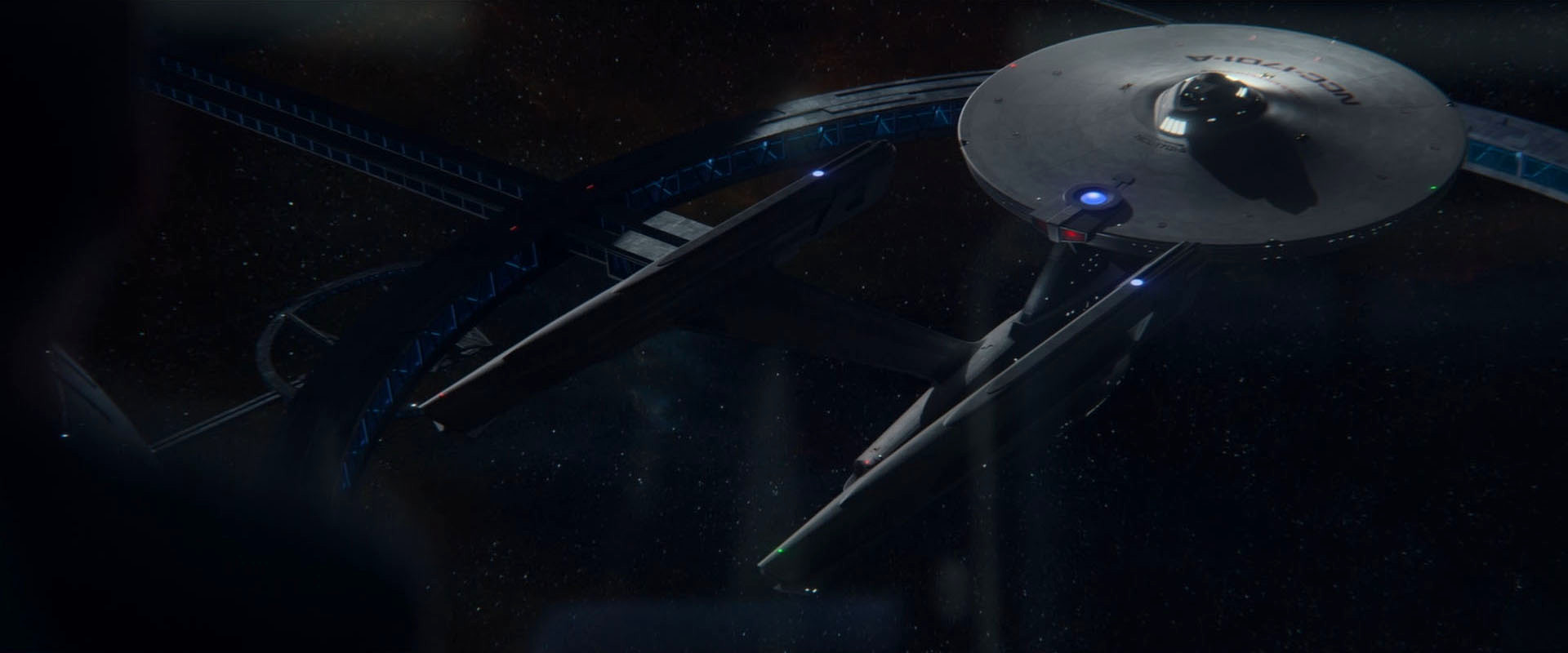
In PIC: "Maps and Legends", we can see that the holographic Enterprise-D is an authentic reproduction of the actual ship of TNG (except for shuttlebays 2 and 3 that should not be of equal size). The alleged "original" Enterprise, on the other hand, is the reboot design from Discovery. Season 3 corrects this mistake. All starships seen at the Fleet Museum and particularly the original Constitution (here represented by the USS New Jersey NCC-1975) and the Constitution refit (USS Enterprise NCC-1701-A) are exactly as they should be in the unrebooted continuity.

Other starships and shuttles
SHO: "Children of Mars" anachronistically shows ships of the Magee class and Discovery-era tugs at Utopia Planitia, in what seems to be a cost-saving measure. There would be no problem for these ships to exist in the Prime Universe and to be up to date as of 2385 once we chose to ignore Discovery. The same goes for the Discovery shuttles that are omnipresent in the first three episodes of Picard and that may well be a much more recent type. If anything, they were out of place in Discovery. Speaking of cost-saving measures, it would have been great to see Riker arrive with a fleet of more than just one ship type (there is only a slight variation of the nacelles) in "Et in Arcadia Ego II". Rather than an error, the missing diversity of Starfleet ships in Picard is only awfully boring.
The second and third seasons of Picard show many unchanged classic classes of the 24th century, besides the original Spacedock, an authentic Klingon Bird-of-Prey and a number of new designs.
Romulans
The most visible aliens of Star Trek Picard are the Romulans. Their look was diversified, rather than revised for the series. In the past iterations of Star Trek, Romulan make-up went from flat foreheads to V-shaped ridges and back. We can see both varieties in Star Trek Picard. In "The End is the Beginning", Laris even provides an explanation that those with the ridges (such as Zhaban) are "Northerners". Some Romulans, such as "Narissa Rizzo", have slight, almost unnoticeable ridges on the sides of their ears, which is a previously unseen feature. Overall, the changes to Romulan culture and society that become obvious in the series are arguably more significant than those to their look.
Klingons
There are no Klingons in Star Trek Picard except for Worf, who appears in a recap in season 1 and in person in season 3. As Alex Kurtzman promised, the popular character does not suffer a retroactive Discovery-style makeover.
Other aliens
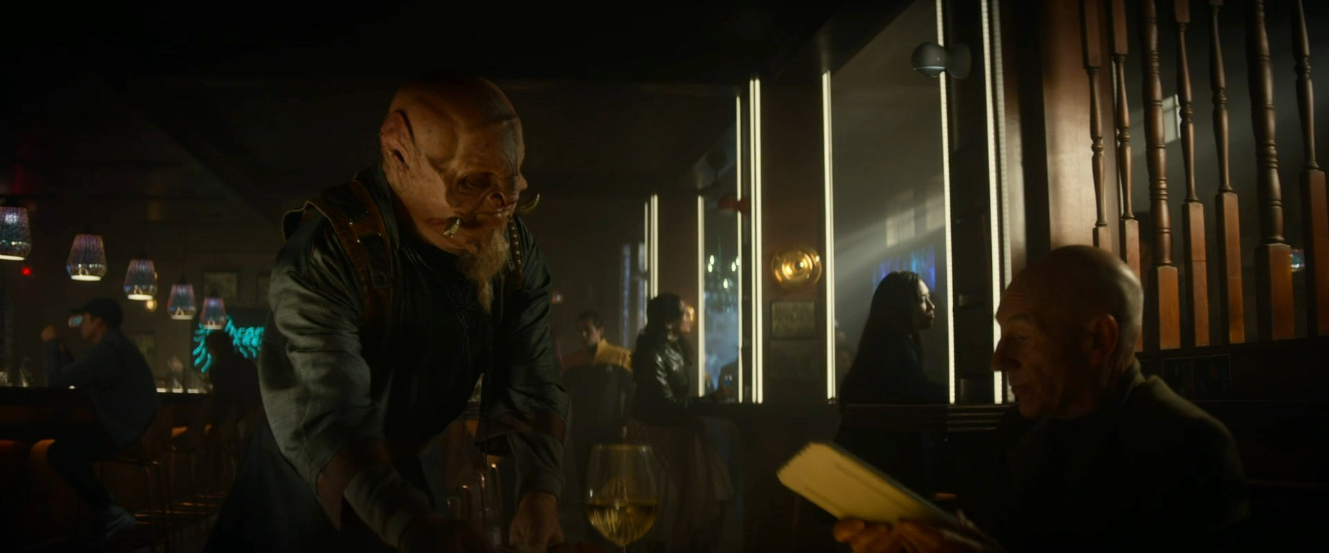
The Tellarite member of the FNN team in PIC: "Remembrance" is (very disappointingly) a "reimagined" one without eyeholes and with tusks. But unlike a Discovery-style Tellarite, this fellow has a much more voluminous head, flush ears and an even less swinish nose. So in this one case Picard goes even much further as the reimagination is concerned. The weird Tellarites appear repeatedly especially in the third season.
The Andorians that can be seen in Star Trek Picard, on the other hand, return to the classic look of the species with eyebrows instead of Discovery-style tentacles. It almost seems like the makers of Picard pick what they think is the best from classic or rebooted Trek.
Visual effects
Regarding the visual effects of Star Trek Picard, a warp flight and a ship dropping out of warp looks much like it does in Discovery. After the latter concession to a "modern" visualization has not been very bothersome in the first nine episodes, it is absurd to see how two complete fleets drop out of warp, to stop abruptly and with a precision of a few meters in orbit of Coppelius. Also, all forcefields in Star Trek Picard are visible all the time and are composed of geometric shapes, exactly as in Discovery and unlike in classic Trek.
Commentary
Although it was admittedly never on the top of the priority list when a new series was created, keeping all designs in line with already established looks was always an important task in classic Star Trek. For the people working in the Art Department it was an affair of the heart to maintain visual continuity, for the sake of credibility but also out of respect for great artists such as Matt Jefferies, Herman Zimmerman, Andrew Probert or Michael Westmore, who shaped the look of the franchise. In fact, after the canon explanation of the Klingon mutation in ENT: "Divergence", the alteration of the Trills for DS9 is the biggest of comparably few visual continuity problems that still exist in classic Star Trek. In the years between 1979 (TMP) and 2005 (end of Enterprise) the franchise has been largely visually consistent as well as respectful of TOS, and definitely not by mere chance. The fan claim that visual canon never existed in Star Trek is a lie.
The Abramsverse introduced a number of visual problems that result from the desire to be different (and usually more bombastic) than the old Star Trek, rather than being rooted in real-world progress that would not have called for a substantial revamp of more than just user interfaces. Only some of the issues may be explained away as a consequence of the timeline split.
Although it is said to be part of the Prime Universe, Discovery comes with still more and still more significant visual changes than the Abrams movies. The alteration and enlargement of the original Enterprise is a paradigm shift because it is the first time that new Star Trek retroactively invalidates existing visuals. At least, the new Enterprise is still similar to the old, now allegedly obsolete design. In other fields the people in charge apparently didn't want their series to look like Star Trek at all. They totally redesigned the Klingons and their ships for change's sake, not because anything was wrong with or outdated about the existing designs. For the first time in the franchise, the grave visual continuity error was not eligible for a retcon, the way it was done with the previous Klingon mutation. The clear intention was that the Klingons always looked like in the latest series and never like in TMP or even in TOS. Discovery was conceptualized as the first "visual reboot" of the franchise, although in a visual medium this is a cherry-picking fallacy and makes as much sense as "a little bit pregnant". In any case, it is the first Star Trek series that systematically abandons and thereby depreciates the looks of its predecessors - whereas the producers continue to preach that everything is perfectly in line with canon and that the old series receive the due respect.
The decision to redesign the look and feel of the TV franchise almost from scratch is even more irritating, considering that a reboot already existed in the form of the Abrams films. But instead of having fun in this readily available restyled universe, the producers of Discovery just couldn't resist targeting the old Star Trek. For many fans, who don't like the Abramsverse and who used to find consolation in the integrity of the classic Trek, this is more than just a slap in the face.
The design revisions for the second season (hair for the Klingons, a recognizable D7 cruiser, half-way familiar looking Enterprise uniforms) are obvious backpedaling, and a response to the widespread (and deserved) disapproval of Discovery's look and feel in the fan community. Ultimately, the noticeable end of the radical alterations of species is solid proof that a rethinking has taken place among the producers and creative staff. Yet, the second season is largely visually consistent with the first one, rather than with the rest of Star Trek. So it is certainly not the reboot of the reboot that many fans have been hoping for. But it is good to know that the people in charge are listening and that they are willing to correct at least some of the worst errors (even though they failed to admit that these errors were made in the first place).
Strange New Worlds revises some of the design changes made for Discovery but at the expense of new visual discrepancies. There are even unrebooted Klingons since the second season. These are officially described as series-specific but effectively turn the Discovery version into an outlier that may be disregarded from now on. The chief problem with this new series, and not just on the visual side, is that even though it doesn't re-imagine the world of the 23rd century as extremely as Discovery, it strives to better TOS in every possible way. If SNW were not set on the Enterprise and did not feature numerous known characters, it would be much easier to accept as a new interpretation of the TOS era.
In its first season, Star Trek Picard does not discard quite all of the questionable redesigns made for Discovery. The makers of Picard initially seemed to adhere to something like a crude "Grand Unified Theory" regarding the look of the franchise. This was successful with the Romulans, who had not been redesigned for Discovery anyway and whose new diversity helps to make sense of previous discrepancies. The unifying concept doesn't work at all when it boils down to mere cherry-picking, as in the case of the Discovery-Enterprise, which was preferred over the original because of - sheer fucking hubris? In its second and third season, the series consequently continues the trend of returning to the old, authentic look of Star Trek and is almost free of visual crossovers.
See Also
The Realism of (Science) Fiction - whether Star Trek is really "bordering on silliness"
What is Canon? - definitions, reasons, interpretations and the EAS canon policy
The Continuities of Star Trek - from a single timeline to a multiverse(?), and how to deal with that
Dealing with Continuity Issues of the Abramsverse - general thoughts and the policy at EAS
Discovery Klingons and Star Trek's Continuity - how different they really are and some more thoughts
Credits
Some screen caps from TrekCore.
![]()
Content is canon, aesthetics are not: the pitfalls of selective nostalgia
@ Kethinov Star Trek Reviews


