


The New Enterprise Design
Exterior DesignInterior DesignThe Size ControversyFinal Remarks
 November 2008. The day I have been dreading for months has come. Paramount has just revealed the first full image of the new USS Enterprise NCC-1701 to appear in J.J. Abrams's "Star Trek (2009)". Based on what little we could see in the first trailer from January 2008, I was prepared for a substantial redesign of the beloved ship. And so it happened.
This is a commentary (rant?) on the ship's design and a fact-based analysis of its scaling. If you have a low tolerance threshold for criticism about the new Star Trek, simply don't read on.
Exterior Design
Aesthetics
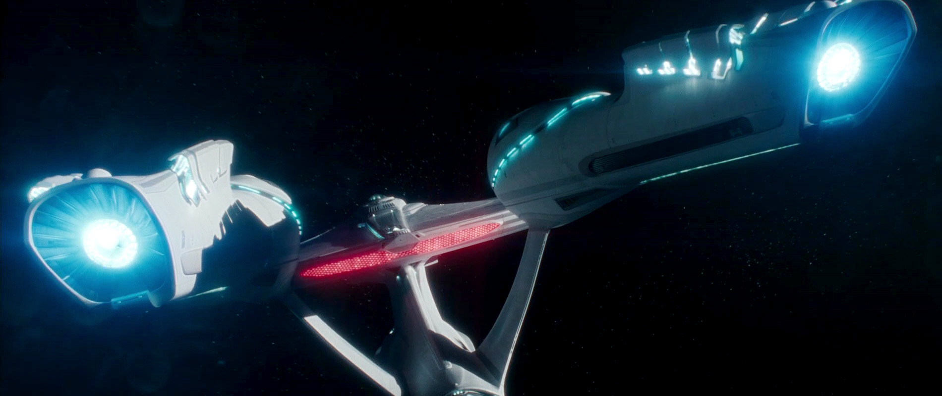
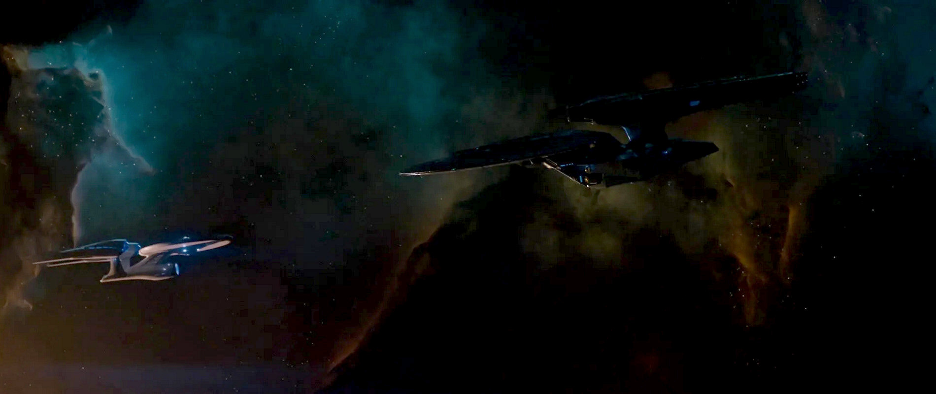
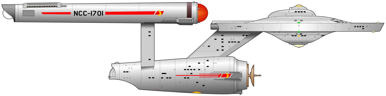
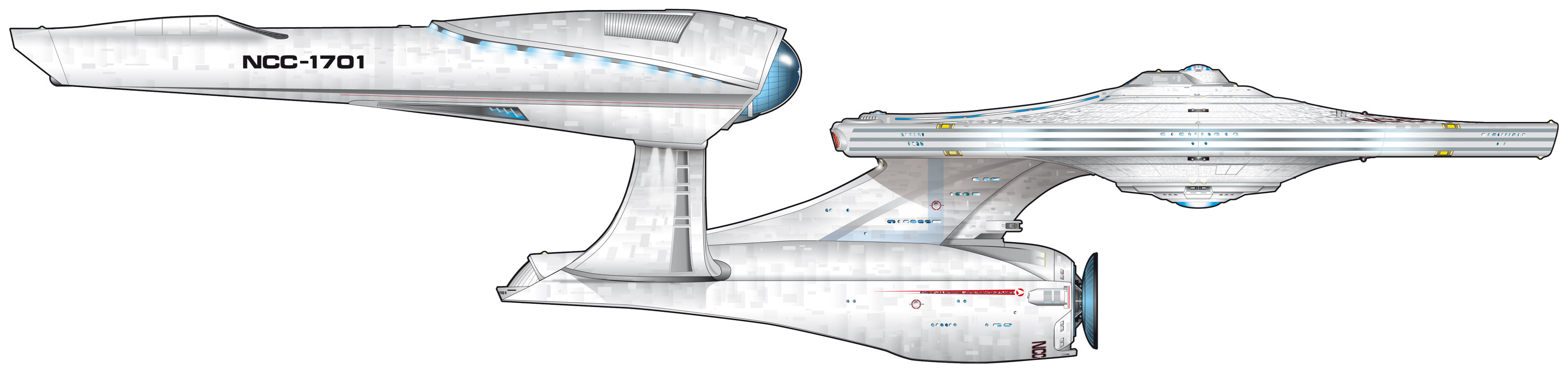 The saucer underside and edge of the new design by Ryan Church are still similar as on the iconic starship, albeit it is the wider saucer of the TMP version and not the one of the TOS ship as it existed in the Prime Universe at the time of "Star Trek (2009)". The rest is different than on any previously seen Enterprise, it only has roughly the same proportions as the original. The engineering hull has been significantly moved forward, there are odd curvatures in the neck, the engineering hull and the nacelle pylons, and the nacelles themselves look a bit like those of the Enterprise-E, with an alien-looking curved backlit cowling.
The new design is unsatisfactory. First off, irrespective of all continuity concerns, I simply don't think it is a great design. I concede that it is overall not quite the butt-ugly "Edselprise" that I saw in it at a first glance and that made me cry in terror (because it was shown from an unfavorable angle). Still, the classic shapes of the saucer and the deflector don't mix with the stylish add-ons and the intricate curvatures. This way it appears like a kitbash, like an odd blend of the TMP Enterprise with an alien CGI ship of the week. The overall proportions are not sufficiently balanced, and the whole ship leans forward too much. I imagine that the engineering hull including the nacelle struts should be moved back relative to the saucer, neck and nacelles to get its look "right". The engineering hull initially appeared to be too small relative to the saucer, but in hindsight I have to admit that the perspective of the photo was deceptive. Yet, the massive neck looks odd relative to the rather small engineering hull. And regarding the aforementioned unfavorable angle, previous major starship designs, and especially the ones by Matt Jefferies and Andrew Probert, looked great from any angle.
Overall, the design does not have the clarity that can be found on Jefferies's original Enterprise, on Probert's TMP Enterprise and Enterprise-D or on Eaves's Enterprise-E. It simply takes basic features that inevitably belong to a Starfleet ship, such as the saucer and the deflector dish, and supplements them with features that are currently deemed stylish. The Enterprises of the past were design classics in much the same fashion as a '57 Corvette or even an iPod. The new one reminds me of the design experiments of car manufacturers such as BMW or Renault since the early 2000s, who added aggressively shaped headlights or "illogical" curved sharp edges to otherwise conventional looking cars.
Technology
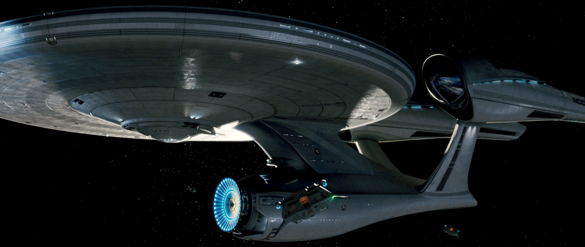
The curved backlit cowling on the warp nacelles (the light obviously being warp plasma) that I already dislike for its mere look does not make much sense, as in this region of the nacelle we would expect the warp coils. And since these are always straight for all we know, having a warped plasma outlet is a useless fad. The movable segments of at the aft end of the nacelles, as well as on the deflector dish, belong into the same category. It may not be a big deal considering that the warp nacelles of Voyager are even tilting in their entirety. Still, for 40 years Starfleet ships could go without moving parts and I think there is no reason to break with this tradition just for an additional cool visual effect.
Furthermore, while all other parts of the ship are more solid than on either the TOS and the TMP Enterprise, the nacelle struts are relatively thin compared to ships of other classes - especially considering that the new Enterprise is being built on the ground. Also, the pylons run into the engineering hull in the region of the shuttlebay. The pylon structure and the power transfer conduit have to continue somehow inside the ship. Although the cross-section of the new shuttlebay is relatively about the same as on the original and on the refitted Constitution (at Church's original design size of 366m), it may be further obstructed by the warp pylons. In the movie itself we get a glimpse of the open shuttlebay, where two rows of the large new shuttles are stacked on either side of the shuttlebay. A ship of 366m length would not be big enough for that. Anyway, on screen there is no sign of the power transfer conduits inside the shuttlebay, so it may work out after all, unless the CGI ship "cheats" in a way that the pylons simply do not continue inside the ship.
Continuity
Sure, the new look of the Enterprise (and of pretty much everything else in the movie) is the result of Nero's manipulations of history. We've certainly had countless time travel incidents in 40 years of Star Trek. Usually any damage to history was repaired in the end (such as the Borg attack on Cochrane's camp in "Star Trek: First Contact"), or it turned out insignificant enough to remain only a side note (such as Sisko's role as "Gabriel Bell" in DS9: "Past Tense"). This is very different in "Star Trek (2009)", because the alternate timeline created in the movie will persist. The new Enterprise is not reverted to the TOS version in the end, and pretty much everything that we know from the classic Star Trek will never happen in the Abramsverse - at least, it shouldn't happen if the new timeline (officially named Kelvin Timeline since 2016) wants to be taken seriously.
If we leave aside the idea of an altered timeline for a moment, the new Enterprise discards the visual continuity that has been a part of the Trek lore for 40 years for all the reasons that I anticipated some time ago. I was prepared to see a restyled Enterprise that would look clearly more modern than the TOS ship. I was hoping for it to retain certain retro elements to set it apart from the 24th century design style and, perhaps even more importantly, from its own refit in TMP. But the underlying style of the new ship is the TMP saucer with indifferent looking add-ons. The only retro element is the deflector dish. It could be any vessel in any later era, even an Enterprise-F or -G. While it undeniably still looks like a Starfleet ship, it does not fit into Starfleet's design lineage.
Since it is a different timeline, the TOS Enterprise the way we used to know it has ceased to exist. For what it's worth, the new Enterprise could work half-way plausibly as design that is contemporary with the TMP Enterprise. While the proportions of the saucer are not exactly the same as on the TMP ship and the curvature of the saucer edge is different (more rounded), the window arrangement and the three horizontal stripes look much the same. It is also interesting to note that the saucer underside that used to be concave on the original and the TMP refit (missing the inner parts of the lowermost full deck) is now flush.
Side note It has been a recurring nuisance for almost two years that the re-imagined Enterprise by Gabe Koerner was mistaken for the one to appear in the movie. Most fans presumed that the actual movie ship would be closer to the original. But now we are left with an even more radical redesign in several respects. Koerner kept the TOS saucer essentially as it was, and while his secondary hull is unnecessarily segmented and greebled, the elements roughly retain their basic dimensions, unlike on the new movie Enterprise.
Enterprise redesigns
We can see the reconstructed Enterprise warp away at the end of "Star Trek Into Darkness". Most notably the previously two impulse engine exhausts are combined to one. The redesign in "Star Trek Beyond" incorporates further changes. The nacelle pylons now lean back, and the neck was made thinner. While this is primarily a plot-driven change to make the ship more vulnerable to the Swarm attack in "Star Trek Beyond", it was also described as being closer to the original Enterprise, in an attempt at fan service.
Enterprise-A
 After the Enterprise of "Star Trek (2009)" and her two refits of "Star Trek Into Darkness" and of "Star Trek Beyond", the new Enterprise NCC-1701 is already the fourth(!) design variation in only three movies. The Enterprise-A under construction looks different than her predecessor in many ways. Most notably the neck is no longer placed in the middle of the engineering hull, removing the most often criticized imbalance of the Ryan Church design. It also looks like the neck is blended into the engineering hull now without the previous flange. The nacelle pylons appear to be straighter and thicker. The nacelles are more conventional, without the curved "engine hoods". They are also farther apart than previously. Finally, the slope of the saucer edge is not as steep any more, and the saucer may be smaller in diameter (or thicker).
Interior Design
Bridge
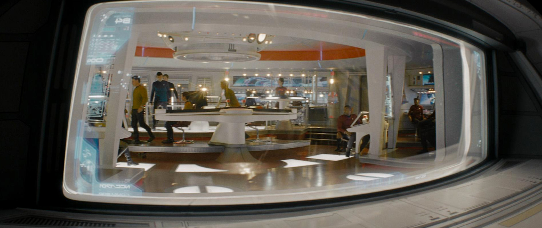
The bridge set of the Abramsverse Enterprise is easily the most sophisticated and flashy looking bridge in the history of Star Trek. The set design is a conglomerate of all kinds of styles previously seen in the franchise, and not at all in the sense of a homage. It is playful with its huge display that is being animated all the time (it must drive the crew crazy), with its complex and fragmented controls and with spotlights in every corner. The spotlights most likely blind the crew in the same fashion as they create lens flares. The bridge has large glass panes of the same kind that were deemed good enough only for "disposable" parallel universe versions of the Enterprise-D bridge. One (behind the desk) even has a totally pointless "printed circuit" decoration on it, of the kind that Mike Okuda routinely created for alien ships of the week. There is absolutely nothing on the bridge that is particularly reminiscent of the TOS era even if we don't expect total purism. Not the captain's chair, which looks like on the Defiant, not the railing, which is "fragile" like on the more recent bridge designs, not the ceiling (that we admittedly never saw on TOS), which looks like designed by Apple. The color scheme is an uninteresting "cool white/blue". I have seen many quickly redressed bridges of the week in the various Star Trek series that were better designed.
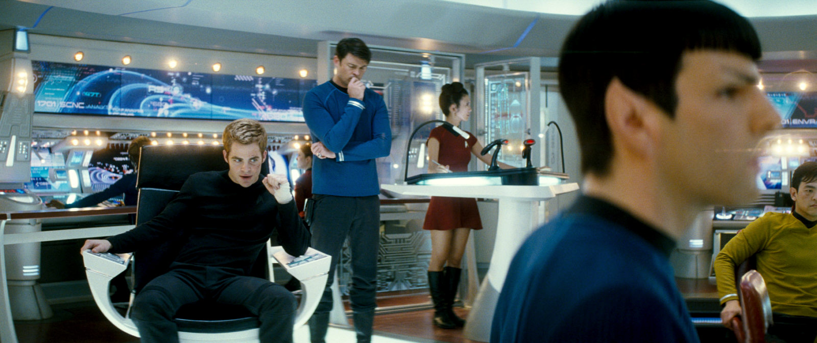
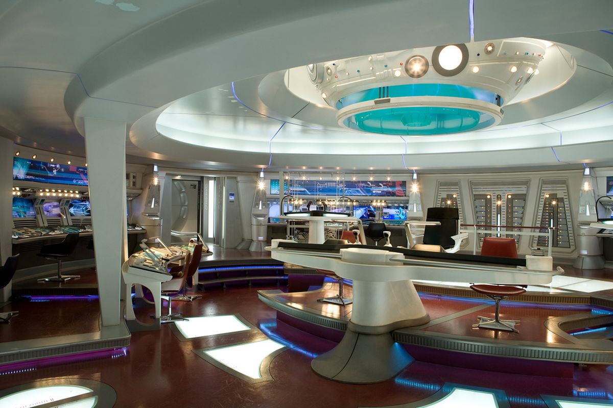
Even if we put up with the idea of anachronisms in the 23rd century in "Star Trek (2009)", the sophistication level on the new bridge just doesn't feel right. As much as I have always criticized Star Trek Enterprise for having too advanced technology, at least it was reasonable as an intermediate step between the 21st and the 24th century. Kirk's new bridge, in contrast, looks like an overblown design set in the 25th century or beyond.
Engineering
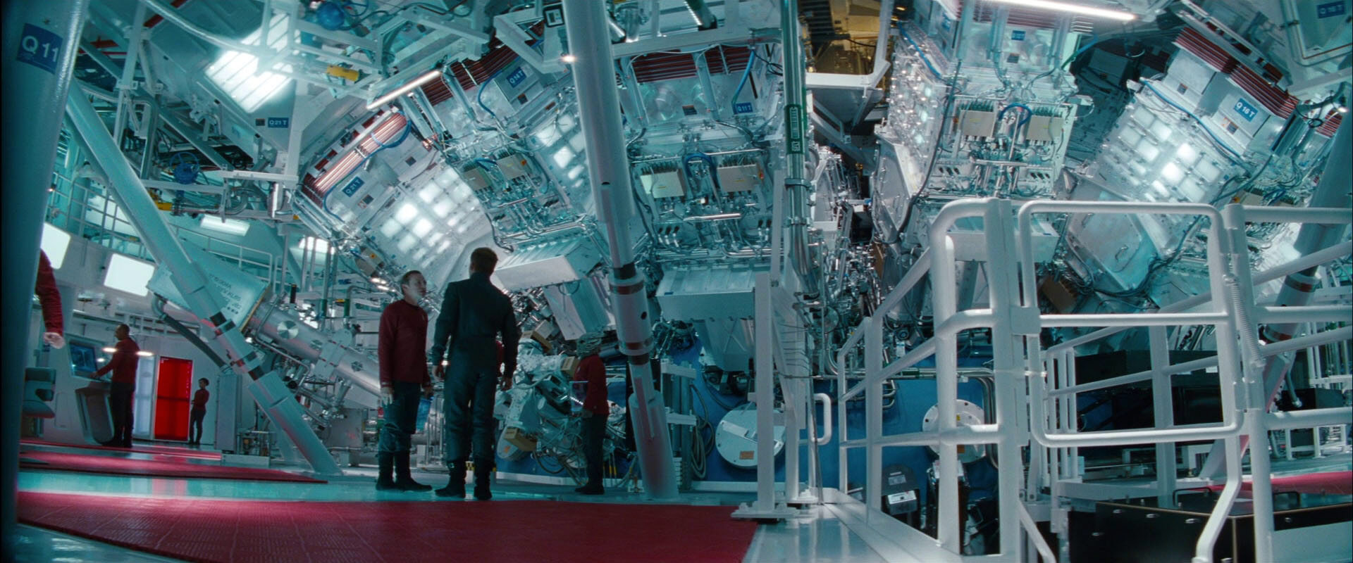
The one set that is even worse than the bridge is the engine room, which was created in the Budweiser Brewery in Van Nuys, California. The set was supposed to have a very industrial look, which may let it appear like a good idea to use a real production plant, rather than a less spacious sound stage. However, the brewery was hardly modified at all and looks just like what it is in the movie. It has big silver tanks and water pipes all over the place, as if processing water was its main purpose, rather than producing power for the ship. Also, while I concede that the traditionally crammed sets of previous Star Trek productions don't give us the sense of how big a starship really is, the engineering set of the new Enterprise takes it to the other extreme. It neither has a recognizable deck structure nor anything like bulkheads, as they are present on every ship or starship in existence. Its size is beyond reason (even if we believe in the official size of the ship), with huge empty spaces that every starship designer would want to fill with something useful or at least make accessible as additional cargo holds.
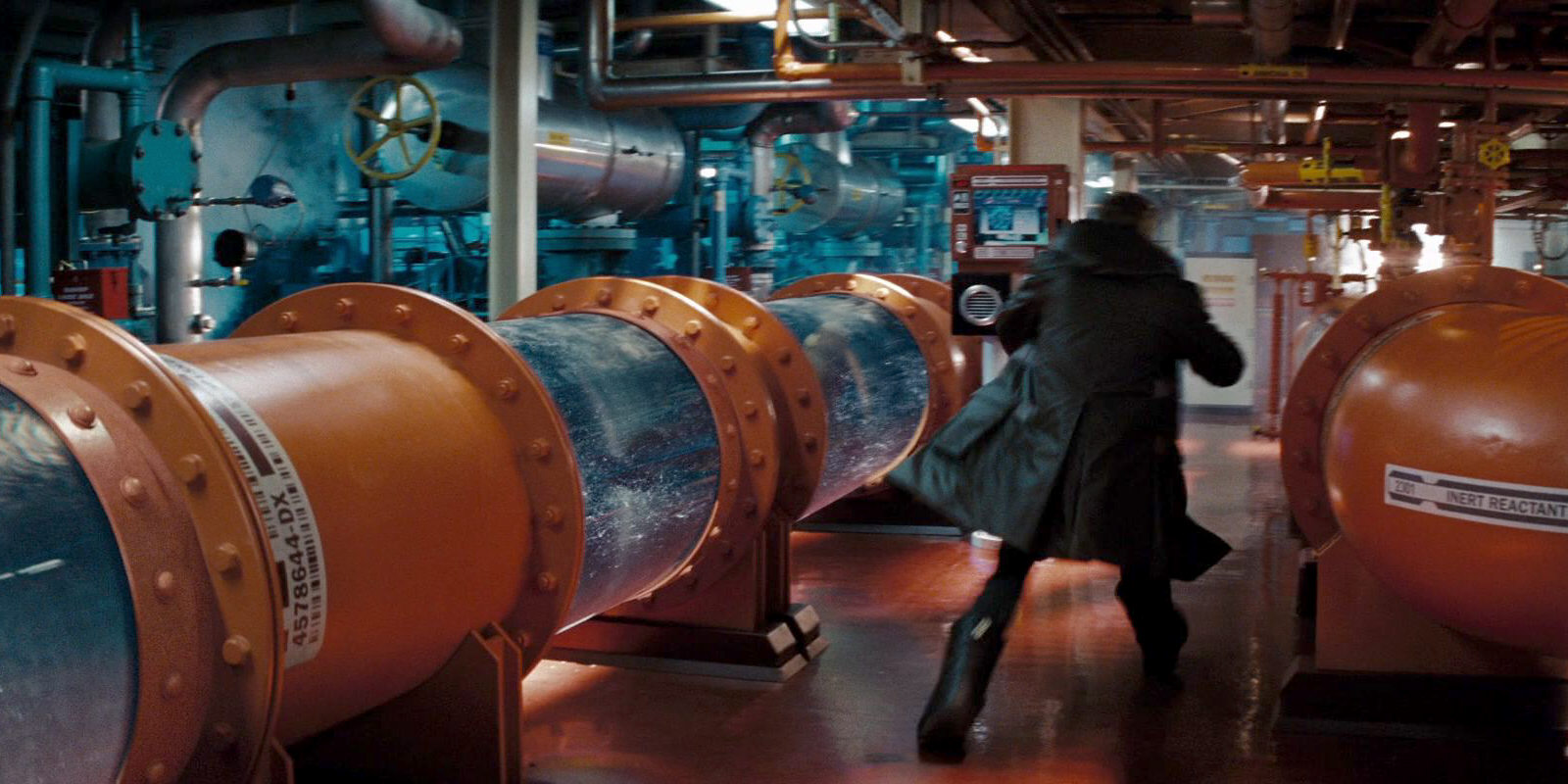

The second film, "Star Trek Into Darkness", includes the brewery set as well. While it doesn't show quite as many pointless water tanks and pipes this time, it reaffirms that the interior of the Enterprise is a huge factory, and does not feel like the engineering decks of any other Star Trek ship (or of sea ships). STID also shows us the warp core for the first time, which plays a big role towards the end of the movie. In real life, it's the National Ignition Facility, a spacious laser chamber at the Lawrence Livermore National Laboratory in Livermore, California. It is pleasant to see that there is more to the engineering section than water pipes, and the industrial look of the warp core complies with the rest of the production design. Still, this new warp core has nothing in common with those established in all Prime Universe generations from Star Trek Enterprise to TNG.
The Size Controversy
The supersized Enterprise
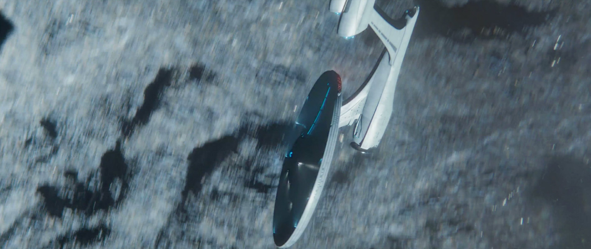
Like millions of other fans, I watched "Star Trek (2009)". And like pretty much everyone else who cares for starship design I was totally convinced that the new ship has to be about the same size as the original Enterprise or the Enterprise refit from the Prime Universe: around 300 meters long. This is what the design clearly looks like, and there was little real evidence in the movie to the contrary - except the oversized engineering location (that almost everyone seems to hate anyway) and the scene when the shuttles with the cadets arrive at the ship. Here we can see how a dozen shuttles are stacked in two rows on each side of the obviously huge shuttlebay.
As usual, I decided to ignore the blatant mis-scaling in case of the shuttle shelves. It would not be the first time that the VFX team disregarded the design sizes as given by the designers, just for an additional dramatic impact. We all remember the Merchantman that appeared to be only shuttle-sized compared to a Klingon BoP in "Star Trek: The Search for Spock", and still no one claims that the ship is really that small. Or the Defiant in "First Contact", which appeared to be just some 50m long compared to the Enterprise-E, whereas any other size evidence is somewhere between 100m and 170m. Or the big shuttles inside Voyager's shuttlebay, which could never pass the shuttlebay door. Or, in a more recent case, the Denobulan medical ship in ENT: "Cold Station 12" that must be some 20m long and almost as high, but fits into the shuttlebay of a Klingon Bird-of-Prey! All this we had to ignore because it was physically impossible. And so was the notion that some 24 big shuttles could be stowed aboard the new Enterprise.
But the more or less official Enterprise Tour comes up with an overall length of as much as 2500ft (762m) for the new Enterprise. The Society of Digital Artists says that the length is 2357ft (718m). And Gizmodo Blog claims that the ship is 2379.75 feet (725.35 meters) long. And because it's apparently so much fun, the blog demonstrates how well the extremely oversized ship performs compared to other sci-fi franchises, at least size-wise. Finally, we have an extra feature on the "Star Trek (2009)" Blu-ray disc that confirms the length of the new ship to be 2379.75 feet. Embarrassingly, on the comparison diagram with the TOS Enterprise that is supposed to make the huge size retroactively plausible the scale is totally off. The Abramsverse Enterprise would be just 490m long if we chose to trust the depiction, rather than the figures!
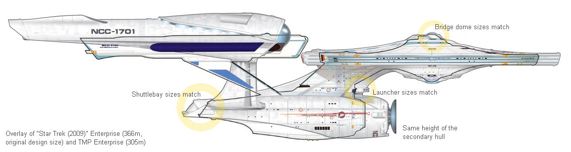
Unlike these various statements insinuate, the ship has not been designed by Ryan Church to be that massive in the first place. In an interview for the Cinefex magazine #118, ILM Art Director Alex Jaeger says: "The reconfigured ship was a larger vessel than previous manifestations -- approximately 1,200-feet-long compared to the 947-foot ship of the original series. Once we got the ship built and started putting it in environments it felt too small. The shuttle bay gave us a clear relative scale -- shuttles initially appeared much bigger than we had imagined -- so we bumped up the Enterprise scale, which gave her a grander feel and allowed us to include more detail." So the ship was designed at 1200ft (366m) by Ryan Church, and was later scaled up by a factor of 2!
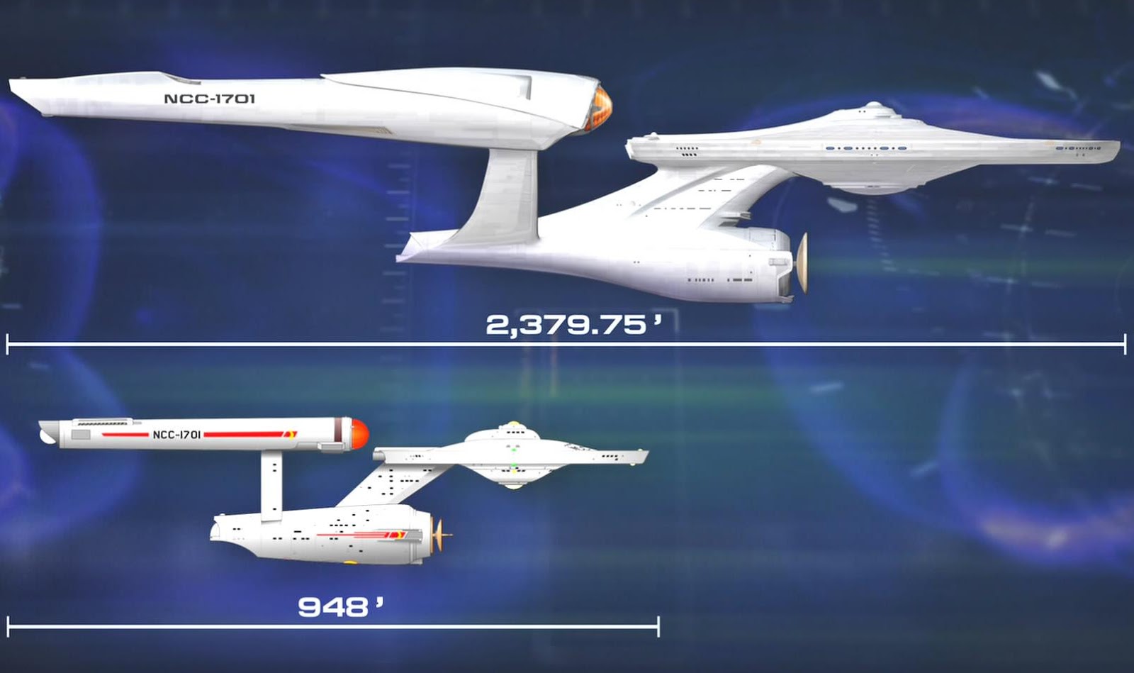
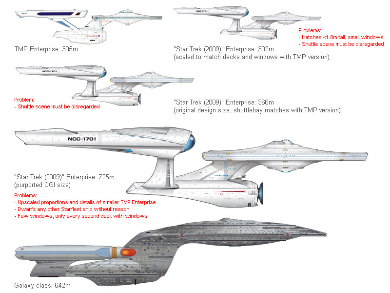
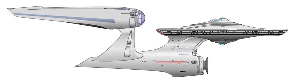
My size comparison with correct relative scales speaks for itself. It is undeniable that, if we base our estimation just on the picture with the relative sizes and not on the visual effects from the movie, the true length of the new ship has to be much closer to 302m (my original assumption) than to 725m, and that Church's size of 366m works well. The 725m version is undeniably totally out of proportion.
Evidence of a huge Enterprise
In all fairness, we have got the following evidence of a huge ship.
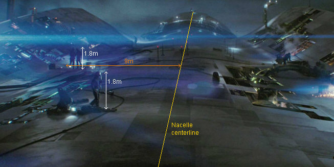
- The teaser trailer from January 2008 shows workers on the nacelle, between the two fins at the aft end. The distance between the roots of the fins would be as much as 18m based on the visual evidence, and this gives us a ship of well over 600m length. The trailer may have been made with the new "official" larger scale of the ship.
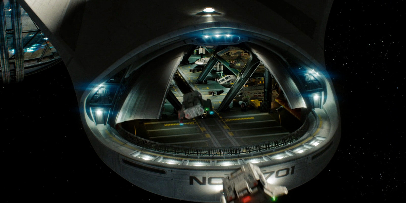
- The shuttlebay is huge and is meant to be huge. Actually, getting a much larger and more impressive looking shuttlebay appears to have been the most important rationale to retroactively increase the scale of the ship. When the cadets arrive in "Star Trek (2009)", we can see how a dozen shuttles are stacked in two rows on each side of the shuttlebay. Since the new shuttles are more than 10m long, this shuttlebay must be at least 40m across, requiring an overall length of the Enterprise of more than 700m.
- Although starships (just like other fictional vehicles or buildings) are routinely bigger from the inside than from the outside, it is hard to imagine that the engineering set (the "brewery") could fit into the secondary hull of a 366m long Enterprise.
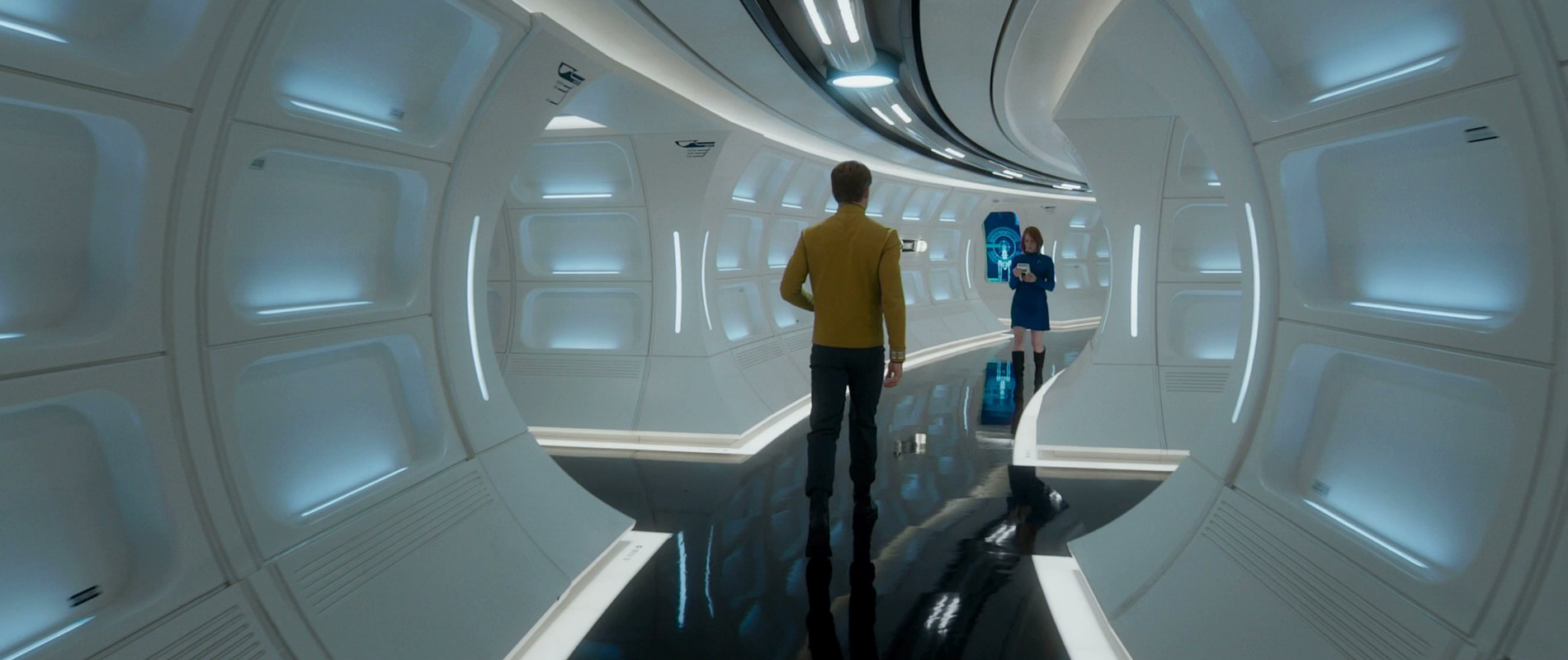
- When Kirk is rushing to the bridge in "Star Trek (2009)" to warn Pike about the Romulan threat, we can see him run through a corridor that is directly attached to the bridge. Such a layout seems impossible on a ship of 366m length, with a bridge module diameter of about 22m (bridge and corridor combined).
- In "Star Trek Into Darkness" the ship sports an enormous hallway with a round cross-section across many decks, which is meant to be located in the center of the saucer section. This would not fit into the saucer of a 366m Enterprise.
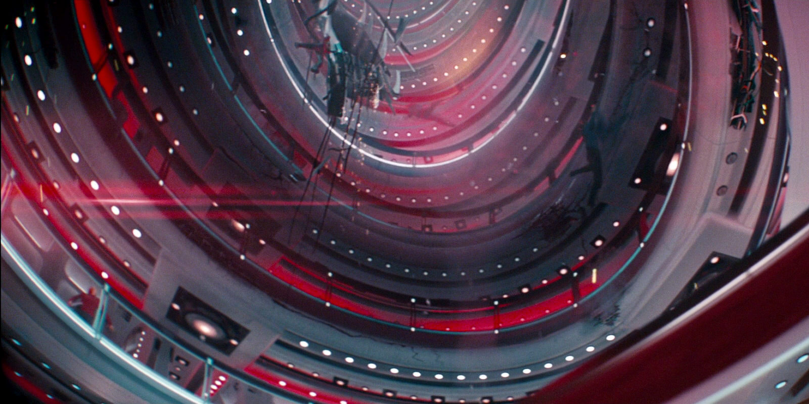
- In one scene in "Star Trek Into Darkness", when Kirk is talking to Scotty, he is obviously standing in the hallway and we can see one more deck and a big transparent dome above him. This is quite clearly meant to be the Enterprise's bridge dome as visible from the outside, which in this case is not located directly above the bridge. The dome measures considerably more than 10m in diameter. The size and location of the dome clearly points to a huge ship. It would be physically impossible if the (rather small) bridge occupied most of the bridge module.
- "Star Trek Beyond" shows us a close-up of the saucer edge. We can see two rows of windows, and two decks with the typical corridors with the round cross-section behind those windows. This is the same basic arrangement as in the shot with the deck that is ripped open in "Star Trek Into Darkness" (see below). There are two differences, however. The windows in "Beyond" are taller. This might corroborate the notion that there are only two deck in the saucer (as it would be the case on a comparably small ship). On the other hand, the shot in "Beyond" shows us human figures in the corridor, which allow a perhaps better size estimation of the saucer edge. It is close to 18m tall and points to a ship of over 700m length. The windows are all 2m high on the refit.
- It is obvious that the Enterprise-A as seen for the first time in "Star Trek Beyond" is supposed to be the same order of size as the destroyed ship. During the construction of the ship we can see people on the surface of the saucer that are so tiny that the saucer has to be considerably more than 200m across.

Yet, there are no known cues in the model itself that would point to a ship much longer than 366m, which is no surprise because obviously the finished model has been scaled up. It is only possible that the skin of the CGI model and hence the level of detail of the hull plates with their "Aztec pattern" was scaled down relative to the TMP Enterprise refit to that end.
Evidence of a smaller Enterprise
So what can we make of the supersized Enterprise? We may decide to simply believe what the more or less official sources keep telling us. Or we can base our size estimation on visual evidence. If we take into account all visual evidence, including the design features of the ship irrespective of how big they are supposed to appear in the film (which is subject to vary), we may arrive at a different conclusion than if we just take into account the opened shuttlebay and the brewery set. It is a mistake in engineering to increase the dimensions until everything fits, thereby approaching or even exceeding a previously established size limit. I think it is just as wrong to nail down a huge size for the new Enterprise to make everything fit, instead of seeking a solution that may work with overall less suspension of disbelief.
There are reasons why I have settled on the original design length of 366m as the true size of the ship.
- The sheer size of the Super-Enterprise is ludicrous. Had it been a fan design submitted to me for consideration, I would have declined it right away as a fanboyish übership irrespective of the excuse that it's a parallel universe, unless the designer had agreed to modify the size to something more reasonable. At 725m length the Enterprise would be 2.5 times as long as the original Enterprise, and it would have as much as 15.8 times its volume! The alternate ship would dwarf any known Starfleet vessel of the Prime Universe, including the biggest starship classes of the 24th century. Sure, there is no rule for the development of starship sizes over time. But the leap to 15.8 times as large vessels in this new universe is a stretch by any means, especially if we consider that many things (such as the senior crew) are still the same in spite of the significant historical and technological differences. Well, the Vengeance from STID is still a lot bigger than the Enterprise (more than twice as long as it seems). Some may argue that if the Vengeance can be over 700m long, we should go the whole way and accept that the Enterprise measures 725m and the Vengeance one mile. To me the Vengeance (which can be operated with a very small crew and includes vast empty spaces) is just more proof that the people in charge totally have lost perspective of ship sizes, and I prefer to limit the damage they have done by keeping at the least the Enterprise at a reasonable size.
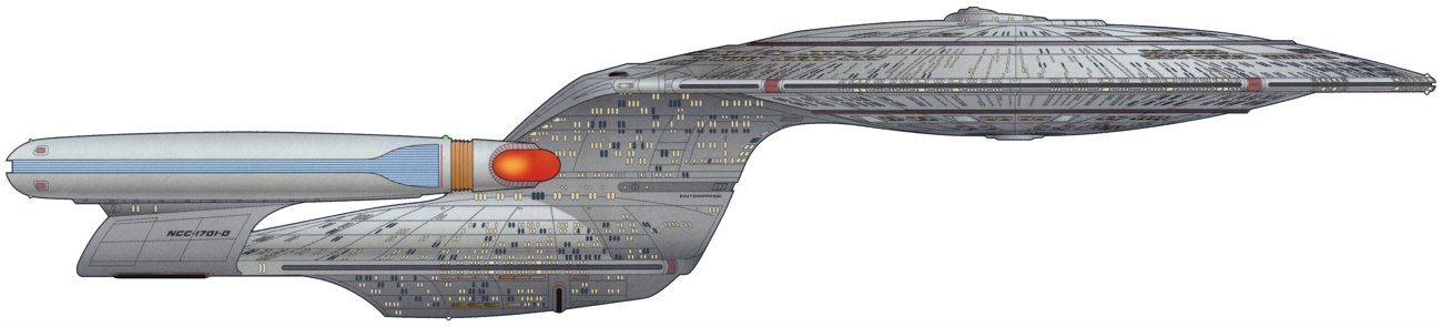
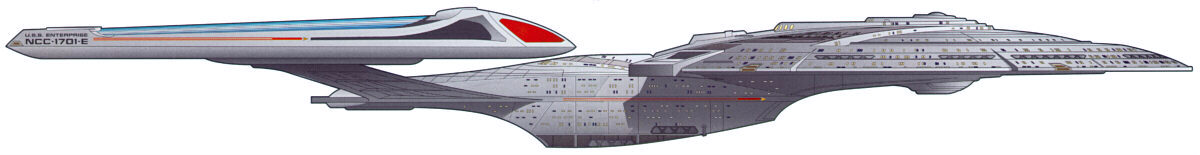
- The proportions of the saucer, neck, engineering hull and nacelles are somewhat different than on either the TOS and the TMP Enterprise, but overall still similar enough to put it into the same size range. In contrast, the designs of the much larger Enterprise-C (Ambassador class) and Enterprise-D (Galaxy) are visibly more compact, as we would expect from bigger ships because of the square-cube law. The big Enterprise-E (Sovereign class) is less compact again, but with its more streamlined hull the design takes a still different direction. Everything about the Abramsverse Enterprise looks like on a small (300m-400m) ship, and not as if it were bigger than the Galaxy class.
- While their sizes are subject to vary considerably between different ship classes of different eras, we would not expect the shuttlebay doors, phasers, thrusters, impulse engines, deflector dish or bridge dome to change their sizes proportionally with the rest of the ship. This, however, would be the case on the "Star Trek (2009)" Enterprise at 725m. Agreed, the shuttlebay doors and the torpedo launcher look small relative to the rest of the new Enterprise, but they match the ones of the TMP Enterprise in size, if the new ship is 366m long (obviously because they have been designed to match at that size!). Even if it could be technically possible, the proportional upsizing of almost every feature goes against the notion that it is intended to be overall bigger. The upscaled design would have to establish *some* substantial visual difference to look bigger, but it doesn't (obviously because the finished CG design was scaled up retroactively, and only the inside of the shuttlebay was adapted).
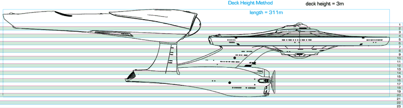
- The visible window rows make perfect sense at 302m length, and still at 366m. There are two rows of windows in the saucer edge, whose arrangement is almost exactly as on the Probert Enterprise refit. Even the two darker stripes around the edge are nearly the same. Actually, this detail was the reason for me to believe that the saucer had to be the same size (before I came across the original design size of 366m, which would naturally increase the saucer too). My original assumption made the new ship overall just a bit shorter (302m) than the TMP version (305m), and undoubtedly not by mere chance, although it turns out that Ryan Church scaled it up a bit. If the actual "Star Trek (2009)" Enterprise were more than twice as long, then the window arrangement in the saucer would be an incredibly stupid coincidence. It is already little useful to scale up hull designs as a whole. But the assumption that the windows would be still the same, leaving the new deck in between (the one behind the stripe) without windows, is extremely far-fetched. The window arrangement is a clearly visible detail and contributes greatly to the impression of the size of any ship. And with its saucer being an inflated Probert design without any changes to make the larger size plausible, it fails at a length of considerably more than 300m. The same applies to the window rows in the neck and in engineering. They always leave "coincidentally" one deck between the rows on an alleged 725m ship without windows, hence indicating that it can only be half as long.
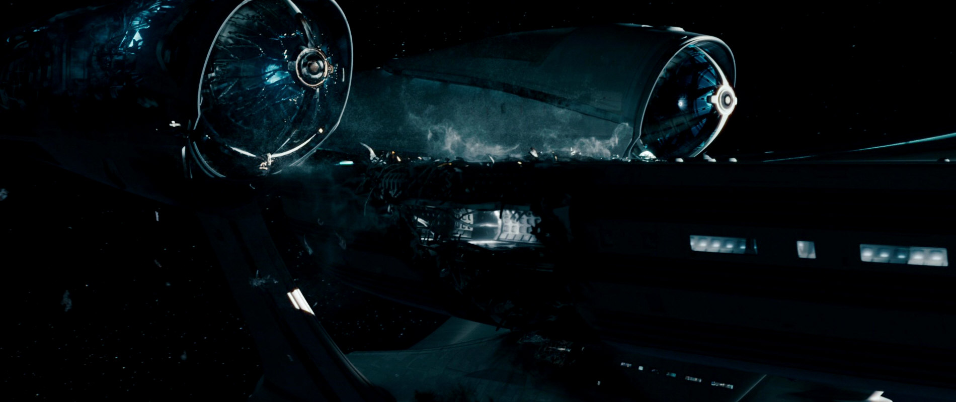
- In "Star Trek Into Darkness" there is visual evidence of the deck arrangement in the saucer. When the Enterprise has lost power and begins to tumble in Earth's atmosphere, there is one shot of a deck in the saucer that is exposed to space due to a hull breach. It doesn't look like there are four decks in the saucer rim as it would be the case on a 725m Enterprise but rather only two. My estimation of the height of the saucer rim is 10-12m, a bit too much for the 366m ship but way to little for the 725m version that would have an 18m rim. An 18m rim can be seen in "Star Trek Beyond", however (see above).
- At more than 700m length, the ship would have overall just a handful of windows, and as already mentioned, exactly every second deck in the inhabited parts of the ship would be completely without windows. Adding more windows would have been crucial to insinuate a larger size (with a 5.6 times as large hull area), but overall the ship has rather fewer than more of them than the 305m long Enterprise refit.
- The windows on a 366m Enterprise would be some 60cm tall, and the docking ports would measure a bit more than 2m. This is about the same as on Andrew Probert's Enterprise refit, on which parts of the new design, most obviously the saucer, are based. These features would become just too large on a 725m Enterprise.
- This Enterprise has evidently been built on the ground in its entirety and must have been lifted up into orbit somehow. The length of more than 700m would aggravate the problems of getting it up into space in one piece. The Enterprise would be 16 times as heavy as originally assumed and 8 times as heavy as designed. The larger the scale, the more likely the lever forces of the nacelles would break off the nacelle pylons already when the ship is standing on the ground (that is, if the nacelle support struts in the ship yards were taken away).
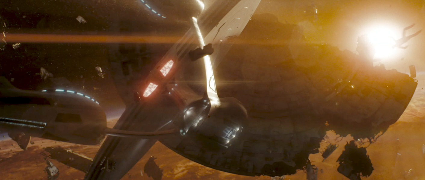
- When the Enterprise arrives at Vulcan, the ship runs into a debris field and almost collides with the saucer of the USS Mayflower NCC-1621, whose diameter is at least 150% of the Enterprise's. This saucer would have to be at least 500m across, and it would belong to a ship of more than 1000m length, provided that it has about the same basic structure as the 725m Enterprise. This is clearly another case of blatant mis-scaling, because no other Starfleet ship of the movie is substantially bigger than the Enterprise, and in particular the Mayflower is smaller, as we can see at the space station. So we either have a precedence of mis-scaling that would call the alleged size of the Enterprise into question or, if there is no mis-scaling in the case of the Mayflower saucer, it does not totally preclude the possibility that there are ships with bigger 200m saucers, but only with a small Enterprise. The Vengeance is still a lot bigger than that, and one more reason why the Enterprise should be as small as possible.
- The shuttlebay with the stacked shuttles of 40m or more width is undeniably solid evidence for an upscaled ship of more than 700m. On another occasion, however, when Pike's shuttle is seen leaving the Enterprise at Vulcan, the shuttlebay doesn't look all that big - at least at a first glance. The shuttle may be some 6 meters wide, then the door opening measures some 10 meters. Perhaps a bit more, since the shuttle may already be a couple of meters ahead of the door. But overall the shuttlebay appears to be much less than 40m wide. On the other hand, the shuttle occupies the width of the letters "C-17" on the Enterprise's hull in this shot, which complies with the above shot of the huge shuttlebay. The reason for the distortion is the use of a "wide-angle lens" in this CG shot.
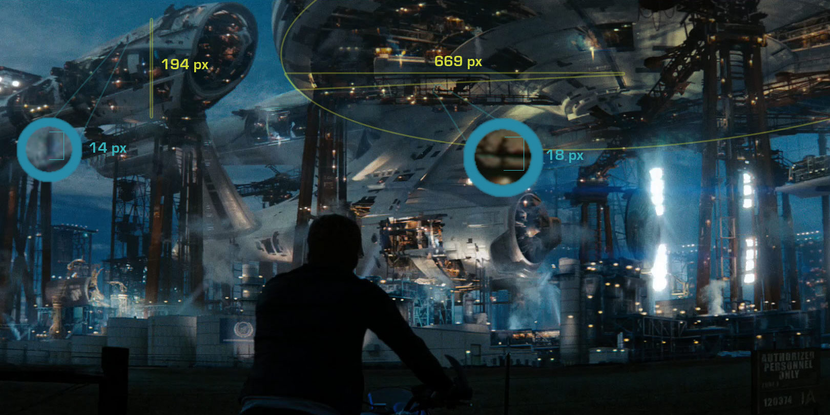
- When Kirk visits the building site, we can see workers close to the hull of the ship, one just in front of the nacelle and one on a bridge a couple of meters below the saucer. The saucer measures 669 pixels from the center to the lower edge. The height of the tiny human figure near the saucer is 18 pixels. Assuming that the worker measures 1.8m, this would give the saucer a radius of just 67m, which is an almost perfect match with the saucer of the TMP Enterprise! Again, this can't be a coincidence. The figure in front of the nacelle measures some 15 pixels, while the nacelle, at the same distance from the "camera", is 194 pixels high from the upper end of the pylon to the very top. The overall length of the ship would be barely 300m based on this comparison, but we would have needed to account for some parallax, so the ship may be actually somewhat longer, perhaps 366m as designed. This is in contrast to the (ultimately non-canon) teaser trailer (see above), in which the ship looks like it is over 600m long compared to the human figures.
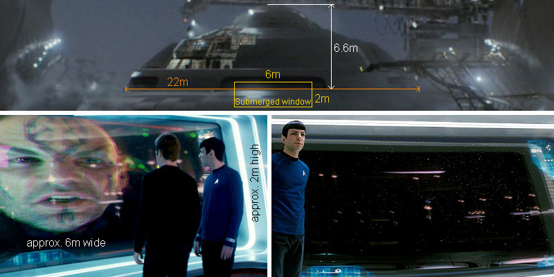
- As already mentioned, the visible windows on a 366m Enterprise would be absolutely reasonable. But what about the bridge windows that, as we can see from inside, are rather large? The combined window/viewscreen in front of the bridge occupies much of the set's height at the edge, but it doesn't quite reach from the floor to the ceiling. I estimate it measures about 6m by 2m. This window, like the port and starboard windows that appear to have the same sizes, is visible on the CGI model. In the teaser trailer we can see the bridge almost perfectly head on, at a certain distance from the "camera", so there is practically no distortion. The window does not occupy the whole deepening into which it is embedded. We can see a faint rectangular frame inside the more rounded contour of the cavity. But this narrow slit as visible on the model is not what we are shown in the close-ups. In order for the proportions to be correct, almost two thirds of this window must be submerged. The idea of a submerged window, however, does not comply with the take of Spock standing in front of a transparent window that is obviously not in the "basement", as well as with the look inside the bridge through the 6m by 2m window. The latter have to be rated as errors in the post-production, because they don't reproduce the correct window proportions of the model. In case we decided that the entirely unobstructed view from the bridge window were the correct depiction irrespective of the inconsistency in the window width (it would have to be some 18m wide at 2m height), the ship would have to be well over 1000m long! Anyway, the 6m by 2m mostly submerged window gives us an overall bridge dome height, measured from the hull surface in the upper third of the window to the very top, of barely 6.6m. The overall length of the Enterprise, based on this evidence, would be still some 450m, but nowhere near 725m.
Other issues
I have come to terms with the new Enterprise. I have accepted it as an alternate-universe version. But that was under the precondition that the ship was 366m long. Aside from not making sense in-universe, there also a couple of real-world reasons why I hate the idea of the supersized Enterprise:
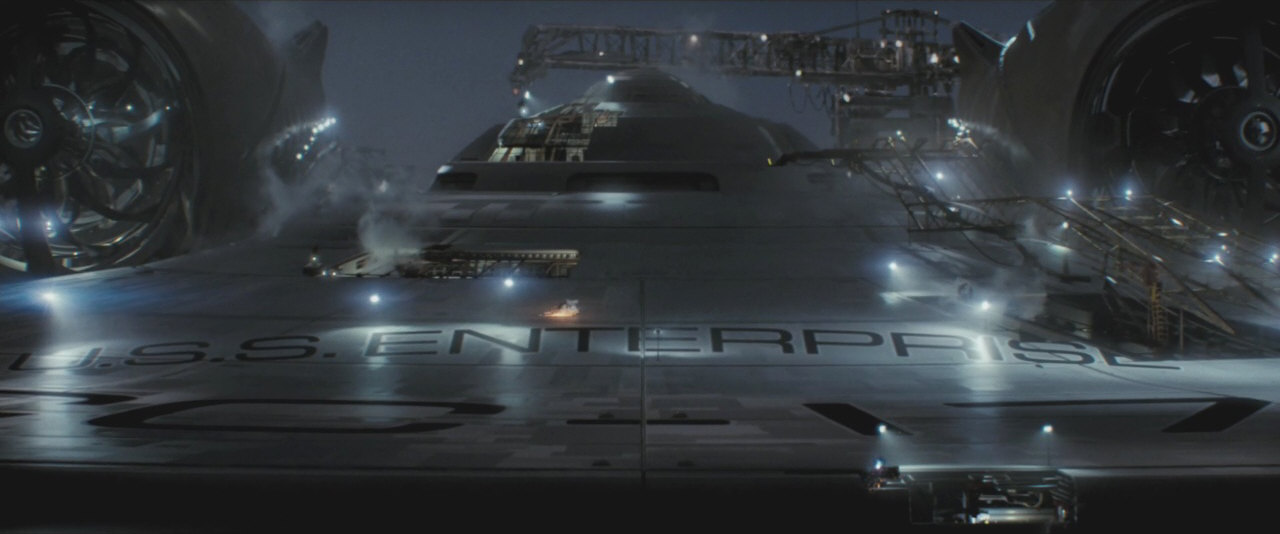
- From Matt Jefferies's original miniature to Doug Drexler's full-CGI NX-01 all Enterprises were designed, built and shown at a definite size, as it can be expected for a ship to bear the illustrious name, as opposed to an alien ship-of-the-week. The eighth Enterprise as designed by Ryan Church was originally 366m long and later scaled up at ILM without any changes to the design. The new huge size was made up way too late by people who apparently did not have an idea what they were doing. Moreover, it was evidently insufficiently communicated and accounted for.
- The new Enterprise was designed by Ryan Church to make sense at 366m length. Moreover, he laid out the overall shape, the deck structure and even many details to be a tip of the hat to Andrew Probert's Movie Enterprise. The extreme retroactive upscaling of the vessel effectively invalidates many of the designer's efforts and his good intent.
- The bigger size is explained by Jaeger as having practical reasons. But it begs the question if someone in charge was of the opinion that Star Trek had to catch up with other science fiction franchises size-wise. Because other than squeezing in all the shuttles, which was irrelevant for the story and could have been avoided, there is absolutely no reason for the extreme oversize of Star Trek's new lead vessel.
Final Remarks
In a comment at Entertainment Weekly, J.J. Abrams implicitly claims that the ship is still the same as a concession to the fans: "If you're going to do Star Trek there are many things you cannot change. The Enterprise is a visual touchstone for so many people. So if you're going to do the Enterprise, it better look like the Enterprise, because otherwise, what are you doing?" He seems to mean what he says without sarcasm, but exhibits a lackadaisical attitude about what he or his people are doing with the franchise. I am afraid that certain people, even some avid fans, rather trust such appeasing statements than their own eyes. The new ship is very different than the TOS Enterprise, and even casual fans notice that. And if we believe the official sources, it is even supposed to be a lot bigger than it should.
Regarding the size issue, I will keep the length of the new Enterprise at 366m. I am not ready to accept the more than 700m length that ignorant people in charge of the visual effects, possibly with problems to understand that there is no size competition among sci-fi franchises, may have deemed a cool idea. In spite of everything, I have a desire to maintain the continuity of the old and the new Star Trek. And this is why I keep defending the new Enterprise design at its reasonable original size. I believe it is the lesser evil to ignore the few scenes where the new ship appears to be monster-sized, rather than abandon everything I have ever read and written about starship design.

As circumstantial it may appear to people who don't care for starship designs (or other technology), the size of the new Enterprise may mark the difference between a parallel universe within the existing canon on one side, and a complete reboot, a new science fiction universe in which different rules apply than in Star Trek so far. The USS Kelvin is another trouble spot in the field of starships. Because the Kelvin, which predates the creation of the parallel universe, starts the trend of ships being much larger than any 23rd century vessel we know so far, including the Excelsior. It has a crew of 800, twice as many as on the original Enterprise 30 years later in the Prime Universe. Yet, it is supposed to be just a survey vessel. The fanboyish Vengeance with its supposed length of one mile and its silly back story is a still worse problem. Along with a certain "homage" in STID it is a reason not to take this universe seriously any longer, at least not as a canonical parallel universe.
Because of my respect for The Original Series and the fact that it has the much older rights I have chosen to give the reboot a lower weight than the classic production design from TOS to ENT. In my view the Kelvin Timeline is something like a second-rate reality, especially since the shamelessly plagiarized events of "Star Trek Into Darkness". In my Starship Database there is only a place for one "true" Enterprise NCC-1701, and it will remain Matt Jefferies's design (and it won't be replaced or supplemented by the "reimagination" from Discovery either). Yet, it is not my intention to ruin everyone else's excitement about the new universe with its new Enterprise for a new generation. I don't want to tilt against windmills, but I keep a critical distance instead of being a part of the hype.
The discussion about the new Enterprise reminds me of the "Akiraprise" controversy a couple of years ago. The Abramsverse with its lead ship, however, has damaged Star Trek's continuity more substantially than Enterprise ever could. The "Akiraprise" NX-01 could fit into the design lineage just because the series was set more than 100 years prior to TOS - and visually it is not as big a deal as I initially thought. In "In a Mirror, Darkly" the Mirror NX-01 and the TOS Defiant even appeared side by side.
Speaking of the "Akiraprise", many fans berated me for finding any fault with the ship, or with the underlying idea of Enterprise. I was aware that my unpopular stance on the Abramsverse would evoke that kind of animosity yet again, and perhaps some hate mails. However, I was not prepared for the slur campaigns against me on several message boards, especially for my heresy of not blindly accepting that the Enterprise is 725m long. I can't avoid the impression that respect and decency are getting lost not only in the new Star Trek but also in the new Star Trek fandom. And the Abramsverse was only the start, with Discovery being even more divisive since 2017, and giving rise to even more hostility towards old-school fans for their justified criticism.
See Also
Starship Gallery - Abramsverse Fedration Vessels
Abramsverse Inconsistencies - continuity issues and nitpicking in the reboot movies
Credits
Thanks to Nick Corcoran for the Jaeger quote, to Geert for reminding me that lifting a 700m vessel would be a major problem, to Dave Metlesits for the hint about the huge saucer, to bX for permission to use his size comparisons, to Brian Gordon for pointing me to the Blu-ray size comparison, to Belz... for the great find of the screen cap with Pike's shuttle, to Nihilus Shadow for finding the exposed decks and to Andrew Probert for valuable discussion. More screen caps from TrekCore and Ariane's Star Trek Gallery.

Back to Starship Articles index


