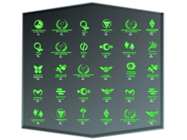
The Evolution of the Romulan Emblem
by Jörg Hillebrand and Bernd Schneider
Obscure TOS EmblemTNG-Style EmblemsNemesis-Style EmblemsPicard EmblemsAddendum: Ni'Var EmblemConclusion
Romulans appeared in over 50 Star Trek episodes and movies altogether. On many of these occasions we could see a Romulan emblem. The very first emblem is kind of obscure and could only be seen in TOS: "The Enterprise Incident". The familiar emblem is a bird-of-prey supposedly holding the planets Romulan and Remus in its claws. It first showed up in TNG: "The Neutral Zone". After that, it could be seen in many variations with switched colors green and blue, with different colors, with variations of the shapes and letters, and sometimes without the letters. The emblem was finally updated to a stylized and monochrome version for "Star Trek Nemesis".
This article outlines the development of all variations of the Romulan emblem.
Obscure TOS Emblem
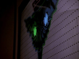
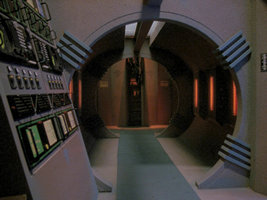
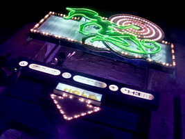
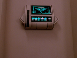
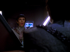
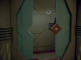
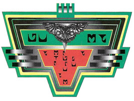
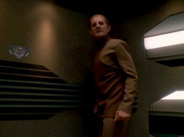
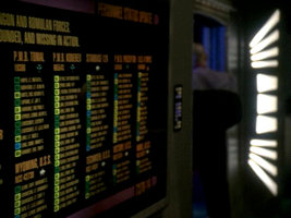
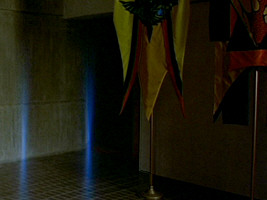
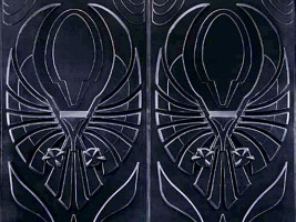
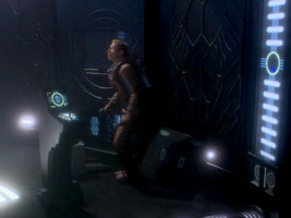
 In TOS: "Balance of Terror" there was nothing like a Romulan emblem, although the painted bird on the ship's hull, which history buff Lt. Stiles already hinted at, qualifies as a distinctive mark of a similar nature. Anyway, it is obscure but something like a Romulan emblem shows up in TOS: "The Enterprise Incident". It is visible only briefly in a corridor, above a door.
Although it may be just a decoration or a pictogram denoting a certain section of the ship, there is one reason why it was likely intended to be the Romulan emblem indeed. It looks remarkably similar to the Klingon symbol that had premiered just a few episodes earlier, in "Elaan of Troyius". It is even composed of the same colors. So whoever created this supposed Romulan emblem had a good intention to give this race more distinctiveness, but should have come up with something much more original to that end. Yet, perhaps the set designers deliberately made it look like the Klingon trefoil. The latter can be found on the ship's hull and may have been recognizable in the episode (the Romulans are using Klingon D7 cruisers in this episode). So the Romulan emblem may have been made to look similar. A possible retroactive in-universe explanation is that the logo symbolizes the supposed short-lived alliance of the Romulans with the Klingons in the 2260s. The colors and their arrangement were taken from the Klingon trefoil, while the unknown individual Romulan emblem may have contributed the hexagonal shapes. Hexagons can be seen all over the Romulan ship in this episode, and probably not by mere coincidence.
Interestingly, the regular hexagon can already be seen on a Romulan helmet in TOS: "Balance of Terror", while elongated coffin-shaped hexagons appear as the cross-section of the bridge in the same episode and, in many places, on Vulcan in TOS: "Amok Time".
TNG-Style Emblems
Variant 01
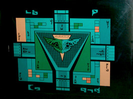
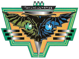
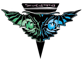
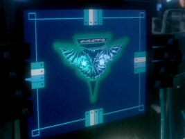
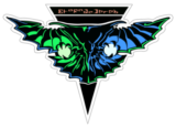 The familiar Romulan emblem, the bird-of-prey supposedly holding the two planets Romulan and Remus, was designed by Monte Thrasher. Michael Okuda tells us about the motivation to create an all-new symbol:
"I knew of the logo in 'The Enterprise Incident.' Although I often tried to preserve elements from the original series, in this particular case, I thought it was too similar to the Klingon logo. I had an artist named Monte Thrasher design the predatory bird for the TNG Romulan logo."
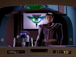
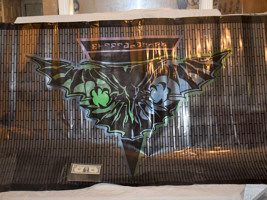
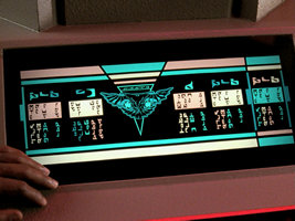
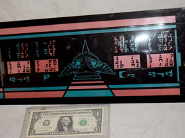
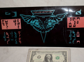
Two large plexiglass panes with the emblem on white ground were fabricated for TNG. The first variant is visible in nine episodes. The second one is slightly larger and shows up in two episodes.
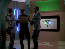
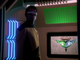
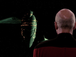
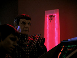
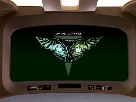
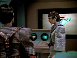
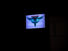
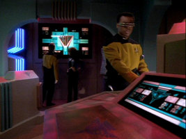
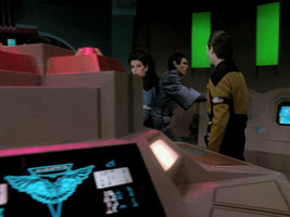
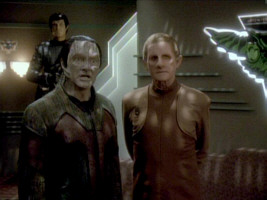
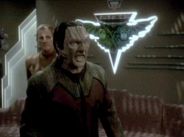
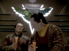
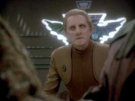
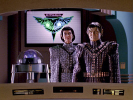
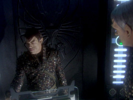
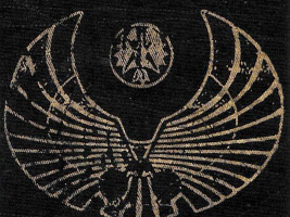
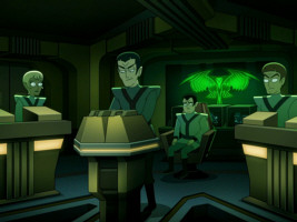
The first appearance of the smaller panel (and of any variant of the Romulan logo) is in TNG: "The Neutral Zone" in the background of the Romulan Warbird bridge. It is barely possible to say which part of the emblem is blue and which is green. We believe that the right half is blue, as will be confirmed in later appearances of the same panel. On some other types of logos, the two colors green and blue are switched. In later episodes we will also see that the gray/white part of the plexiglass panel has a slight pattern like a brick wall that is turned by 90 degrees. This is best visible in "Face of the Enemy". The writing on the emblem is recognizable for the first time in "Contagion". We can see an E-shaped letter on the left. The location of this "E" indicates the orientation of the lettering, which is mirror-inverted on many other variants. The bird's (right) blue wing has a green outline, and vice versa, as we can clearly see e.g. in "The Mind's Eye" or "Redemption". Furthermore, the whole emblem has a white border.
The plexiglass pane can be seen in TNG: "The Pegasus" with an unusual green lighting.
Variant 02
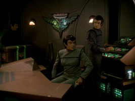
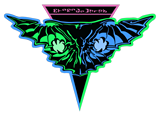 The wall emblem that appears in TNG: "Data's Day" resembles the above variant 01. The larger variant 02 was probably deemed necessary because a larger bridge set was built for the episode. We can see that the arrangement of green (left) and blue (right) and of the letters ("E" on the left) is the same, and that this variant too appears on a backlit panel with a vertical stripe pattern. But some details are different. The whole bird-of-prey now has a colored border in green on the blue side and vice versa, instead of only parts of the wings. The green/blue border includes the lower portion of the triangle, whereas the upper part with the letters is pink now. One more difference is that the two planets don't appear as distinct spheres any more; they have grown in size to fill out the whole space between the bird's claws. Variant 02 reappears in "Redemption II".
Variant 03
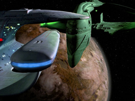
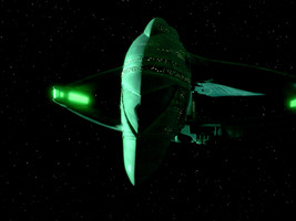
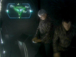
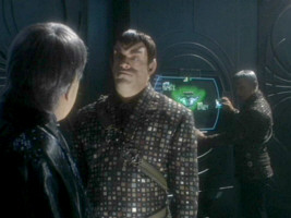
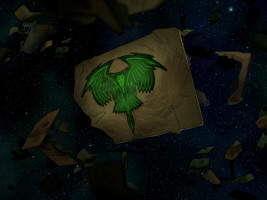
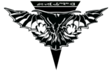 A monochrome black Romulan emblem is visible on the bow of the Romulan D'deridex class. The model was too dark when it first appeared in "The Neutral Zone" to recognize this detail, but it "Contagion" it is clearly visible, as well as on several later occasions in TNG, DS9 and Voyager. A plain black emblem also appears on the wreckage in TNG: "The Enemy". In "Future Imperfect" we can see a plain dark emblem for the first time in (fake) Romulan interiors, on at least two occasions (variant 03a). These were most likely created with stencils, like the beige (variant 03b) and the turquoise (variant 03c) emblems below. The larger emblems in this episode include the letters, but it is not possible to identify the orientation. In TNG: "Unification I", such an emblem can be seen on Neral's monitor, and the "E" is on the right.
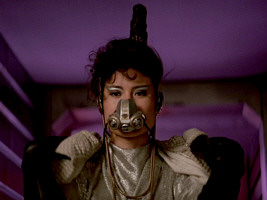
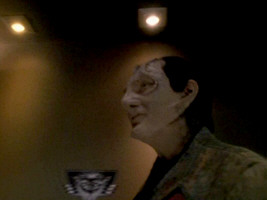
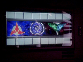
Monochrome TNG-style emblems also show up twice in "Star Trek: The Final Frontier" (set in 2286). The first one can be seen on Caithlin Dar's mask. The second one can be spotted on a sign in Paradise City, beside the Klingon and the Federation emblems. Including the then new logo in the movie was the obvious choice, as it had just been established for the Romulans on TNG, albeit 80 years later in the timeline.
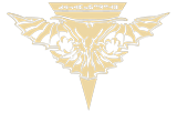 As already mentioned, a large beige variant of the monochrome Romulan logo can be seen on a wall in "Future Imperfect", probably created with a stencil.
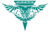 All-turquoise Romulan emblems can be seen in various episodes, always as spray-on logos or stickers such as in TNG: "Future Imperfect", "The Mind's Eye", "Redemption II", "Unification II", "The Next Phase", "Face of the Enemy", "Birthright II" and "Timescape".
Variant 04
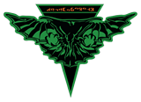 A green variation can be seen on a Romulan monitor in TNG: "Redemption II". The Romulan letters, on the other hand, are orange-brown. This logo has the same orientation as the animated ones from the same episode (variant 15). The "E" is on the right.
Variant 05
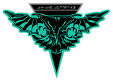 A turquoise monitor logo shows up in TNG: "Unification II". We can see that the bird-of prey including the lower corner of the triangle is turquoise, whereas the top of the triangle with the letters is gray. Once again, the "E" is on the right.
Variant 06
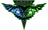
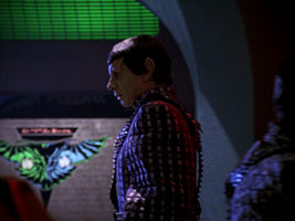
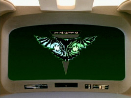
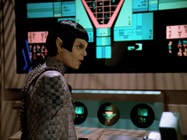
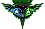 A new variant of the emblem can be seen on the Enterprise-D viewscreen in TNG: "Unification II". It is the first time that a large version appears with the colors blue (now on the left) and green switched, and with the letter "E" on the right, unlike on the variants 01 and 02. The logo doesn't have a white border but is placed directly on a green background. The triangle is gray with a light green border.
 For the remastering of "Unification II", the viewscreen emblem was reconstructed. The color of the letters is pink now instead of previously salmon. But even more obviously, the edges of the wings are not in inverted colors any more, they are now blue on the blue wing and green on the green wing. Also, some small details found on the original were not reconstructed.
Variant 07
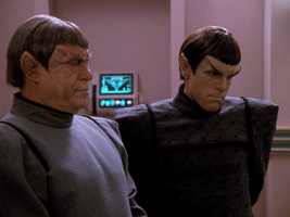
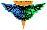 A monitor logo visible only in TNG: "Face of the Enemy" consists of an all-blue left wing and a green right wing on an orange triangle with lettering. As already established for monitor emblems at this time of the series, the "E" is on the right.
Variant 08
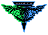 Another monitor emblem in TNG: "Face of the Enemy" has a green left wing and a blue right wing. Still, the "E" is on the right. The eagle is placed on a blue outline, and the letters are pink.
Variant 09
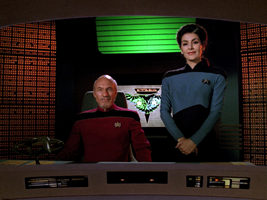
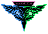 A new backlit panel appears in the Romulan crew quarters in TNG: "Face of the Enemy". The vertical grid is the same as on the already known panels (variants 01 and 02), but the colors of the emblem are different. For the first time on such a kind of panel, the wings are blue on the left and green on the right. Also, the "E" is now on the right, so the whole pattern was mirror-inverted. Furthermore, the wings are uniformly blue and green, respectively, without differently colored borders. The border of the upper part of the triangle including the letters is pink, while the lower tip has the same border colors as the adjacent wings. This is the same scheme that was already found on variant 02. Interestingly, the emblem does not show up in later scenes in Deanna's quarters on the Romulan ship. It was created purposefully for the dramatic revelation at the beginning of the episode.
Variant 10
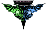
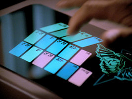
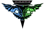 The Romulan emblem in full colors appears on a display in TNG: "Birthright II". As on most monitor logos, the left wing is blue and the letter "E" is on the right (mirror-inverted to the original panel from "The Neutral Zone"). The letters are pink.
 For the remastering of "Birthright II", the monitor symbol was reconstructed. While everything else including the orientation of the letters remains the same, the colors of the wings were switched. Apparently the "generally accepted" DS9 version of the emblem was used, although it previously wasn't done for the remastering of "Unification II".
Similar monitor emblems appear on the Defiant in DS9: "The Search I", with the orientation as in the remastered version TNG-R: "Birthright II". These emblems show up whenever the ship is cloaked but not on red alert.
Variant 11
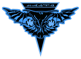 A bluish monitor logo is visible in the engineering of the Romulan Warbird in TNG: "Timescape". The triangle, the letters and the two planets are only slightly more greenish than the rest of the logo. As it is customary on this kind of graphics, the "E" is on the right.
Variant 12
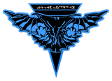 Another monitor logo in TNG: "Timescape" is completely blue/turquoise. Only the letters are differently colored. They appear light gray in the episode and pale salmon on the photo of the panel.
Variant 13
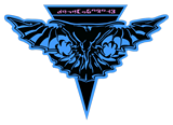 On a third variant from TNG: "Timescape", the emblem is blue/turquoise, and the letters are pink. This might be the same as variant 12 and only looks different because of the lighting.
Variant 14
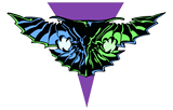
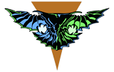
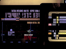
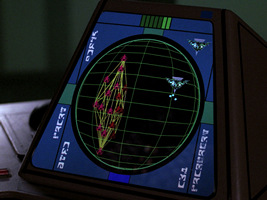
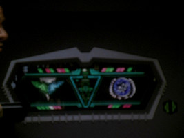
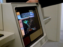
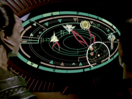
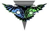 In TNG: "The Defector" we can see three different color variations of a monitor emblem that is used on the Enterprise-D to symbolize Romulan ships. In the first one (variant 14a), used for the scout ship, the bird-of-prey appears on a gray triangle without the lettering but still with the lettering area accentuated. The second one (14b, used for the Warbird) has a plain orange triangle, the third one (14c, used for the scout ship) a purple one. All three emblems have in common that they are mirror-inverted relative to the large plexiglass pane on Romulan bridges. In the chronological order of appearances, this is the first inverted version.
Variant 15
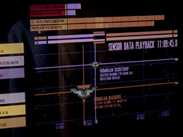
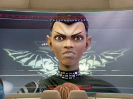
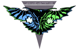 A similar animated logo as variant 14a on the Enterprise-D monitors can be seen on the Romulan displays in TNG: "Redemption II". Once again, the wing colors are reversed, with blue on the left and green on the right. The Romulan monitor symbol includes the lettering, as we can see in HD.
Variant 16
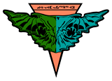 A TNG-style emblem shows up in VOY: "Eye of the Needle" (set in 2351) on the Romulan ship. The Voyager (or early 24th century?) variation is special because it is the only one on which the colored and black areas on the wings are inverted. The emblem is green on the left and blue on the right, on an orange triangle.
Variant 17
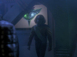
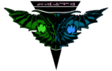 A large wall emblem shows up for the first time in DS9: "Improbable Cause" and "The Die is Cast". The left side is green, the right side is blue, the letter "E" is on the right. After the confusing permutations of TNG, this is the final and meanwhile "generally accepted" version of the emblem. The edges of the wings have the same colors as the wings themselves. Something of note is that the wall emblem includes 3D effects, almost like a relief. The upper part of the bird with the claws and the two planets is protruding. An actual wall relief will appear in "Inter Arma Enim Silent Leges". The whole wall panel is edge-lit, but only in "Improbable Cause" and "The Die is Cast". When the same prop reappears in "Image in the Sand", it will remain dark.
Variant 18
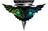 Besides the large wall emblem (variant 17), three small labels with the Romulan emblem were created for DS9: "Improbable Cause" and "The Die is Cast".
The first one (variant 18a) is colored and is placed on a trapezoid label. It can be seen in Enabran Tain's room on the Warbird and in the adjacent corridor. A still smaller version of this logo appears on a Romulan device in DS9: "Inter Arma Enim Silent Leges". We can't recognize any details on the screen caps, but the scan of the label gives away that there is an additional Romulan letter on the emblem, on the very left. It can also be seen that the left half of the emblem is olive green now, whereas the left planet is still plain green.
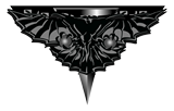 A second small label too appears in Tain's quarters, above the large emblem. The Romulan emblem on this label is strangely distorted, as the upper text field was enlarged but is largely hidden by the rest of the triangle and the wings.
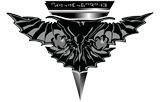 The third of the small emblems created for DS9: "Improbable Cause" and "The Die is Cast" is only visible in the latter episode. It seems to be a black-and-white version of variant 18a.
Variant 19
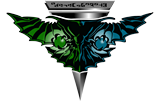
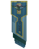 An emblem that is much like variant 18a, including the additional letter on the very left, can be seen in DS9: "Broken Link" and again in DS9: "In the Pale Moonlight" (on four different occasions in the latter episode). The only difference is that the previously black triangle with gray letters is now gray with black letters. This variation will appear in several more episodes until the end of DS9, mostly on monitors but also on the pennant in "Inter Arma Enim Silent Leges".
"Star Trek Nemesis" is known for introducing a new style of Romulan emblems. However, we can also still see the TNG-style emblem in the movie, on a monitor on the Enterprise-E. We can't really identify if there is any text, but this could be another occurrence of variant 19.
Variant 20
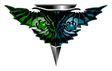 Variant 20 is much like a simplified version of variant 19 without the text. It first appears in DS9: "The Reckoning" on a tactical display and can be seen in some episodes. It appears like that even on rather decorative large displays (where we would expect the letters to show up), such as in "Badda-bing Badda-bang" and "Inter Arma Enim Silent Leges". Most likely we can also see this variant in VOY: "Message in a Bottle".
Variant 21
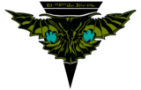

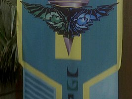
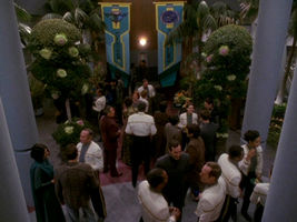
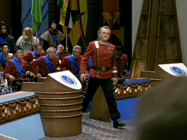
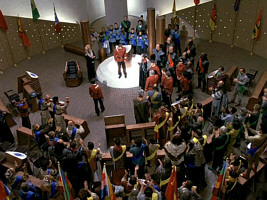
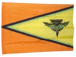
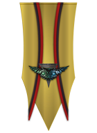 Two different Romulan flags or banners appear in "Star Trek: The Undiscovered Country". On both of them the emblem is overall black, the wings are olive green and the planets are turquoise. The banner appears outside the building and at least twice inside. It is overall yellow, with thin red (or orange) and black stripes. The flag is hardly visible inside the meeting hall. The prop photo reveals that it is a yellow triangle, bordered by thin black and green stripes, on orange ground.
Variant 22
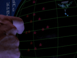
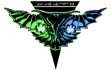 Interestingly, the "classic" TNG-style logo also appears on Enterprise, on displays in "Babel One" and "United", although otherwise the "Nemesis"-style seems to be dominant (see below).
Unusual emblems
The Cardassians usually display symbols of other aliens in the "true" colors, or in simplified colors. In the sixth and early seventh season of DS9, however, we can see strangely colored Cardassian variants of the Romulan, the Klingon and the Federation emblem on a couple of occasions. It appears that the Cardassians adapted the enemy emblems to their pastel color palette.
Uniform insignia
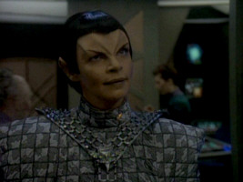
The TNG-style Romulan uniforms already existed in TNG: "The Neutral Zone" and "Contagion". But the Romulans didn't yet have badges based on the emblem. In "The Neutral Zone", the two officers wear drapes, with emblems that roughly resemble the Romulan logo from "The Enterprise Incident" but perhaps not on purpose. In "Contagion", the Romulan insignia is recycled from Q's post-atomic horror uniform from "Encounter at Farpoint".
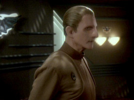
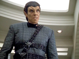
The familiar Romulan insignia first appears in TNG: "The Enemy". At the time of TNG, there are two color variants. The higher-ranking officers consistently wear a copper emblem and sash, whereas the lower ranks wear silver gray.
The Romulans who always wear the copper sash are:
- Tomalak in all his appearances in "The Enemy", "The Defector", "Future Imperfect" and "All Good Things"
- Sela in all of her appearances except "The Mind's Eye"
- The Romulan commander in "Tin Man"
- Taibak in "The Mind's Eye" (who seems to be in command, rather than Sela)
- Romulan commander in "The Chase"
- Major Rakal und Toreth in "Face of the Enemy"
- Sirol in "The Pegasus"
The Romulans in "The Next Phase" have silver/gray badges, probably because it is only a science ship. In "Timescape", all Romulans have silver gray insignia, as we never see the commander.
The TNG-style copper insignia don't show up again in the later series. For DS9, collar rank symbols were introduced, making the sash insignia expendable.
Discovery emblem
 A TNG-style Romulan emblem appears as a projection on the Vulcan "learning spheres" to the left of young Michael Burnham in DIS: "The Vulcan Hello". In DIS: "Will You Take My Hand?", we can see two more such emblems in the outpost on Qo'noS, one on a tent and one on a display just in front of the tent. All these emblems consist just of the bird-of-prey, without the triangular shield and the lettering.
Strange New Worlds emblem
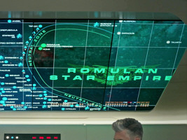
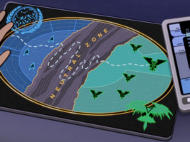
 The TNG-style Romulan emblem also appears in Star Trek: Strange New Worlds. It can be seen on the map of the Neutral Zone in "A Quality of Mercy". Like the emblems seen on Discovery, it consists just of the bird-of-prey clasping Romulus and Remus, without add-ons.
Prodigy emblem
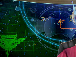
 In PRO: "Crossroads", we can see the Romulan emblem twice, once on a Starfleet map and once on the bridge of the Romulan warbird itself. Both are TNG-style and both feature the shield and lettering. The first one is a so far unseen color variation with an inscription as on the DS9 variants 18 and 19 (starting with a letter that looks like a superscript "o"). The latter is a faithful reconstruction of the emblem variant 06b as it appeared in TNG-R: "Unification II", including the inverted "h" as the first letter instead of the "d" as (presumably) in the original episode. The display emblem on the Dauntless can be seen again in PRO: "Masquerade".
Nemesis-Style Emblems
Nemesis Senate sculpture and insignia
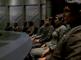
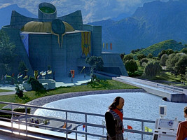
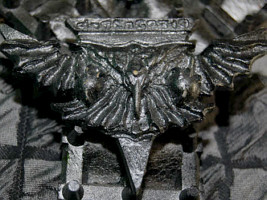
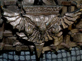
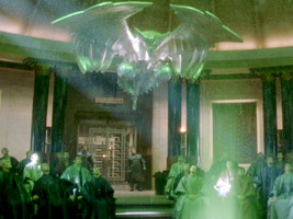
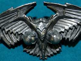
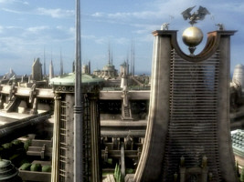
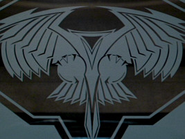
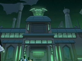
 Rick Sternbach designed a new, more stylized variation of the Romulan emblem for "Star Trek Nemesis". It appears in 3D in the form of the large sculpture in the Romulan senate and the uniform badges, as well as in the CG cityscape of the Romulan capital.
We can see Rick Sternbach's "Nemesis"-style emblem in ENT: "Kir'Shara", "Babel One", "United" and "The Aenar" (set as early as 2154) too. It appears on the Romulan uniforms that Enterprise simply took over from the movie, just like the CG cityscape.
Nemesis screen and floor emblems

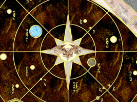
 Regarding the floor emblem of the Romulan Senate, Sternbach planned to let it appear in the center of the star map in a shade of pink marble. But the actual graphic created for this purpose by someone else deviates a bit from his sketch, and the color was switched to gray. Likewise, the bird graphic seen on a screen looks a bit different than the 3D sculptures in the Senate and on the uniforms. For example, it lacks the distinct head with what looks like ears. Rick Sternbach on the two variants:
"I designed the floor layout and the bird sculpture, but someone else did the central bird graphic that was printed on adhesive vinyl and applied to the floor. I don't remember who did that one."
We can't make out the TNG-style logo in "Nemesis" at all. Also, the two stylized new Romulan emblems have in common that they never appear in a specific color or even in multiple colors; they are always plain silver or gray.
Promotional logo and variations
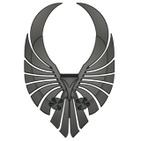
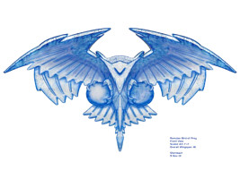
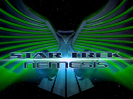
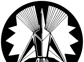
 Another new emblem was created for "Nemesis". However, it never appeared on screen and was only used for advertising purposes, such as in the trailers or on the DVD. Strictly speaking, this second stylized variation was non-canon at this point, which didn't prevent it from being widely distributed.
There is, however, a new wall decoration in the trilogy of "Babel One", "United" and "The Aenar" that features another variation of a stylized bird-of-prey. The engraved depiction on the wall panel clearly resembles the "promotion logo" from "Nemesis", although the proportions are not the same. Interestingly, the same wall element can be seen with yet another and even more stylized bird-of-prey depiction and without the planets Romulus and Remus when Reed and Tucker are aboard the Romulan drone ship in "Babel One" and "United". This was obviously done to obscure the Romulan origin of the ship (although the Romulan writing on the panels should give it away just as well).
Abramsverse emblems
 Purportedly all Romulan costumes of "Star Trek (2009)" included a lining with two different Romulan emblems on it, the stylized "promotion logo" from "Nemesis" and the one created for the FASA role-playing games. Yet, no Romulan emblem is visible in the movie at any time.
Lower Decks emblems


 Every single new Romulan emblem that was originally created for "Star Trek Nemesis" also shows up in the Lower Decks episode "Veritas" (which is set only two years after the events of the movie). We can see Rick Sternbach's bird statue on top of a building and a variation of the wide "promotional logo" above the entrance of that building. The latter was previously seen on a tower in LOW: "Envoys".

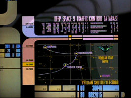
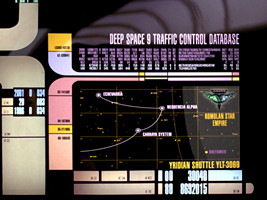
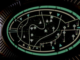
 The simplified "floor/screen emblem" from "Nemesis" appears on a map in "Veritas". Additionally, the map features triangular symbols that evoke the shape of the classic Romulan emblem of TNG, a bit like on the Dominion War screens. The attention to such details in the animated series is simply amazing.
The Nemesis-style emblem appears in a somewhat more detailed form on the vertically oriented ship in LOW: "I Have No Bones Yet I Must Flee" and on a D'deridex class in "Empathalogical Fallacies".
Prodigy emblem
 As already mentioned, the classic TNG-style Romulan emblem appears in PRO: "Masquerade". However, the same episode also shows a different symbol that is likely supposed to represent the Romulan species on a display in the genetic lab on Noble Isle. This one is obviously the "promotional logo" for "Nemesis". We surmise that it was included by accident because, like some definitely non-canon logos on the same display, it appeared in a fan compilation of logos (there replacing the actual, canon Romulan emblem). Anyway, its appearance in "Masquerade" canonizes the "promotional logo" in its original form.
Picard Emblems
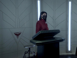
The political situation of the Romulans after the disaster of 2387 that destroyed the home system of their empire is unclear. The Borg cube known as the "Artifact" is in the possession of an entity called the "Romulan Free State". On the other hand, the secret police Tal Shiar still exists, although the Romulan Empire has collapsed. We can't tell whether the emblems displayed on and inside the Artifact belong to the Romulan Free State or to the Tal Shiar. Two decades ago, the latter used to have distinct emblems from the official Romulan state and government, emblems which are not the subject of this article. See Other Romulan Logos - Tal Shiar.
Notwithstanding the exact political situation, new Romulan emblems were created for Star Trek Picard. They still contain the bird-of-prey, but without the two planets in its talons, which used to represent the now destroyed Romulus and Remus.
Relief emblems
 The first new emblem appears as a relief on the outside of the Artifact. We first see the relief in PIC: "Remebrance". When it appears again in "Maps and Legends", the logo seems to look somehow different. But so does the whole surface of the Borg cube, which may have been given a "weathering". The structure of the emblem is arguably still the same.
A similar but not quite the same relief logo appears on the uniforms of some Romulan guards, continuing the tradition from TNG and DS9. Commodore Oh has a similar emblem on her uniform belt, which could be a different, more reddish or copper color.
Finally, there are wall panels that very roughly resemble a bird-of-prey, comparable to the ones we already saw on Star Trek Enterprise.
Stylized emblem
 A second type of new emblem is visible aboard the Artifact in several different places, usually as a wall or equipment sticker. It comes in different sizes and is always red.
 The red Romulan Free State emblem can be seen on a flag (the third from the left) in PIC: "The Star Gazer" as Picard gives his address to the cadets. This doesn't have to mean they are Federation members now. The flag may have been included to represent Elnor.
Addendum: Ni'Var Emblem

 In the 32nd century, Romulans and Vulcans both reside on the planet Ni'Var, formerly known as Vulcan. Ni'Var's emblem shows up, among many others, at the voting in DIS: "...But to Connect". It consists of the Romulan bird-of-prey, which was combined with a Vulcan IDIC. The exact color is conjectural, as all icons on the transparent display are either red or green, depending on the vote.
Conclusion
 The familiar Romulan emblem as it was first visible in TNG: "The Neutral Zone" appeared in many variations. In particular, the green and blue wings frequently switched their colors. While the exact arrangement of colors may have no significance in the Romulan culture, the letters on top of the emblem definitely have. Yet, they frequently appear mirror-inverted, sometimes together with the wings and sometimes independently. At some point, Michael Okuda may have decided that "green on the left, blue on the right" was the "correct" version, together with the Romulan letter resembling an "E" on the right. The latter may have to do with the letter looking just like a Latin "E" when placed on the left, and hence not alien enough. Anyway, in later episodes of DS9 and later publications the emblem is largely consistent.
 "Nemesis"-style emblems do not actually replace the ones from TNG, although the latter do not appear in "Nemesis". The TNG style can be seen in the 23rd century in "Star Trek V" and even on Discovery, as well in the 22nd century in ENT: "Babel One" and "United", so it appears to be "timeless". The same can be said about the "Nemesis" emblem that too is a common sight on Star Trek Enterprise. The two emblems are definitely used concurrently, with the TNG style perhaps being more "military" and the "Nemesis" style more "ceremonial".
See Also
Other Romulan Logos - communicator badge, Tal Shiar, Senate and more
Alpha and Beta Quadrant Emblems L-Z
Credits
Some screen caps from TrekCore. Thanks to Ambassador/Ensign Q and to E.W.G. for suggestions pertaining to the origin of the TOS Romulan emblem and to Nathan for the hint about the Romulan hexagon in "Balance of Terror". Special thanks to Rick Sternbach for clarifying some issues regarding the "Nemesis" emblems and to Brad Wilder for redrawing the Picard emblems.


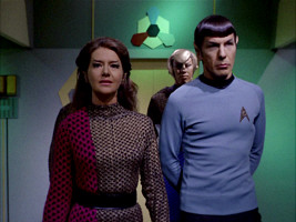
 Old emblem in TOS: "The Enterprise Incident"