The Evolution of the Cardassian Emblem
by Jörg Hillebrand, Shisma and Bernd Schneider
Variants of the Cardassian Union EmblemOther Cardassian EmblemsConclusion
Contrary to many other logos of the Star Trek Universe the basic shape of the emblem of the Cardassian Union was never changed. There is only one Cardassian emblem throughout a couple of decades whose colors, however, were frequently switched. In spite of the considerable color variations nearly all depictions available in the internet so far were closely based on the one from the Star Trek Encyclopedia (later adopted by the Star Trek Fact Files) that is authentic but just one (albeit an important one) of several variants.
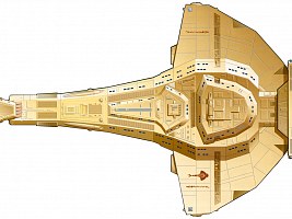
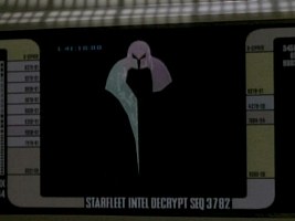
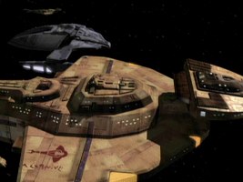
The Cardassian emblem in a slightly modified version is also visible on the hulls of all Cardassian starships. The planform of the Galor class is even a largely faithful reproduction of the symbol. In addition there is the emblem of the Obsidian Order (DS9: "The Die Is Cast"), consisting of a part of the complete Cardassian Union emblem, the patch of the Third Order with its additional "wings" (DS9: "Empok Nor") and the emblem of the Cardassian-Klingon Alliance of the Mirror Universe (known since DS9: "Crossover").
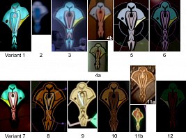
Variants of the Cardassian Union Emblem
Variant 0
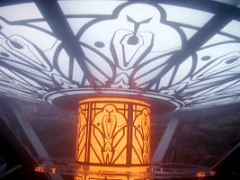
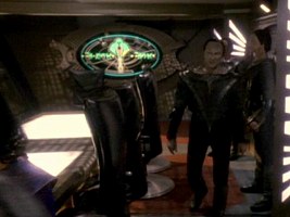
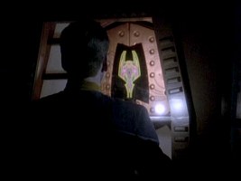
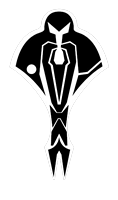 In Tora Ziyal's Cardassian sauna holoprogram in DS9: "For the Cause" we can see two backlit versions of the Cardassian emblem, one monochrome black & white arranged in a circle on the ceiling and one monochrome black & yellow in the form of a column. This is the only time that large versions of the symbol are monochrome. Obviously this has aesthetical and technical reasons (to achieve a sufficient illumination) in this architecture, and the colors definitely don't matter here as the depictions are by no means official but just decoration.
Variant 1
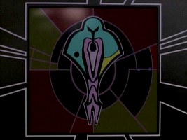
 This variant is visible for the first time in the year 2369, more precisely in the TNG episode "Chain of Command, Part II". Several areas of the emblem are colored completely differently than in the more familiar later variants.
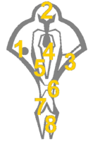 1 The dot in the left half is dark red with a black border.
2 The entire area is bright teal.
3 yellow
4 This area is, like #5 too, vertically separated by a black line into two halves. The left half is the same teal as
#2, the right half is somewhat darker.
5 The brighter and darker areas are switched relative to #4.
6 uniformly bright teal (like #2)
7 This area is, like #8 too, vertically separated by a black line into two halves. The left and right halves are divided themselves roughly in the middle into a bright teal upper part and a darker lower part.
8 The area consists of a left and right part, just like in #7.
Variant 1 is unusual because of its line styles. All inner lines, including the "eyes" of the figure, are not solid black like in all later versions but pale red (salmon). Only the outermost borders are plain black.
This emblem can be seen a few more times in the years 2369 and 2370, like in DS9: "Emissary", "Duet" and "Tribunal". It seems that it used to be the official version of the Cardassian emblem during that period (although we will see that some later variants are also on display in flashbacks of the time of the occupation of Bajor).
Variant 2
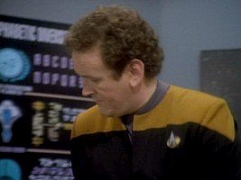
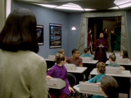
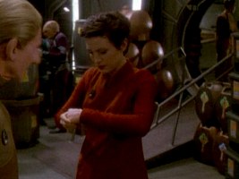
 This is a rather insignificant color variant visible in Keiko's classroom on Deep Space 9. Here it is part of a wall chart together with the emblems of other civilizations. All of them are reproduced in pastel blue colors, apparently to maintain a uniform style. Hence, the colors should not be taken as "official". There seem to be two colors, a mid to dark blue and a bright grayish blue. The single areas are colored like this:
 1
dark blue
2 bright blue
3 dark blue
4 dark blue
5 dark blue
6 bright blue
7 dark blue
8 dark blue
The wall chart can be seen in DS9: "The Nagus", "In the Hands of the Prophets" and "Cardassians". It disappears together with the classroom in the second season (early 2370).
Variant 3
 Variant 3 may be seen as a step toward the familiar emblem from the Encyclopedia. Here all separation lines are solid black, only the outermost border around the entire emblem is salmon. For the first time, however, we can see two shades of salmon inside the emblem. The areas are colored as follows:
 1
dark teal
2 bright teal
3 yellow
4 dark salmon
5 bright salmon
6 bright teal
7 bright salmon
8 This area is divided into two shades of teal but without a black line this time. The outer areas are somewhat brighter than the inner parts. The latter are the same color as the dot #1.
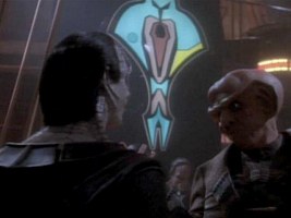
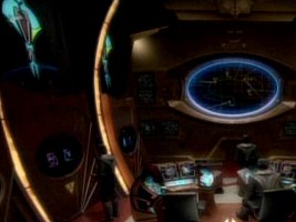
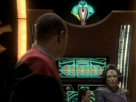
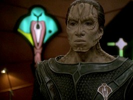
The emblem is clearly visible in a flashback in Quark's bar on Terok Nor in 2365 (DS9: "Necessary Evil"). It was re-used on two occasions, namely in DS9: "Second Skin" where we can make out the lower part on the Defiant's viewscreen. Furthermore two large backlit wall emblems adorn the Cardassian control center in DS9: "Defiant".
Variant 4a/b
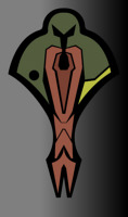
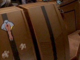
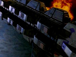
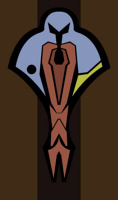 This is the best-known variant, also because it is the one depicted in the Star Trek Encyclopedia. A closer look reveals that two sub-variants exist which sport different colors, regardless of the material or illumination. The screen cap from DS9: "A Simple Investigation" shows both variants 4a and 4b on freight containers. Thus the general color scheme of variant 4 is like this:
 1
black (now more or less a part of the black border lines)
2 green or blue
3 yellow
4 dark salmon
5 bright salmon
6 bright salmon
7 bright salmon
8 bright salmon
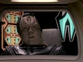
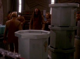
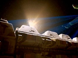
The emblem can be seen for the first time as a sticker next to the docking hatch of the Bok'Nor in DS9: "The Maquis, Part I". It is the blue sub-variant 4b. The same emblem appears adjacent to the holding cell in DS9: "Tribunal". Likewise, the stickers on the Cardassian consoles in DS9: "Defiant" are bluish. The first Cardassian freight containers with labels appear on the Groumall in DS9: "Return to Grace"; the containers were built for this episode. The logo can be seen repeatedly on containers since DS9: "Sons of Mogh", in the blue as well as the green variant.
We can also see the emblem in the form of a large lighted wall display in DS9: "Things Past". Although we just see the lower part of the logo, we can confirm that area #4 is dark salmon and the rest bright salmon. The same emblem is visible in DS9: "Wrongs Darker Than Death or Night" and therefore as early as 2346. It is actually the earliest appearance of any Cardassian emblem in the fictional chronological order. Finally, variant 4 appears on maps in DS9: "Tears of the Prophets" in 2374. Whilst the logo does not have a border when shown as a sticker or as a wall lamp, it sports a green border on the said display.
Variant 5
 All salmon regions are the same shade, meaning that area 4 is not darker here. This variant 5 is visible exclusively on viewscreens since 2371. For instance, we can clearly see it in DS9: "Civil Defense" where all colors seem to be equally pale. Likewise, in its first appearance in DS9: "Improbable Cause" the salmon areas are all the same color. The logo has the same red border in both cases. This gives us the following colors:
 1
black
2 green/blue
3 yellow
4 bright salmon/red
5 bright salmon/red
6 bright salmon/red
7 bright salmon/red
8 bright salmon/red
Some time later a slightly different communication logo with just one salmon tone seems to be in use. We can make it out in DS9: "In the Pale Moonlight" and "Treachery, Faith and the Great River". On both occasions the salmon tone is much darker, area #2 is definitely green, while the border is violet.
Variant 6
 The only change in this variant is that the bright and dark salmon regions are switched, compared to variant 4. Hence, we are dealing with the following color pattern:
 1
black
2 green or blue
3 yellow
4 bright salmon
5 dark salmon
6 dark salmon
7 dark salmon
8 dark salmon
The emblem makes it first appearance in DS9: "Improbable Cause" in blue/teal. Note that area #4 is brighter than the rest, just like in DS9: "Explorers". The latter is a green variant on which the salmon areas appear as brownish. Removing the blue portion from the "Improbable Cause" emblem in an image editor gives us much the same green logo, so it is obvious how the color variation came to life in the computer age.
Variant 7
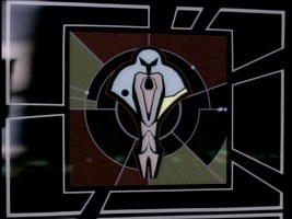
 Variant 7 is visible as a wall display in DS9: "Defiant". It is essentially the same as variant 6; the only difference is that variant 7 is left-right reversed. We can clearly see that, like on version 6, the inner area #4 is brighter than the rest. While we could simply claim that this must be an error, variant 7 reappears consistently toward the final year of the Dominion War, beginning with DS9: "In the Pale Moonlight" in the year 2374. In the latter episodes the Cardassian emblem usually appears next to the Dominion emblem. It seems that the backlit display was built with one side supposed to face the camera so there was no other way to show it once it was completed with the black dot on the wrong (right hand) side.
Variant 8
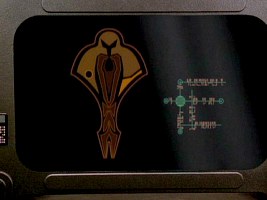
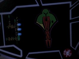
 Something remarkable (and previously almost unnoticed) happens to the emblem after Cardassia has joined the Dominion in DS9: "By Inferno's Light" in mid-2373. Beginning with this episode and continued until DS9: "Statistical Probabilities" in mid-2374 the emblem is bereft of its typical colors and appears in shades of orange and brown. It looks like this:
 1
dark orange
2 dark orange
3 dark orange
4 bright orange
5 bright orange
6 dark orange
7 dark orange
8 dark orange
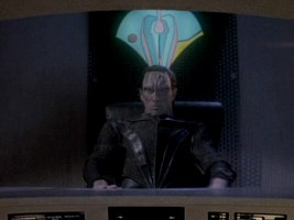
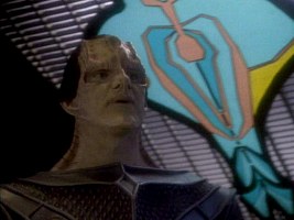
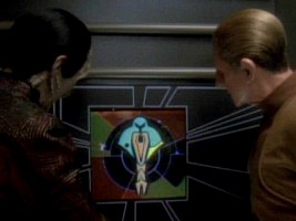
We can see this unusual variant of the logo on viewscreens and as a wall display behind Dukat in DS9: "Ties of Blood and Water". We may conjecture that the colors were intentionally modified by the Art Department in order to reflect the political change on Cardassia.
Variant 9
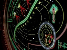
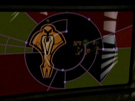
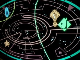
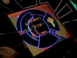
 A less prominent further orange variant. We can see it on a Cardassian tactical star map in DS9: "Sons and Daughters" in plain orange without any different tones, while the separation lines are black. This is remarkable because the Cardassian logo so far always appeared in full color on maps (provided it was a complete emblem and not just an outline), and will appear again after this episode. It seems that the one-time exception is attributed to the "orange year" of the Cardassian Union under Dukat. The other symbols on the map are unicolored as well, however, so in this regard variant 9 is not so special.
Variant 10
 Finally, the third orange variant shows up in DS9: "Statistical Probabilities", the same episode that marks the return to the more colorful emblem. It really seems this has something to do with Dukat being captured not long before the episode. Maybe he forced the orange emblem on the Cardassians who returned to the more traditional colors after his departure. Variant 10 is more complex as it exhibits several different shades of orange and brown:
 1
black with bright orange border
2 orange
3 bright orange
4 dark brown
5 brown with orange border
6 brown with orange border
7 brown with orange border
8 brown with orange border
We can see variant 10 only in "Statistical Probabilities". The same episode shows us, for the first time since the Cardassians joined the Dominion, the customary colorful Cardassian emblem.
Variant 11a/b

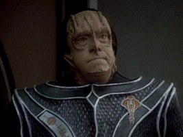
 Variant 11a originally appeared as the badge worn by the Cardassian Legate in DS9: "The Maquis, Part II". After that it could be seen several more times. The badge is made of a golden metal, with the black "lines" of the according printed logo being polished and accordingly bright metal here. As the deepened areas are somewhat darker, the Legate badge is two-colored. We can see the emblem in essentially the same colors on a screen as well, in DS9: "Nor the Battle to the Strong".
Variant 11 also appears in slightly different colors in DS9: "The Changing Face of Evil", again on a display (variant 11b)
Variant 12
 The final variant of the Cardassian Union emblem appears in DS9: "What You Leave Behind". It is just a left-right reversed version of the above emblem variant 5 (the circle is on the right), with all four salmon (or dark red) areas being equally dark. We can make out a violet border too. It seems this time the emblem was really accidentally flipped, as it is a one-time occurrence (moreover in the haste of the final arc) and there was no technical reason why it had to appear like this on a computer display.
32nd century variant

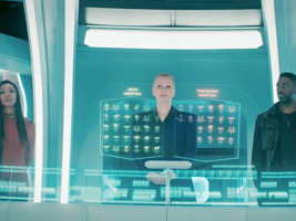
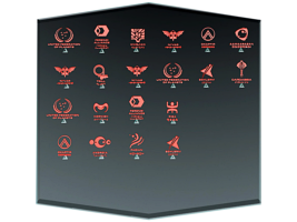
 A 32nd century Cardassian emblem can be seen at the voting in DIS: "...But to Connect", among many other symbols. The emblem was slightly simplified, either for general use or specifically for such icons. All icons on the transparent display are either red or green, depending on the vote, so the correct color composition of the 32nd century variant remains uncertain.
Other Cardassian Emblems
Simple Cardassian symbols
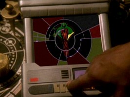
We can see a simple monochrome Cardassian emblem on several tactical displays in the course of DS9's run. It appears in brown ("The Maquis I"), in yellow ("Defiant", "Rocks and Shoals", "Sacrifice of Angels") and in green ("For the Uniform").
In addition, the emblem shows up as a metal relief, in blue on a "checkerboard display" together with the Federation and the Bajoran emblems in DS9: "Life Support" and even in black on red background on the docking hatch of a Cardassian ship in DS9: "Destiny".
 The Cardassian emblem is all green when it can be seen in the genetic lab on Noble Isle in PRO: "Masquerade". All other symbols on the display are plain green too, so this is not a new variation but just a styling choice.
Obsidian Order
 The Obsidian Order emblem can be seen only once, in DS9: "The Die Is Cast". It essentially consists just of region #2 of the Cardassian Union emblem whose left side is extended to end in a sharp point. There is a color gradient from purple to green, and the color looks overall mottled.
Third Battalion, First Order
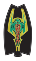 The emblem of the Third Battalion, First Order, is visible in DS9: "Empok Nor" on a wall, as well as in the form of a badge worn by the Cardassian soldiers who were left behind. The Third Battalion (or First Order?) emblem is essentially the Cardassian Union symbol supplemented with two "wings".
Ship emblems
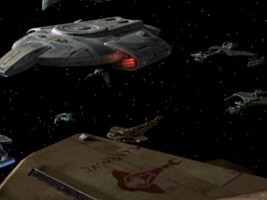
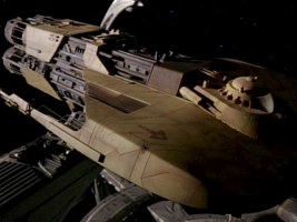
 A variant of the Cardassian Union emblem appears on all Cardassian starship types. It can be seen on the Galor class (both on the physical and on the CGI version), on the Bok'Nor as well as on the Cardassian military freighter (both on the original version, the Groumall, and on the reconstructed ship from DS9: "For the Uniform"). The symbol is subdivided somewhat differently than the above Cardassian Union emblem on the Galor and Bok'Nor, whereas on the freighter it is solid.
Conclusion
There is no clear evolution of the Cardassian logo like there can be witnessed one of the Federation emblem. As we can see, the Cardassian emblem appears in several apparently random variations some of which may be attributed to artistic license or to a uniform style to be maintained (especially wherever different emblems are on the same display). On the other hand, the more common colors, the ones which are also reproduced in the Star Trek Encyclopedia, are being used throughout almost 30 years, thanks to occasional flashback episodes. The only remarkable consistent change is the switch to the orange versions during the reign of Dukat in 2373/2374.
See Also
Alpha and Beta Quadrant Emblems A-K
The Evolution of the Alliance Emblem - exhaustive survey of all variants
Credits
Special thanks to Brad Wilder for additional emblems.

Cardassian Logos @ LCARS Interface


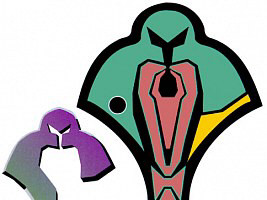
 Cardassian & Obsidian Order emblems




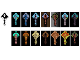
 All variants, clean drawings


