


The Evolution of the Federation Emblem
by Jörg Hillebrand, Brad Wilder and Bernd Schneider
United Earth Emblems 2067-2260sFederation Emblems 2161-240432nd CenturyAddendum: ConfederationConclusion
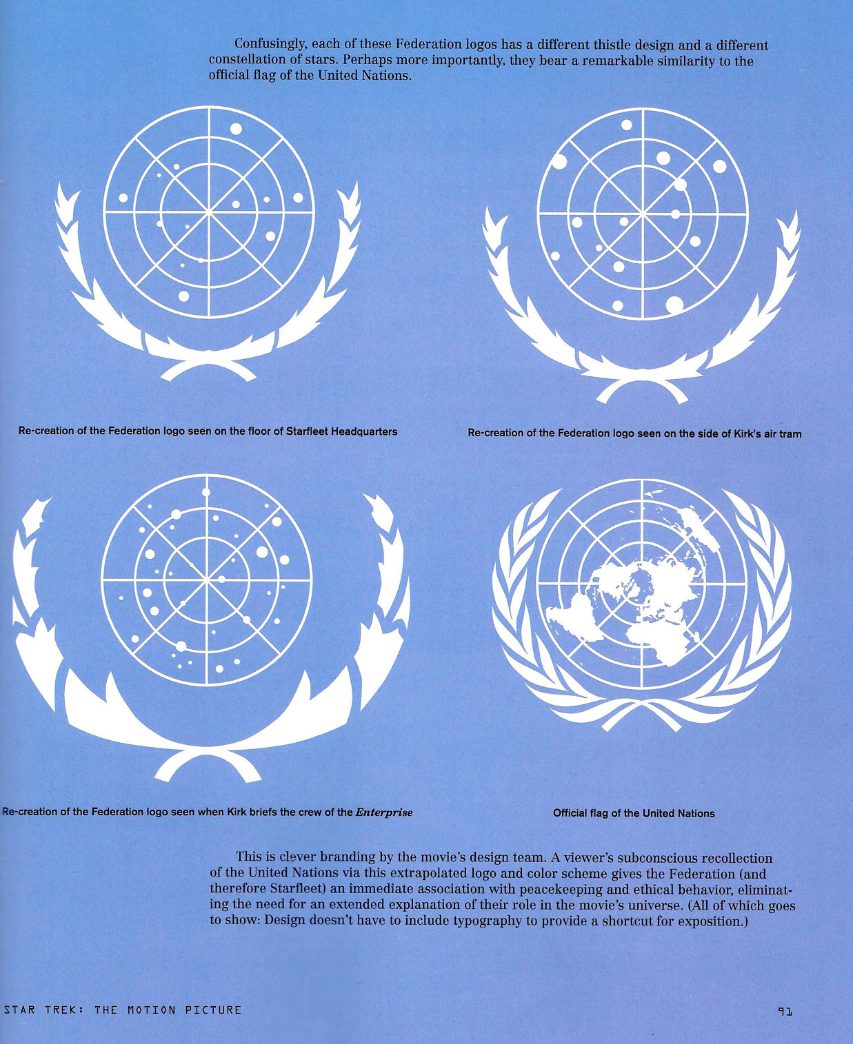
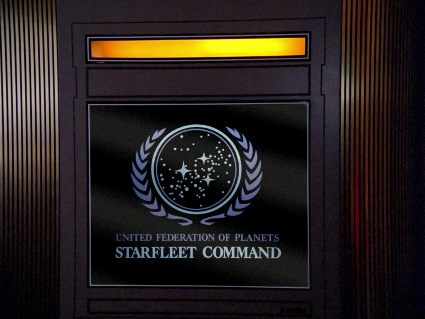
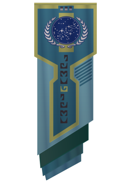
 The seal of the United Federation of Planets (UFP), in its most familiar versions of the late 23rd century (TOS movie era) and the 24th century (TNG era), consists of a circular star map on blue ground, enframed by a wreath of two olive branches. The design is quite obviously closely based on the emblem of the United Nations (see Flags of the World). A large number of variants of this emblem were visible on screen since its first appearance in a canon Star Trek production in "Star Trek: The Motion Picture" (1979). The most common variation was created by Mike Okuda and is used since the first season of TNG.
The idea to model the Federation seal after the UN emblem originates in Franz Joseph Schnaubelt's Star Fleet Technical Manual of 1975 (see an interview at Trekplace). Unlike the later versions in the movies and TNG, however, the seal in the SFTM replaces the somewhat geocentric symbol of the olive branches with two humanoid silhouettes, one male and one female, as a more fitting representation of all members of the Federation (at least at the time of TOS when apparently only humanoid races were fit for joining). Also, Franz Joseph based his version of the seal on actual star maps, whereas the Federation emblems on screen were never meant to depict a distinct constellation - although on many versions a band of stars runs through the center of the emblem that looks like the galactic plane as it can be observed from Earth.

Side note According to some sources there are laurel wreaths around the UFP emblem (which would be the ancient symbol of victory), but since they are definitely intended to be olive branches on the UN emblem (as a symbol of peace), we should assume the same regarding the Federation seal.
The variants of the UN-based Federation emblem as well as related symbols representing the Federation from over 300 years of fictional history and 40 years of Star Trek on screen shall be investigated in the following. Also included are logos that include single elements but are no Federation emblems, such as notably United Earth emblems (see also The Emblems of the Federation Founding Members). Emblems representing Starfleet with the various arrowhead symbols are not taken into account. There is a separate article that investigates Federation flags in more detail.
United Earth Emblems 2067-2260s
2067
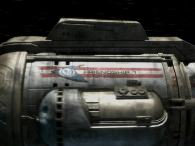
The United Earth Space Probe Agency (UESPA) logo on the hull of the space probe Friendship One in VOY: "Friendship One" marks the earliest in-universe date that a symbol akin to the one of the later Federation shows up in the Trek Universe. The UESPA logo consists of a horizontal arrowhead, which is blue in contrast to the later red or yellow incarnations on Starfleet vessels. Inside the arrowhead we can make out a stylized Earth map with all continents in white and blue oceans. It is enclosed by two white olive branches, just like today's UN emblem and the later Federation emblem.
Actually, as the probe passes by on the screen, while the lettering is the right way, we are shown a mirror image of the emblem, with Asia being left of Africa. (What looks like West Africa is actually Eurasia!) In the same episode, we can also see the logo on a screen aboard USS Voyager where all continents are as they should be. A variation of the UESPA logo in gray can be seen on the hull of Friendship One, on the hull extension below the colorful version. This one too is mirror-inverted. The UESPA was mentioned in TOS and then silently vanished in favor of Starfleet as the Federation's only organization for space exploration. In Voyager, UESPA is retroactively defined as some sort of precursor to Starfleet.

2140s and 2150s
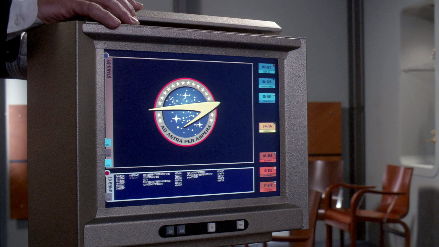
The Earth Starfleet emblem, as it appears in ENT: "First Flight" and then in "Home" and other episodes of the fourth season, does not include olive branches, but it shows a star map with three dominant and many smaller stars, a bit like the NASA seal and much like the later Federation emblem. Their arrangement, however, is not the same, so it is only a faint cue. The inscription in the lower half of the gray border reads "Ad Astra per Aspera" ("To the stars through hardship"), and it is supplemented with white stars in the upper half. Similar star rings appear on some 23rd century Federation emblems.

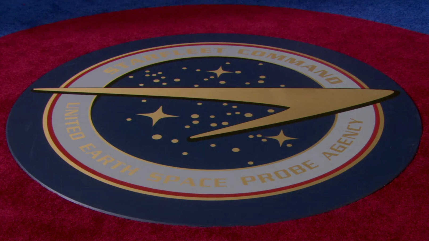
Two different emblems of the UESPA turn up in Enterprise. The first one appears as a patch besides the patch of Earth Starfleet in the 602 Club in ENT: "First Flight". It is blue, with North and South America and lettering in black, similar to the one of the two TOS pilot episodes. The second UESPA symbol is essentially one of Earth Starfleet, whose text and colors were modified, and the stars in the upper border were removed. The lettering "Starfleet Command - United Earth Space Probe Agency" indicates that Starfleet and the UESPA may be the same organization at that time (ENT: "Demons").
2150s
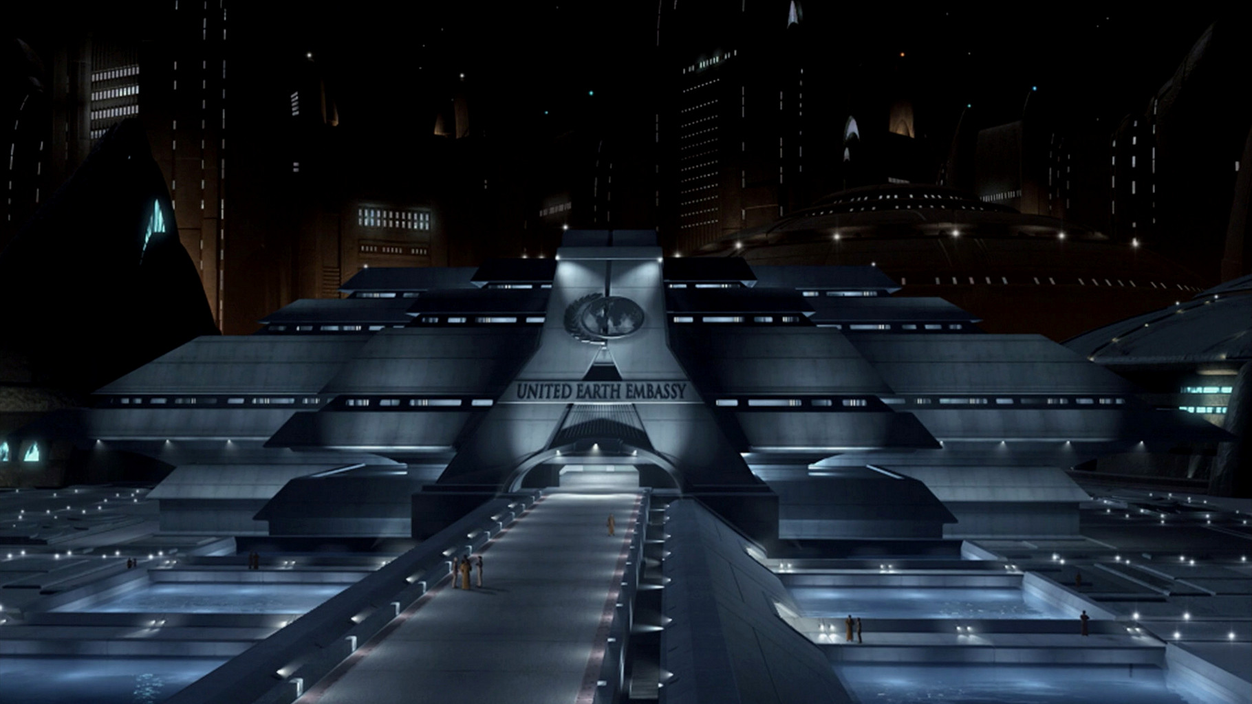
The United Earth emblem appears as late as in the fourth season of Star Trek Enterprise. It includes just one olive branch that closely resembles the doubled version on the later Federation seal. Only its lower end is made to look less complex, as the kink in it is missing. The inside shows no stars yet but a map of Earth, in a somewhat strange projection, which compresses all continents in one round hemisphere. The olive branch and the continents are colored golden, as opposed to the white of the present-day UN emblem, whereas the oceans are blue. The emblem is visible outside and inside the embassy building in ENT: "The Forge" and in two more variants, as a shoulder patch and as a flag. The shoulder patch shows up in ENT: "The Forge" but is hardly recognizable there. It consists of the Earth emblem with an additional text "United Earth Diplomatic Corps" in the place of the later second olive branch. In the same episode, we can see white flag-like sheets covering the coffins of the victims of the embassy bombing on Vulcan. It is also shown on a lectern in ENT: "Home".


The corresponding flag of United Earth can be seen in ENT: "Demons". It is made of a gray cloth with the seal in the center. A frame of golden leaves, obviously repeating the basic pattern of the olive branch, surrounds this flag.
2257
 Besides the Federation emblem, the symbols of the four founding member planets appear in DIS: "Will You Take My Hand?", including the one of Earth. We can see the Earth emblem on a transparent display and on a flag. At the first glance, the emblem looks like in the fourth season of Star Trek Enterprise, but there are some changes. Not all continents are compressed into a circle, but we mainly see the Western Hemisphere (a bit like in TOS), with just a small portion of Africa and probably of Europe. Antarctica is not visible. The single olive branch, on the other hand, is much like in Enterprise. Overall, it looks like this emblem was designed as an intermediate step between Enterprise and TOS.

2254
In the very first Star Trek pilot episode, "The Cage", we can see an emblem on the jumpsuits worn by several lower ranking crew members and by Doctor Boyce and Transporter Chief Pitcairn. An Earth map, which depicts just North and South America, is surrounded by two golden olive branches unlike any of the earlier or later in-universe versions. The symbol is supplemented with the ship's name "USS Enterprise". It looks like everything is just printed or even painted on the uniform fabric. We can also see the symbol on an old-fashioned clipboard that Pike uses a couple of times in the episode. Quite possibly the cap on the infamous TV set in his quarters is adorned by this emblem too, without the lettering.

2265
The same North and South America logo as in "The Cage" is visible on a paper cup in sickbay in TOS: "Where No Man Has Gone Before", which will also appear in several regular TOS episodes but probably without the logo. The layout is the same as in the first pilot, only the colors are different. Earth's continents and the lettering are now blue, while the olive branches are golden or orange. Most likely the cups were made for "The Cage" but did not make it into the episode. The clipboard with the logo from "The Cage" also returns, during the crew briefing and on Delta Vega.

2375 (holodeck)
More on a side note, when Voyager's Doctor poses as the "President of Earth" in the Captain Proton program in VOY: "Bride of Chaotica!", he wears a badge with a stylized depiction of Earth and the letters "President of Earth". Its olive branches were directly derived from the Federation emblem.
Federation Emblems 2161-2404
2161
![]() The first official symbol of the United Federation of Planets is visible during the organization's founding ceremony in 2161 in ENT: "Zero Hour" and "These Are The Voyages". The inside of the emblem is what it will still (or again) look like in the 24th century: three big stars and several small dots (amassed to form a galactic plane) on blue ground, here with a light blue seam. The leaves are white with a blue border. Their design is unlike the olive branch of United Earth and rather like the more stylized version of the TOS movies.
The first official symbol of the United Federation of Planets is visible during the organization's founding ceremony in 2161 in ENT: "Zero Hour" and "These Are The Voyages". The inside of the emblem is what it will still (or again) look like in the 24th century: three big stars and several small dots (amassed to form a galactic plane) on blue ground, here with a light blue seam. The leaves are white with a blue border. Their design is unlike the olive branch of United Earth and rather like the more stylized version of the TOS movies.

 The founding of the Federation is also shown in LOW: "Crisis Point 2: Paradoxus". We can hardly recognize the emblem in the assembly hall, which was otherwise faithfully reconstructed the way it looked in "Zero Hour" and "These Are The Voyages". But the episode also shows the building from the outside, which is the Federation Council building as it appeared already in "Star Trek VI", more than 100 years later in in-universe time. The emblem on the outside does not look exactly like the one established for 2161 in the ENT episode but close enough and not like the Franz Joseph version in the movie or the 24th century emblem that appears in the reuses of the shots on TNG-R.

2250s and 2260s (Kelvin Timeline)
 The Kelvin Timeline movies consistently use the UFP emblem of the 24th century. In "Star Trek (2009)", set in 2258, the same emblem that appears on DS9 adorns the building site of the USS Enterprise in Iowa as well as inside and outside the Academy assembly hall. We can also see the "cogwheel" flag towards the end, which would appear more prominently in the next movie.

![]() In "Star Trek Into Darkness", set in the years 2259 and 2260 of the parallel universe, we can see this emblem again in several places, including the flag with the "cogwheel" variant of the emblem.
In "Star Trek Into Darkness", set in the years 2259 and 2260 of the parallel universe, we can see this emblem again in several places, including the flag with the "cogwheel" variant of the emblem.

The same variants of the emblem appear in various places in the year 2263 in "Star Trek Beyond".
2250s
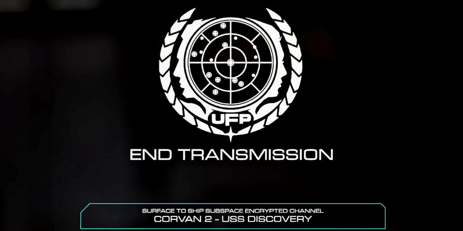
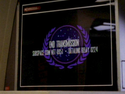
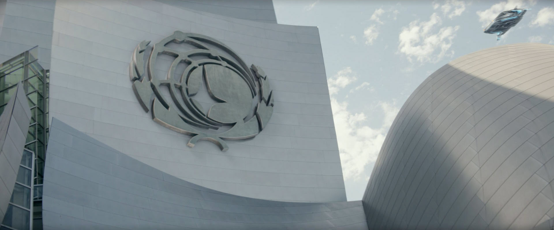
![]() In Star Trek Discovery, there are previously unseen variations of the Federation seal. A hybrid emblem with the olive branches and the faces from the SFTM appears for the first time at the end of a transmission in DIS: "The Butcher's Knife Cares Not for the Lamb's Cry". After the SFTM emblem had already appeared on a building in "Star Trek IV" (see below), it is the first time that the two elements are combined. The arrangement of the stars is essentially the same as in the SFTM.
In Star Trek Discovery, there are previously unseen variations of the Federation seal. A hybrid emblem with the olive branches and the faces from the SFTM appears for the first time at the end of a transmission in DIS: "The Butcher's Knife Cares Not for the Lamb's Cry". After the SFTM emblem had already appeared on a building in "Star Trek IV" (see below), it is the first time that the two elements are combined. The arrangement of the stars is essentially the same as in the SFTM.
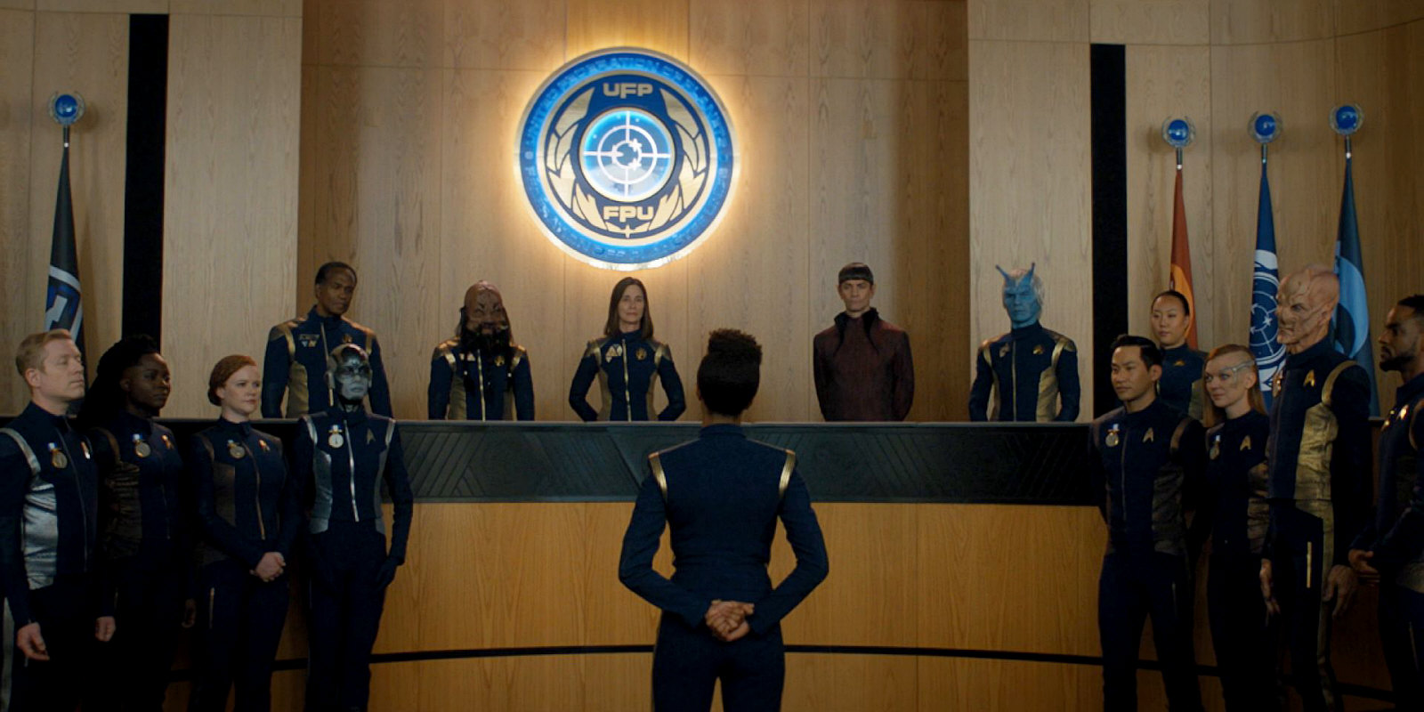
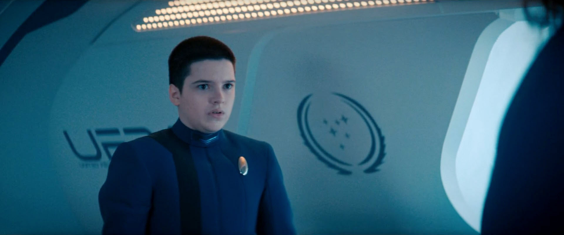
![]() The hybrid emblem, however, is not consistently used in the Discoverse. DIS: "Will You Take My Hand?" shows a different emblem, without the SFTM reference. The olive branches are similar to those of the emblem that appeared in ENT: "These Are The Voyages". The blue map, on the other hand, was reduced to just the three central stars and a coordinate grid. Also note the lettering "FPU" for "Fédération des planètes unies" on the wall emblem.
The hybrid emblem, however, is not consistently used in the Discoverse. DIS: "Will You Take My Hand?" shows a different emblem, without the SFTM reference. The olive branches are similar to those of the emblem that appeared in ENT: "These Are The Voyages". The blue map, on the other hand, was reduced to just the three central stars and a coordinate grid. Also note the lettering "FPU" for "Fédération des planètes unies" on the wall emblem.
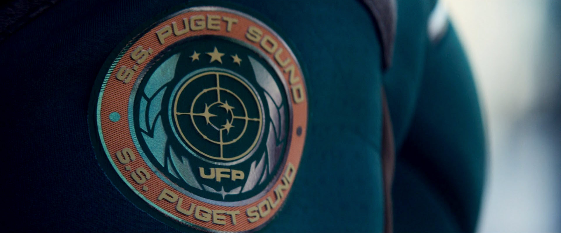
This revised emblem can also be seen in the series Strange New Worlds, around the year 2259. It appears on a display in SNW: "Strange New Worlds", on the ship patch of the SS Puget Sound in "Memento Mori" and also on the various commemorative badges in the same episode.
2268
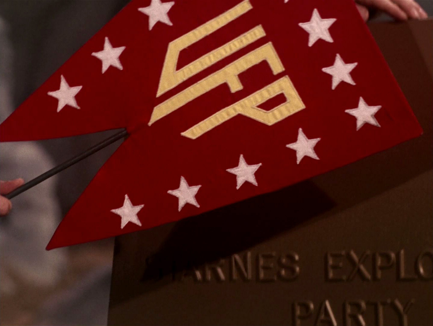
![]() The red UFP symbol, or rather the pennant, can be clearly seen on just one occasion, in TOS: "And the Children Shall Lead". Its design remains isolated except for appearances in "Star Trek II" and DS9: "What You Leave Behind", where it is barely identifiable. The three letters "UFP" are yellow, the 13 stars around the lettering are white.
The red UFP symbol, or rather the pennant, can be clearly seen on just one occasion, in TOS: "And the Children Shall Lead". Its design remains isolated except for appearances in "Star Trek II" and DS9: "What You Leave Behind", where it is barely identifiable. The three letters "UFP" are yellow, the 13 stars around the lettering are white.

![]() At about the same time as the strange pennant the familiar Federation seal and flag of the 24th century is shown for the first time in the in-universe chronology in ENT: "In a Mirror, Darkly II". The emblem on the USS Defiant's monitor is relatively simple, in dark blue on white ground. The flag looks like in the 24th century, with a white emblem on blue ground and the inscription "United Federation of Planets".
At about the same time as the strange pennant the familiar Federation seal and flag of the 24th century is shown for the first time in the in-universe chronology in ENT: "In a Mirror, Darkly II". The emblem on the USS Defiant's monitor is relatively simple, in dark blue on white ground. The flag looks like in the 24th century, with a white emblem on blue ground and the inscription "United Federation of Planets".
2271
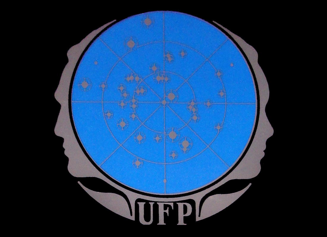
![]() Three varieties of the Federation emblem debut in "Star Trek: The Motion Picture". Discounting the pennant from TOS, these are also the first UFP emblems in the Star Trek production history. They have in common the olive wreaths and the blue circle with the stars. In contrast to the TNG versions, all stars are just round dots and a polar coordinate grid divides the central disk into sectors. This grid is exactly like the one Franz Joseph devised for the Star Fleet Technical Manual.
Three varieties of the Federation emblem debut in "Star Trek: The Motion Picture". Discounting the pennant from TOS, these are also the first UFP emblems in the Star Trek production history. They have in common the olive wreaths and the blue circle with the stars. In contrast to the TNG versions, all stars are just round dots and a polar coordinate grid divides the central disk into sectors. This grid is exactly like the one Franz Joseph devised for the Star Fleet Technical Manual.
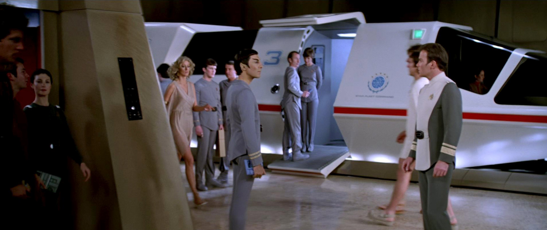
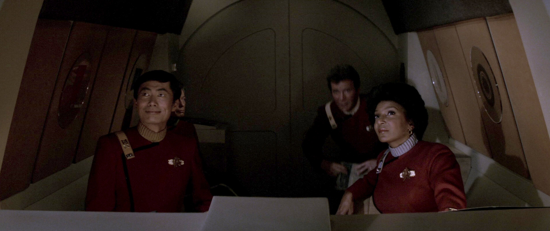
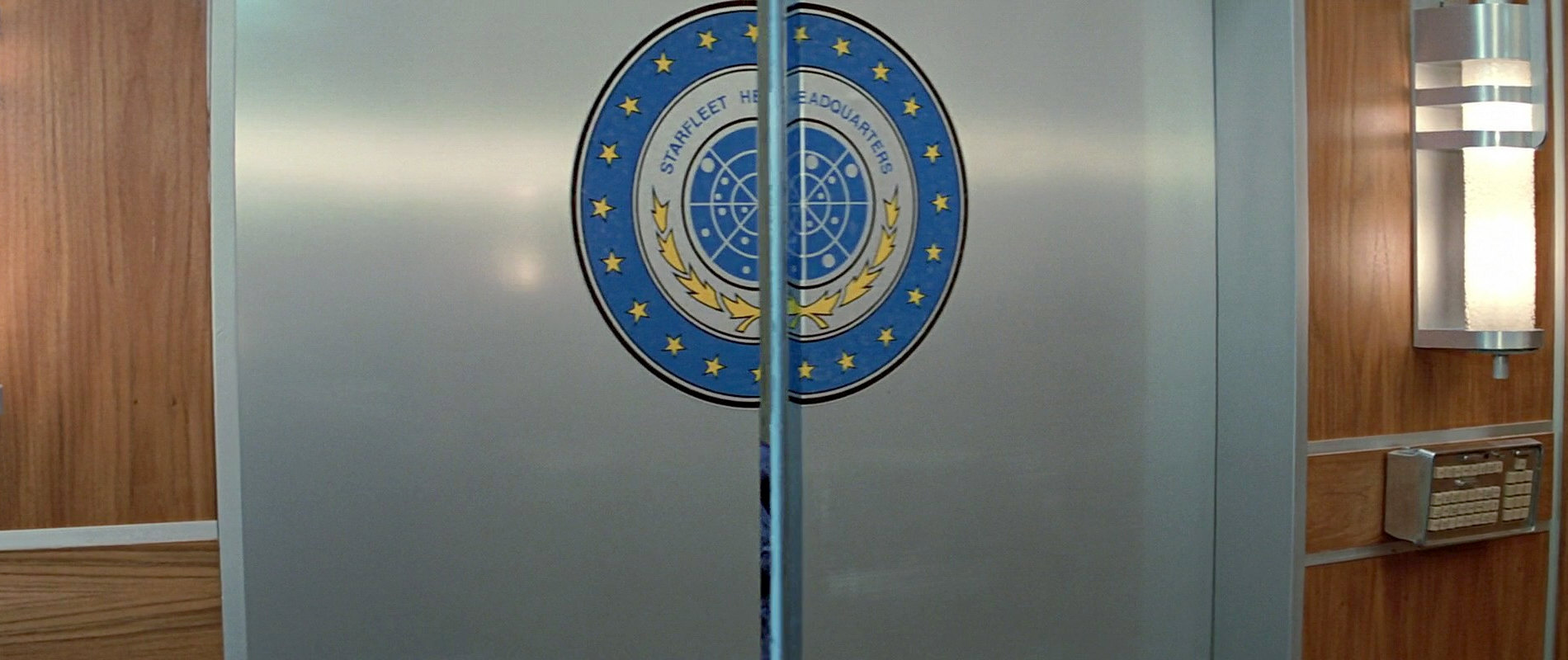
The first of these three variations can be seen on the floor of the Starfleet Headquarters air tram station. The star dots are dark brown. The light blue olive branch is close to the central disk, and the whole emblem is surrounded by the lettering "United Federation of Planets" (outermost ring) and "Starfleet Headquarters" (closing the upper ends of the olive branches to a ring).
![]() A slightly different emblem appears on the air tram. Here the arrangement of the olive branches is identical to the one on the floor, but the one of the stars is different. Also, the dots are white instead of brown. The inscription "Star Fleet Headquarters" consists of two words here like in the SFTM and is horizontal below the emblem. The space between the tips of the branches is filled with five five-pointed stars, a bit like on the Earth Starfleet emblem of the 2140s.
A slightly different emblem appears on the air tram. Here the arrangement of the olive branches is identical to the one on the floor, but the one of the stars is different. Also, the dots are white instead of brown. The inscription "Star Fleet Headquarters" consists of two words here like in the SFTM and is horizontal below the emblem. The space between the tips of the branches is filled with five five-pointed stars, a bit like on the Earth Starfleet emblem of the 2140s.
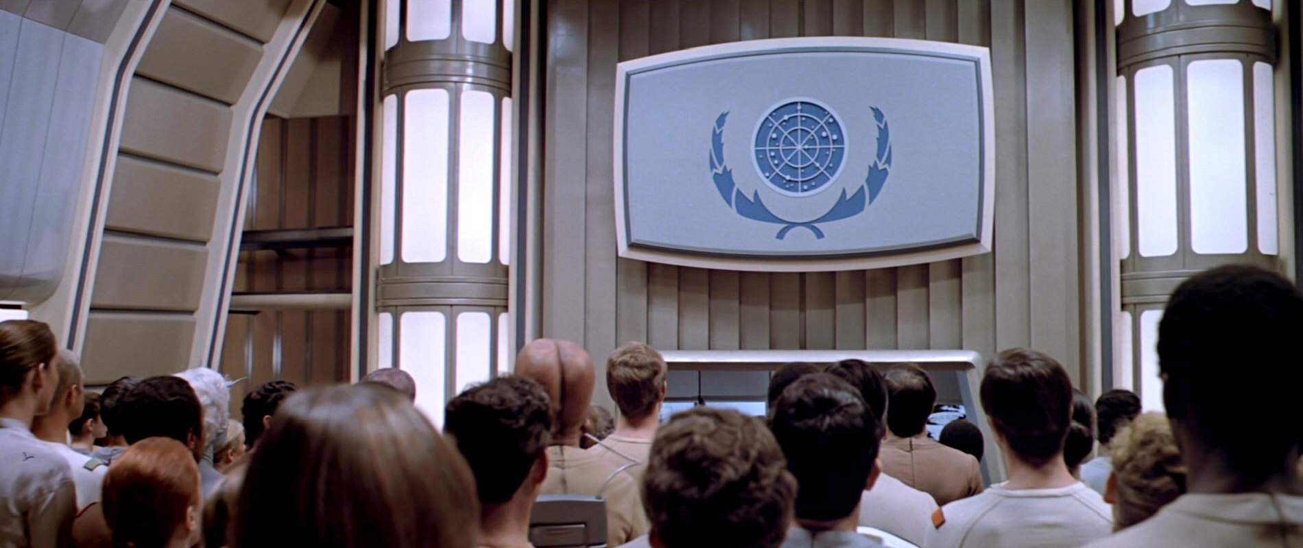
![]() The third TMP variation of the emblem is prominently visible on the big viewscreen on the Enterprise's recreation deck, colored blue and white and with ample olive branches around the central star map. It shows a still different arrangement of the star map. Most likely the different arrangements of the stars don't have any significance but simply came to pass because the graphics were created by different people and/or with different methods.
The third TMP variation of the emblem is prominently visible on the big viewscreen on the Enterprise's recreation deck, colored blue and white and with ample olive branches around the central star map. It shows a still different arrangement of the star map. Most likely the different arrangements of the stars don't have any significance but simply came to pass because the graphics were created by different people and/or with different methods.
2285
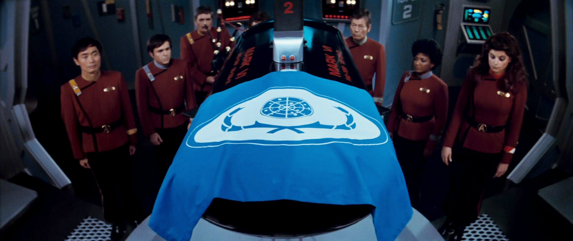
![]() This may be the time with the most variants, owing to the fact that three movies are set around 2285. In "Star Trek: The Wrath of Khan" there is the simple emblem of the Federation in white on blue, slightly modified compared to the version on the big viewscreen in 2271. The shape and position of the olive branches is somewhat different, as is the arrangement of the stars inside the coordinate grid. A similar logo shows up on the Federation flag as it covers Spock's torpedo coffin. Here the blue emblem is put onto a white oval on the otherwise blue flag. The olive branches are stretched in a way to fit into the oval shape, and the stars are in a different arrangement yet again.
This may be the time with the most variants, owing to the fact that three movies are set around 2285. In "Star Trek: The Wrath of Khan" there is the simple emblem of the Federation in white on blue, slightly modified compared to the version on the big viewscreen in 2271. The shape and position of the olive branches is somewhat different, as is the arrangement of the stars inside the coordinate grid. A similar logo shows up on the Federation flag as it covers Spock's torpedo coffin. Here the blue emblem is put onto a white oval on the otherwise blue flag. The olive branches are stretched in a way to fit into the oval shape, and the stars are in a different arrangement yet again.

Also in "Star Trek II", we can see an emblem, which will come into sight time and again until the 24th century. This is a variant based on the one on the floor of Starfleet Headquarters in "Star Trek I", henceforth visible on various walls, displays and containers. The star map and olive branches as well as the lettering "United Federation of Planets" look like on the floor emblem, albeit in different, varying colors, depending on their size and material. Five stars on the bottom supplement the lettering to a ring. The emblem is visible outside the Kobayashi Maru simulator in white, black and gold. In the travel pod and the docking hatch on the Enterprise it is golden on (plexi-)glass. On monitors the emblem appears in black & white or in blue, yellow and white. Here the outer ring is blue, the lettering with the five stars is yellow, the middle ring is white and the olive branches are yellow. The central disk is blue with white stars, surrounded by a yellow border. Depending on where the emblem can be seen, the letters "Starfleet Headquarters" are included or not. It will still show up in the 24th century on Captain Picard's dishes (TNG: "Encounter at Farpoint", "The Bonding").
It is barely visible, but in the travel pod in "Star Trek II" we can see the red UFP pennant on the left wall behind Sulu. Here it seems to be in red on (plexi-)glass, reproduced like depicted in the STTM. There are other Franz Joseph creations on the shuttle walls as well.
![]() "Star Trek III" shows us a slightly different seal of Starfleet Headquarters. Here the inscription reading "United Federation of Planets" is missing and is replaced with a ring of stars. Otherwise it looks virtually the same as the blue, yellow and white version of the previous movie. "Star Trek III" is probably the origin of the aforementioned dishes with emblems, as we could see a bar in this movie.
"Star Trek III" shows us a slightly different seal of Starfleet Headquarters. Here the inscription reading "United Federation of Planets" is missing and is replaced with a ring of stars. Otherwise it looks virtually the same as the blue, yellow and white version of the previous movie. "Star Trek III" is probably the origin of the aforementioned dishes with emblems, as we could see a bar in this movie.
Likewise, in the room of the Federation Council in "Star Trek IV" the familiar emblem shows up, this time consequentially without the label "Starfleet Headquarters". Even the arrangement of the stars remains unchanged this time.
![]() One surprising discovery in "Star Trek IV" is that, on the outer wall of the building of Starfleet Headquarters, we can make out the Federation emblem as it was devised by Franz Joseph for the STTM, that is, with the two faces instead of the olive branches. Obviously the matte painting was made independently of the rest of the graphics for the movie trilogy of "Star Trek II, III, IV".
One surprising discovery in "Star Trek IV" is that, on the outer wall of the building of Starfleet Headquarters, we can make out the Federation emblem as it was devised by Franz Joseph for the STTM, that is, with the two faces instead of the olive branches. Obviously the matte painting was made independently of the rest of the graphics for the movie trilogy of "Star Trek II, III, IV".
2287
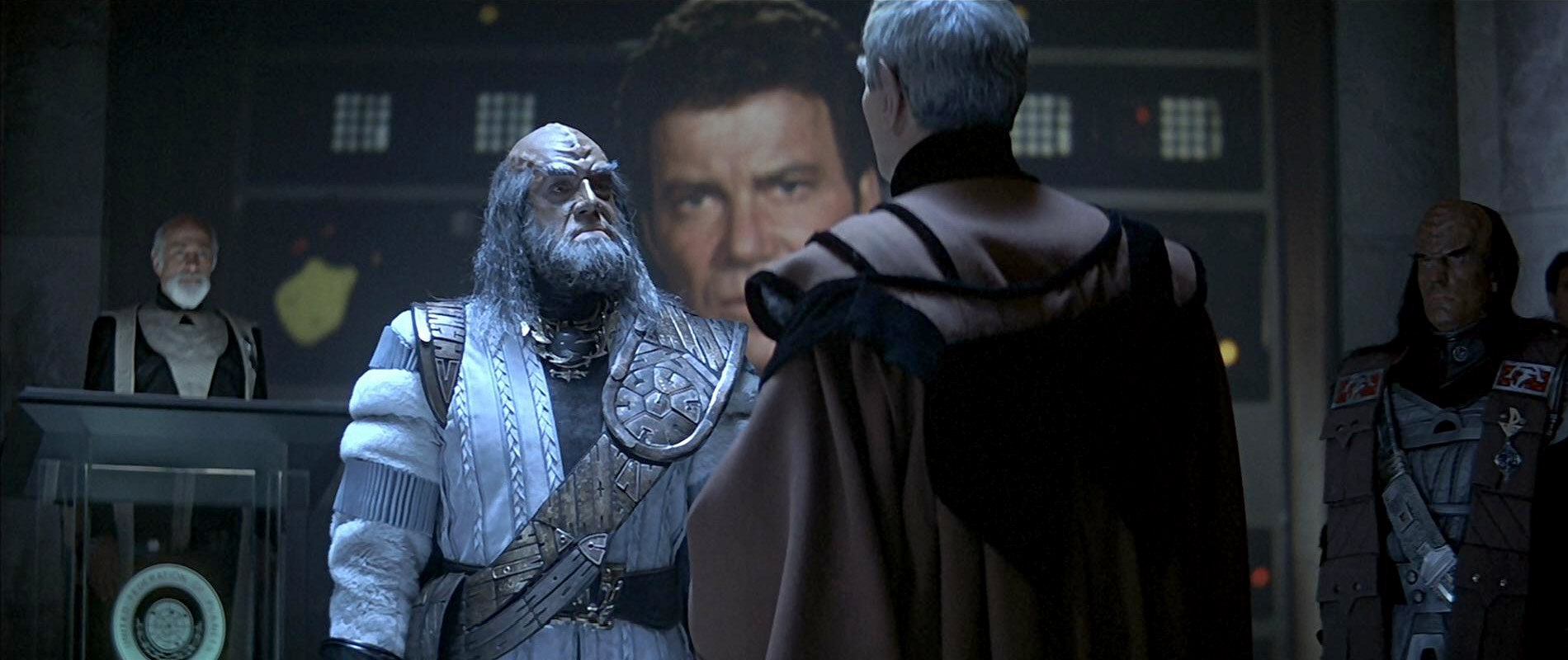
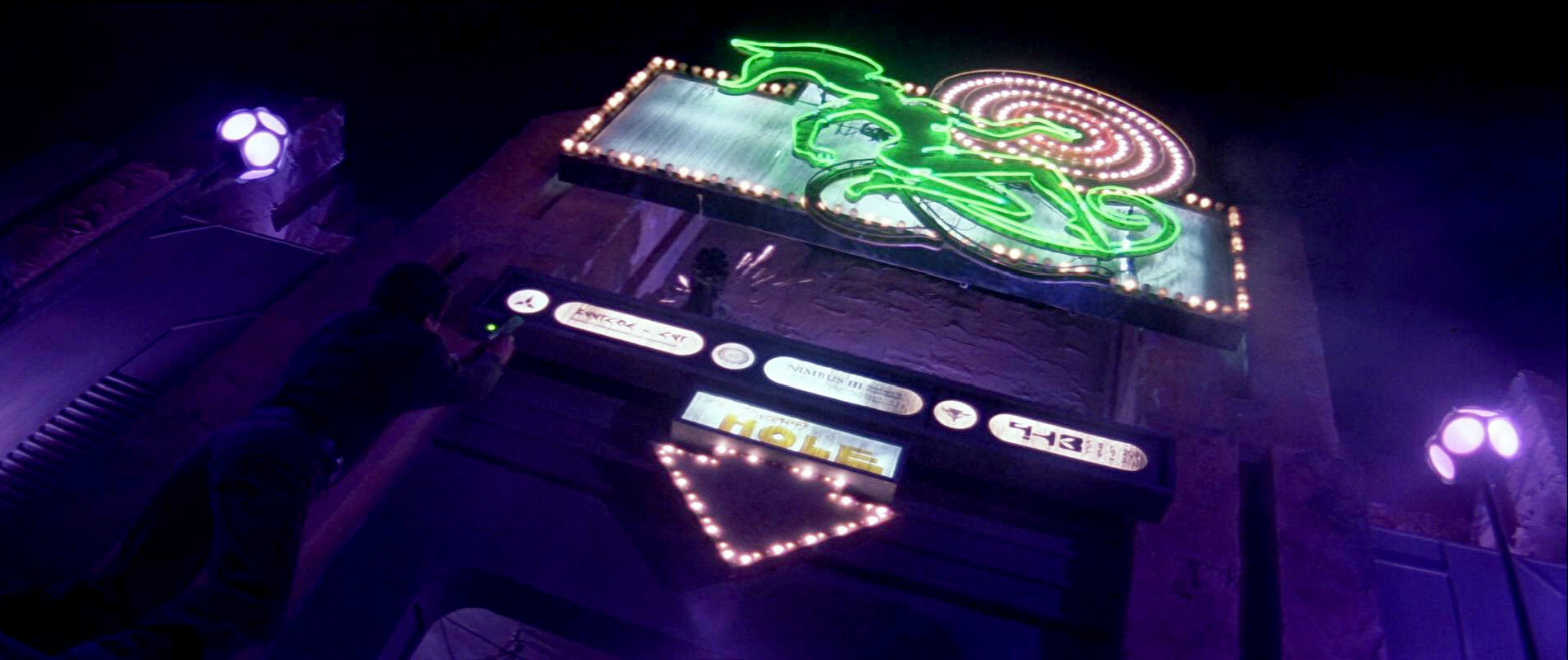
"Star Trek V", made after the launch of TNG on TV, presents the familiar Federation emblem of the 24th century. We can see it on Scotty's tool box and as a logo for communication links. It is also visible at the entrance of the bar on Nimbus III, alongside the emblems of the Romulans and Klingons. Here the Federation emblem is simply monochrome dark and bright.
2293
![]()
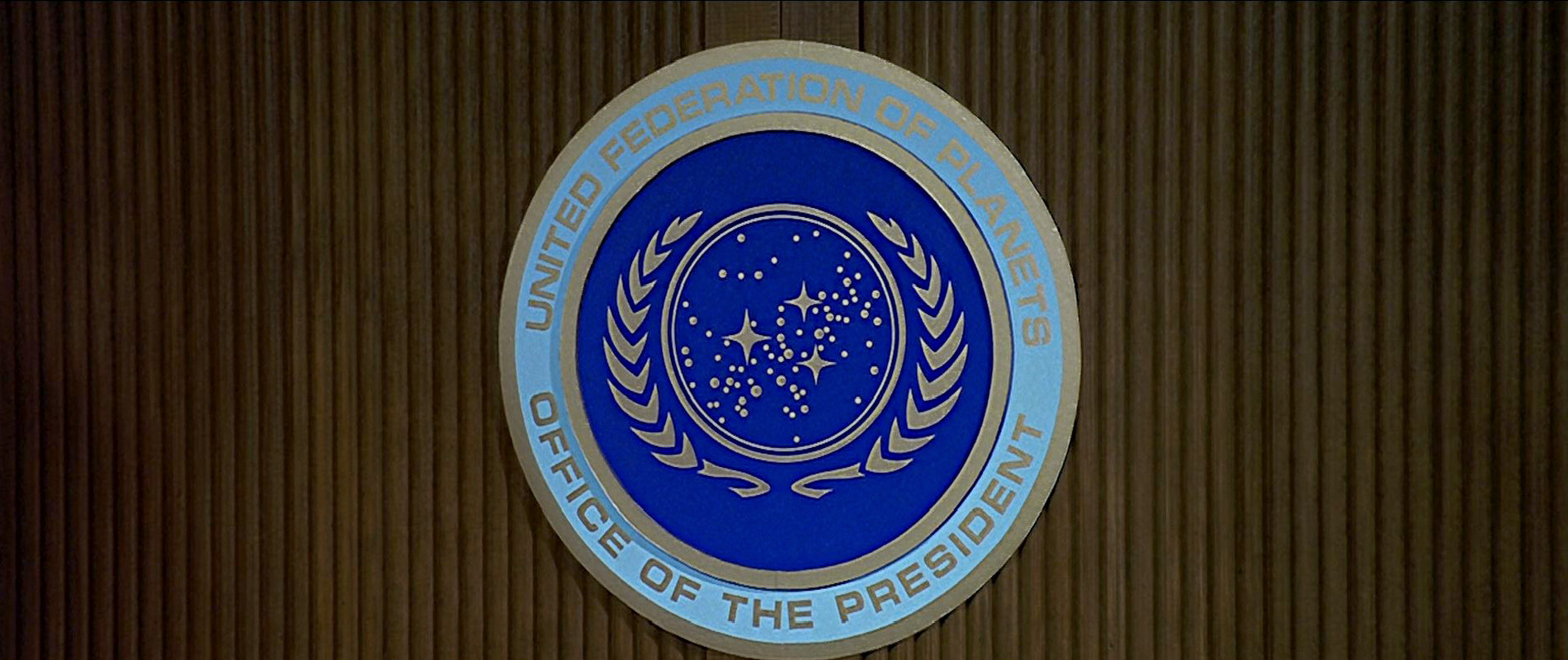
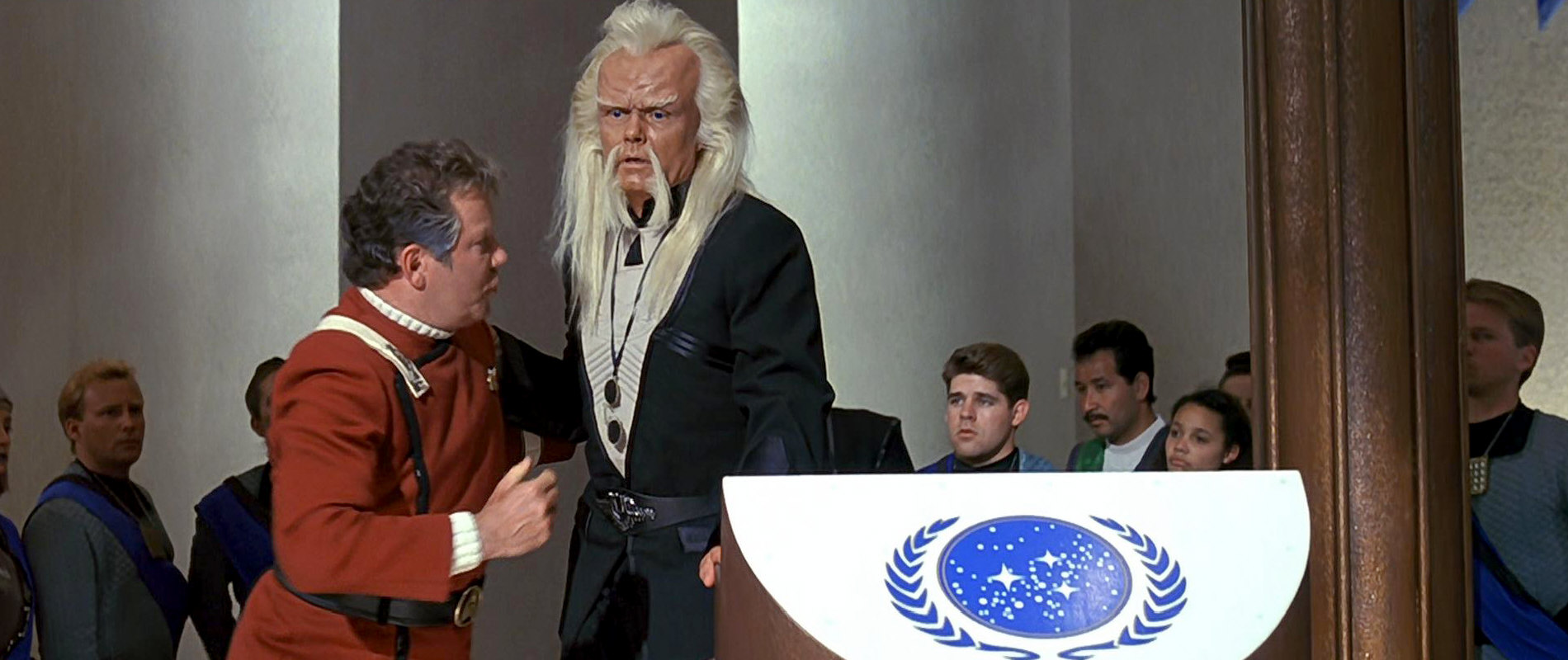
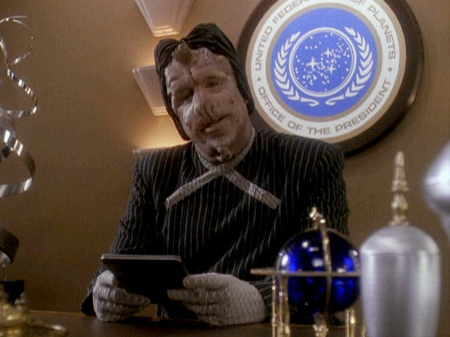
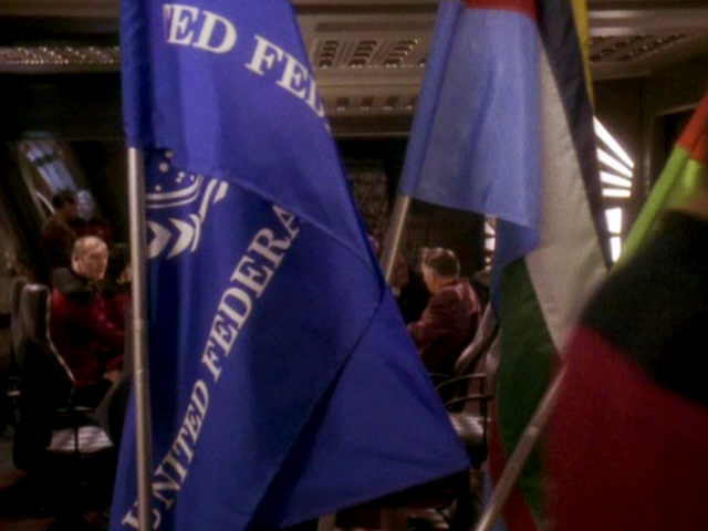
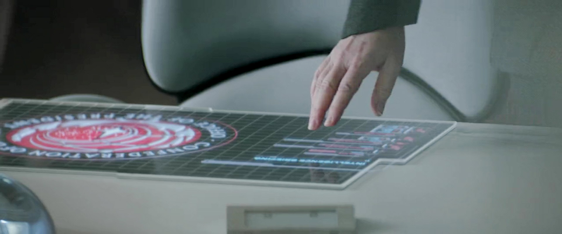
 In "Star Trek VI" we can see the familiar emblem from 2287 yet again. It appears on communication monitors and for the first time in blue on white ground in the conference hall on Khitomer. Furthermore there is a white flag in front of the hall, bearing a round disk with the emblem. Here the star background and the olive branches are black or dark blue, the stars and the border around the central disk are white, while the background disk is yellow. Inside the hall another emblem appears on a wall on which the star background is black or dark blue, the stars are white, the olive branches are yellow and the background is blue. The same emblem appears in the Federation President's office, here completely in gold with a blue background. The inscription reads "United Federation of Planets" and "Office of the President". An oval variant is visible only in the conference room, on a column behind the president's desk. The disk is the same as usual, except that it was stretched, whereas the olive branches look somewhat different especially on their upper and lower ends.
![]()
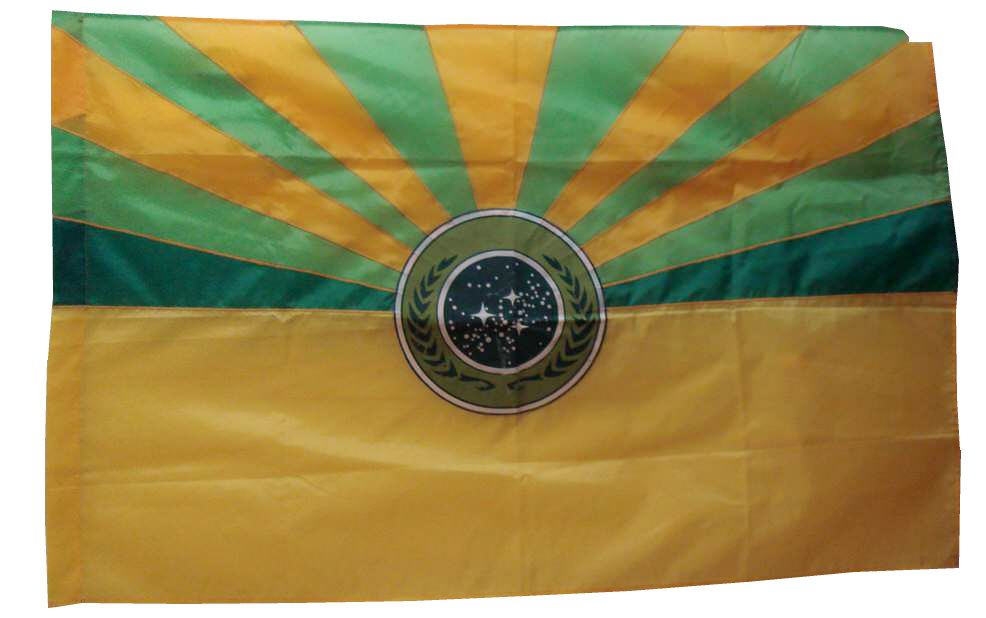
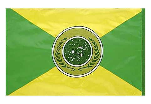
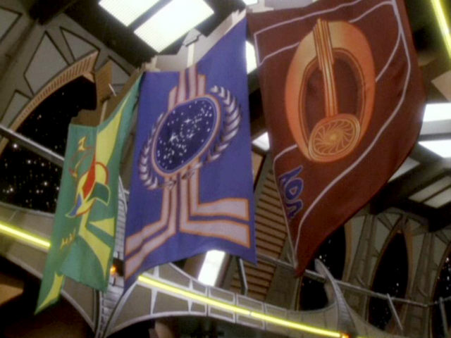
![]() Two other flags from the conference room were barely visible in the movie. They show the Federation emblem in an unusual green or teal on a yellow/green flag cloth. Several of these flags in such odd color combinations were produced for the movie, also for the Romulans.
Two other flags from the conference room were barely visible in the movie. They show the Federation emblem in an unusual green or teal on a yellow/green flag cloth. Several of these flags in such odd color combinations were produced for the movie, also for the Romulans.
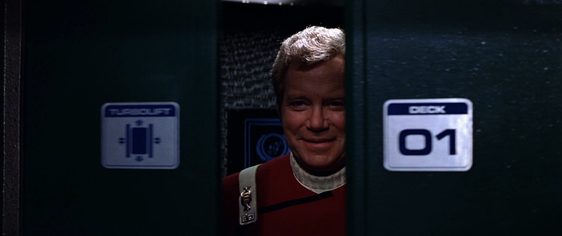
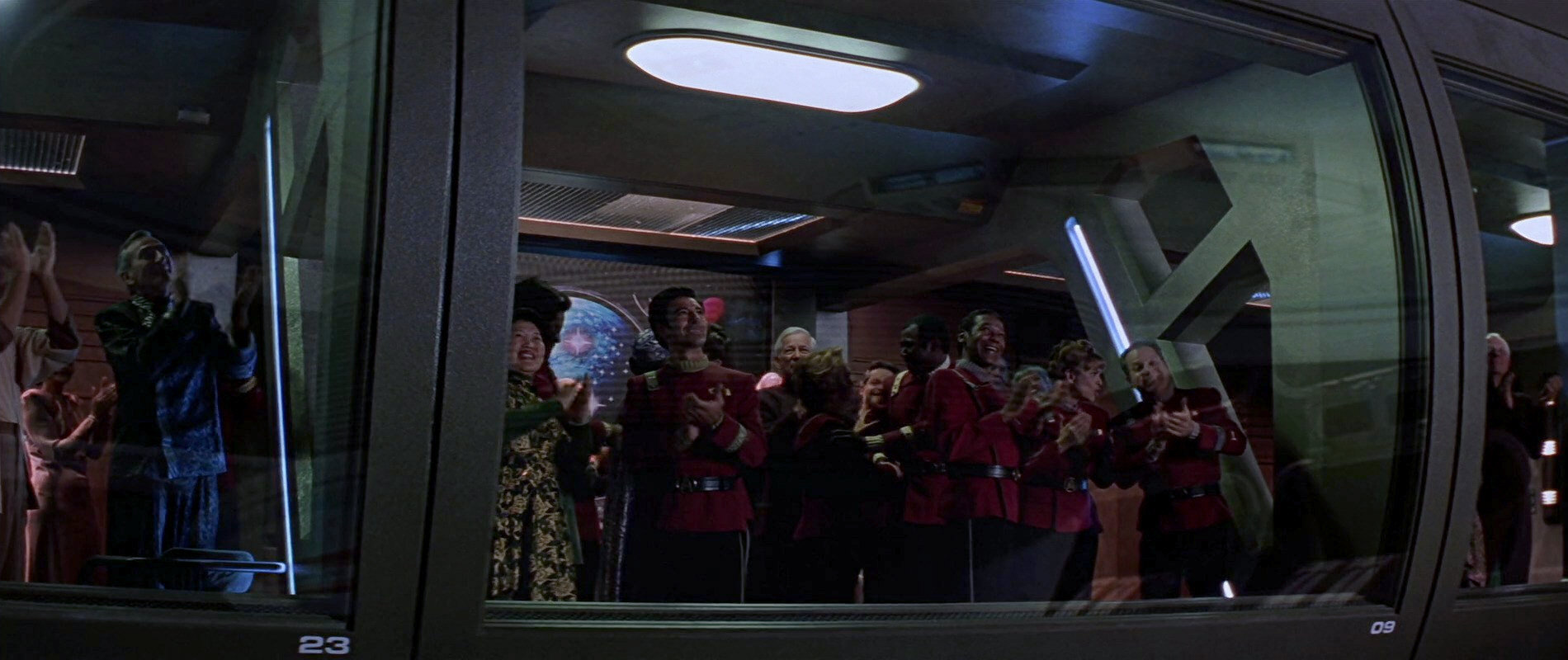
The emblem remains the same until "Star Trek Generations" when we can see it inside the turbolift of the Enterprise-B as a ceiling light, as well as behind Captain Kirk on an interface. The whole turbolift will be re-used in VOY: "Flashback" for the Excelsior. Furthermore the emblem appears as a colorful wall decoration in one of the lounges of the Enterprise-B during the ship's launch ceremony. It was designed by Dave Archer.
2340
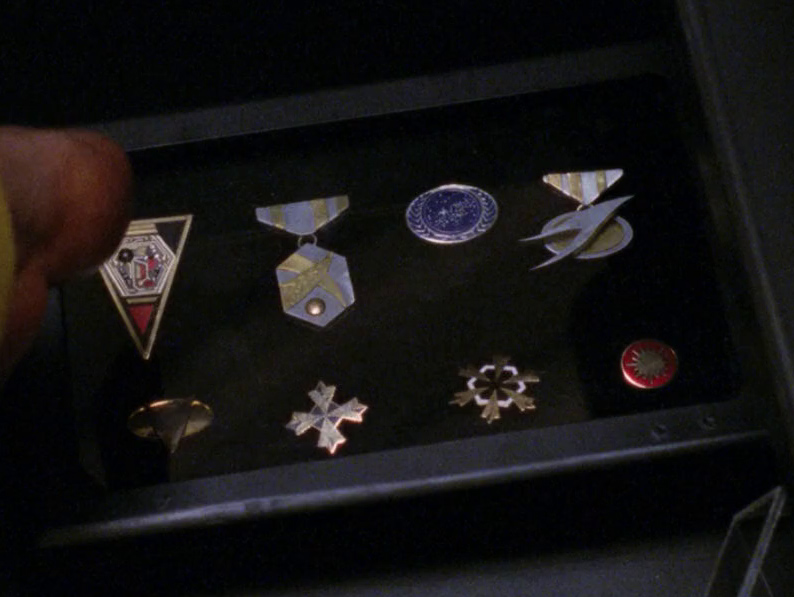
The classic TNG-era Federation emblem retroactively appears on an award that is barely visible in PIC: "Remembrance" (the upper right one above Picard's right arm). It is the "Federation Planets Hall of Honor Award" and dates back to the year 2340. Picard's awards and trophies from this episode should generally be taken with a grain of salt (some come with factual errors), but this one fits in nicely.

2364
As already mentioned, Picard holds a cup with the old-style Federation emblem in TNG: "Encounter at Farpoint", which was probably left over from the production of "Star Trek III".

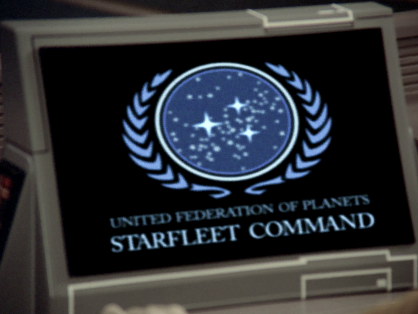
Apart from such single exceptions, from now the shape of the emblem, including the arrangement of the stars (the three big ones and the small dots forming the galactic plane) and of the olive branches will always remain the same, only the color and the arrangement of the rings will be subject to vary. Also, we will see a few animated versions. Aside from the aforementioned dishes from the 23rd century and some stock footage, only the 24th century variants appear on screen in TNG, DS9 and Voyager.
The 24th century seal appears on early TNG computer screens in green, as everything else on LCARS screens of that time (TNG: "The Naked Now", "The Last Outpost", "Datalore"). Furthermore the emblem shows up on freight containers, always monochrome (TNG: "Symbiosis"), on a bottle of Altarian Grand Premier (TNG: "Datalore") and also on Starfleet Academy certificates like Picard's final exam of 2327 (TNG: "The Battle"), indicating that the TNG logo was in use already that year.


Towards the end of 2364, a multicolored version is visible for the first time until 2365 when it will be replaced with a new one. The first colored version of TNG can be seen in TNG: "Conspiracy", "The Outrageous Okona", "The Schizoid Man" and "The Measure of a Man". Here the olive branch and the inner border are light blue, whereas the stars and the two outer borders are white. Inside Starfleet Headquarters in "Conspiracy" it shows up in various places, such as on a large disk on the wall behind the admirals, one time even in red and also as a gray carpet. The same carpet reappears in Picard's quarters in "Where Silence Has Lease".
 "Conspiracy" also shows us the façade of Starfleet Headquarters which, thanks to it being stock footage, is still adorned by the Franz Joseph version of the emblem. Yet, in the remastered version of the episode this was replaced with the proper 24th century emblem as it exists on all other occasions in the year 2364.

Furthermore we can see the Federation emblem on the bridge of a Klingon vessel, here with Klingon lettering, and as a 3D version in a banquet hall aboard the Enterprise-D. The three big stars appear to be three-dimensional, with the small dots being probably just painted on the glass plate.

2365
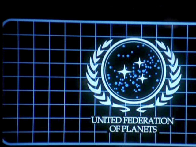
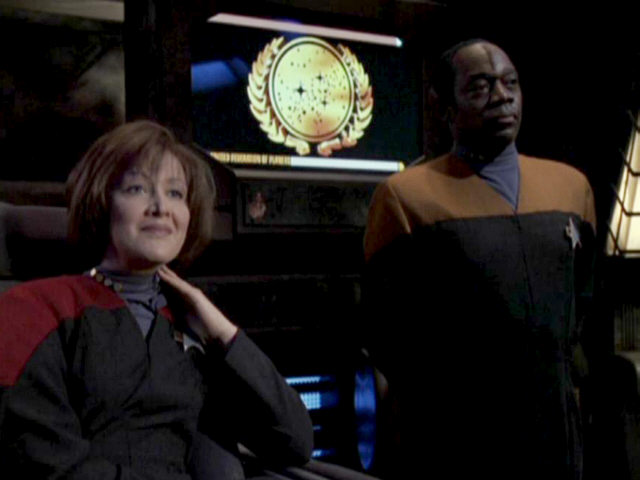
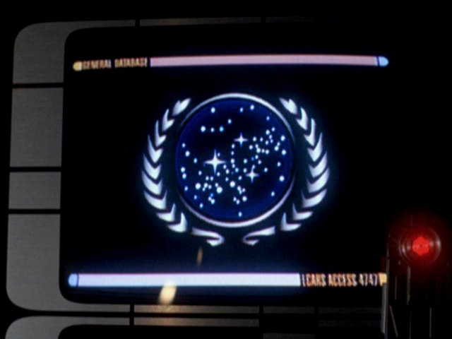
![]() This year brings us the first appearance of the by far longest-lived emblem of the Federation as the number of episodes is concerned. Each time someone establishes a comm link from now in TNG, DS9 or Voyager, this emblem will appear on the screen before and after the visual link. It consists of white olive branches, white borders, white stars and dots and a blue star background, everything usually on a black screen background. This version of the emblem can be seen initially in TNG: "The Measure of a Man" on an LCARS terminal. It appears for the first time as a comm link symbol in "Contagion". The impression that its colors varied between dark and mid blue may be deceptive and can be explained away with the different quality of the footage. In DS9 the emblem shows up in "Duet" and "Homefront", for instance, as well as in VOY: "Ex Post Facto" and "Lifeline". Since the latter episode takes place in 2376, the emblem remains in continuous use from 2365 to 2376.
This year brings us the first appearance of the by far longest-lived emblem of the Federation as the number of episodes is concerned. Each time someone establishes a comm link from now in TNG, DS9 or Voyager, this emblem will appear on the screen before and after the visual link. It consists of white olive branches, white borders, white stars and dots and a blue star background, everything usually on a black screen background. This version of the emblem can be seen initially in TNG: "The Measure of a Man" on an LCARS terminal. It appears for the first time as a comm link symbol in "Contagion". The impression that its colors varied between dark and mid blue may be deceptive and can be explained away with the different quality of the footage. In DS9 the emblem shows up in "Duet" and "Homefront", for instance, as well as in VOY: "Ex Post Facto" and "Lifeline". Since the latter episode takes place in 2376, the emblem remains in continuous use from 2365 to 2376.
Other places in which this emblem can be seen include Data's Starfleet certificate, one of Data's medals and a glass carving on a door on a starbase in TNG: "Samaritan Snare".

2366
We can see the familiar emblem in light blue on music stands, on Data's medals and, of course, on communication screens. Aside from that, the apparently obsolete TOS movie logo is visible on one of Picard's glasses.

2367
In addition to the usual blue emblem we are presented just a black & white variant on a desk. Even in Barash's fabricated alternative future in TNG: "Future Imperfect" the emblem shows up, obviously unchanged.
2368
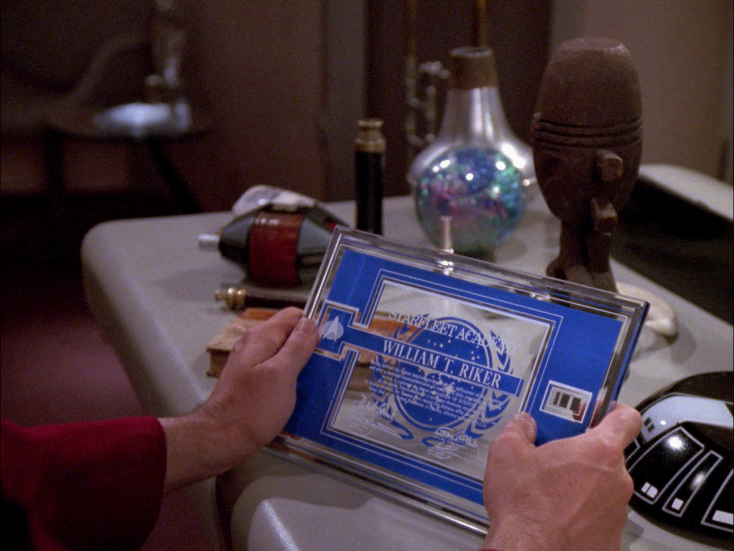
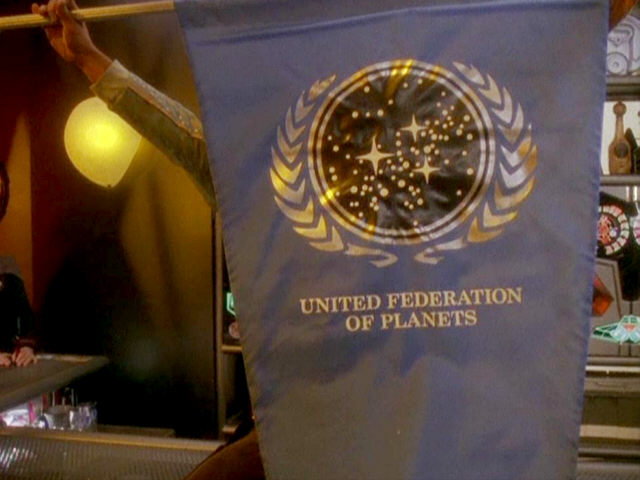
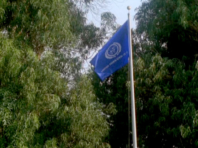
 We can have a good peek at Riker's Academy certificate and the emblem in TNG: "Conundrum". In addition, there is the first sighting of the Federation flag in TNG: "The First Duty", with a white emblem and white letters on blue ground, just like it was (or rather will be) in ENT: "In a Mirror, Darkly II".
2369
Not much new this year. One can see the emblem on a blackboard in the classroom of DS9, together with the symbols of other races, including Cardassians and Ferengi. In DS9: "Vortex" there is an unusually dark variant of the customary emblem, as a communication symbol on a runabout.

2370
The emblem shows up for the last time in TNG in the episode "Journey's End". Interestingly one of the differences between the parallel universes between which Worf is switching in TNG: "Parallels" consists in the use of the Starfleet emblem instead of the Federation seal for communication purposes. The futuristic Starfleet symbol is apparently in use in the future of "All Good Things" likewise.

2371
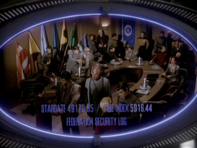
![]() A couple of changes take place in this year. In the wardroom on Deep Space 9 a symbol appears, which will be seen until mid-2374. Everything is light blue to white on this Federation emblem, except for the dots which are mid blue here, just like a rectangular coordinate grid in the background of the emblem. This variant is visible for the first time in DS9: "The Die Is Cast", then in DS9: "The Adversary". It shows up prominently in DS9: "The Way of the Warrior" the following year. We can also see a checkerboard-like collage of emblems of various races in the wardroom of the station. In DS9: "Life Support" it is the Bajoran, Cardassian and the Federation emblems, whereas the Cardassian emblem is replaced with the Trill one in "Rejoined". In "Life Support" we can also make out the Federation seal as a relief on metal dining plates.
A couple of changes take place in this year. In the wardroom on Deep Space 9 a symbol appears, which will be seen until mid-2374. Everything is light blue to white on this Federation emblem, except for the dots which are mid blue here, just like a rectangular coordinate grid in the background of the emblem. This variant is visible for the first time in DS9: "The Die Is Cast", then in DS9: "The Adversary". It shows up prominently in DS9: "The Way of the Warrior" the following year. We can also see a checkerboard-like collage of emblems of various races in the wardroom of the station. In DS9: "Life Support" it is the Bajoran, Cardassian and the Federation emblems, whereas the Cardassian emblem is replaced with the Trill one in "Rejoined". In "Life Support" we can also make out the Federation seal as a relief on metal dining plates.
A communication symbol with blue leaves appears in DS9: "Destiny", to indicate that the comm link to the Gamma Quadrant has been established eventually.
In "Star Trek Generations" an animated Federation seal is shown for the first time. On the complete emblem the star background is blue, the round stars are white, and the big stars and the olive branches are golden. There is only one ring around the emblem, which is golden as well. During the animation the olive branches appear leaf by leaf, while the center of the emblem is continually growing in size. The golden ring comes from outside, whereupon the three golden stars appear one by one, twinkle and take their final positions. This color combination and animation sequence remains unique in Star Trek.
2372
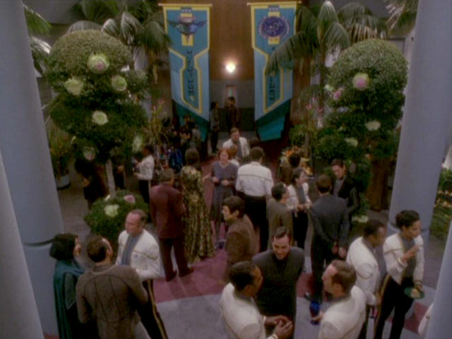
This year brings some interesting innovations again. Firstly we can see the Federation emblem outside the Starfleet Headquarters building. Inside his office the seal of the Federation President appears again, hardly changed since 2293. Only the font is somewhat different, and the depictions on blue ground are white instead of golden. An important variant of the Federation emblem is visible for the first time on a PADD of President Jaresh-Inyo. This will become the standard Federation emblem beginning in 2374. The multicolored and shaded (and hence slightly three-dimensional) symbol is well visible in DS9: "Behind the Lines". Furthermore, at the conference in Antwerp in DS9: "Homefront" the Federation flag shows up for the first time since TNG: "The First Duty". A second appearance is in DS9: "Rules of Engagement".


Harry's Starfleet certificate is shown in VOY: "Non Sequitur". By the way, the same episode makes use of the stock footage of the Federation building with the Franz Joseph SFTM logo once again.
2373
![]() We can see another variant of the Federation emblem on a light blue pennant. Quark displays this pennant, probably no official version, in his bar. He also has drinking glasses with the Federation emblem. Curiously, Quark's pennant has the same rather unusual shape as the red one of the UFP of 2268 - a tip of the hat? The same episode, DS9: "Rapture", also shows us the standard Federation flag and, moreover, the seal in gold on the documents for Bajor's admission to the Federation. When Gowron confirms the Khitomer Accords, we can see on his PADD the somewhat more colorful shaded version of "Homefront" and "Paradise Lost". DS9: "Blaze of Glory" gives us a new color variant which will appear frequently in the following. On a PADD we can see a deep blue star background with white stars and dots and bright blue olive branches and rings. The same logo is visible in DS9: "Call to Arms", DS9: "What You Leave Behind" and VOY: "Body and Soul".
We can see another variant of the Federation emblem on a light blue pennant. Quark displays this pennant, probably no official version, in his bar. He also has drinking glasses with the Federation emblem. Curiously, Quark's pennant has the same rather unusual shape as the red one of the UFP of 2268 - a tip of the hat? The same episode, DS9: "Rapture", also shows us the standard Federation flag and, moreover, the seal in gold on the documents for Bajor's admission to the Federation. When Gowron confirms the Khitomer Accords, we can see on his PADD the somewhat more colorful shaded version of "Homefront" and "Paradise Lost". DS9: "Blaze of Glory" gives us a new color variant which will appear frequently in the following. On a PADD we can see a deep blue star background with white stars and dots and bright blue olive branches and rings. The same logo is visible in DS9: "Call to Arms", DS9: "What You Leave Behind" and VOY: "Body and Soul".


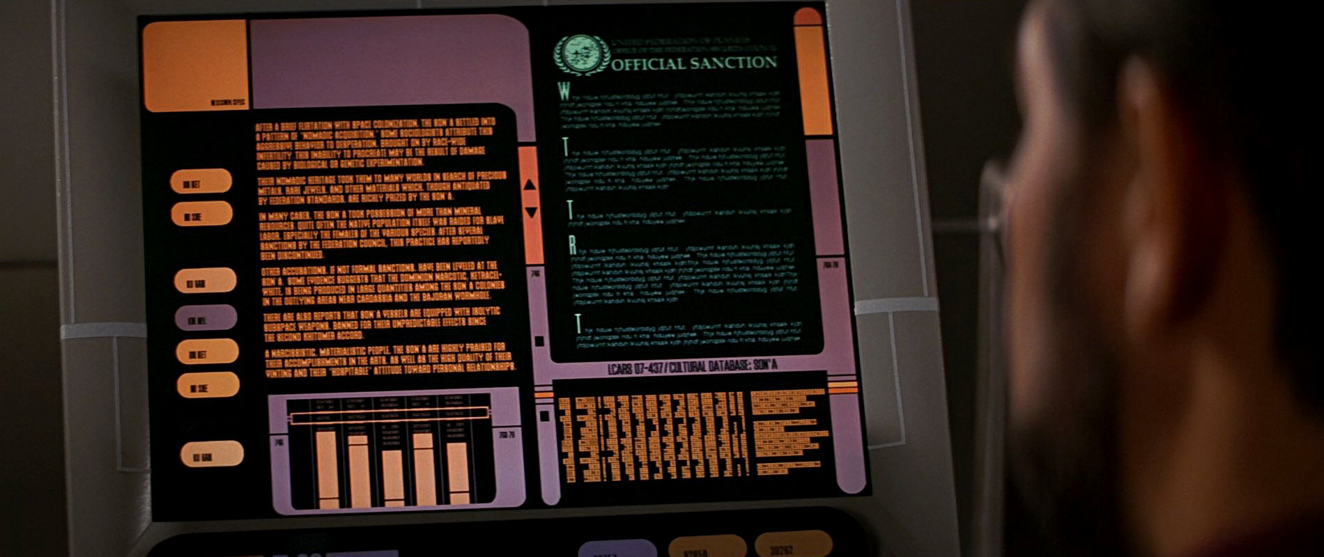
"Star Trek: Insurrection" prominently shows us the more colorful and shaded version from "Homefront" et al., as well as a variant in green on a sanction document against the Son'a.

2374
![]()
![]() The shaded version now shows up in the two series on a regular basis. It is clearly visible in DS9: "Behind the Lines", as well as on a star map in "Statistical Probabilities" and "In the Pale Moonlight". Additionally it adorns the viewscreen in Deep Space 9's wardroom since DS9: "Inquisition". Here it replaces the logo variant with the checkered background. Also, the shaded emblem is part of a new Federation flag on the promenade deck. This flag has a blue background with an odd orange-white stripe pattern reminiscent of hockey sticks. The same logo appears in VOY: "Hope and Fear" the same year.
The shaded version now shows up in the two series on a regular basis. It is clearly visible in DS9: "Behind the Lines", as well as on a star map in "Statistical Probabilities" and "In the Pale Moonlight". Additionally it adorns the viewscreen in Deep Space 9's wardroom since DS9: "Inquisition". Here it replaces the logo variant with the checkered background. Also, the shaded emblem is part of a new Federation flag on the promenade deck. This flag has a blue background with an odd orange-white stripe pattern reminiscent of hockey sticks. The same logo appears in VOY: "Hope and Fear" the same year.
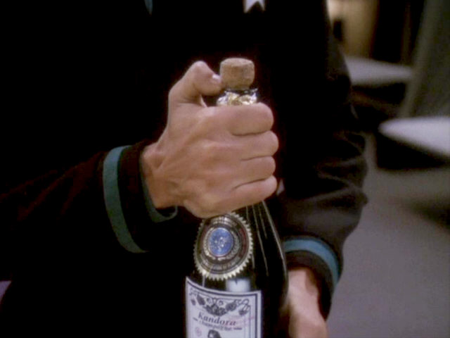
We can also see the traditional "flat" Federation emblem, partially in silver on a bottle of Kandora champagne.

Another variant without the new shading makes its premiere this year and can be seen exclusively on the Defiant. It looks like there is a color gradient in the blue field, but this is most likely due to the illumination with a single light spot. The first appearance is in DS9: "Time's Orphan", the most conspicuous in "The Sound of Her Voice". The logo on an alien screen, namely of the Cardassians, can be seen in "Tears of the Prophets". Here it appears in shades of green and yellow.
DS9: "The Sound of Her Voice" and "Tears of the Prophets" show us the familiar blue Federation flag on torpedo caskets.
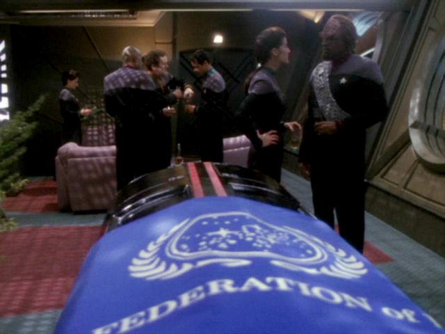
Side note When it became clear that Terry Farrell would leave the series the idea was to cover her torpedo coffin with a Federation flag just like Spock's. With everything made available for her funeral, the idea was adopted for the preceding episode "The Sound of Her Voice". When the ceremony for Ensign Muniz was held in DS9: "The Ship", there was no flag on the coffin.
2375
 No really new variants come out in 2375. We can see the customary Federation flag in DS9: "Field of Fire" and "Take Me Out to the Holosuite". On the latter occasion we can notice that the "of" in "United Federation of Planets" is written in capital letters, whereas it was in small letters in the previous year and season. Also, the more colorful variant can be seen, in DS9: "When It Rains", VOY: "In the Flesh" and DS9: "Inter Arma Enim Silent Leges". The latter episode shows the emblem as part of a Romulan-style flag, which is quite obviously decorative and not an official ensign of the Federation. The silver/blue Defiant version of the previous year turns up in DS9: "Penumbra", and the variant from "Blaze of Glory" reappears, like already mentioned, in "What You Leave Behind".
2376
In VOY: "Live Fast and Prosper" Dala and her gang fake the Federation emblem just like everything else they pretend to be. Their version is golden and three-dimensional. Moreover, areas of the emblem gleam alternately. With this little trick the membership in the Federation that Dala wants to sell may appear even more rewarding. In 2376 we also see the colorful variant on a viewscreen of the Delta Flyer, as well as the customary communication logo in VOY: "Life Line", as mentioned before.
2377
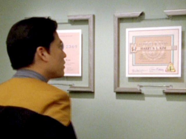
Again no novelties this year. The shaded version is still in use, as one can see in VOY: "Author, Author". In addition, the emblem shows up on Harry Kim's Starfleet certificate once more and on a display as monochrome background for the Charter of the Federation. We can also see the aforementioned variant in "Body and Soul" as it previously appeared in some DS9 episodes.

2379
The basic shape of the emblem remains unchanged in "Star Trek Nemesis". The movie has two new variants, however. A simple flat one as communication symbol on which the olive branches, the dots and stars as well as the inner ring are white, while the star background is blue and the outer ring is gray. The second variant is shaded and animated, and the modifications to the star field are the most radical since the beginning of TNG, as a cloud/nebula replaces the galactic plane. In the animation the dots slide from left to right in front of the blue background, while the three big stars and the nebula remain where they are. The star background is blue again, and the outer border is gray. The olive branches are white with a blue grain here.
2381
Multiple instances of the traditional Federation emblem can be seen at the famous Command Conference after party in LOW: "An Embarrassment of Dooplers", along with the Earth and the Tellarite emblems.
2382
We can see the emblem still better on a screen in LOW: "Grounded", now clearly with two rings around the seal just as in live-action Trek of this era. The same basic variation also appears on the infamous recruitment booth in "Reflections", but here in yellow on blue ground.
2384
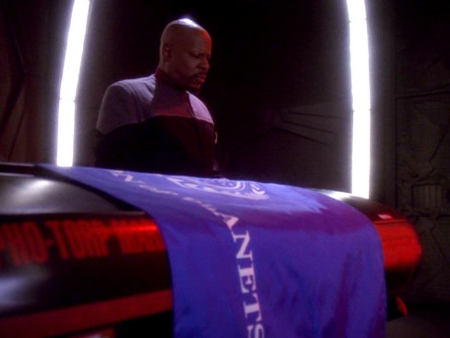
The floor emblem of Relay Station CR-721 in PRO: "Asylum" has two rings around the central seal, whereas the banners in the same episode have only one. The text on the banners is written with all capital letters, like on the one from DS9: "Take Me Out to the Holosuite". In PRO: "Supernova II", we can see many Federation flags at Starfleet Headquarters with the same seal, no lettering and a so far unseen ratio of 1:1.
2385
The traditional TNG-era Federation emblem is still in use in the year 2384. It can be seen embossed on a worker's hard hat at Utopia Planitia in SHO: "Children of Mars". The same mini-episode, however, also shows the Discovery-style emblem in the news footage. This probably inadvertent crossover happened because the team in Toronto is the same that also produces Discovery and the Discovery Short Treks and had the according graphics readily available.
2399
Star Trek Picard consistently shows the TNG-style Federation emblem. We can never see it clearly in the first season of the series, but it appears on screens in Clancy's and in Oh's offices in "Maps and Legends". The same map as in Clancy's office is later visible on Riker's flagship Zheng He, although the logo doesn't come into sight. Furthermore, also in "Maps and Legends", Picard opens a box in which he keeps his old communicator. This box is decorated with the familiar leaves of the emblem without the seal.


2401
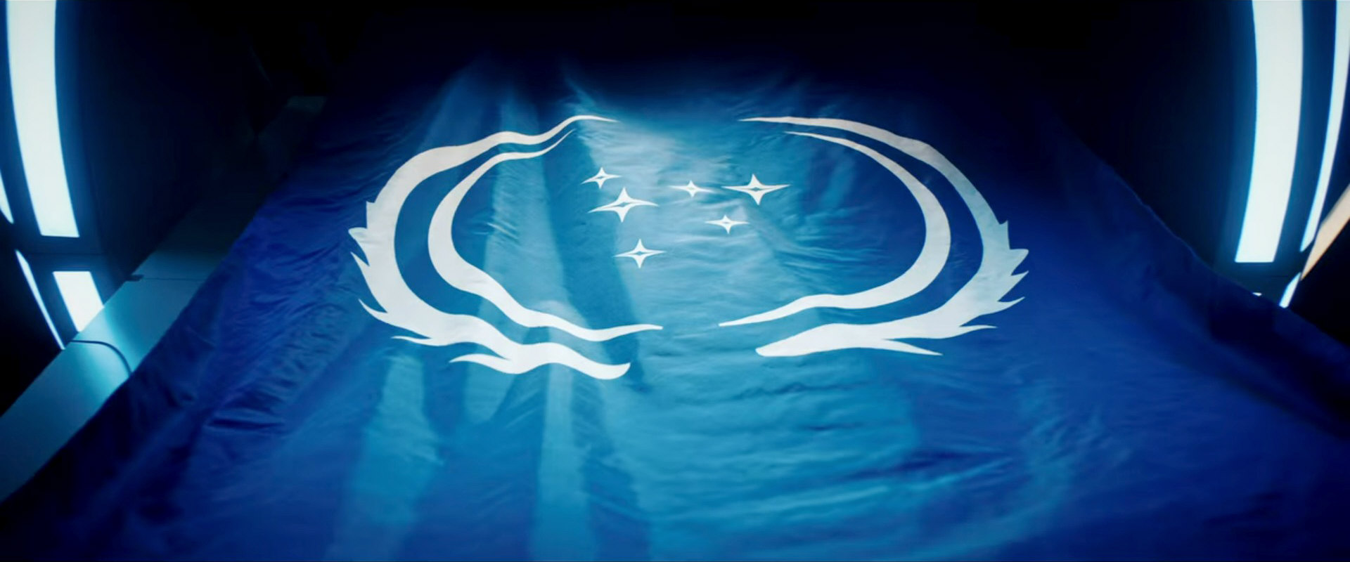
 A flag with the TNG-style UFP emblem can be clearly seen in PIC: "The Star Gazer". There is only one ring around the central seal, and it is rather thin compared to most versions that have appeared so far.
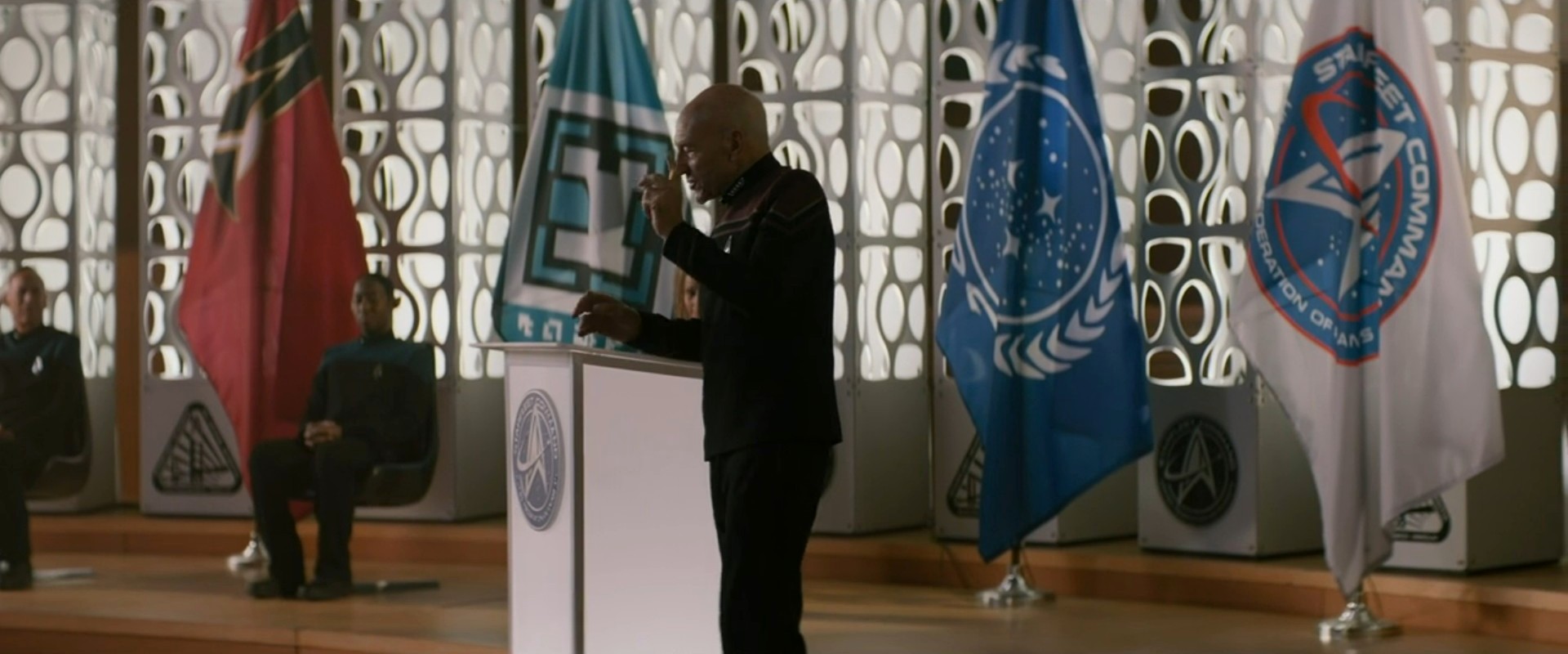

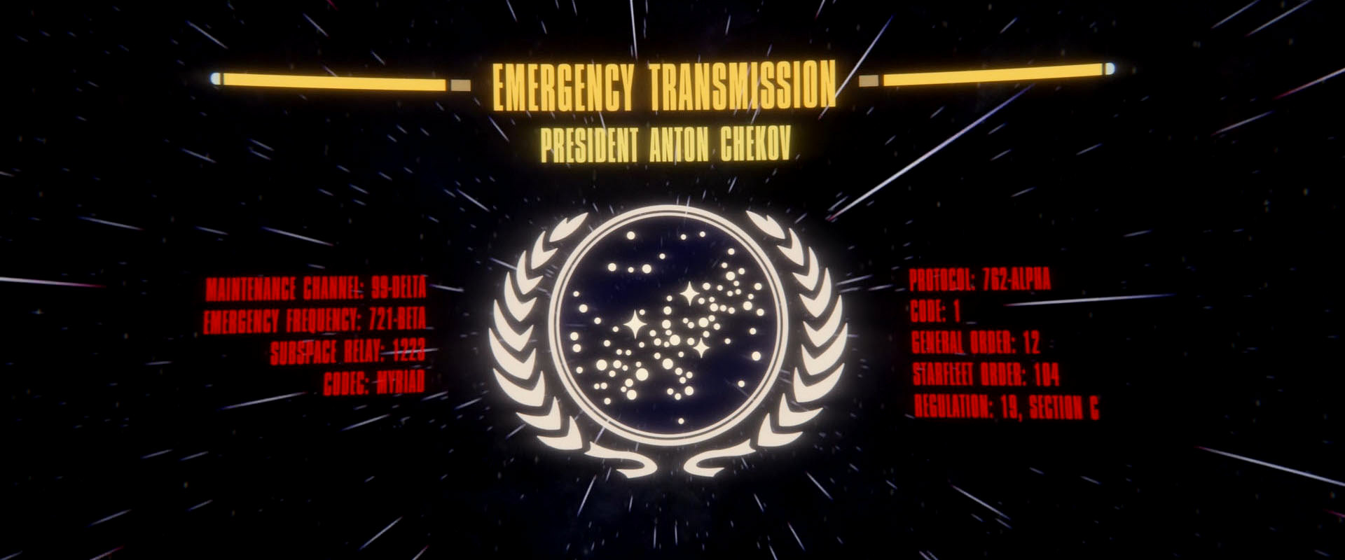
The third season of Picard features a version with two rings again, which can be seen as the message from President Anton Chekov plays in PIC: "The Last Generation".
2404 (alternate timeline)
One can see the familiar Federation emblem on Janeway's shuttle assigned to Starfleet Command in VOY: "Endgame". The star background is deep blue as usual, whereas the olive branches are now golden or yellow.
32nd Century

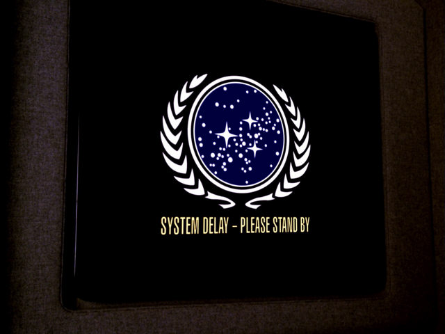
 In the 32nd century, the Federation (or what's left of it) uses an emblem with simplified shapes, but still in the same color white on a blue flag. The emblem, which "needed to illustrate a complex history in a very simplified graphic", was designed by Timothy Peel. It appears in inverted colors when placed on a bright background.
Addendum: Confederation

 The "Confederation" as it was created by Q in PIC: "Penance" uses a similar shield as the Federation, with only one dominant star and with a laurel branch pattern very close to the one of the UFP emblems in "Star Trek: The Motion Picture". Although the stars on the UFP emblem have no particular significance, it can be deduced that the single star of the Confederation represents Earth. The simplified wall emblems don't feature any of the smaller stars. The colors on the flag are black, white and red, denoting it as a fascist regime.
The seal of the President of the Confederation follows the same basic pattern as the one of the UFP, as it was seen in "Star Trek VI" and in DS9: "Homefront".
Conclusion
The real-world reasons behind the divergence between the various Federation emblems are obvious. First of all, the emblem was needed in very different formats from tiny stickers to large wall ornaments. An original copy may not always have been available for reproduction, especially in the time before powerful computer graphics existed. Secondly, owing to more or less accidental re-uses as well as deliberate revisionism we may be shown anachronistic symbols. The latter, in its most obvious case of the 24th century Federation flag in ENT: "In a Mirror, Darkly", may be even beneficial for continuity, considering that it makes up for the appearance of the inept (in retrospect) pennant in TOS: "And the Children Shall Lead". Finally, perhaps some variants, which we classified as slightly different may be even the same, considering the varying quality of the footage and random reflections.
Overall,the emblem has been used very consistently throughout over 200 years of Federation history if we take into consideration that it was reproduced for different purposes in different sizes and materials. The original emblem as it emerged in 2161 may have been repeatedly slightly redesigned as were real-world coats of arms or company emblems too in the course of decades or even centuries. Moreover, artistic license may have produced several variants, especially as the colors, the different types of borders around the central disk, the shading and the 3D effects are concerned, and especially when depicted on less formal items like on dishes or wall decorations. Yet, the divergence of the positions of the three big stars, not to mention the many small dots, in the single variants is considerable and would not be tolerable on an official reproduction if the stars represented a real star map, something too characteristic and definite to allow measurable deviations. But in spite of everything we may just not be supposed to observe so closely as in this article.
See Also
The Evolution of the Federation Flag - investigation of all familiar and obscure variations
The Emblems of the Federation Founding Members - Earth, Vulcan, Andor(ia), Tellar
Uniform and Rank Inconsistencies - problems with changing uniform styles, emblems and rank signs
The Emblems of Earth Starfleet and Earth Starfleet Command - overview of all variations of the two logos
Earth and Federation Emblems Gallery


