


The Emblem of Starfleet Academy
by Jörg Hillebrand, Bernd Schneider and Brad Wilder
Appearances of the Academy Emblem32nd CenturyCertificates with Other Emblems
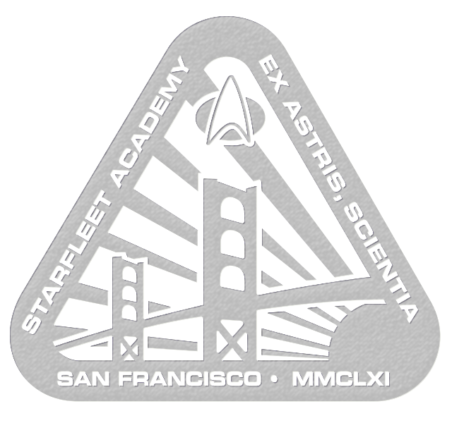
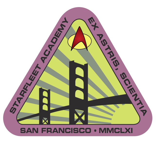
The Starfleet Academy emblem was created for TNG: "The First Duty". Joe Sena had the original idea for the Academy logo with the Golden Gate Bridge. Michael Okuda designed the version used in "The First Duty" and subsequently. In this episode, it can be seen prominently in several places. VOY: "Non Sequitur" and DS9: "Paradise Lost" are two more episodes that clearly show the logo. In some other episodes and movies, the logo can be seen on certificates or awards but is blurred. While the basic composition with the red frame and the yellow/white/black/gray inner field remains consistent, the exact combination of colors is different almost every time.
As the logo was designed for "The First Duty", a grammatical error was famously overlooked. Here, Starfleet Academy's Latin motto is falsely "Ex Astra, Scientia." For each subsequent appearance from "Non Sequitur", as well as for the remastered version of "The First Duty", this error was corrected (at least in the most visible appearances).
Appearances of the Academy Emblem
TNG: The First Duty
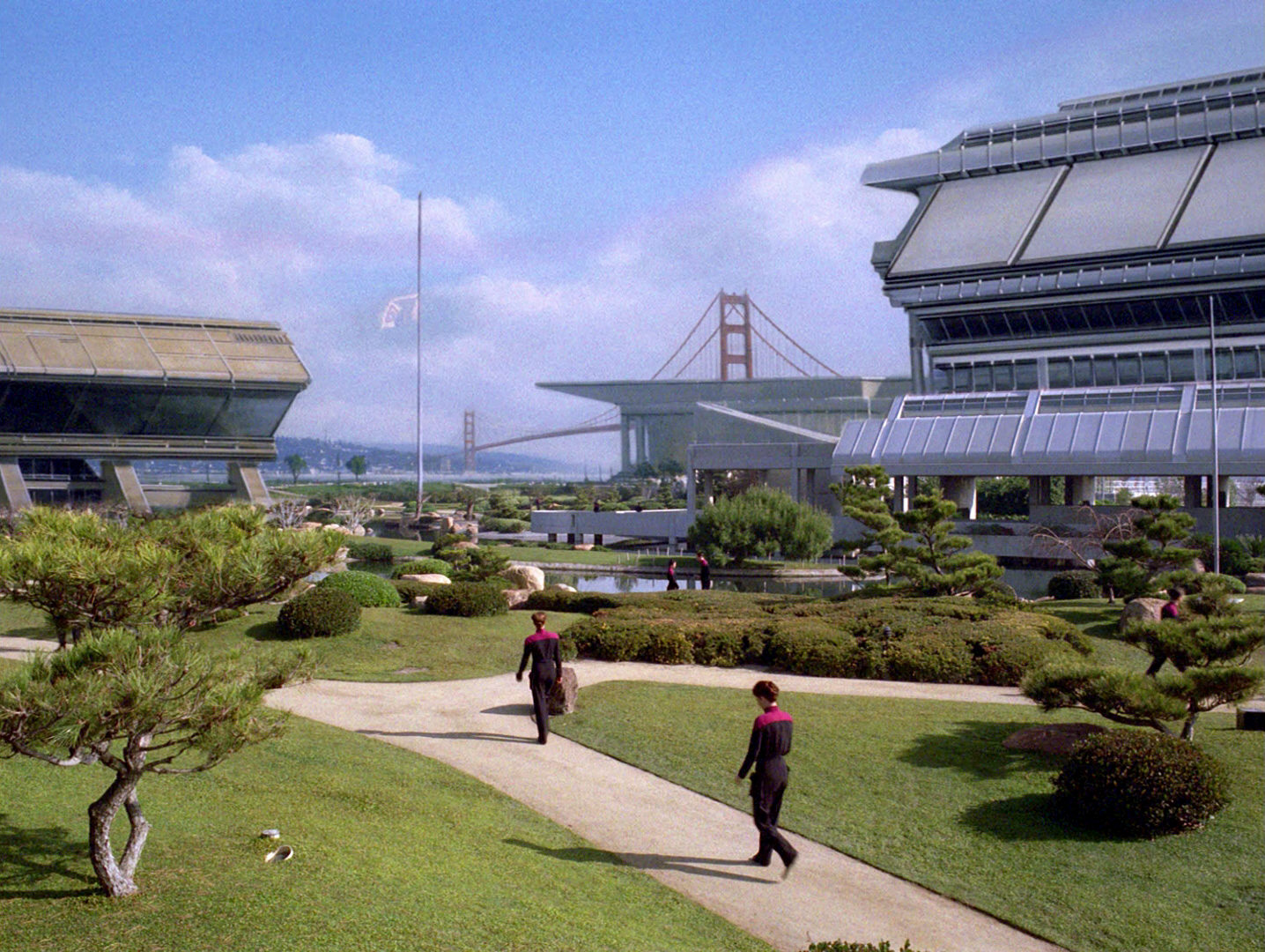
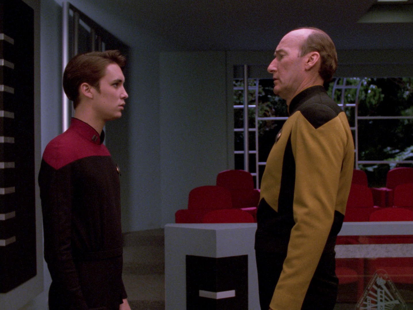
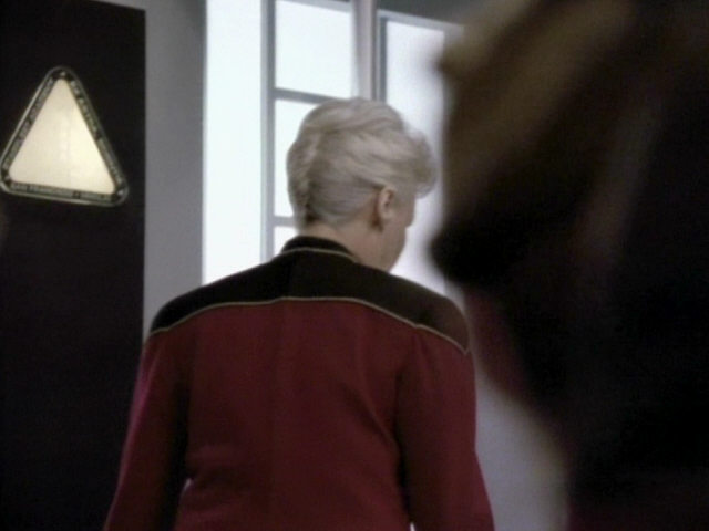
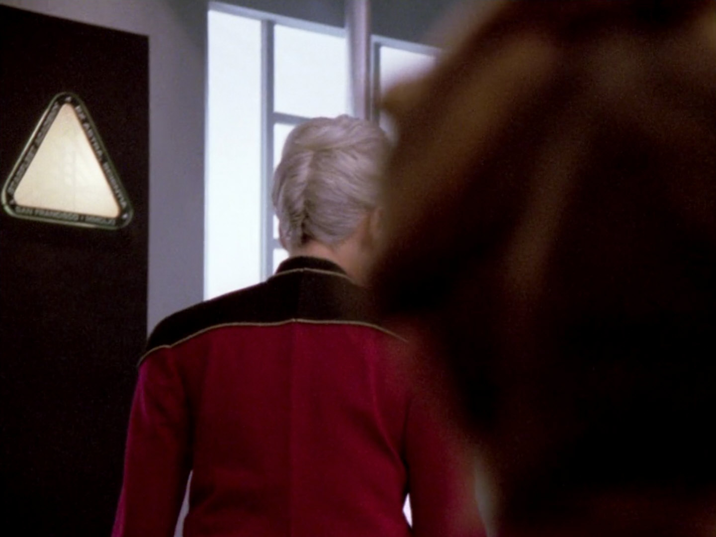
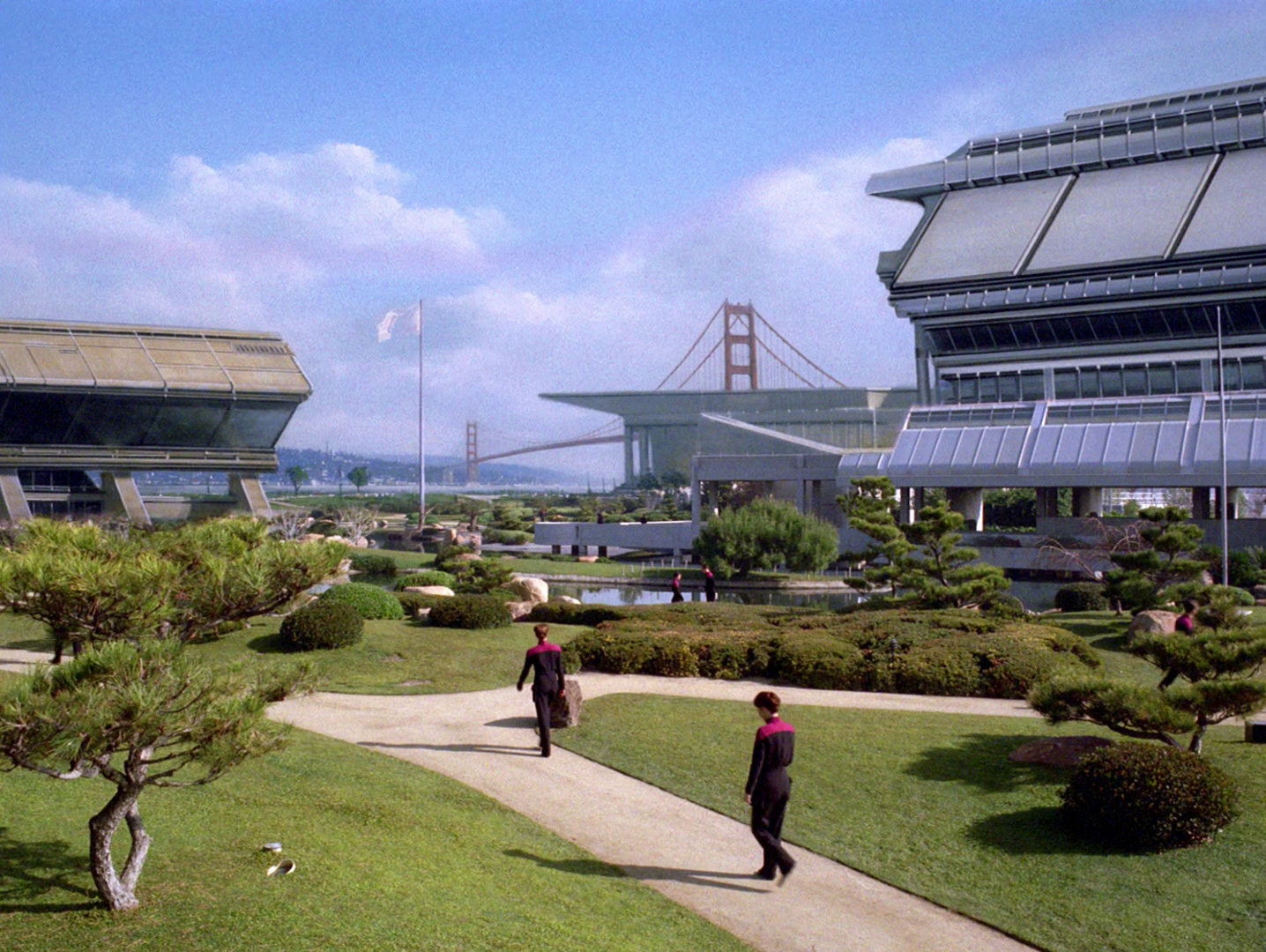
 The very first appearance of the logo is on a waving flag (at half mast, following the death of Wesley's fellow squadron member) on a matte painting of Starfleet Academy. Even in HD, we can recognize only few details, but the characteristic triangular logo is clearly visible.
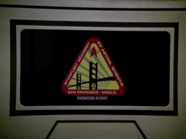
In the next scene, which takes place in the Starfleet Academy hearing room, we can see this newly designed flag much better. The frame of the logo is red, the letters are yellow or golden, and the faulty Latin motto is not yet visible. The background of the flag, as well as the sun and its rays are white, the bridge is black and the area between the rays of the sun seems to be golden (or yellow). On a black rectangular wall panel, we can see another variant, which is completely white.
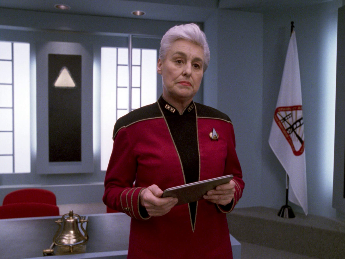
 In the next shot we can see the audience in the hearing room. The logo of the Academy is printed in white on glass panes. Here it is visible that the top of the logo, above the bridge, is the TNG-style Starfleet delta. In the original version of the episode we could not recognize the lettering on the right side, but in HD the faulty Latin motto "Ex Astra, Scientia" is discernible. It was apparently not deemed visible enough to warrant a correction (nevertheless we fixed it in our reconstruction, to avoid further distribution of the wrong motto). A little later in the episode, the logo on the glass pane is clearly visible again.
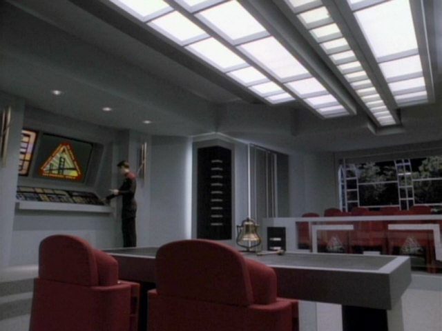
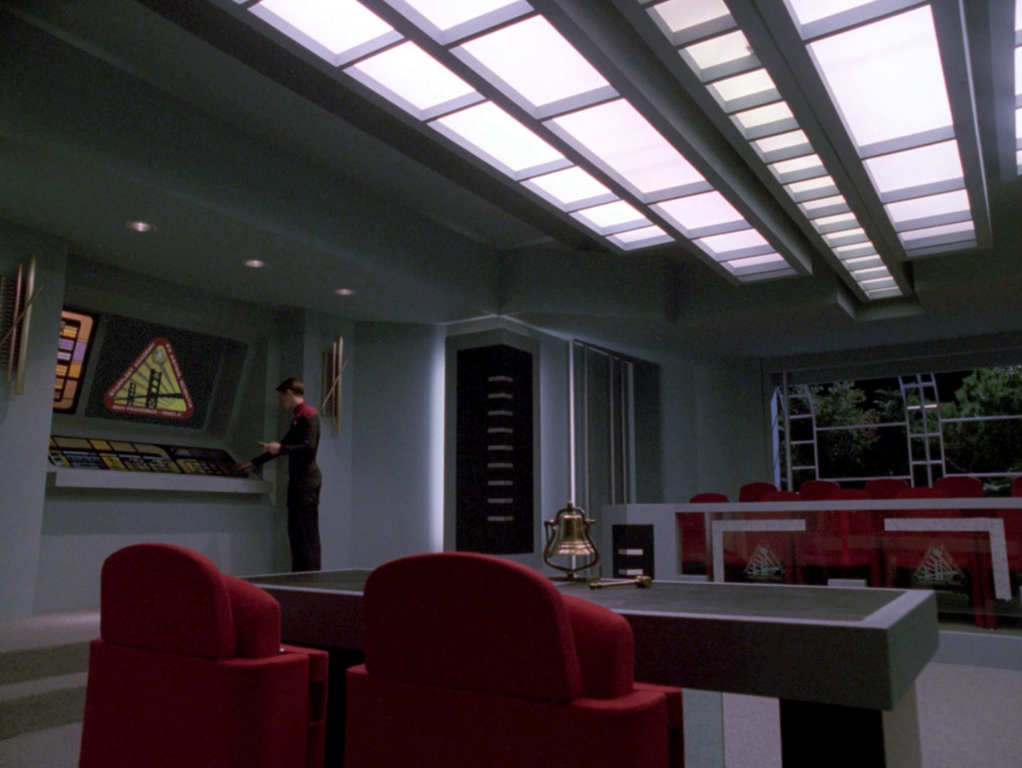
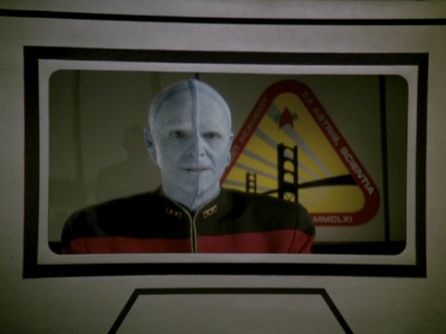
A little later the colored logo appears on a screen. We can see this version better when Wesley makes his testimony next to the same screen later in the episode.
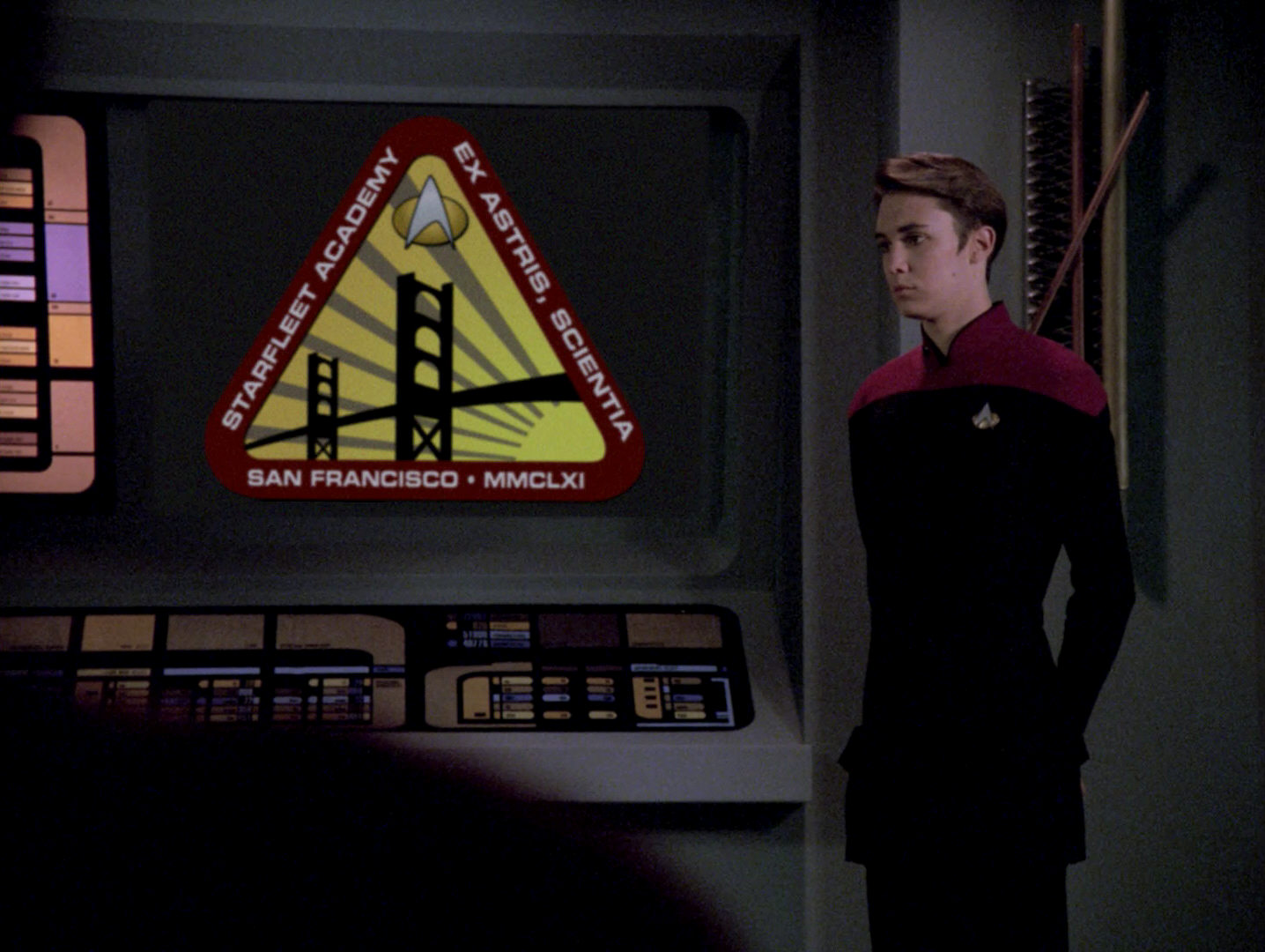
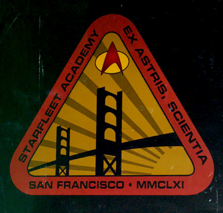
 Let us first look at the original, faulty version of the emblem. In the original version of the episode, we can only recognize the faulty motto in the close take with Wesley Crusher, not in the long shot. The frame of the logo is red. The letters, the sun and its rays are yellow. If we compare this version with the one on the flag, we see that the arrangement of the rays (yellow) and the empty areas between the rays (white on the flag, gray on the standalone emblem) is identical. The bridge is black and the TNG Starfleet logo features a red arrowhead and a yellow oval shield with a black border. The yellow of the oval is darker than the yellow of the sun.


 When this logo was re-created for the remastered version of the episode, the text was changed to "Ex Astris, Scientia", because the preposition ex always requires the ablative case, which is astris for the plural of the word astrum (constellation). The incorrect astra would denote the nominative or accusative plural.
Mike Okuda: "We did not consider fixing the astra/astris error on anything in live-action photography in the HD remastering of 'The First Duty' because that was outside our scope of work. Our job generally wasn't to fix mistakes that were made in the original production, although we did do so on occasion when someone took a particular interest in a particular shot, but only if schedule and budget permitted. As you noted, I did fix a shot in which the emblem was a visual effect, and had to be recomposited anyway."
However, there are more changes aside from the text. All letters are no longer yellow but white now. In addition, the pattern of beams and beam space was reversed. The areas that were previously yellow are now gray and vice versa. Also, the logo of Starfleet was changed. All components of the logo now have a black outline. The arrowhead is white/silver, the oval yellow/golden. The logo now resembles the TNG communicator.
The previously mentioned, almost completely white variant of the logo can be seen better a little later. In HD, the faulty Latin motto can still be seen. The illustration in the center of the triangle is only faintly visible. It is unclear why this hard-to-spot variant (dull white on glossy white) was created, instead of sticking a white version of the logo on the black background, similar to the version on the glass panes.
TNG: Time's Arrow I
This episode uses stock footage from "The First Duty", of the matte painting with the white Starfleet Academy flag. Here, however, the flagpole was shortened, as it made no sense for the flag to be still flown at half mast.
Star Trek Generations
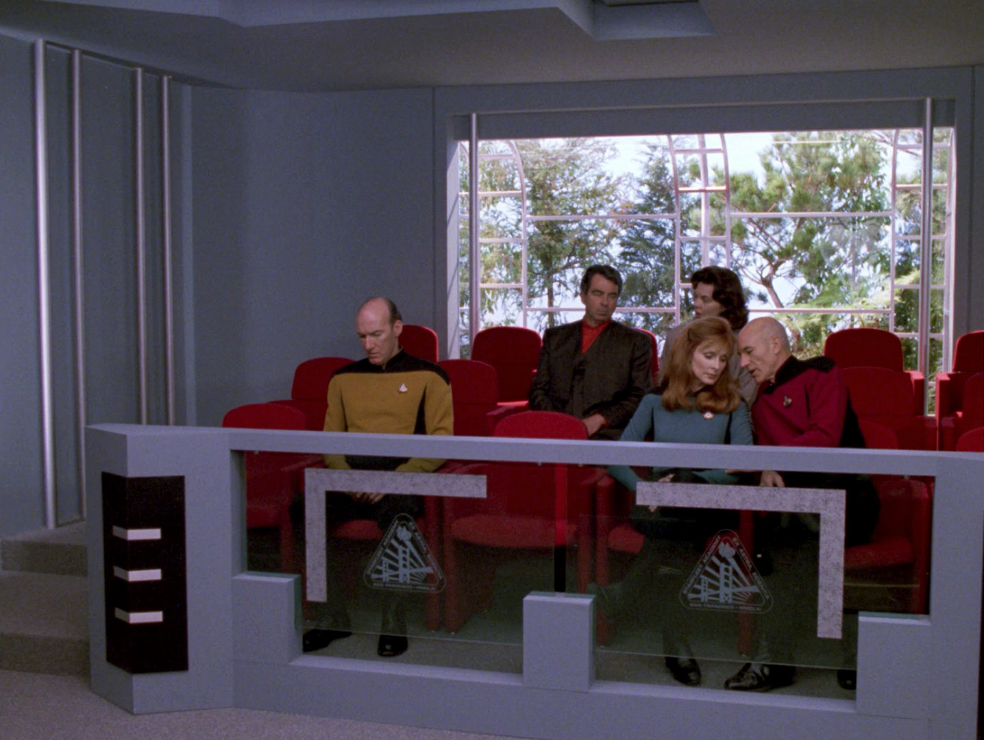
 The Starfleet emblem was used when the Picard family album was created for the first TNG movie. For this book, a certificate was created, which testifies that Picard won the Academy Marathon in the year 2323. The page with the certificate did not show up in "Generations", but was opened in "Nemesis", as Picard looked into the book again. So this variant of the emblem is canon. In "Nemesis", we can see no details, but there are photos of the book with the document, on which all the details are clearly visible.
The logo has a wine red frame. The writing, as well as the rays of the sun and the sun itself are golden. The areas between the rays are the same beige color as the document paper. Here we can clearly see that the order of rays and the areas between the rays have been reversed compared to the original version of "The First Duty". This variant of the logo thus corresponds to the one from the remastered episode as far as the rays are concerned. The grammatical mistake in the Latin motto has been corrected here for the first time, it says "Astris" instead of "Astra". A striking observation is that the Starfleet arrowhead is missing.
Mike Okuda: "The absence of the Starfleet arrowhead emblem from the marathon certificate was an oversight, and I did not do a final review before it was used."

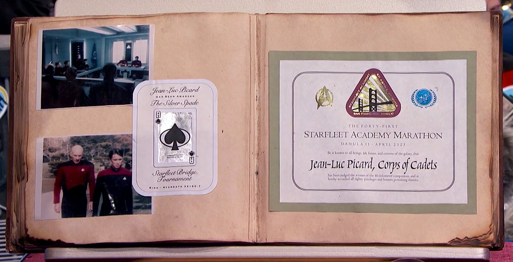


An issue of Star Trek: The Magazine, published in July 2002, contains the artwork used for the certificate. However, it is not the actual graphic used, as there are differences between this image and the photos of the actual book with the certificate. The Federation logo, for instance, looks different. The logo of Starfleet Academy too exhibits differences. While the design only hints at the golden color, the areas in the actual logo are actually golden. In addition, the areas inside the bridge pylons are solid white, so the golden rays are not continued here, as in all other variants of the logo. It is therefore only a preliminary version of the document, or perhaps a replica.
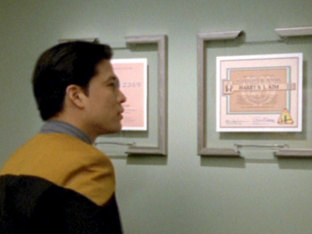
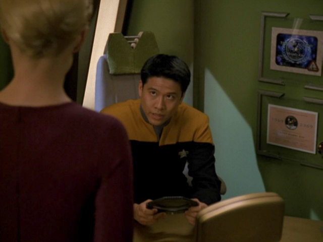
VOY: Non Sequitur

 The next appearance of the Starfleet Academy logo is in "Non Sequitur". Here it shows up in a large version on an LCARS display behind Harry Kim. The grammatical error was also corrected for this episode, now reading "Ex Astris, Scientia". The LCARS display was later sold by It's a Wrap, so we can take a close look at the logo, which appears relatively blurry in the Voyager episode.
As we can see on the photo of the panel, the frame is still red, but the lettering was changed to black. The Starfleet logo still looks like the original version from "The First Duty". The arrowhead is red, the oval is yellow/gold. Both the arrowhead and the oval have a black outline. In "The First Duty", the black frame of the arrowhead was not clear, but it was likely present as well. The order of the sunbeams and the areas between the rays was changed. We can see that it was swapped; the yellow areas are now gray and vice versa. As far as this is concerned, the pattern is identical to the one in the Picard family album and the remastered version of "The First Duty".
Mike Okuda: "I don't specifically recall that emblem, but looking at the art, I would guess that it was done as a traditional high-contrast black-and-white Kodalith film transparency, onto which I (or someone working for me) attached pieces of hand-cut colored lighting gel to create the coloring."
This would explain the black lettering on the border: Cutting out white letters in a red field would have been time-consuming and I would not have wanted anyone to take the time to do so. Black lettering would mean that you could simply lay a strip of red gel over the entire area, which would be much faster.
In the Voyager episode, the red frame looks like it is pink, and the whole emblem has an overall "colder" tinge than on the auction photo.
Mike Okuda: "I would also guess that I did not intend to change the color scheme. My guess is that our colleagues in the special effects department used a different brand of lamps to backlight the art, using bulbs with different color characteristics. For example, on TNG, the panels on the aft stations used exactly the same color range as the panel on Worf's tactical station, and on the vertical status strips on each side of the aft stations. However, while the aft stations used fluorescent lamps, Worf's station used white-blue neon, and the status strips used warm incandescent Lumaline lamps. The result is that all three groups of panels had very different coloring when photographed."

The episode also features two diplomas in Harry Kim's office. One of them is his Starfleet Academy Graduation certificate. Both have the Starfleet Academy logo. It is hard to see, but the lettering in the frame of the logo is white or yellow again, as in "The First Duty" and not black, as shown on the LCARS display in this episode.
DS9: Little Green Men
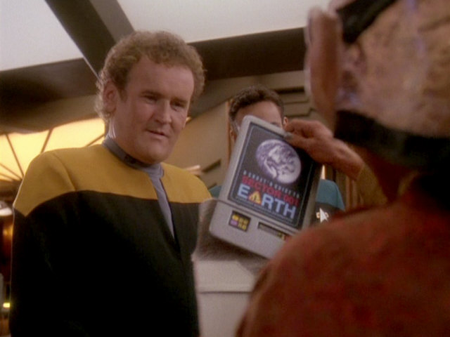
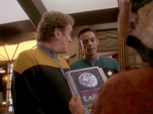
Before the logo would make its final big appearance in "Paradise Lost" in the 4th season of DS9, it appeared on a PADD on the cover of a travel guide to Earth in "Little Green Men". Here the logo represents the "A" in Earth. Details are unrecognizable, but it is likely the same version as seen on Harry Kim's certificates.
DS9: Paradise Lost
In this episode, the logo can be seen as a wall decoration behind the Bolian Starfleet Admiral and as an LCARS display in digital form.
 The logo on the LCARS display has a red frame with white or gray letters. The motto is grammatically correct. The rays of the sun and the empty areas between the rays have the same pattern as in "Non Sequitur" (and "The First Duty" remastered). The Starfleet logo of the 2360s has been replaced by the new 2370s logo. The arrowhead is still red with a black frame, the area behind it is gray with a black frame.
The wall decoration behind the Bolian admiral looks somewhat misshapen, it seems that the triangle is a bit too wide. As a result, the right ray of the sun is very broad. The areas between the rays and the lettering are not gray here, but silver. Otherwise, the logo corresponds to the now established design.
Admiral Leyton's displays his Starfleet Academy certificate in his office, which also features the logo. The design basically corresponds to the one on Harry Kim's certificate, which was created for "Non Sequitur" only a few months before. The central, rectangular area, which was pink/beige on Kim's certificate, was switched to blue. The Starfleet Academy logo is still in the same place and likely remains unchanged here.

Doug Drexler posted a diploma for "Doctor of Blinkology" that Mike Okuda created for him. It is the same design template as used for the Academy diploma.
VOY: Flashback
In this episode we see Tuvok's quarters on the USS Excelsior. On the walls there are numerous awards of Starfleet. These are very similar to the certificates in Harry Kim's office in "Non Sequitur". The awards are only vaguely recognizable, we can't make out any details on the screen caps. It can be seen, however, that several of them have the Starfleet Academy logo.


DS9: Valiant
We can briefly see Tim Watters's Starfleet Academy certificate in the ready room of the USS Valiant. The design is identical to Admiral Leyton's certificate, perhaps the same prop has been reused here. The logo of Starfleet Academy can be clearly seen.

VOY: Imperfection
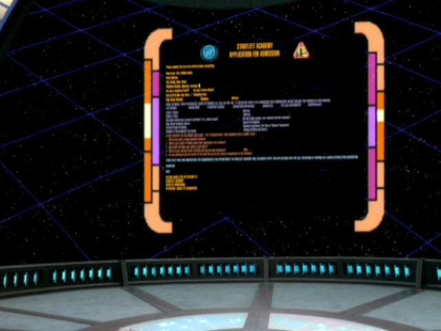
The Starfleet Academy emblem appears on an application form for Starfleet Academy that Icheb looks at on a viewscreen. We can't recognize any details.
VOY: In the Flesh
In the simulation of the Starfleet Academy created by Species 8472 we can see the familiar Aacdemy flag again, which last appeared in "Time's arrow I". It can be seen here along with the flag of the Federation.

VOY: Nightingale & Endgame
In this episode, Harry Kim decorates his ready room on the Nightingale with various certificates. The upper one of the two certificates (which could not be seen in "Non Sequitur") again features the logo of Starfleet Academy. It is barely recognizable, but the certificate from "Nightingale" reappears in "Endgame", in Captain Kim's ready room on the USS Rhode Island.
Mike Okuda: "On your frame grab from 'Nightingale,' you might note that the lower certificate on Harry Kim's wall thanks him for participating in the Apollo 11 quadricentennial celebration."
Star Trek Nemesis
As already mentioned, in one scene of the last TNG movie we can see the page of the Picard family album with the certificate of the Starfleet Academy. This is the last time the emblem is shown in Star Trek so far.

PIC: Remembrance
In 2019, the exhibition "The First Duty", on the occasion of the new series Star Trek: Picard, showed several screen-used props related to Captain Picard. Among them is a plexiglass sculpture from Starfleet Academy that was created for the Quantum Archives scene in PIC: "Remembrance". It can't be spotted in the episode itself, but in the Ready Room episode. This new sculpture has the Starfleet Academy emblem engraved (or perhaps rather printed on) in all-white. It is noticeable that, just as on the inaccurate or preliminary family album version, the sunbeams are interrupted by the bridge pylons. This may be artistic license. Also, the rays are placed in the same fashion as on the first, still incorrect version from "The First Duty".

Very annoyingly, the grammatical error "Ex Astra Scientia" reappears on the plexiglass award, after being consistently correct for the past 25 years! The error most likely came to pass because Michael Okuda was not involved and because whoever created the graphic looked it up at Memory Alpha where, until Jörg fixed it on July 20, 2019, the faulty version was prominently placed in the "Starfleet Academy" article.
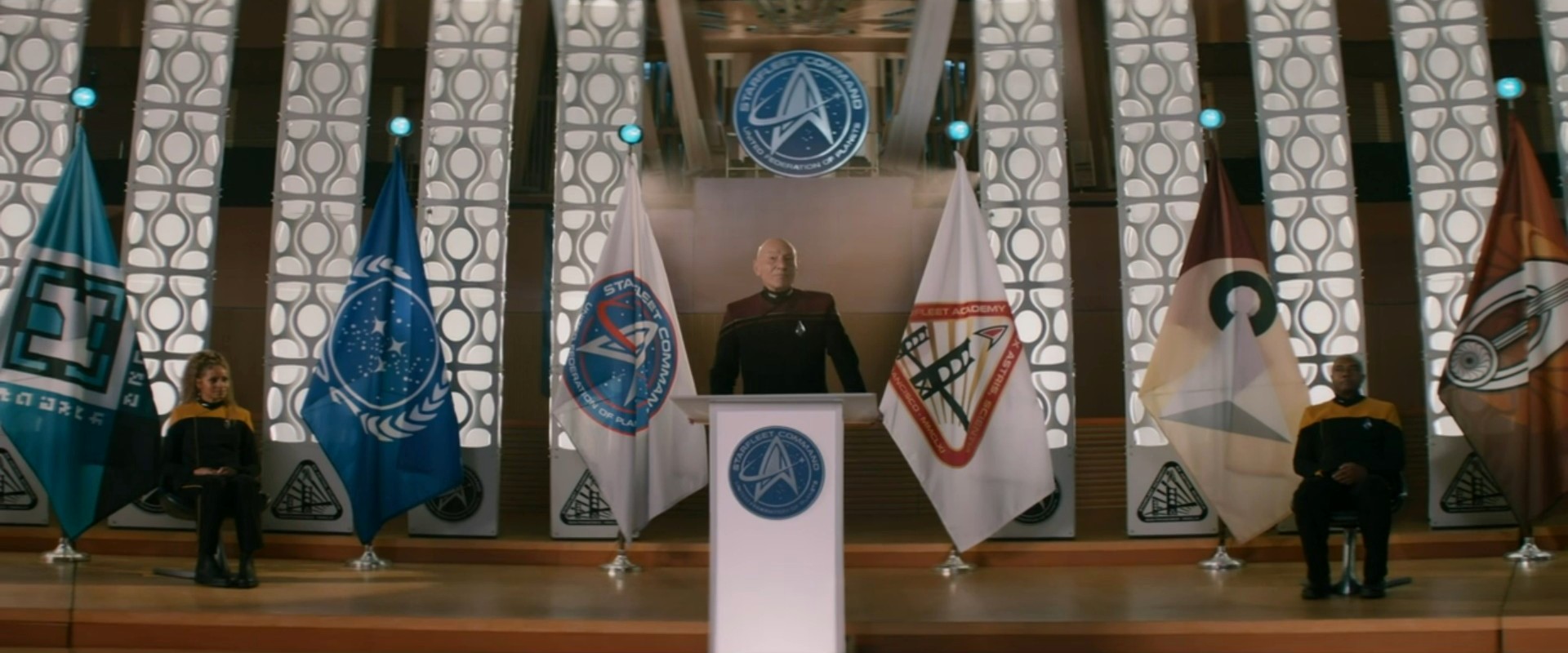
PIC: The Star Gazer
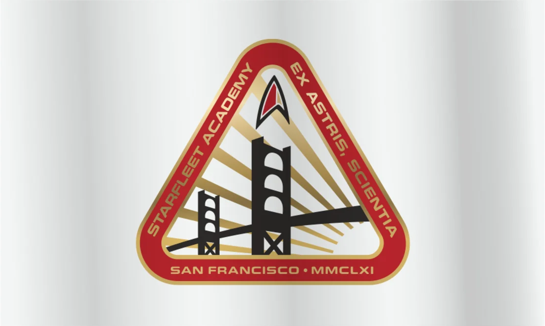
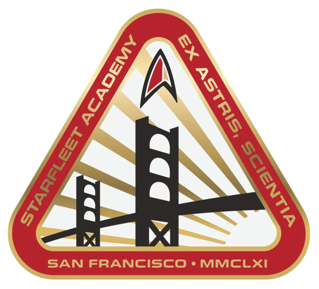 A flag with the Starfleet Academy emblem prominently appears behind Picard's lectern in PIC: "The Star Gazer". We can see that the emblem was updated, now showing the Starfleet delta in its late 24th/early 25th century variant. And the lettering correctly reads "Ex Astris, Scientia".
PRO: Observer's Paradox
Janeway's Academy diploma is displayed on Voyager-A in PRO: "Observer's Paradox". We can see the familiar Academy emblem in the upper center, as well as the one of Starfleet Command on the lower right.

32nd Century
 Starfleet Academy is reopened at the old site in San Francisco after more than a century in 3192. We can see full emblems of the Academy with the familiar (and correct) inscription "Ex Astris, Scientia", which don't include the depiction of the Golden Gate Bridge any longer but just an arrowhead and a "swoosh". Additionally, there is the logo with the Academy's mascot, a lapling called "Lappy".


The flag of the Academy shows the seal on red ground. There are also simplified versions without the motto or even without the letters "Starfleet Academy" that are essentially like the Starfleet Command seal.


The Academy seal is sometimes combined with a shape that looks like an inverted "U" and that resembles the planform of the USS Athena, just like the commbadges of the Academy.

Certificates with Other Emblems
TNG
Various TNG episodes include Picard's, Data's and Riker's Starfleet Academy diplomas.
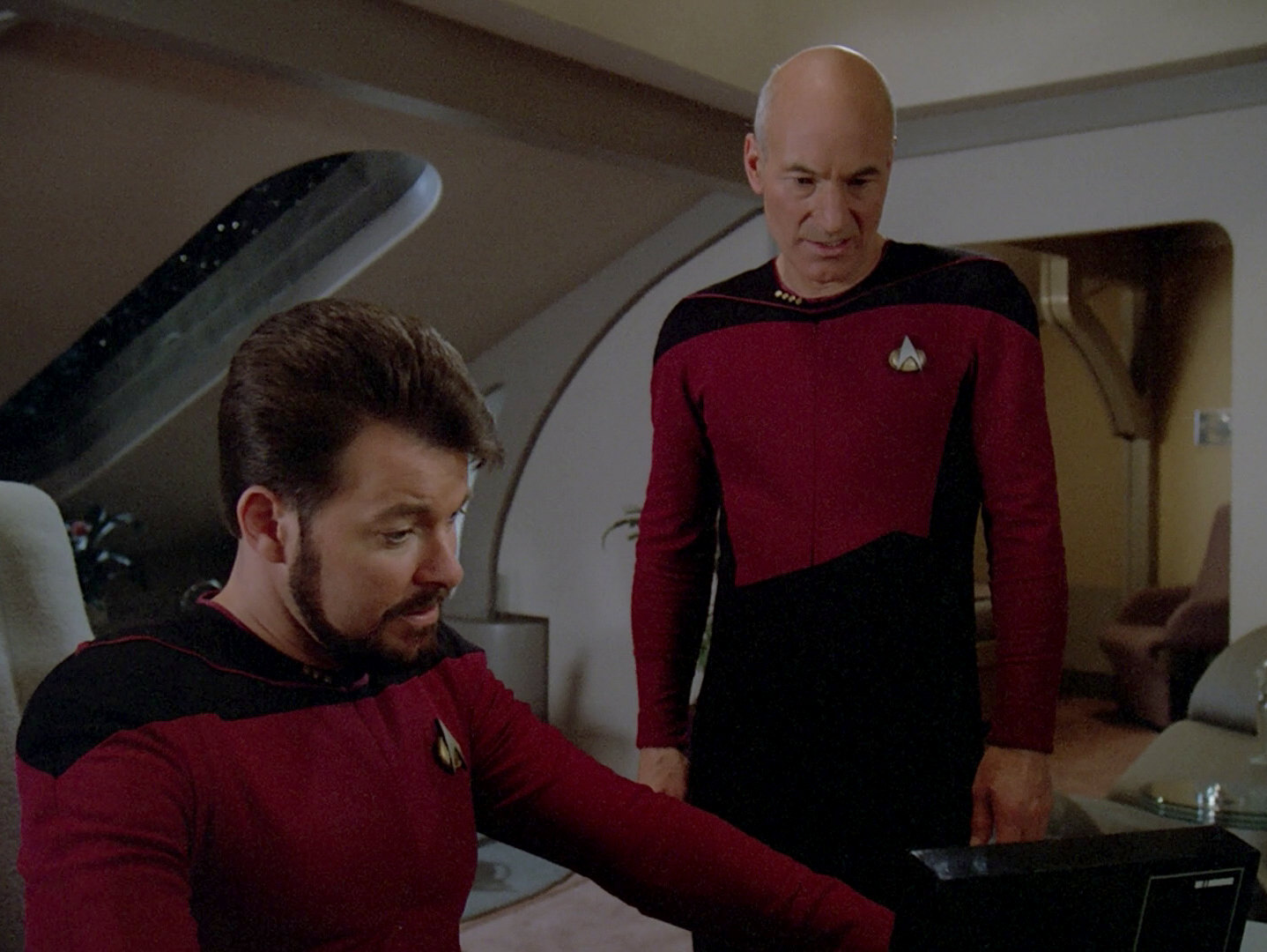
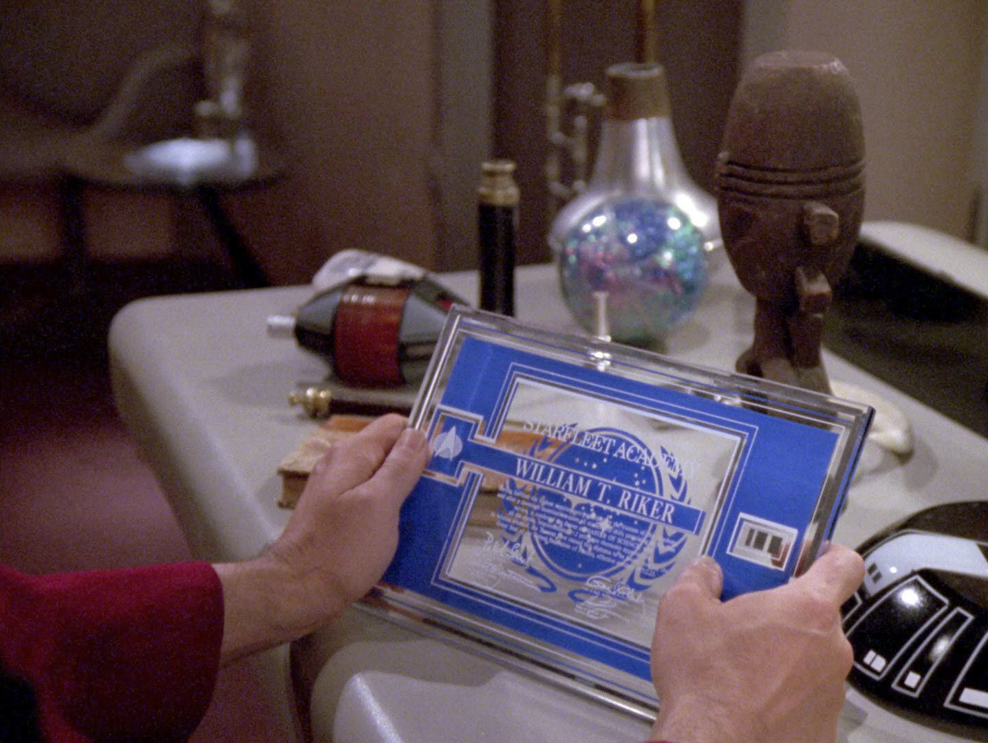
In "The Battle", we can see Picard's certificate for the first time. It is printed on transparent plexiglass and looks very large in comparison to the later versions. In "The Measure of a Man", Data's clearly smaller certificate can be seen. This too is printed on plexiglass, but has a blue background. This design should later be reused in all TNG appearances of Starfleet Academy records. In addition, it is the basis for the certificates in "Non Sequitur" because the structure of the diploma is identical. In "The Icarus Factor", Riker's certificate shows up for the first time. This one would be seen much more clearly in "Conundrum". Finally, we can see Picard's certificate again in "Pen Pals", but this time it has the same design as Data's and Riker's certificates.
Mike Okuda: "The plexiglas certificates were intended to be Starfleet diplomas, and the text so indicates."
Since all the aforementioned episodes in which the diplomas appeared were originally produced before "The First Duty", none of them contains the logo of the Starfleet Academy.

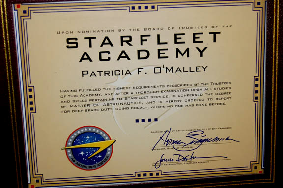
ENT
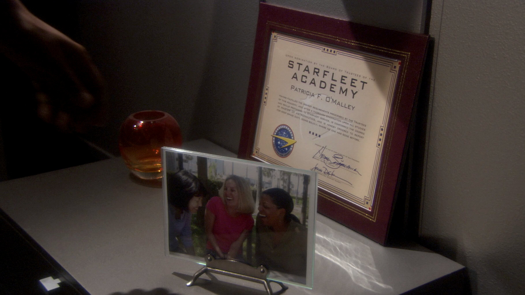
In ENT: "Storm Front II" we can see the Starfleet Academy diploma of Ensign Patricia F. O'Malley, a crew member killed in the war with the Xindi. It is adorned by the emblem of Earth Starfleet. The existence of an institution of that name at that time (2153 according to the certificate text) may be rated as an error, knowing that the Starfleet Academy emblem clearly establishes the foundation date of 2161. On the other hand, just like Earth Starfleet became the Federation Starfleet, the name may have been passed on to the new academy.
Mike Okuda: "Yes, the Starfleet certificate in 'Storm Front' was my mistake."
See Also
The Evolution of the Federation Emblem - exhaustive survey of all variants
The Evolution of the Starfleet Medical Emblem - exhaustive survey of all variants
Credits
Thanks to Mike Okuda for his annotations, to Star Trek Auction Listings, from where we took photos of auctioned items, to TrekCore for the Picard exhibition photos and to Thorsten Reichelt for saving Rex Duglar's diploma.


